ScreenFonts_201803_2-1_lede.jpg

ScreenFonts: March 2018

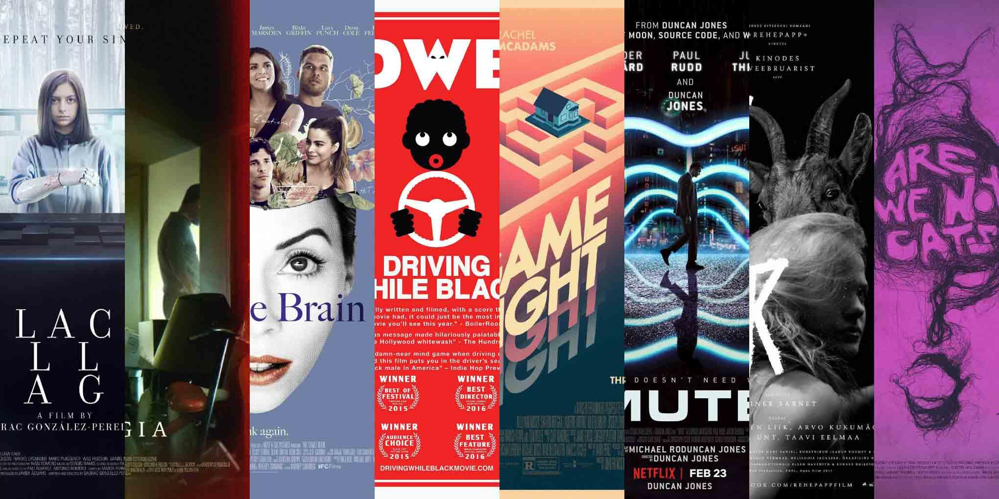
A supernatural beginning and a downright weird ending: this episode looks at posters for Black Hollow Cage, Nostalgia, The Female Brain, Driving While Black, Game Night, Mute, Rehepapp (November), and Are We Not Cats.
Hello to any new readers who may have followed me here after my SXSW Interactive talk in Austin! If you liked what you saw and heard on stage, there’s more of that every month here at Type Network, home of some of the most exciting independent type designers and foundries from around the world. Come for the stories, stay for the fonts.

Black Hollow Cage

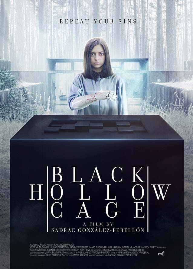
Daniel Fumero’s main theatrical poster for Black Hollow Cage
© 2017 levelFILM. Key art by Daniel Fumero.
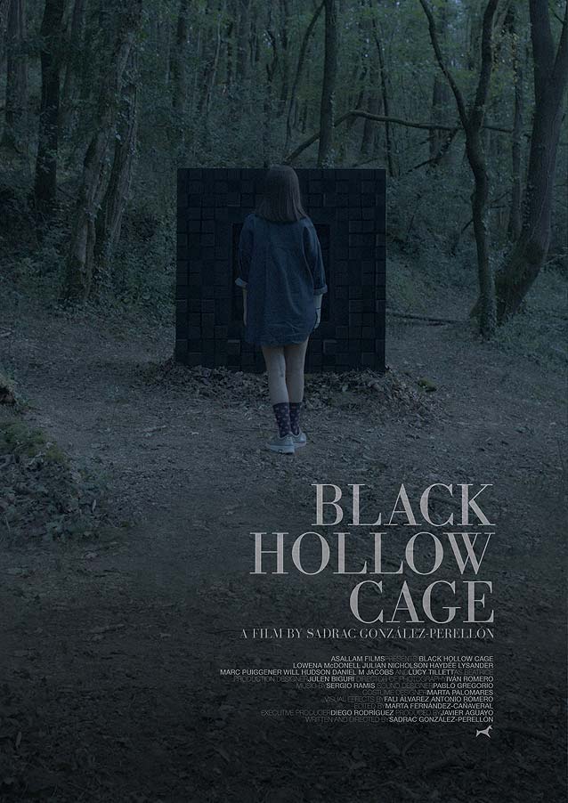
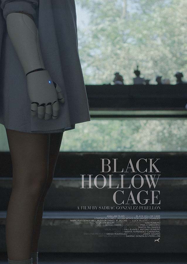
I enjoy inventive and unusual typesetting, but Daniel Fumero’s main theatrical one-sheet for Black Hollow Cage has me confuzzled. In this Spanish horror drama, a girl lives secluded in a house in the woods, her father and a wolfhound her only company. One day, she finds among the trees a mysterious cubical device that promises to alter the past. Fumero manages to evoke the film’s eerie premise with his almost clinical depiction of the black cube and the girl standing behind it, resolute, calmly showing her blood-stained prosthetic arm. So far, so good. But the typographic composition is another matter. I’ve attempted to deduce the linguistic or aesthetic rationale behind it, but have come up empty. The title is set in Bodoni (exquisitely interpreted, by the way, by Matthew Carter as Stilson). Having the H and the W outside the vertical lines doesn’t create multiple or alternative readings, and no geometric patterns appear in the three lines of loosely tracked capitals. Because the first word has an odd number of letters and the two subsequent ones even numbers, the spacing is also inconsistent. I have no idea what the reasoning is behind this lockup.
Poster for Black Hollow Cage
© 2017 levelFILM.
Poster for Black Hollow Cage
© 2017 levelFILM.
Poster for Black Hollow Cage
© 2017 levelFILM.
Poster for Black Hollow Cage
© 2017 levelFILM.
Poster for Black Hollow Cage
© 2017 levelFILM.
Poster for Black Hollow Cage
© 2017 levelFILM.
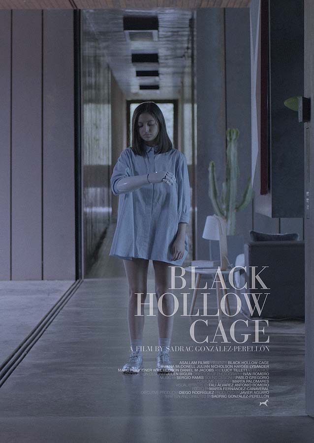
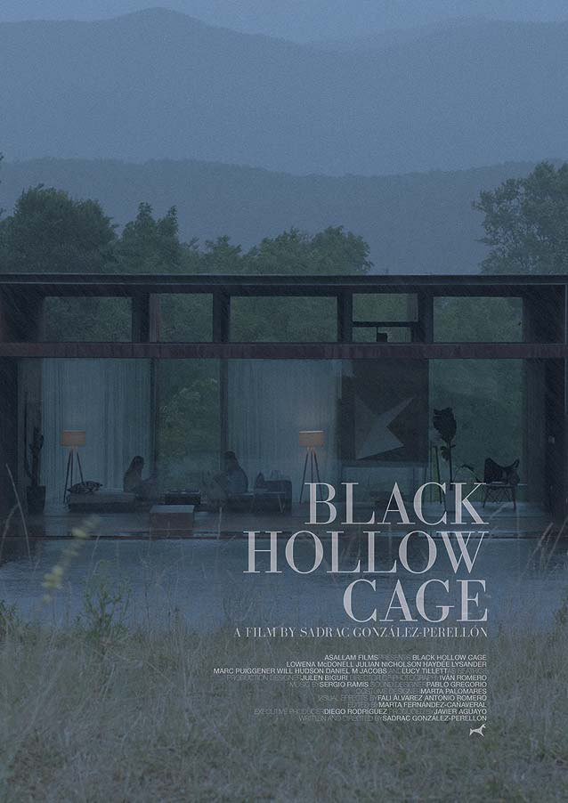
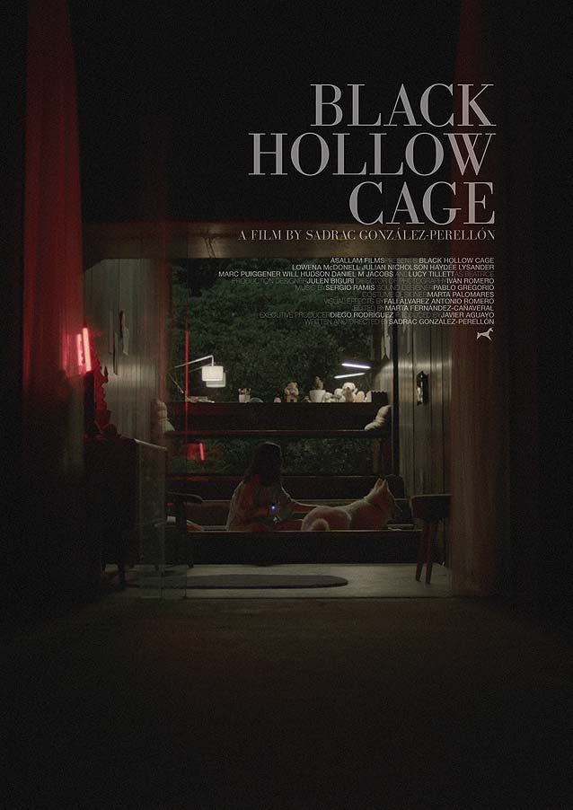
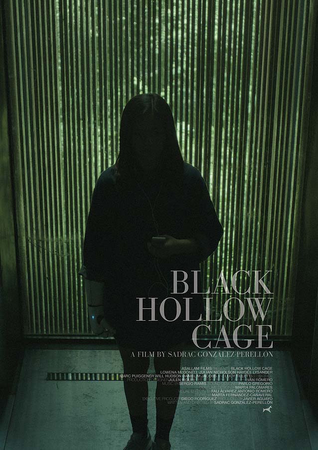
The series of alternate posters proves that the type needs no artifice to come into its own. All textual information is gathered in one semi-transparent block and aligned to the right, allowing the moody photography to speak for itself.

Nostalgia

P+A’s poster for Nostalgia
© 2018 Bleecker Street Media. Key art by P+A.
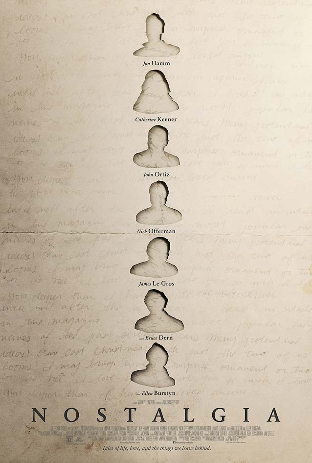
P+A came up with bittersweet visual metaphors for Nostalgia, a mosaic of stories about love and loss that explores our relationships to the objects, artifacts, and memories shaping our lives. The first poster conjures up correspondence lost and found again—faded letters from someone one once knew, once loved? The artwork subverts the done-to-death floating heads motif: only anonymous silhouettes remain where the headshots of the cast were cut out, the holes revealing a second layer of handwriting. Adobe Garamond reinforces the artwork’s literary appearance. Obvious alternatives are Font Bureau’s (much crisper) Garamond FB, drawn by Jill Pichotta, or Retype’s award-winning Guyot, both available in Text and Headline optical sizes. If you like the bookish look but want something different, take Underware’s calligraphic Dolly, Kontour’s exciting Dwiggins-inspired Odile, or Monokrom’s chiseled Satyr/Faunus duo for a spin.
P+A’s poster for Nostalgia
© 2018 Bleecker Street Media. Key art by P+A.
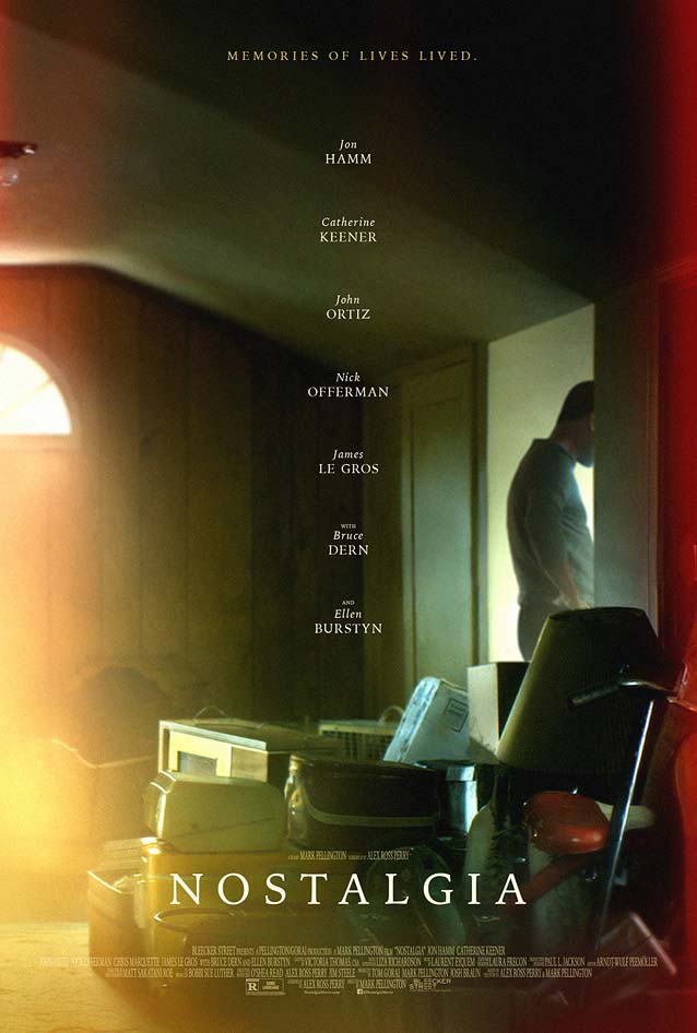
P+A’s second poster is gorgeous, a half-forgotten phantasm, an abandoned room littered with the belongings of…who was that again? The intense color palette reminds me of the beginning of a cellulose acetate film strip that got partly overexposed when the film roll was inserted in the camera, the expectation of an image to come just out of reach. The many objects strewn all over the floor create the impression of a person sifting through memories, trying to remember…something. Despite the clutter and the presence of the person, back turned toward the room, the image is devastatingly barren. The lone column of names descending toward the movie title echoes this sense of emptiness. Oddly, the second version uses a different typeface: Iowan Old Style by noted sign painter and friend of Type Network John Downer, creator of the slender Roxy and SamsSans, and the multifaceted powerhouse Ironmonger.

The Female Brain

The Refinery’s main theatrical poster for The Female Brain
© 2017 IFC Films. Key art by The Refinery.
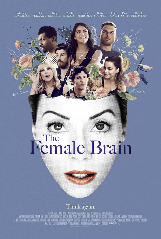
The Refinery’s theatrical one-sheet for The Female Brain, a comedy exploring the science behind our romantic missteps, is nostalgic too, but a very different kind of nostalgic. This witty collage channels the classic illustrations found in fashion magazines of the 1950s and ’60s. It’s another alternative to the floating-heads cliché, and a most refreshing one at that. No Photoshop, just good old-fashioned scissors make the colorful portraits of the cast, together with some retro flowers, pop out of the head of a vintage fashion model in rasterized black and white, with fiery red lips. (I know, I know, Photoshop probably did play a role here, but you catch my drift.) The type choice is an impeccable match for the period illustration style: Matthew Carter’s Big Caslon looks absolutely perfect in this setting, beautifully enhancing the artwork.

Driving While Black

Festival poster for Driving While Black
© 2016 Anthem Films.
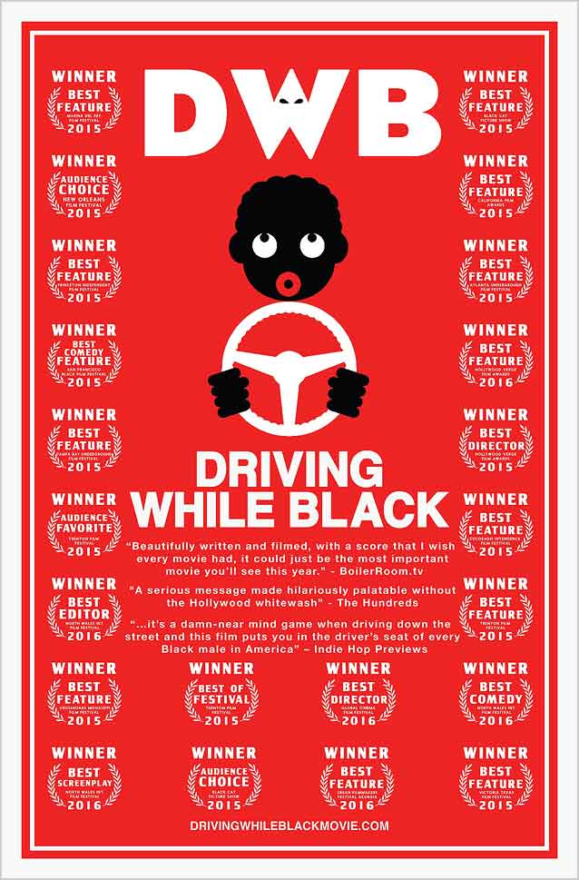
Another movie that uses humor, but brandishes it as a powerful beacon exposing racism and bigotry, is Driving While Black, a comedy about the extra layer of police hassle that young black men face while driving. The minimal artwork in simple—but very effective—red, black, and white references the cruel blackface advertisements of old and a blink-and-you-miss-it Ku Klux Klan hood in the W of the DWB logo. True to the minimal artwork, the title is set in the quintessential Modernist typeface Neue Haas Grotesk, arguably the most faithful rendition of the original designs for Helvetica. David Berlow’s Eagle is easy to recognize in the abbreviation at the top for its sharp, bold features.

Game Night

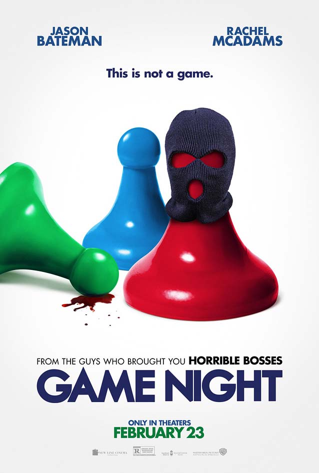
P+A’s alternate poster for Game Night
© 2018 Warner Bros. Key art by P+A.
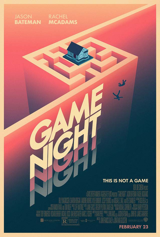
In the crime comedy Game Night, a group of friends who meet regularly for game nights find themselves trying to solve a murder mystery. While the main theatrical poster is bland, mainstream, Photoshopped fare, P+A also released a neat alternate version. The illustration with a slightly retro vibe is whimsical and accomplished, but the movie logo seems to have been drawn by a well-meaning amateur. Curves and weight distribution are off, there are no optical corrections to speak of, and the design is inconsistent—the pointed apex of the A gets lopped off on the M and N. The artwork would have greatly benefitted from a professional, well-crafted typeface with similar qualities, like the aforementioned Eagle, Telefon, or Mostra Nuova. Arbotek Ultra or Pilar would have considerably amped up the fun factor.
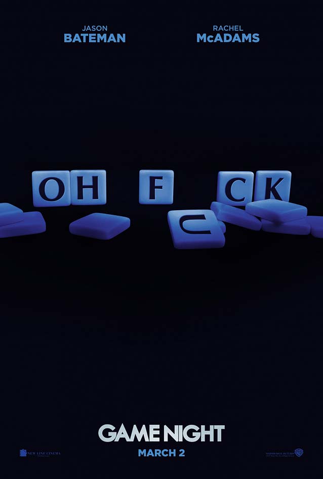
Leroy and Rose’s teaser poster for Game Night
© 2018 Warner Bros. Key art by Leroy and Rose.
Leroy and Rose’s teaser poster for Game Night
© 2018 Warner Bros. Key art by Leroy and Rose.
In the teasers by Leroy and Rose, the supporting typeface incomprehensibly alternates between Futura and Gotham. I like the first version, where Optima surfaces in the Scrabble tiles . Amira and Vinter are delightful alternative options for Optima. The second poster contains too many competing concepts, and the photo compositing is pretty poor.

Mute

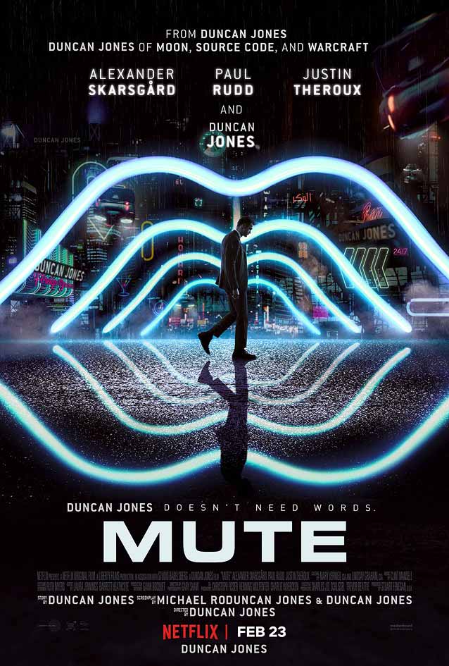
Main theatrical poster for Mute
© 2018 Netflix.
The main theatrical poster for Duncan Jones’ Mute, about a mute bartender who goes up against his city’s gangsters in an effort to find out what happened to his missing partner, sports Aldo Novarese’s classic Microgramma. The film is set in a futuristic Berlin, so the type choice makes perfect sense—read Dave Addey’s excellent series Typeset in The Future or, better yet, preorder the book! The wide square sans letterforms (see also Agency FB) play well with the poster’s luminous arcs and neon signs. The supporting typeface is ITC Conduit, a technical sans in the vein of New Frank or DINosaur. I initially thought that Cardinal’s gorgeous one-sheet for Jones’ first film, Moon—which I reviewed almost a decade ago—featured the same typeface, because, you know, nostalgic sci-fi. However, I rediscovered that the artwork was dressed in a round, not a square extended sans, something like Revolver Type Foundry’s confident Dinamit. Memory sure can play tricks on you.
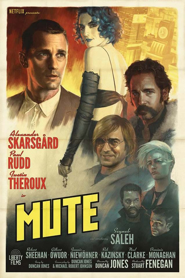
Alternate vintage poster for Mute
© 2018 Netflix.
There’s a cute faux-retro alternate design, with spot-on typography: a combination of Mark Simonson’s Kinescope and a compact sans like Titling Gothic Skyline or Benton Sans Extra Compressed for the credits, and a hand-drawn constructivist movie title. But how does vintage-looking artwork relate to the futuristic setting of the film? I get that it’s a neo-noir story, but that hardly explains the conceptual disconnect.

Rehepapp (November)

Margus Tamm’s poster for November
© 2017 Oscilloscope Laboratories. Key art by Margus Tamm.
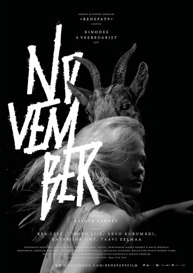
This is where this episode of ScreenFonts takes a turn toward the bizarre. The Estonian fantasy Rehepapp (November) is a mixture of magic, black humor, and romance. This tale of love and survival in nineteenth-century Estonia, filmed in black and white, is set in a dark, harsh landscape populated by spirits, werewolves, plagues, and even the Devil. Margus Tamm tapped into the gothic love story with dark social satire to devise a domestic poster that is as alluring as it is grotesque. He preserved the movie’s black-and-white gamma, refining it by adding silver, and designed an angular title inspired by the “kratts,” the scrappy DIY demons depicted in the movie. The composition is superb; the young woman, the goat, and the vigorous letters interact beautifully. While the move title is in front, some of the letters disappear behind the goat’s head in the back, thus creating a dimensional paradox that enhances the surreal atmosphere. The centered credits in Adobe Warnock anchor the totem-like arrangement.
Margus Tamm’s poster for November
© 2017 Oscilloscope Laboratories.
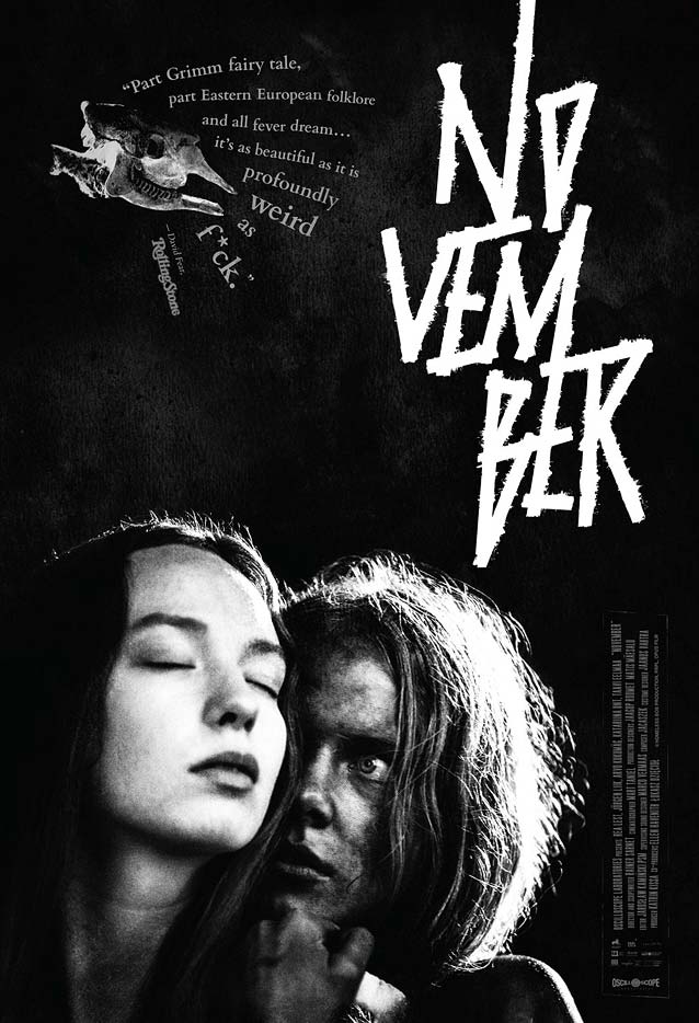
The international version demonstrates the importance of layout skills. While it uses essentially the same components as the domestic version, the artwork falls flat due to their haphazard placement. The Rolling Stone quote, the movie title, the vertical block of credits, the image—each item has simply been shoved into a different corner, turning the poster into a collection of disparate visual elements instead of a coherent composition.

Are We Not Cats

Poster for Are We Not Cats
© 2016 Cleopatra Entertainment.
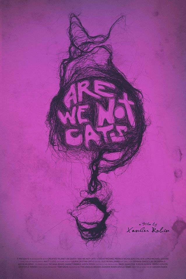
You haven’t seen weird, though, until you’ve seen the theatrical one-sheet for Are We Not Cats. This romantic horror comedy follows a young man who loses his job, his girlfriend, and his apartment in a single day. As he attempts to rebuild his life, he gets sidetracked when he meets a woman who shares his strange habit: a propensity to eat hair. The Are We Not Cats poster may be the most outlandish I have ever come across: Iranian artist Morteza Mottaghi created the artwork entirely with human hair. He chose this medium because he believes that a person’s hair represents their unique personality and character traits. In an email, director Xander Robin told me that producer Josh Sobel found Mottaghi on Instagram. “I had a simple idea that he could create some kind of question mark,” Robin said. “Mottaghi proposed three interpretations of the concept made with his grandmother’s hair, one of which was better than we could have ever imagined.” The physical artwork was scanned; then Christian Cueva and Ricardo Farias of Giant Films, a graphic design firm based in Mexico City, integrated the title treatment and completed the poster. The astonishing design honors the quirky film’s unique premise. In their interview with Indiewire, producers Theo Brooks and Joshua Sobel of F Productions explained it best: “Mottaghi’s work is instantly recognizable for its organic, human, and sometimes revulsive qualities, which we felt were representative of the unrelenting and occasionally dangerous intimacy that characterizes the film.”
No worries, new SXSW friends, you will never get unrelenting and occasionally dangerous intimacy from me, just my unsalted opinion on the design and typography of recent movie posters. If you enjoyed reading ScreenFonts, linger a little longer for The Leftovers, which will be published soon, and then keep an eye on Type Network’s News section for the next installment of ScreenFonts. Bald Condensed, né Yves Peters, is a Belgian-based rock drummer known for his astute observations on the impact of letterforms in the contemporary culture-sphere. A prolific writer on typography, he has a singular knack for identifying the most obscure typefaces known to humankind.