ScreenFonts: March 2017 | The Leftovers
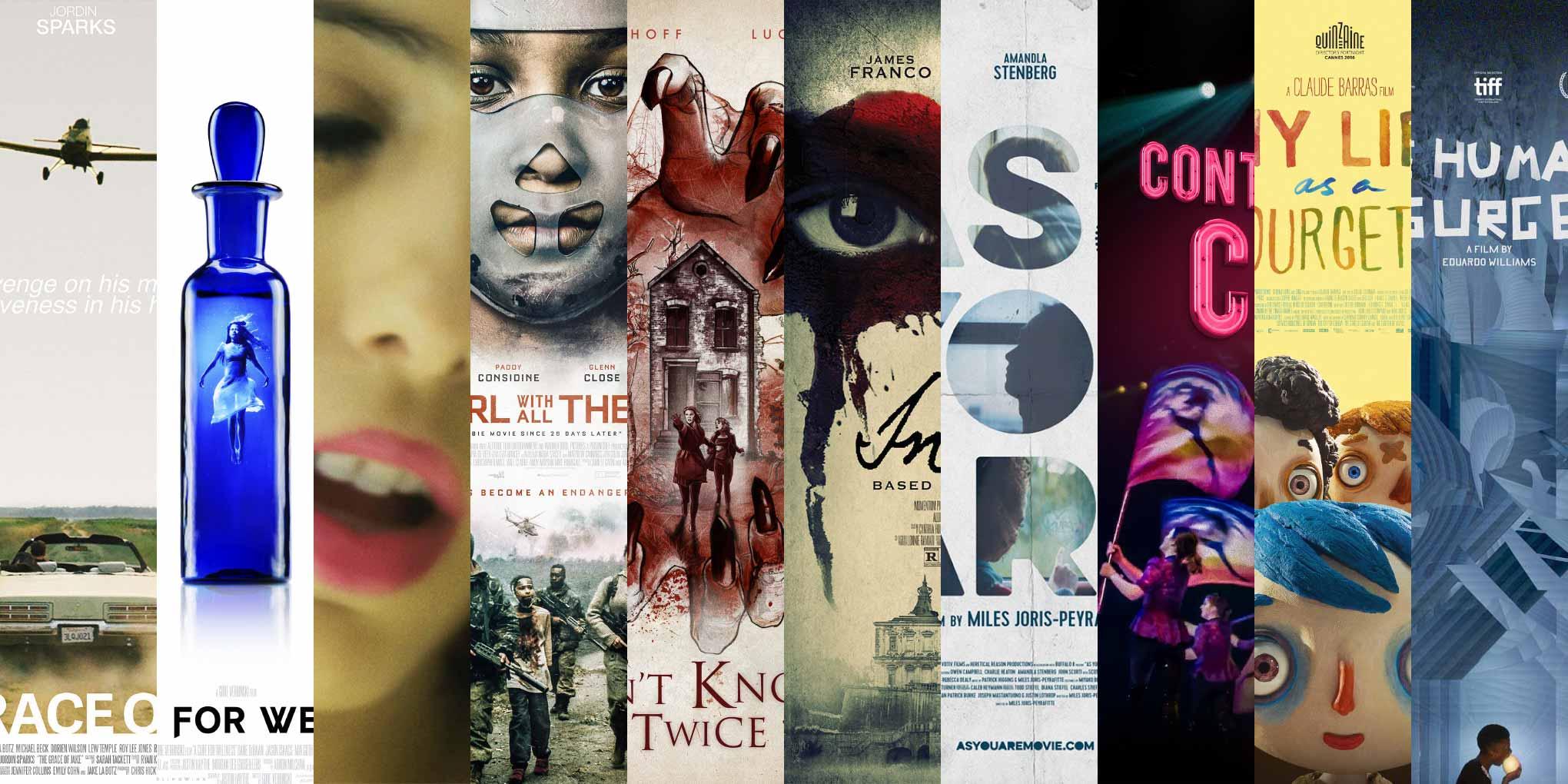
These posters didn’t make the cut, but are still noteworthy for their design and/or typography.
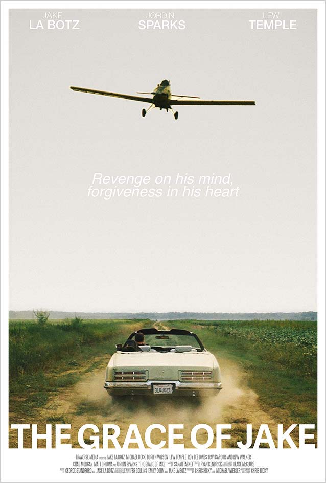
The Grace of Jake © 2015 Indican Pictures. This (deliberate?) homage to the classic crop duster scene in North by Northwest is a good example of a single-point perspective design that doesn’t look static. I love how the knocked-out film title bleeds into the classy white frame. The cheesy version with floating heads falls flat. 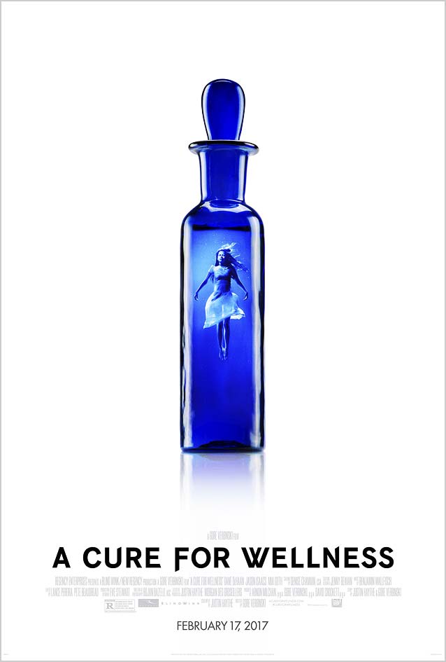
A Cure for Wellness © Twentieth Century Fox Film Corporation. Gravillis Inc.’s theatrical one-sheet nicely translates a key theme from the movie into a simple yet effective image. The type could almost be a customized Benton Sans. |
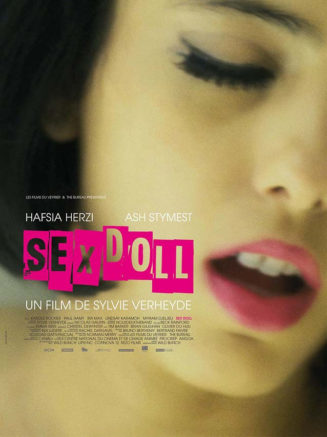
Sex Doll © 2016 IFC Midnight. The latex-like yellowy skin tone, closed eyes with exaggerated false eyelashes, and half-open mouth in this photograph virtually transform the actress into the titular sex doll. The suggestively positioned hot-pink ransom note typography gives a nod to the male protagonist’s penchant for “rescuing” women from the sex trades. This poster strikes an uneasy balance between the sensual and the explicit. 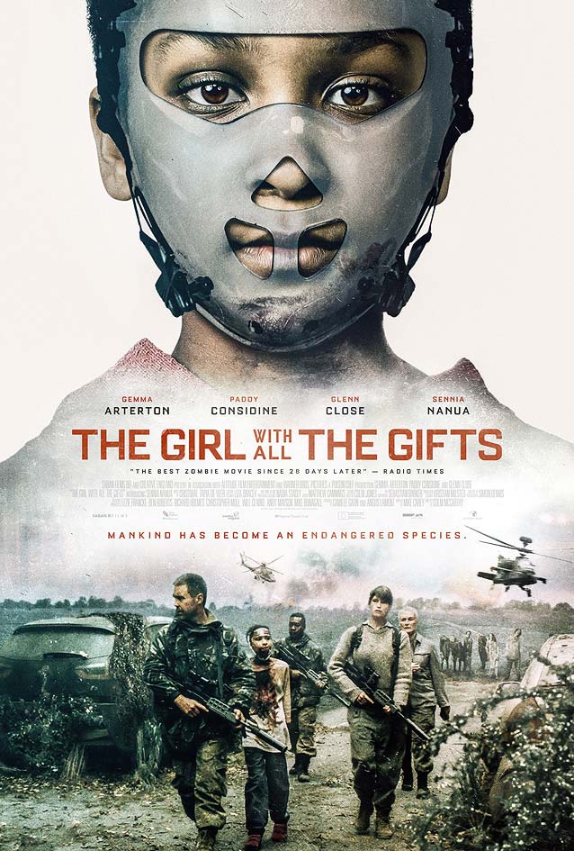
The Girl with All the Gifts © 2016 Saban Films. When you compare the typography in the half-baked original poster with Gravillis, Inc.’s superior artwork, you notice how Jonathan Barnbrook’s Bourgeois is a much better typeface design in the square sans serif genre. See also Agency FB. |
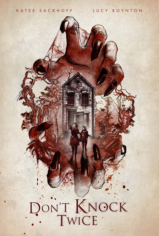
Don’t Knock Twice © 2016 IFC Midnight. While the main poster is predictable, this nice illustrated poster stands out. Playing with type sizes, however, does not exempt one from proper kerning: the KN and TW pairs need to be tightened. Trajan has become the obligatory typeface in the horror genre. A worthy alternative is Canto, which offers three different finishes and a full set of lowercase characters. 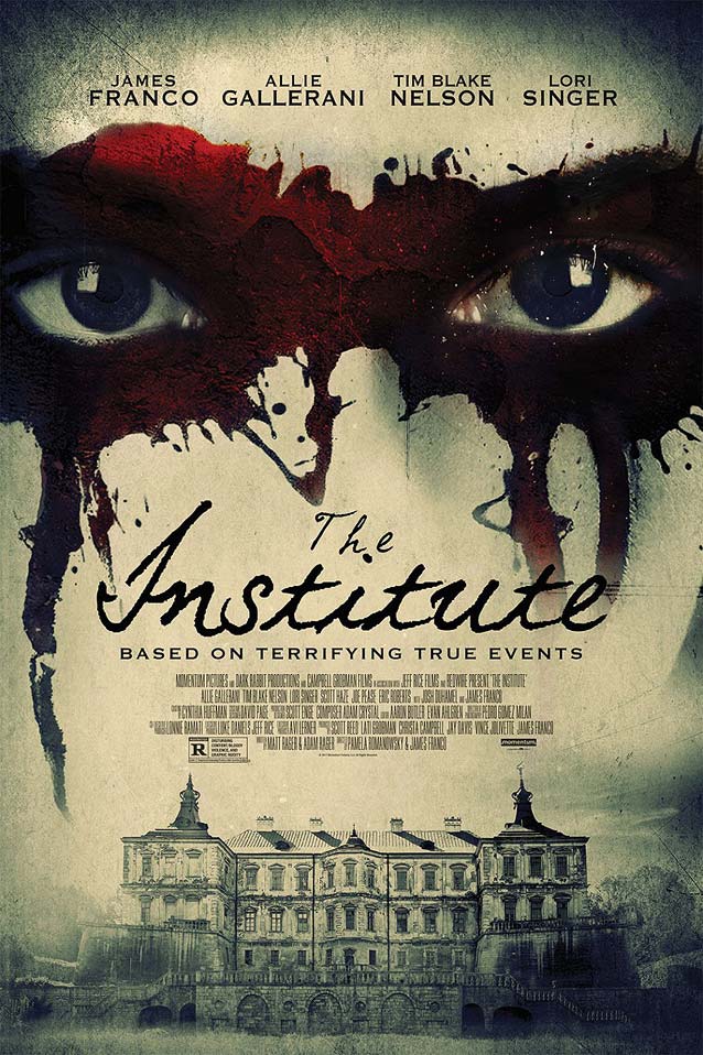
The Institute © 2017 Momentum Pictures. One thing immediately jumped out at me in this theatrical one-sheet: if you use a connected script, you’d better make sure the letters actually connect. |
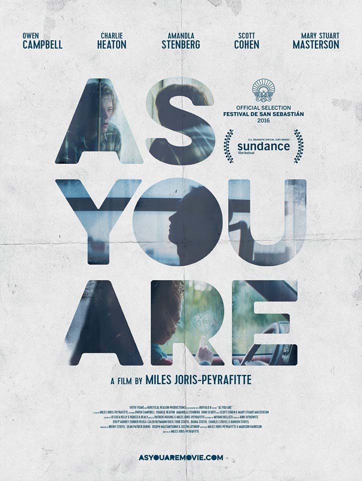
As You Are © 2016 Votiv Films. Excellent integration of images inside letterforms elevates this beautiful, moody photo/typographic poster. 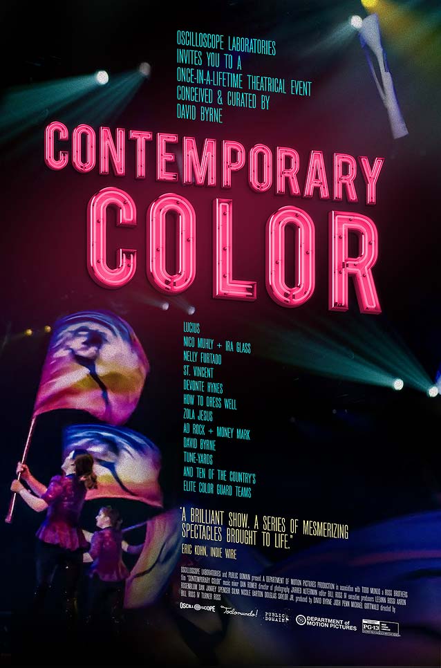
Contemporary Color © 2016 Oscilloscope. This colorful theatrical one-sheet makes great use of vibrant neon letters. |
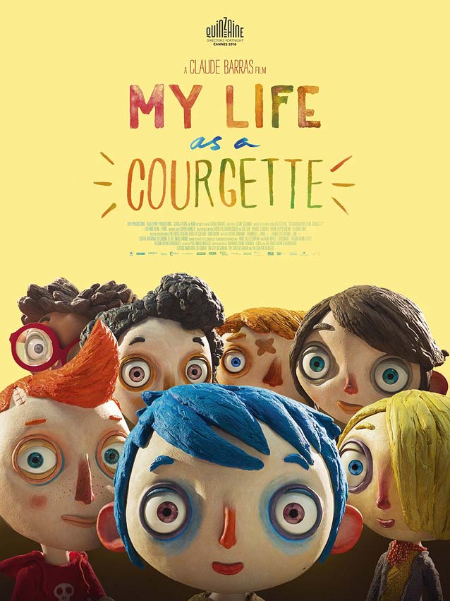
My Life as a Courgette © 2016 Gkids. Wonderland’s endearing international poster is a joyous affair with lovely hand lettering done in watercolors. 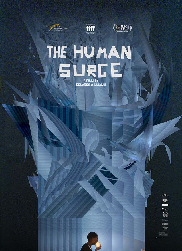
El auge del humano (The Human Surge) © 2016 Grasshopper Film. Wondrous techno-psychedelic poster with well-balanced, irregular tape lettering. |
Bald Condensed, né Yves Peters, is a Belgian-based rock drummer known for his astute observations on the impact of letterforms in the contemporary culture-sphere. A prolific writer on typography, he has a singular knack for identifying the most obscure typefaces known to man.