From spare simplicity to sepia-infused nostalgia: the March episode of ScreenFonts looks at posters for The Comedian, On The Rocks, A United Kingdom, XX, From Nowhere, Kiki, Table 19, and Logan.
By Bald Condensed
Because February is missing a couple of days, this installment of ScreenFonts turned out to be a little lighter than usual. Fear not, though—I still found some great posters among last month’s movie releases. I chose some of them primarily for their clever concepts, others for their beautiful execution.
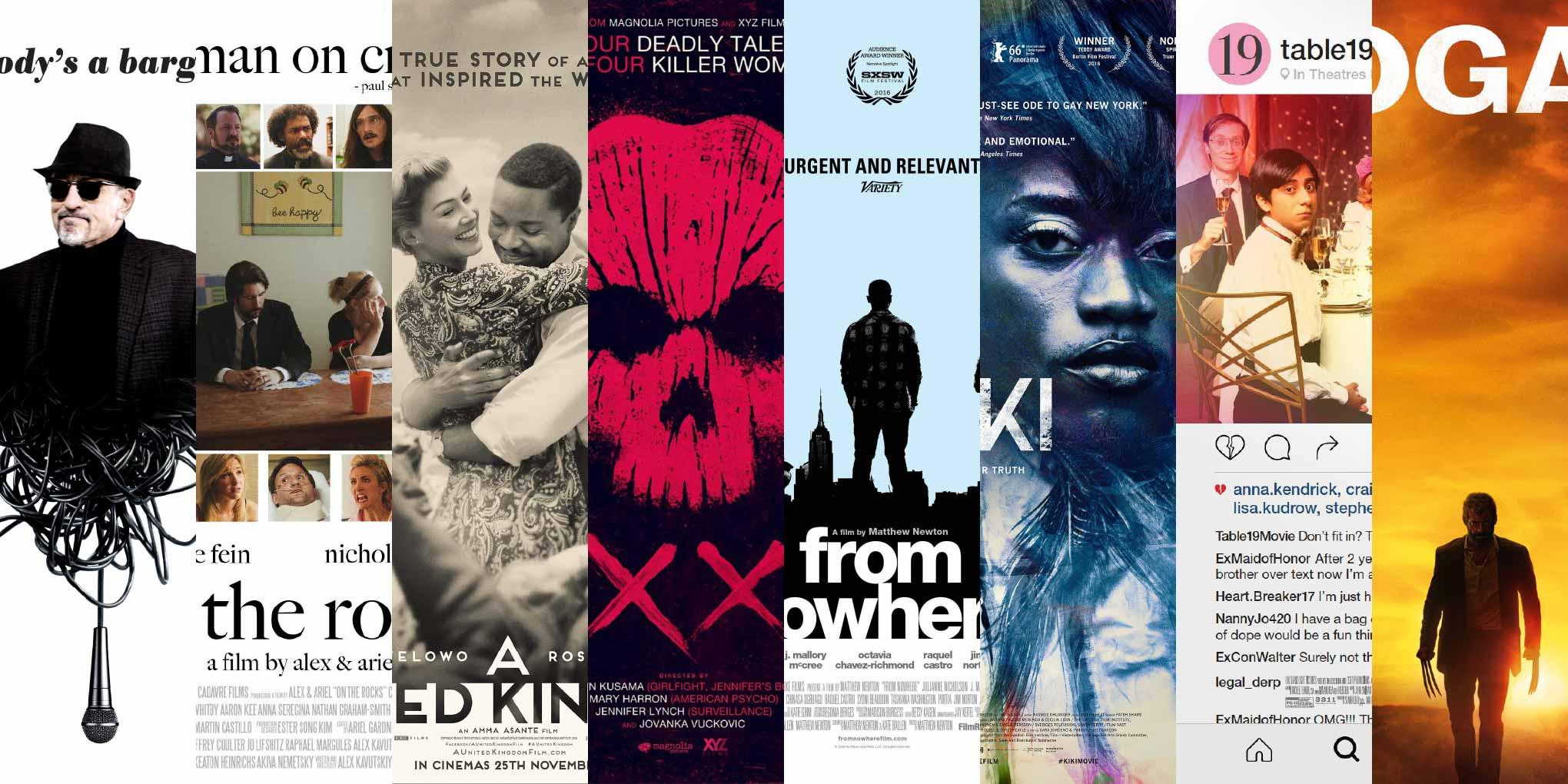
The two half images that seamlessly merge on the theatrical one-sheet for The Comedian make me think of Invisible Creature’s gorgeous package design for Echoes, Silence, Patience & Grace, the decade-old album by Foo Fighters. The resulting hybrid is an excellent visual metaphor for the film’s subject: the microphone hints at Robert De Niro playing an aging insult comic; the literal tangled mess of cable spilling out of De Niro’s gut represents the figurative mess his character is in. The artwork is striking in its simplicity: the sharply delineated, mostly black shape against the pristine white background is punctuated by all-lowercase black typography.
Poster Bodoni’s allure lies mainly in the contrast between the fat upward strokes and the hairlines. However, I find the letterforms too mechanical for my taste, and the hairlines are still pretty blocky. Compare this to the elegant contours and delicate transitions from healthy thicks to ethereal thins in Miller Banner Black Italic. Other viable alternatives to Poster Bodoni are Benton Modern Display Black Italic and Escrow Banner Black Italic.
On The Rocks
@ 2017 No Sleep Films.
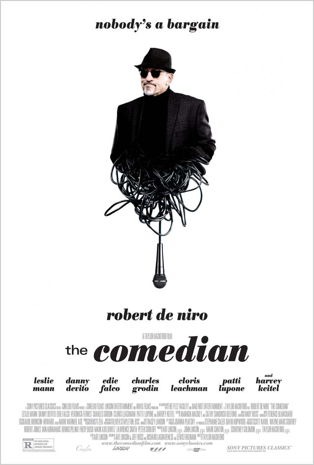
While the general approach and typographic treatment are similar (immaculate white canvas; all-lowercase classic serif face in black; tagline at the top; movie title, actors’ names, and credits underneath the picture), the imagery in the poster for On The Rocks differs radically from the previous design. This relationship dramedy is a typical ensemble-cast film—a genre Robert Altman excels in—hence the tagline, “Altman on crack.” I’m relieved the art director wasn’t on crack and for once didn’t have all the actors Photoshopped into one composite setting. That happens far too often, and invariably results in artificial, inane-looking images. Here, headshots of the supporting characters form a frame around the main picture.
Whatever you may think of the overall design, its execution falls flat. First, the color balance varies from one headshot to the next. Black-and-white or colorized versions would have created a more harmonious overall impression, nicely offsetting the central image. Second, it drives me bonkers that the white gaps between the images are not consistent. Finally, the overhang of the f collides with the tittle in the i in “a film by alex & ariel.” Big Caslon offers a ligature that elegantly solves this problem. A little more effort would have turned this into a much better poster.
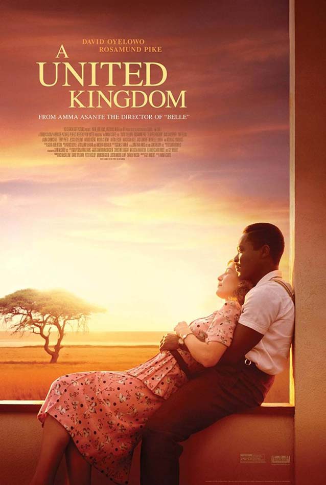
The biographical drama A United Kingdom recounts the late 1940s marriage of Prince Seretse Khama of Botswana to Ruth Williams, a white woman from London. At a time when apartheid was just being introduced in South Africa, their union caused an international stir. I almost passed on this film because Midnight Oil’s theatrical one-sheet (top left) is rather nondescript and mainstream. Although I don’t think this was intentional, the equally nondescript Times kind of works as a marker for the period. For a fresh alternative to such an overused typeface, check out Starling.
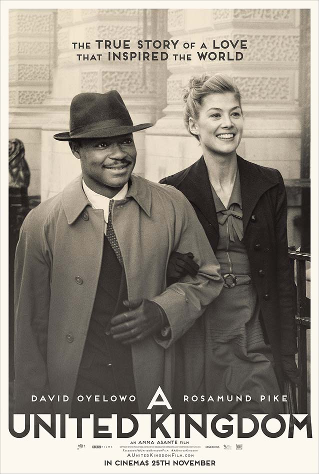
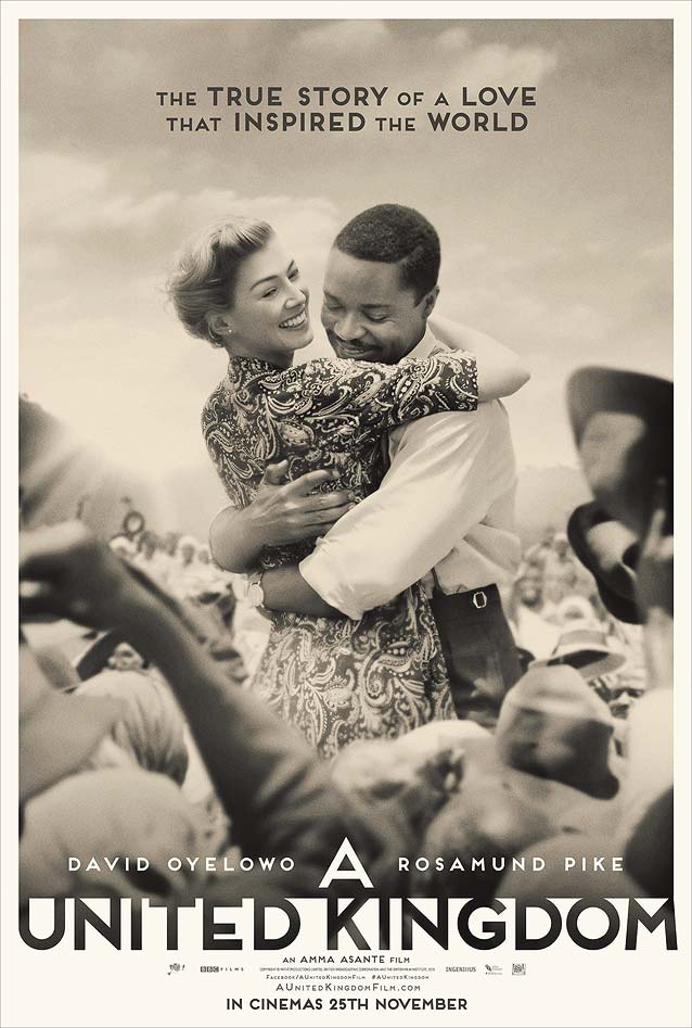
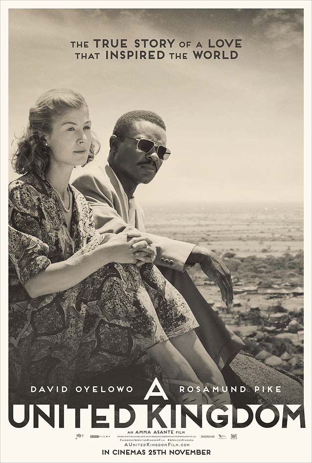
What completely captured my attention was thisnostalgictrio of teasers by AllCity. Everything—from the subtle sepia tone of the black-and-white pictures, to the acting, to the art deco overtones in the geometric sans serif—lovingly references the post-WWII years. If that aesthetic appeals to you, Mark Simonson’s Mostra Nuova is a great digital interpretation of hand-painted art deco lettering, and Eagle, Nobel, and Dunbar are all based on or inspired by metal type from that era. For a more organic look, try Berlin Sans, whose adaptable-width capitals offer extra flexibility.
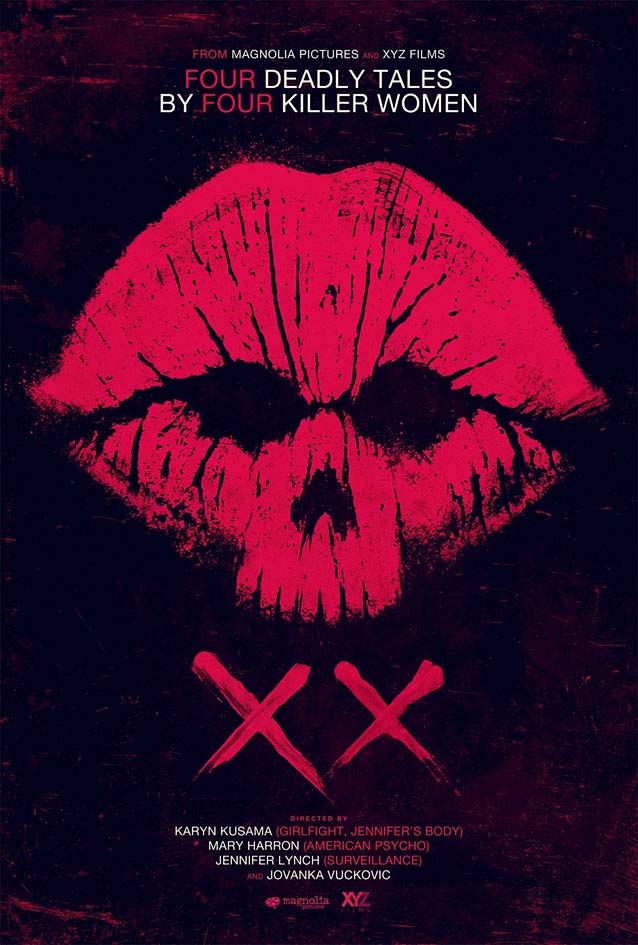
I guess there must be a competition among horror-poster designers for finding novel and unexpected ways to suggest a corpse’s head. The premise for XX is interesting. This new horror anthology with a gender twist features only segments directed by and starring women. It could be argued that the theatrical one-sheet reinforces gender clichés: women = lipstick = kiss. Yet the surprising skull shape is very effective at communicating the concept behind this anthology movie. The movie title is—of course—written in lipstick, while the type is set in centered all-caps Neue Haas Grotesk.
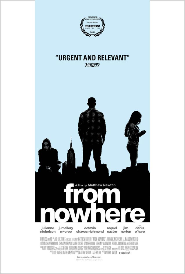
I am not Helvetica’s biggest fan—most digitizations fall short. In my opinion, the only version truly faithful to the original in form and spirit is Neue Haas Grotesk (NHG). Furthermore, Helvetica is criminally overused, primarily because people select it without asking themselves if it is really the most appropriate typeface in a given situation. Yet it can be a meaningful choice, like in the excellent movie poster for From Nowhere, about three undocumented Bronx teenagers who graduate from high school while trying to secure their papers to stay in the United States.
NHG works really well in the context of the eighties-style artwork. The knocked-out title acts like the protruding part of the piece of a jigsaw puzzle. It connects the generous white border with the silhouettes of the three youngsters towering over the black cityscape. Tight but not touching, the compact architectural letterforms become a third character alongside the city and the teenagers. And because Helvetica/Neue Haas Grotesk is the default font on many official government documents, the typography also works on a conceptual level. A thoughtful poster that eschews sensationalism.
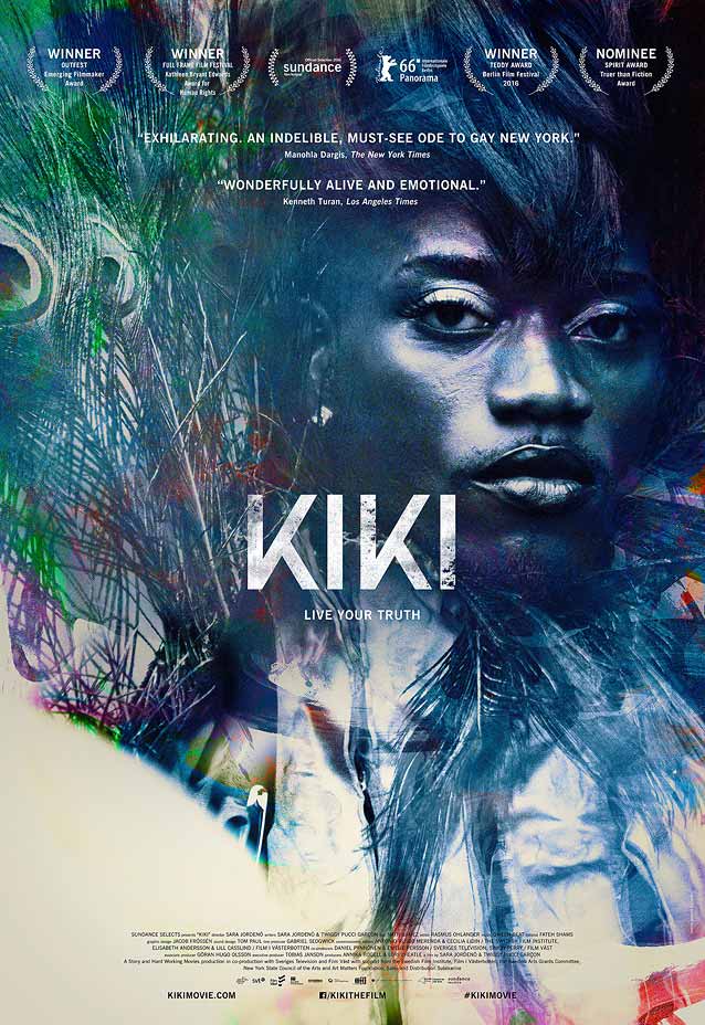
It might not look like it, but there is more than one connection between From Nowhere and Kiki. Both are set in New York City, and both deal with demographics that have been facing ever-increasing challenges. Kiki is a documentary about a group of LGBTQ youths of color who unite to form a safe gathering space through dance. The Boland Design Company’s theatrical one-sheet is positively stunning. The portrait of the flamboyant character is an explosion of otherworldly colors: gushes of intense blues, greens, and purples, plus the occasional dash of red and orange, with areas of white to provide contrast. This riot of colors belies the calm and composed expression on the character’s face. Framed by peacock feathers and sporting an outrageous hairdo, the personage seems to be ripped straight from a psychedelic reimagining of a baroque painting, looking almost regal. This is another design that favors dignity over luridness, a wonderful tribute to these besieged young adults.
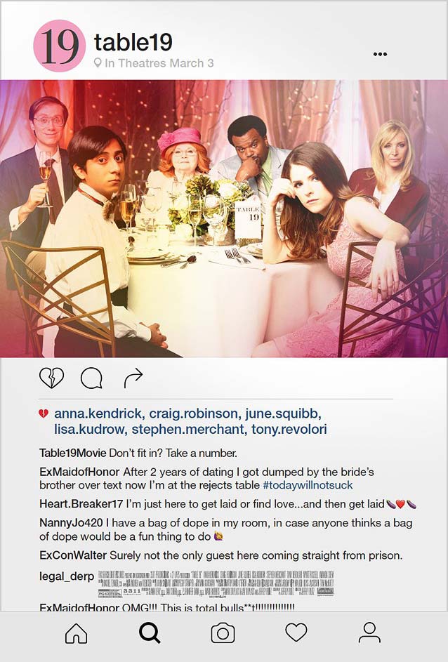
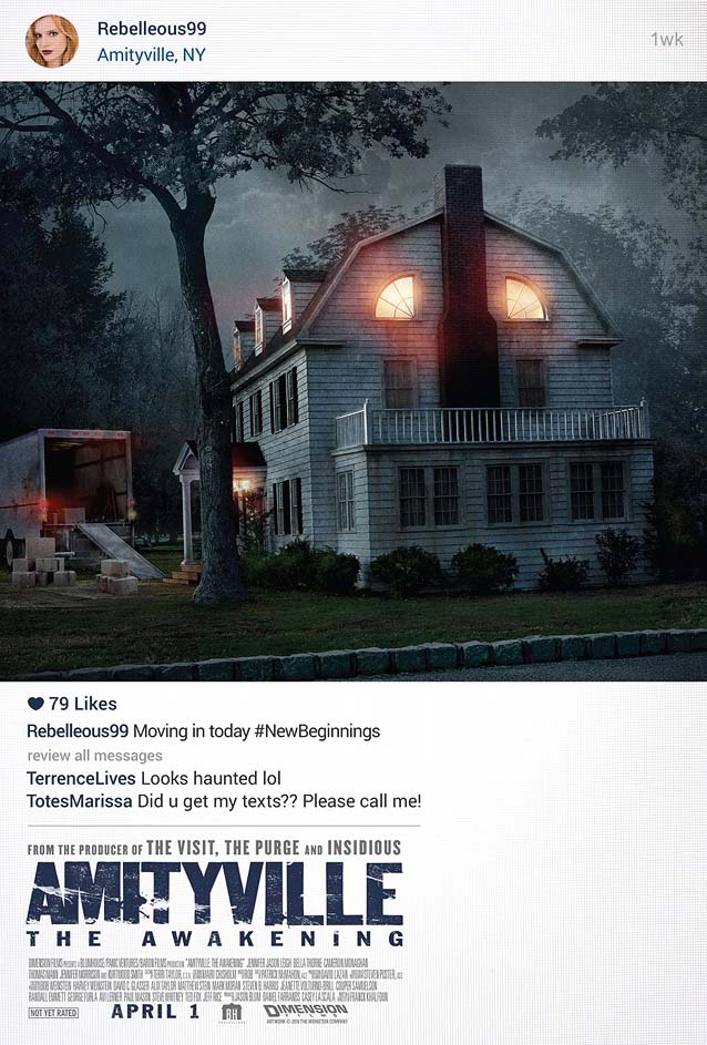
Our “oops” moment this episode comes from the comedy Table 19. Did Midnight Oil realize that their idea to appropriate the visual language of Instagram for their poster was also being used in GNAH Studios’s alternate design for the upcoming Amityville: The Awakening? The timeline is conflicting: although Amityville: The Awakening is scheduled for release in June, the teaser poster was revealed in February 2016, almost a whole year before the poster for Table 19. Chronology aside, I prefer Midnight Oil’s approach because it integrates Instagram’s visual vocabulary much better. The movie title becomes the username, with the release date of the movie appearing where the geolocation normally goes. I also like how they subverted the “Like” symbol by making it a broken heart. This unfortunate mix-up invites a larger conceptual discussion about whether one movie has the right to claim this idea, thus making it unacceptable for any other movie to use it. Food for thought.
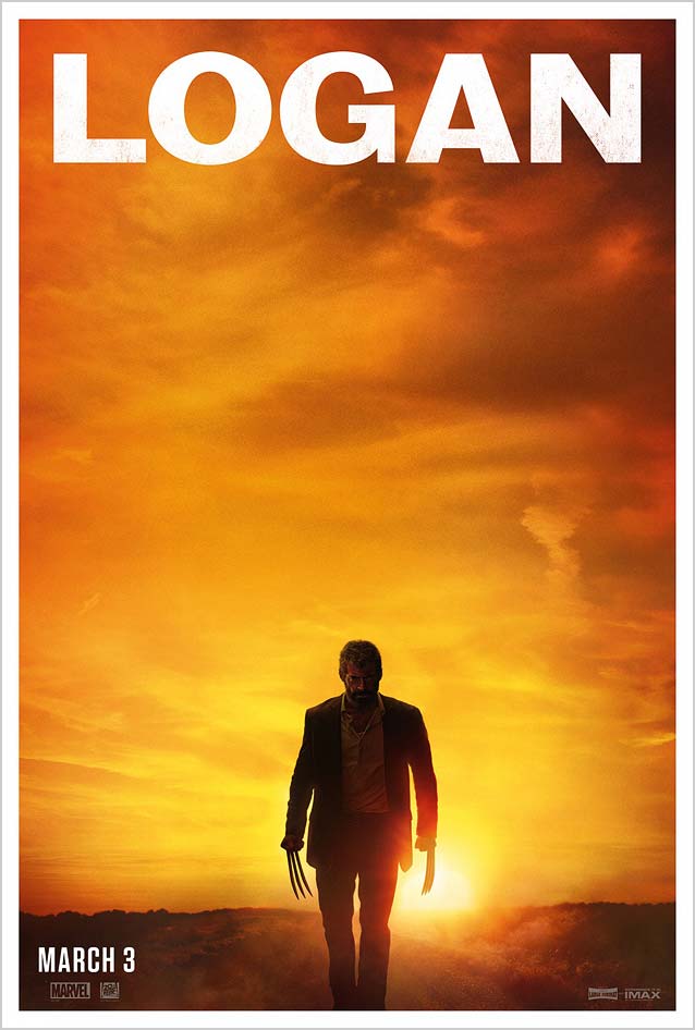
Gravillis’ surprisingly subdued theatrical one-sheet for Logan aptly illustrates how typography can communicate on a subconscious level. Action film posters usually sport forceful typefaces, mostly wide, square sans serifs like Agency FB. However, this is not your typical superhero movie. Set in the near future, there is a definite air of weariness, of finality, to this tale. The intensity of the bare image—Logan, claws unsheathed, walking away from the setting sun—isn’t the only element conveying this sense of closure. The use of Bureau Grot Wide Bold also lends the image a certain maturity and nostalgia rarely seen in superhero fare. Once again, intelligent typography demonstrates why Gravillis, Inc., is such a well-regarded agency.
And this is me walking into the sunset. Until next month, when I return with a fresh batch of noteworthy film posters.
Bald Condensed, né Yves Peters, is a Belgian-based rock drummer known for his astute observations on the impact of letterforms in the contemporary culture-sphere. A prolific writer on typography, he has a singular knack for identifying the most obscure typefaces known to man.