ScreenFonts: June 2017 | The Leftovers
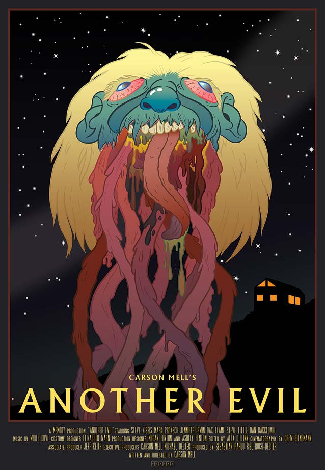
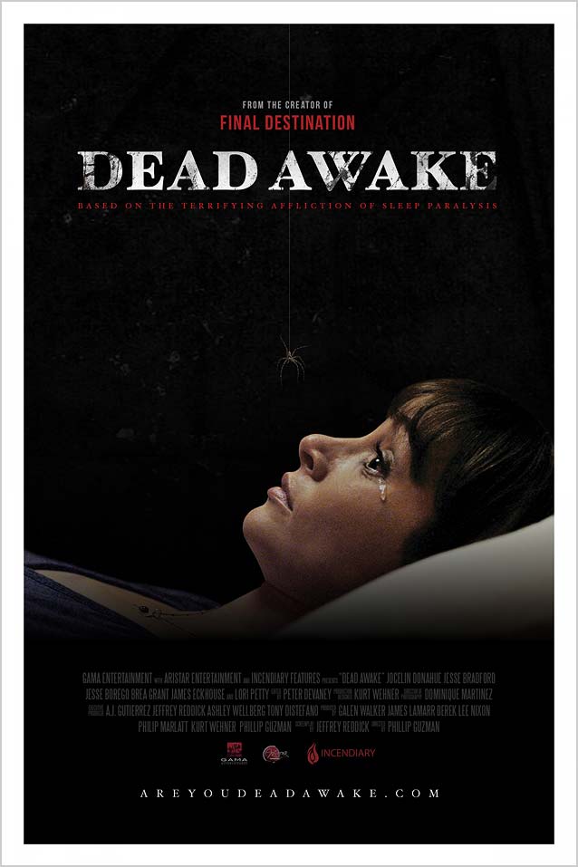
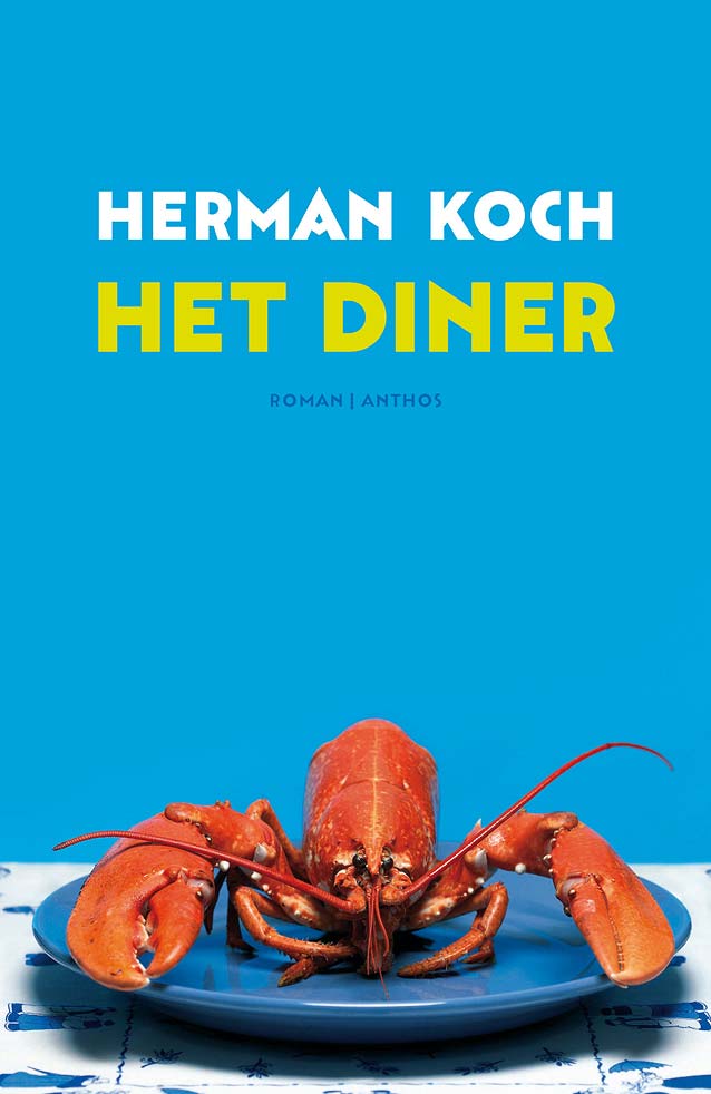
These posters didn’t make the cut, but are still noteworthy for their design and/or typography.
Before we dive into The Leftovers, allow me to share a brief follow-up to the latest episode of ScreenFonts. After it was published, I had an interesting exchange on Twitter with The Poster Boys. They confirmed my hunch that the web was the catalyst for the proliferation of expansive movie-poster campaigns. By devoting a small portion of a promotional budget to digital assets, it’s now possible to broadcast to a much larger audience than could formerly be reached via the side of a theater wall. Good or bad, this means more exposure for a film; that’s why there has been a surge in character posters and all kinds of alternate versions.
|
|
|
|
|
|
|
|