
ScreenFonts: July 2018
Now that I’m on my way to becoming a YouTube celebrity (not), I wonder if more people will tune in to read my movie-poster reviews for Solo: A Star Wars Story, The Cleanse, Jia nian hua (Angels Wear White), Geu-hu (The Day After), Measure of A Man, Goodland, First Reformed, In Darkness, and What Haunts Us. Only stats will tell.
I’m pretty excited about the release of the Vox video that Christophe Haubursin taped the morning of my talk at SXSW last March. Haubursin did a great job paring down an hour-long conversation and combining it with fragments of my presentation to create a snappy four-minute video. To any new readers who found this episode of my quasi-monthly ScreenFonts series via the Vox video: welcome! I hope you enjoy my typography-driven reviews. You can find links to previous episodes in the sidebar.
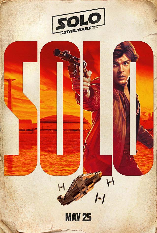
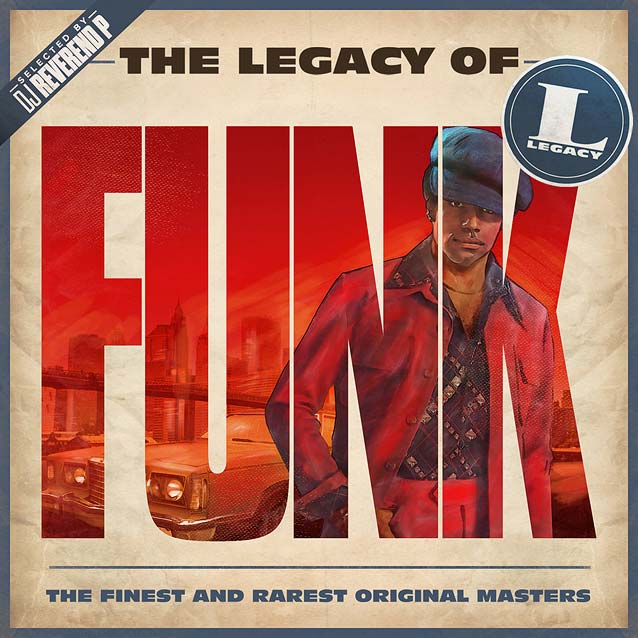
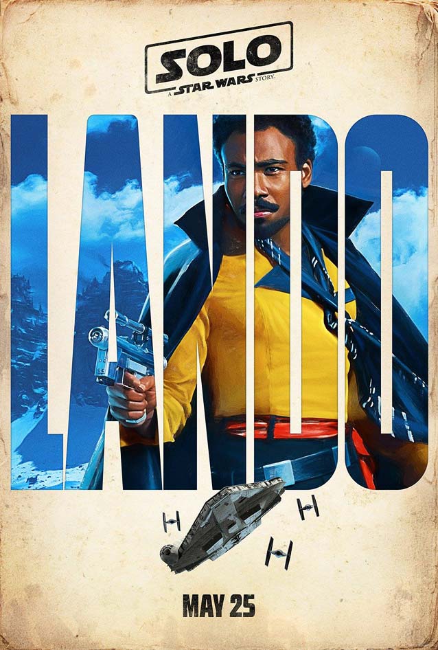
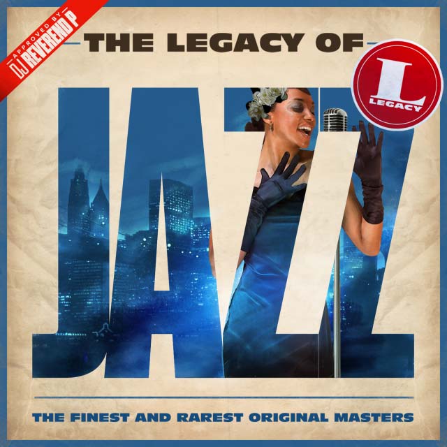
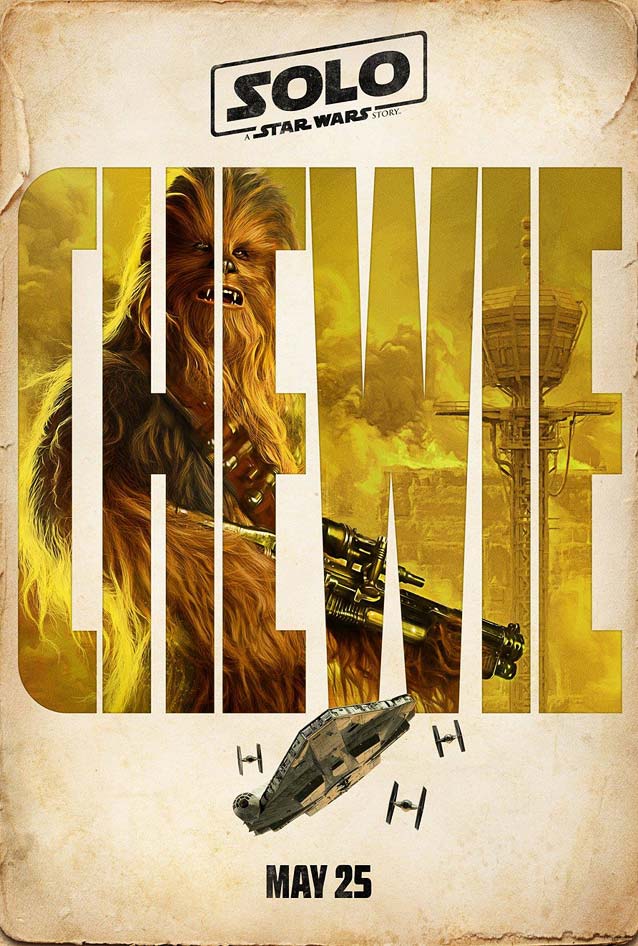
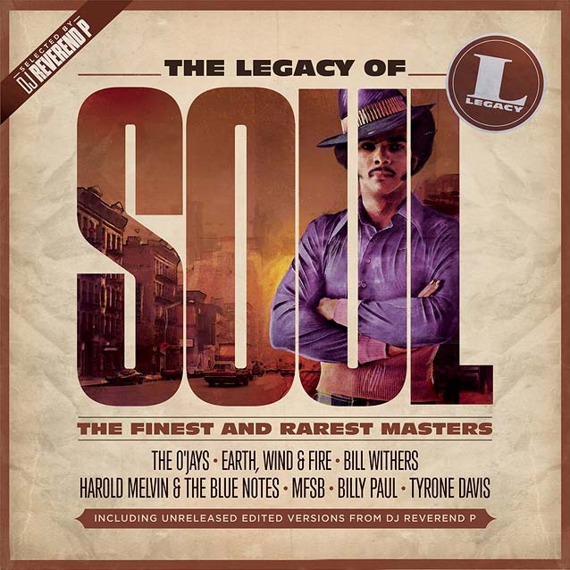
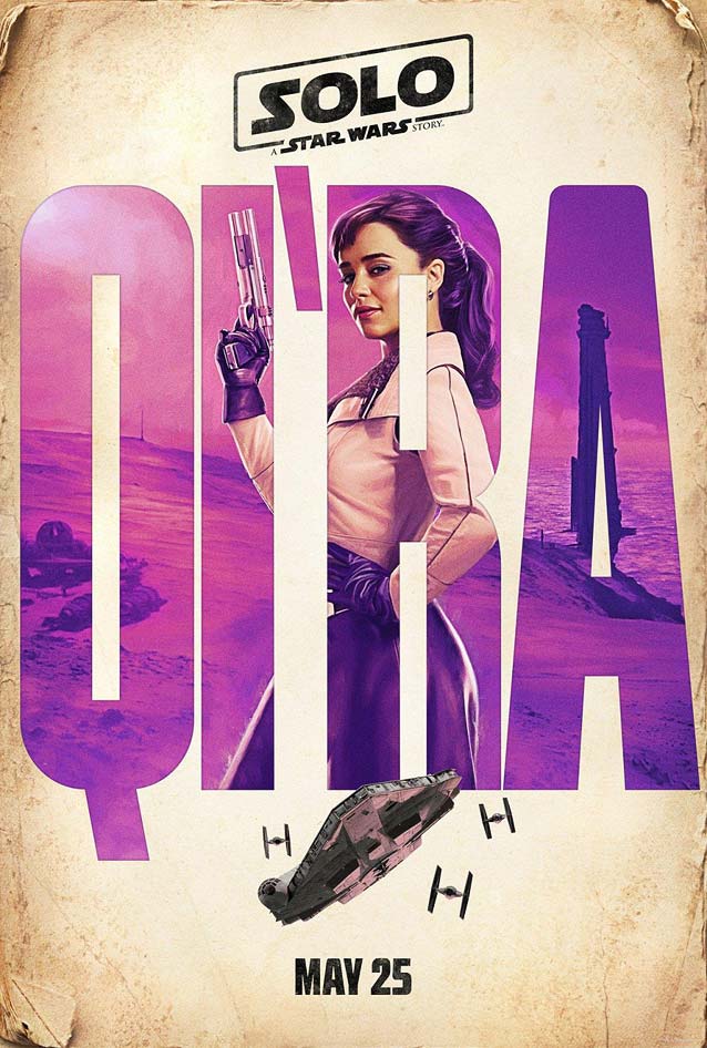
Anyone who has seen one of my movie-poster talks knows that I like to point out posters that seem to copy one another. This time, instead of the usual “this movie’s key art looks very much like that other movie’s key art,” the resemblance crosses media. Four character sheets for Solo: A Star Wars Story seem to copy a music compilation series.
Scribble all you want; I will continue blathering on and on about movie posters, one of my very favorite mediums to think about. Soon I will serve up The Leftovers, and after that, I’ll come back for the summer edition of this series.
Bald Condensed, né Yves Peters, is a Belgian-based rock drummer known for his astute observations on the impact of letterforms in the contemporary culture-sphere. A prolific writer on typography, he has a singular knack for identifying the most obscure typefaces known to humankind.
Solo: A Star Wars Story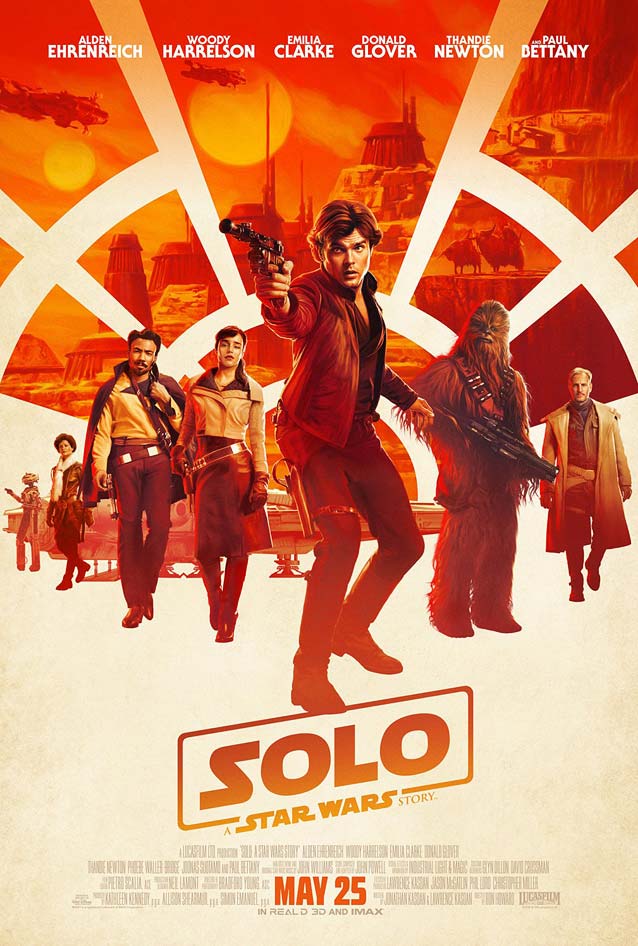
|
|
|
|
|
| Four character sheets from the promotional campaign rocked the internet when French graphic designer Hachim Bahous pointed out (in a since-deleted Facebook post) the obvious similarities with album art he created for a 2015 Sony Music Legacy series. Disney replied: “The posters were created by an outside vendor and it’s something we are currently looking into.” To the best of my knowledge, this has been Disney’s only public statement; I wonder if we’ll ever learn how the situation panned out. On a purely formal level, both series skillfully frame character shots within the letterforms of a compact sans serif. Bahous chose a display sans with closed apertures, set as tightly tracked capitals, to create as much surface as possible to house the images. This typographic style was popular in the late seventies and early eighties when the songs included in the compilations were released. The rounder Titling Gothic Skyline and more angular Armada Black Compressed, which offer a maximum amount of “blackness,” would make perfect alternatives here. The character posters for Solo use a straight-sided design with open apertures, similar to Tasse. |
The Cleanse
|
|
Jia nian hua (Angels Wear White)
|
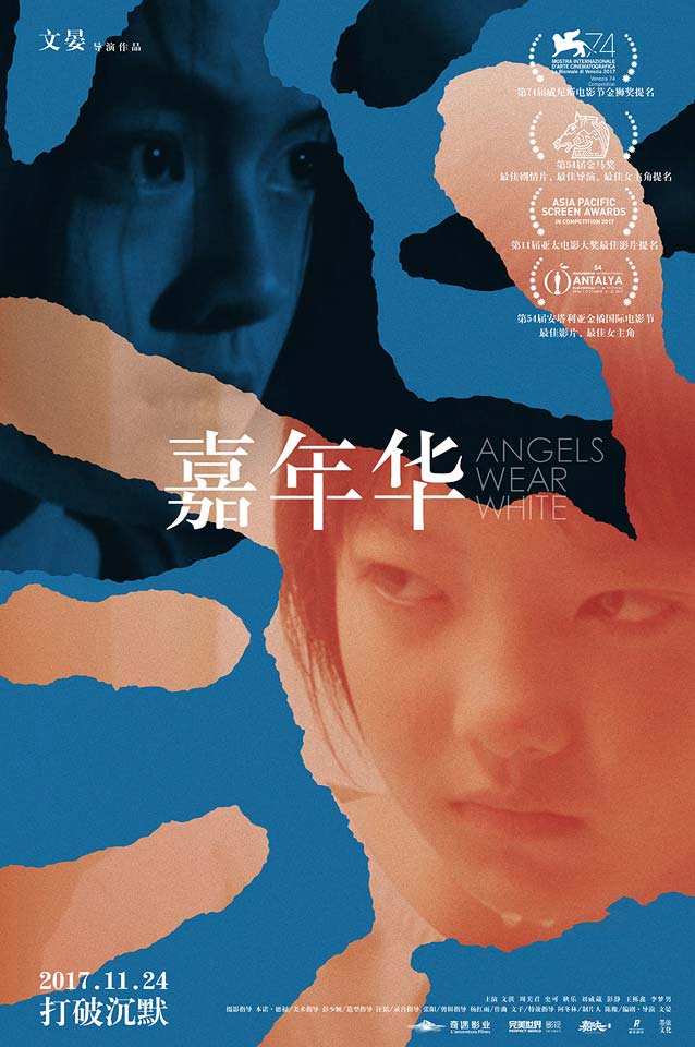
|
Geu-hu (The Day After)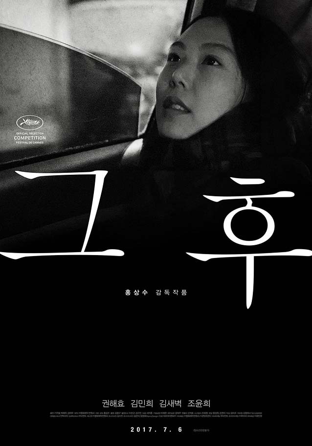
|
|
|
Measure of a Man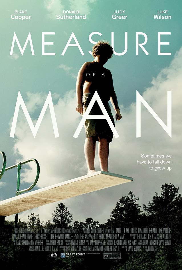
|
Goodland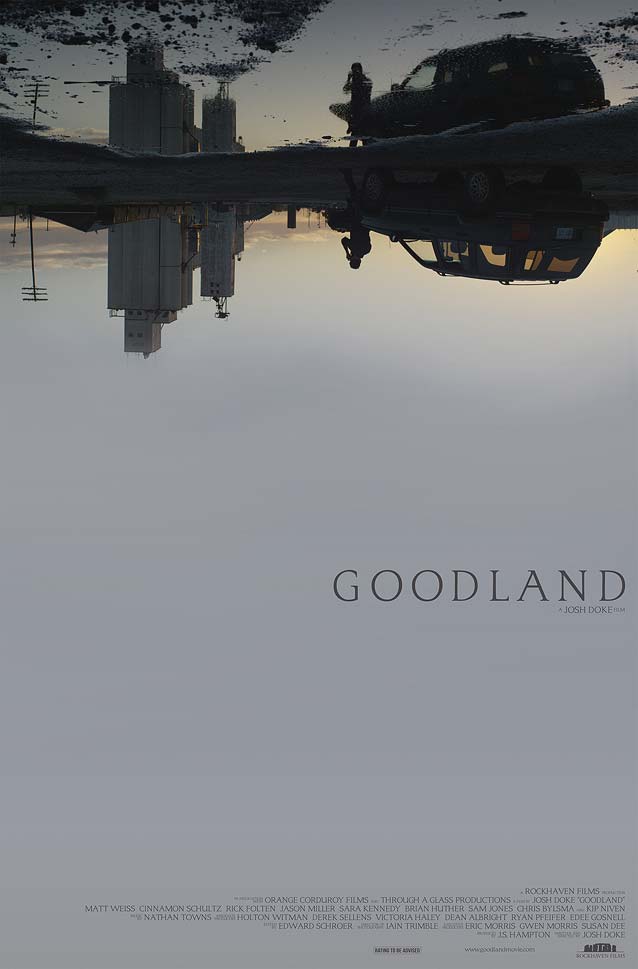
|
First Reformed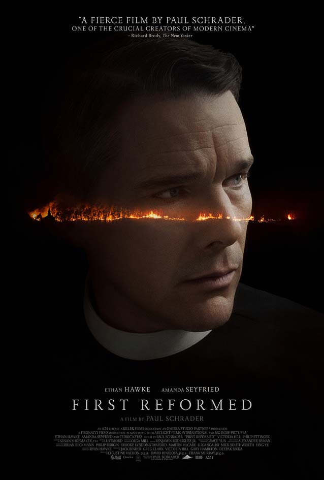
|
In Darkness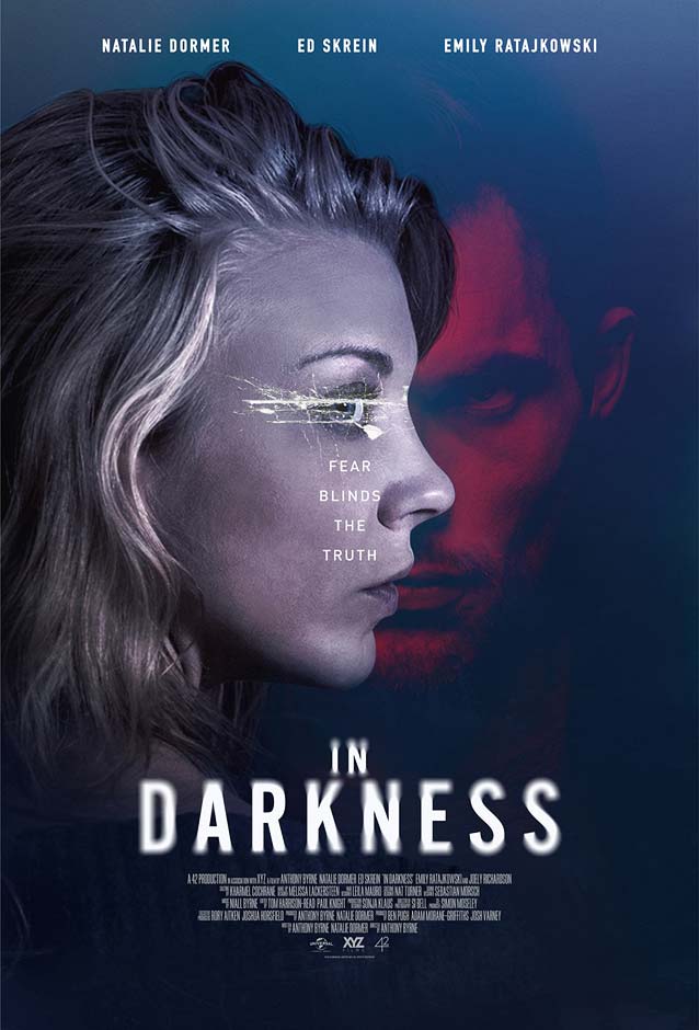
|
What Haunts Us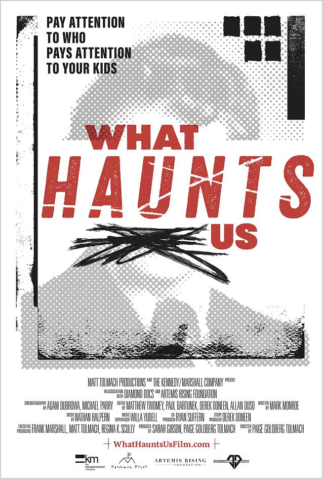
|