ScreenFonts: January 2019
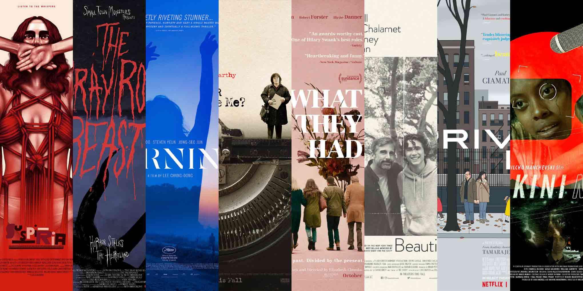
A lot of struggle surfaces in the posters for this episode. This time around, I look at art for Suspiria, The Bray Road Beast, Beoning (Burning), Can You Ever Forgive Me?, What They Had, Beautiful Boy, Private Life, and Bikini Moon.
Serendipity bookends this edition of ScreenFonts: I stumbled upon an unexpectedly charming one-sheet for an obscure crypotozoological documentary (of all things) and, just before closing off my selection, I discovered a poster by one of my favorite comic-book artists.
It’s ironic that, after writing about all of these movies where people experience difficulties, I find myself struggling to come up with a witty endnote. Or maybe I just did! Anyway, come back for The Leftovers in a couple of days.
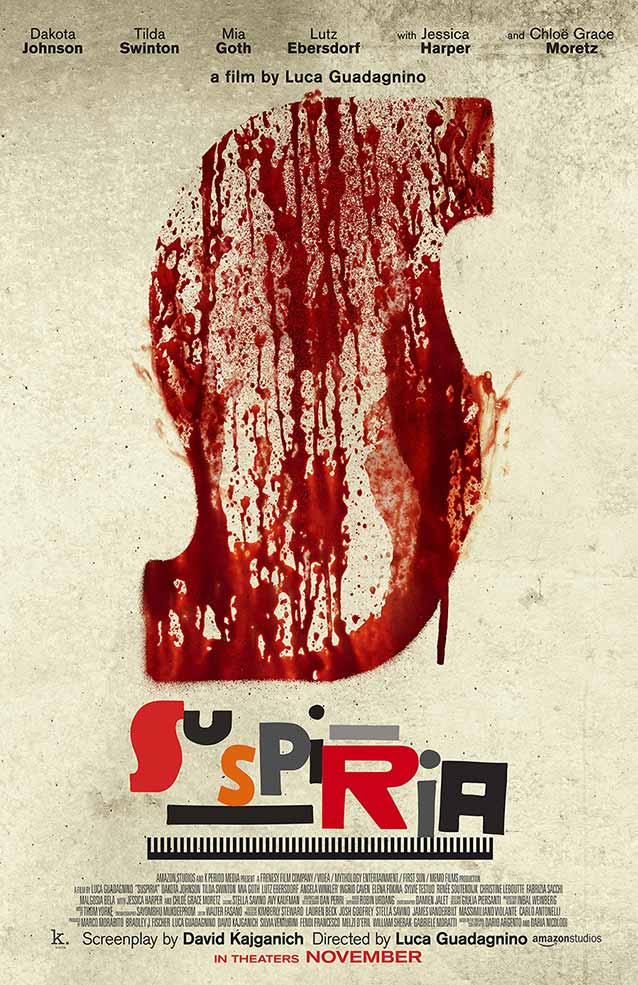
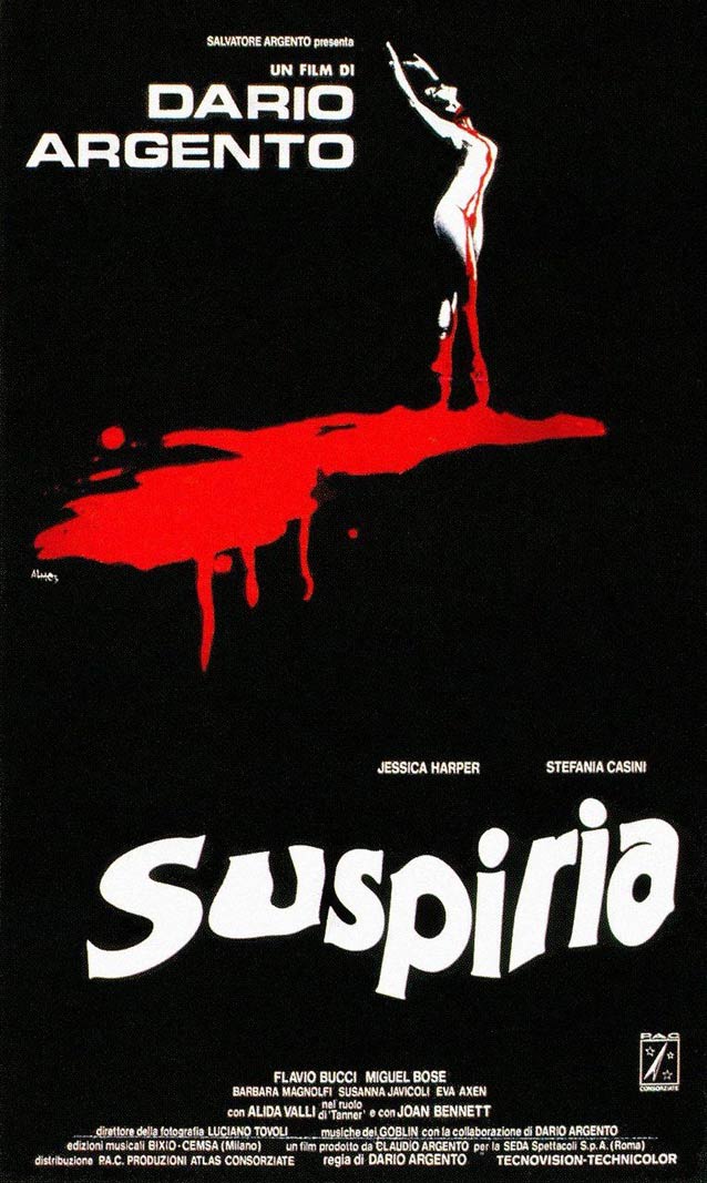
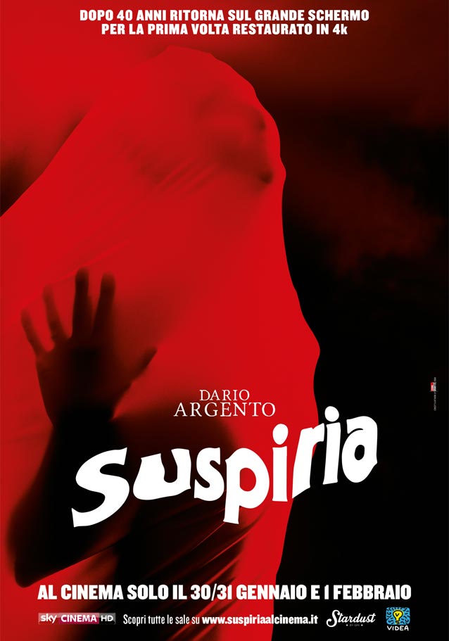
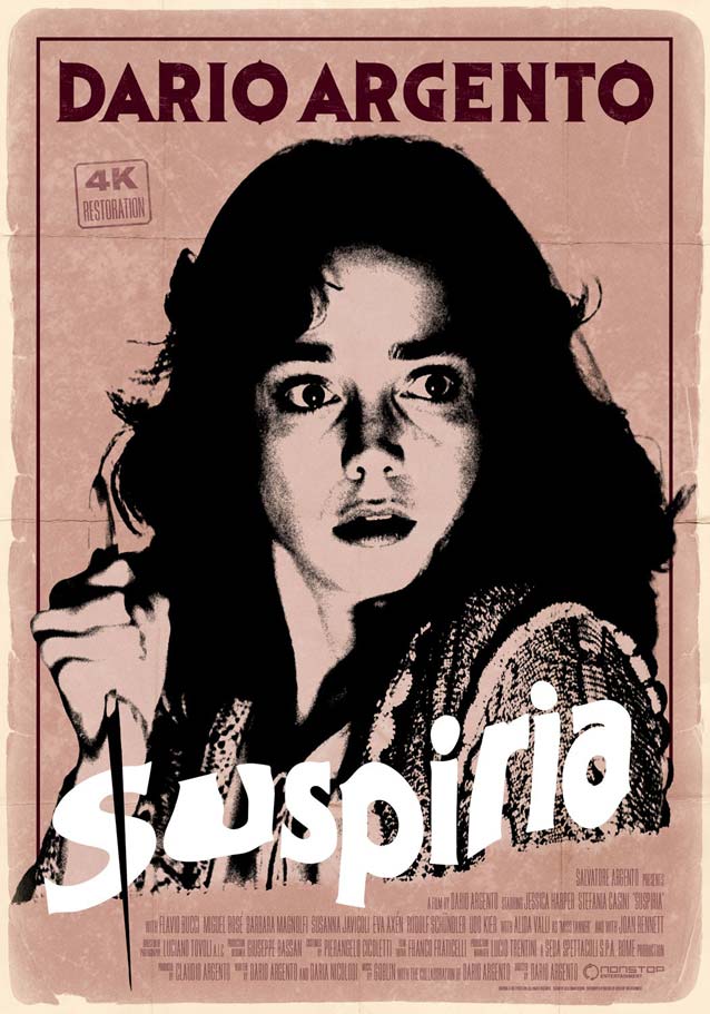
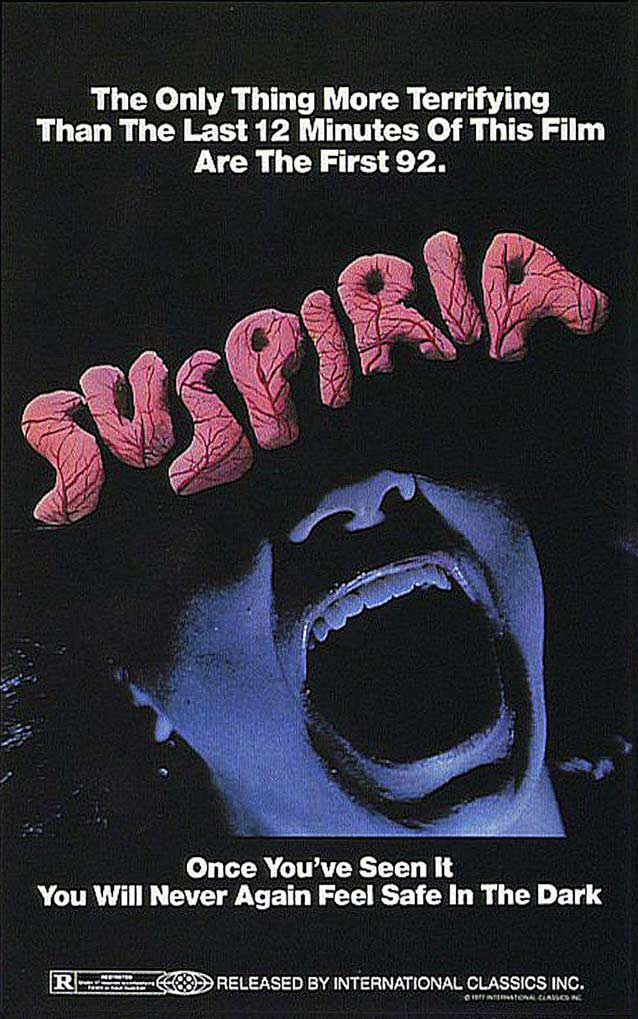
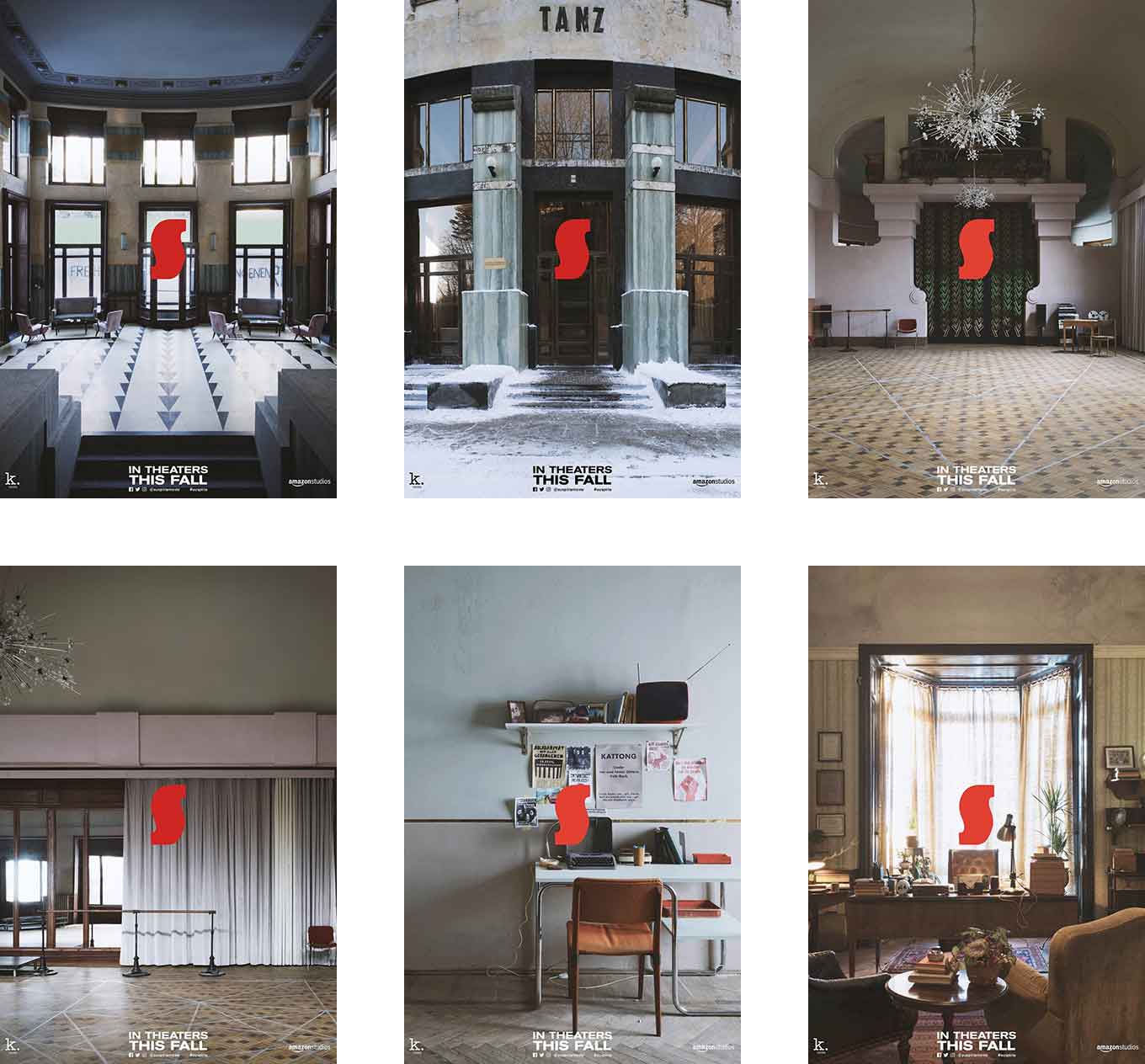
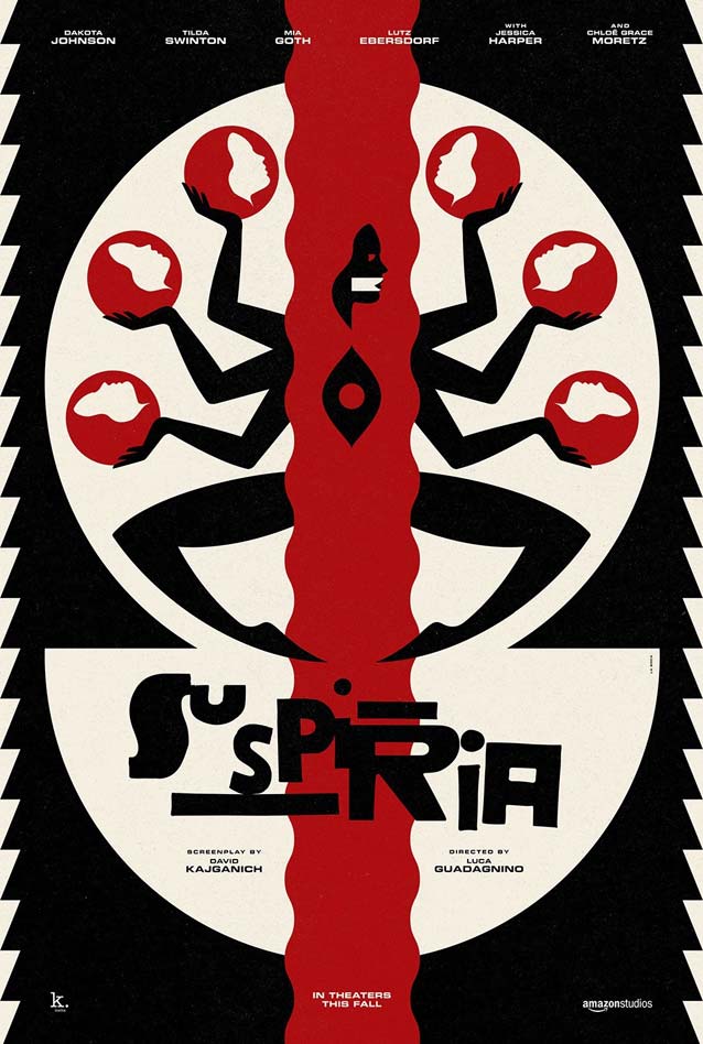
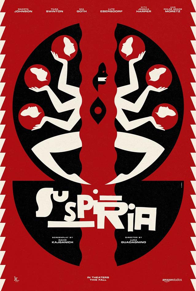
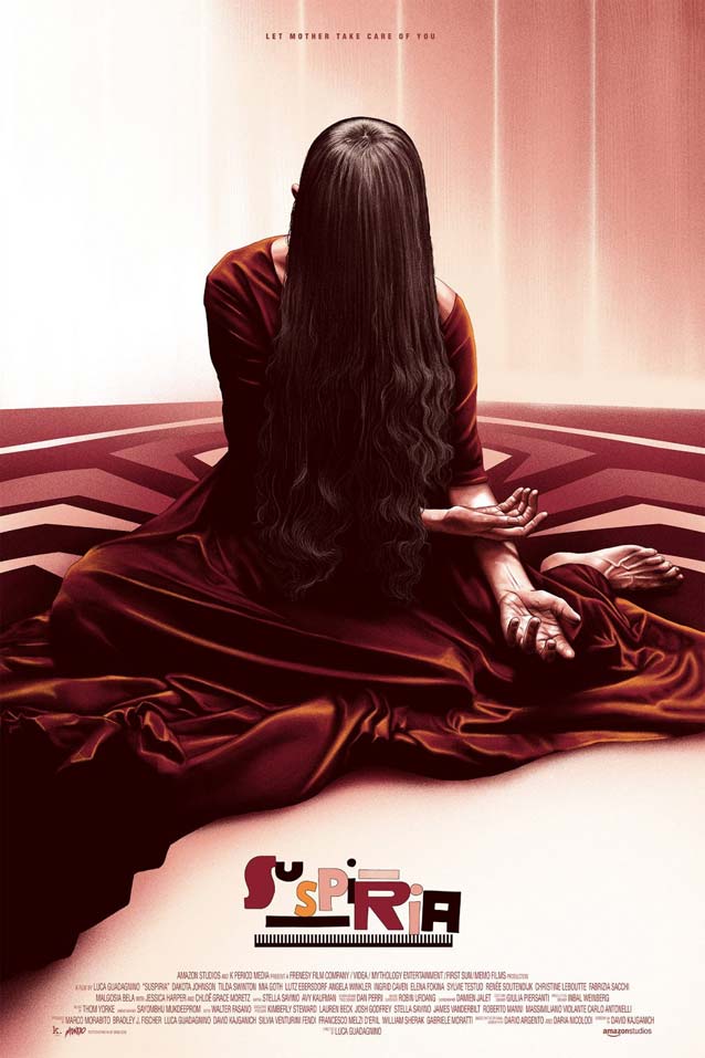
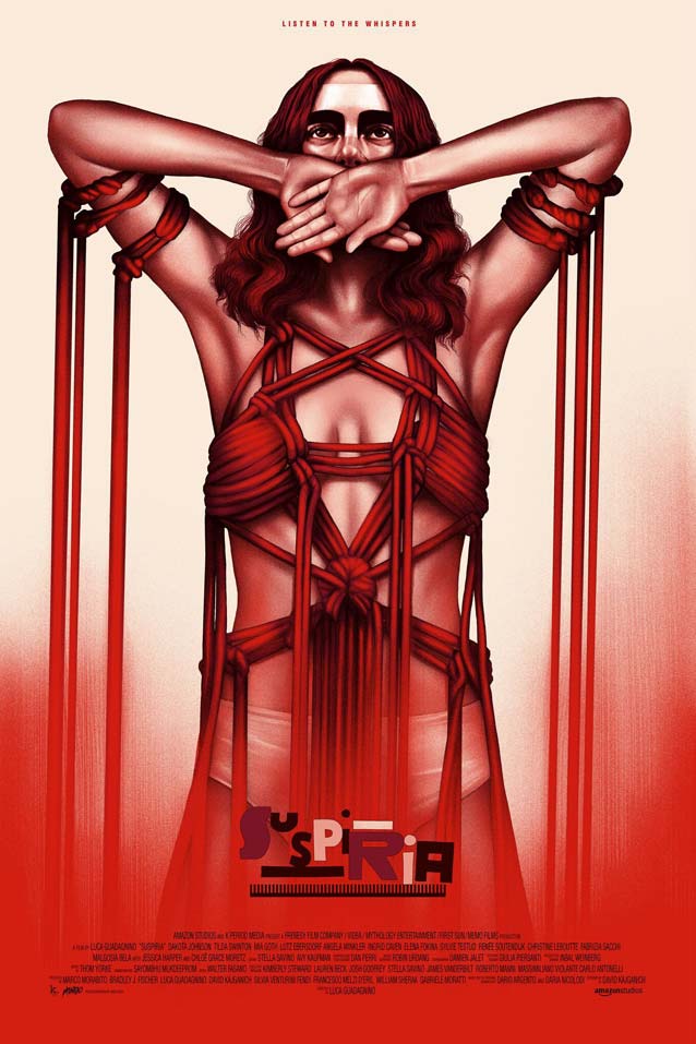
Suspiria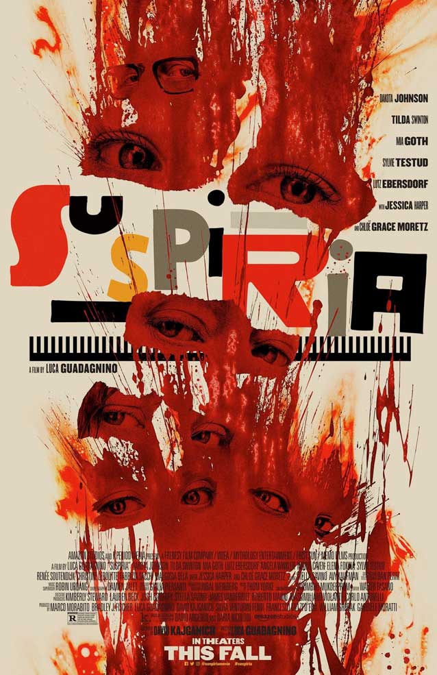
|
|
|
|
|
|
|
The Bray Road Beast
|
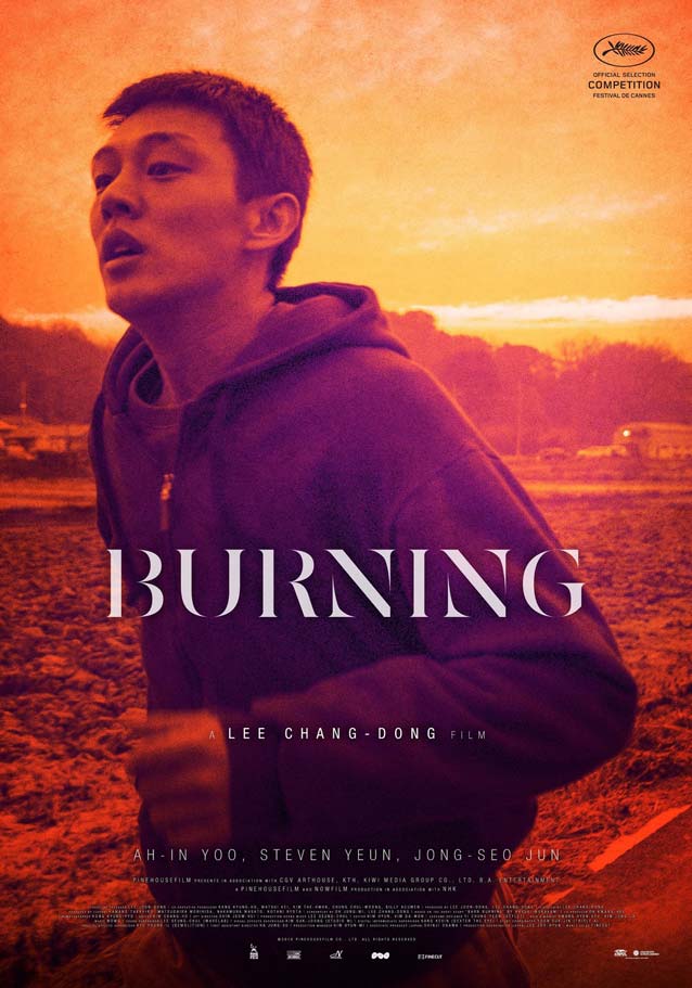
Beoning (Burning)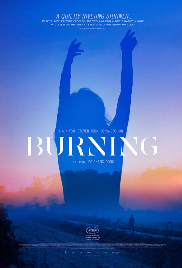
|
|
Can You Ever Forgive Me?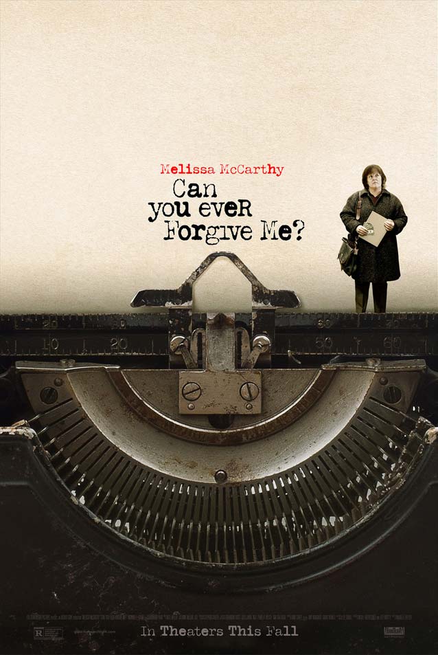
|
What They Had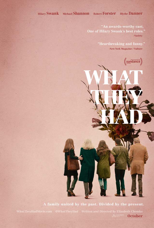
|
Beautiful Boy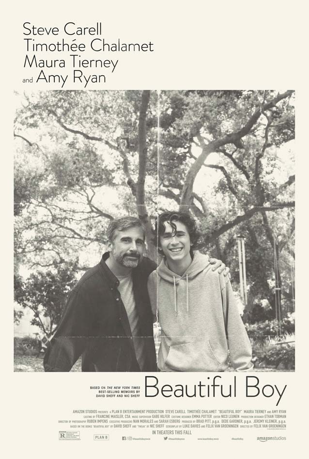
|
Private Life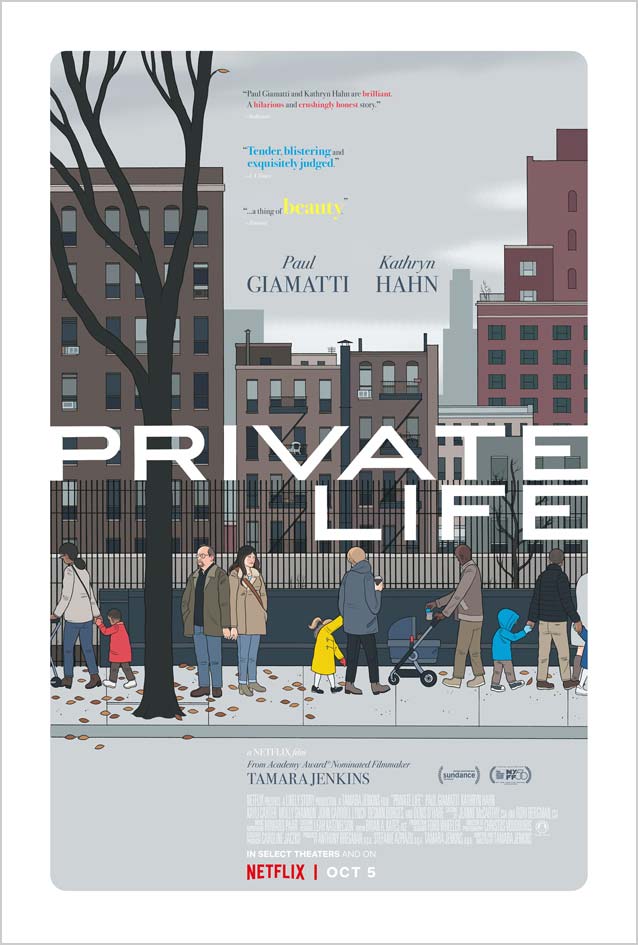
|
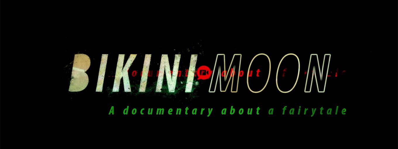
Bikini Moon
|


|
| In our email conversation, Manchevski mentioned that McKean designed the posters, opening credits, and titles for all of his films after the first one, Before The Rain. Dust is a great example of McKean’s early style: a muted brown-and-gold color palette, subtle layering of people and symbolic objects, and glowing, scintillating type set in an adventurous typeface—Jeremy Tankard’s Disturbance. Shadows suffers a bit from the pitfalls of late-2000s post-grunge, with overdone layering and texturing, resulting in a less cohesive look. |


|
- Dan Perri: A Career Retrospective on Art of The Title