ScreenFonts: January 2018
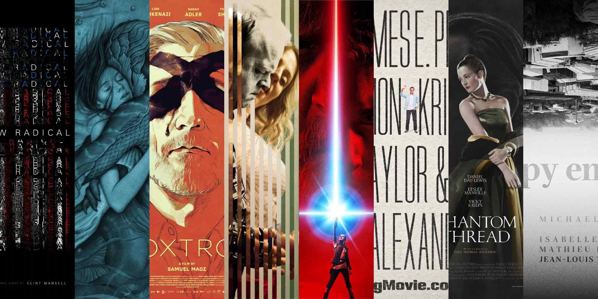
Defying legibility conventions. Shattering images. Subverting any sense of scale. Turning the world upside down. This episode looks at posters for The New Radical, The Shape of Water, Foxtrot, Kaleidoscope, Star Wars: The Last Jedi, Downsizing, The Phantom Thread, and Happy End.
The creators of many of this episode’s posters played with convention, deliberately breaking the rules in order to magnify the impact of their artwork. I wanted to take a closer look and explore why these surprising interventions had been made. I found that, far from being mere artifice, they were conceptually sound and added something significant to the visual narrative.
And this is my happy end. The year is off to a pretty good start—our world hasn’t been flipped completely upside down yet. Come back later for The Leftovers, and then meet me next month for a new edition of ScreenFonts.
Bald Condensed, né Yves Peters, is a Belgian-based rock drummer known for his astute observations on the impact of letterforms in the contemporary culture-sphere. A prolific writer on typography, he has a singular knack for identifying the most obscure typefaces known to humankind.
The New Radical
|
The Shape of Water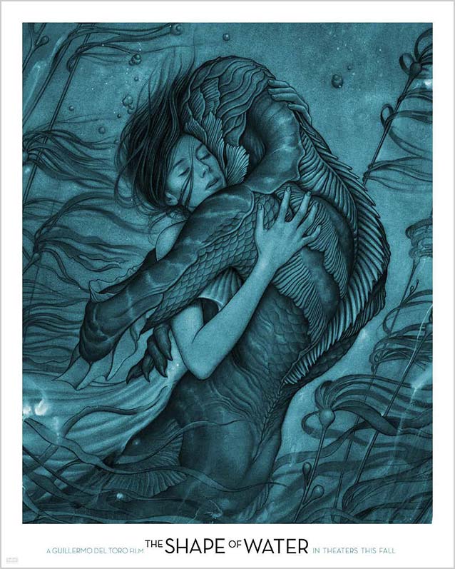
|
Foxtrot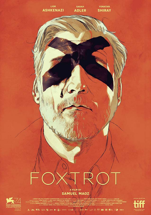
|
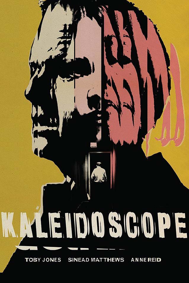
Kaleidoscope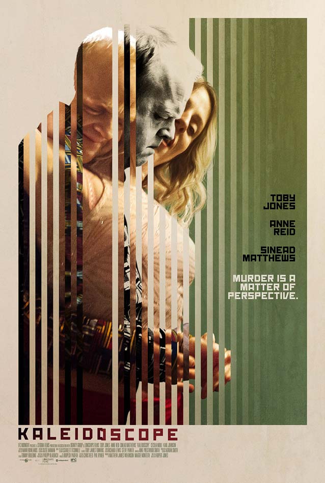
|
|
Star Wars: The Last Jedi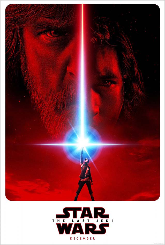
|
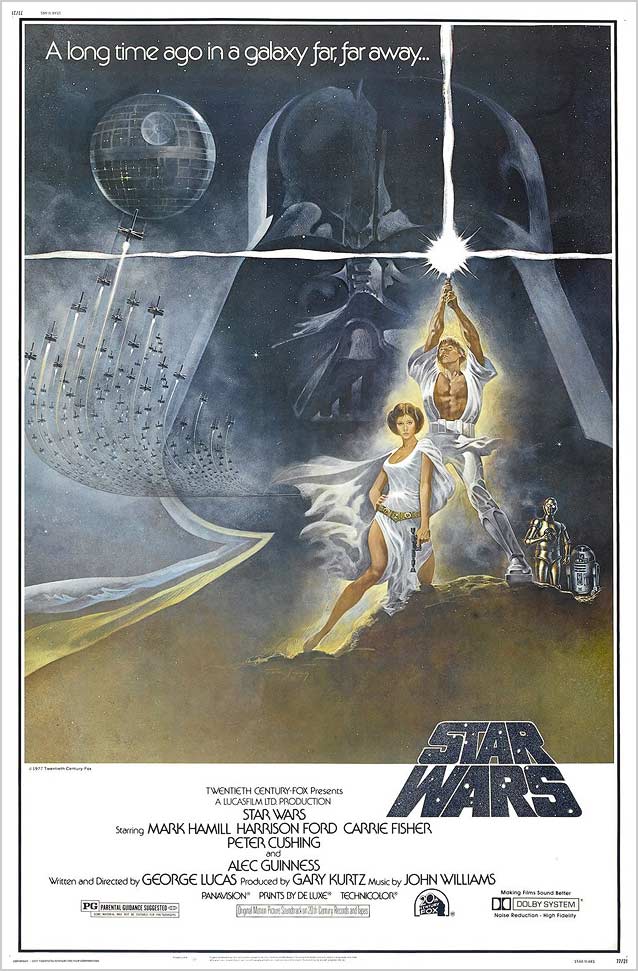
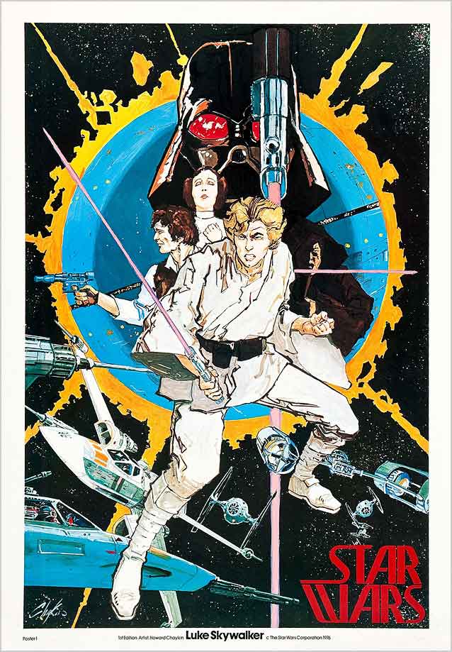
| As becomes blockbusters these days, Episode VIII – The Last Jedi, the latest installment in the Star Wars franchise, is promoted with a galaxy-spanning marketing campaign boasting a flotilla of printed and digital collateral. Two posters caught my eye. The first is LA’s teaser. Rey, the film’s female protagonist, channels Luke Skywalker’s iconic pose, light saber held high, from Tom Jung’s seminal one-sheet for the original Star Wars, which was retroactively subtitled Episode IV: A New Hope. (I don’t care for that revisionist nonsense, by the way. Seriously. It’s just Star Wars. The first epsiode.) Besides sporting the original logo—initially only used in the teaser, not in the theatrical one-sheets—the artwork also reprises ITC Serif Gothic to anchor the new films to the first trilogy, not the Trajan-clad ill-fated second trilogy from the 2000s. |
|
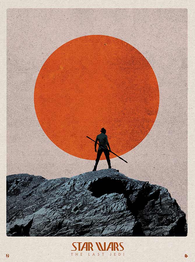
| The contemplative print Matt Needle created for the Poster Posse goes even further back in time. Rey’s serene pose, staff in hand and back turned to the audience, conjures up both martial-arts cinema and Westerns, two genres that had a major influence on the original Star Wars films from the 1970s. Because Needle wanted to create something with a distinct retro feel, he used the prerelease version of the Star Wars logo. The peculiar letterforms can also be seen in the forty-year-old artwork by Howard Chaykin, who illustrated the first ten issues of the Star Wars comics series published by Marvel in 1977. |
Downsizing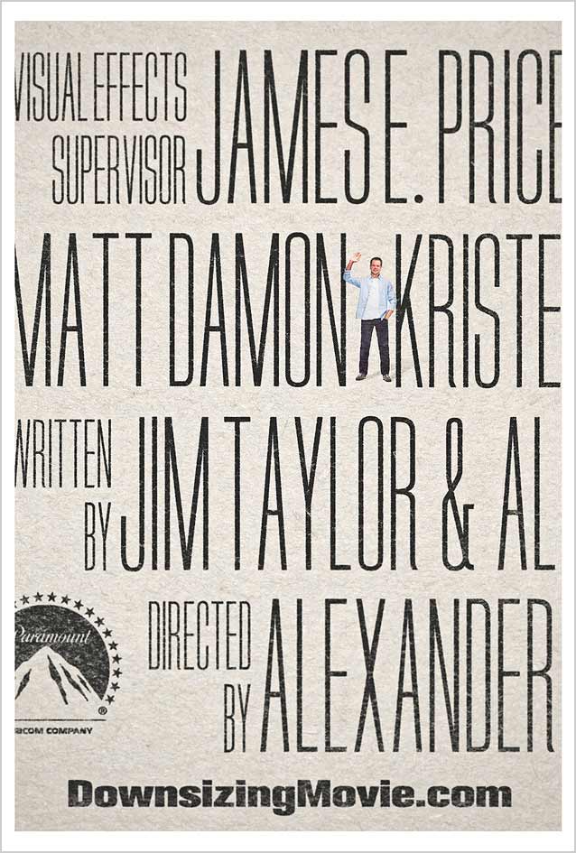
|
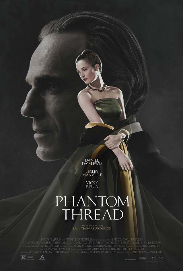
Phantom Thread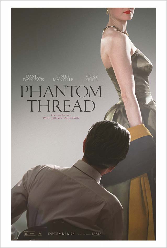
|
| Set in 1950s London, the romantic drama Phantom Thread tells the story of Reynolds Woodcock, a renowned dressmaker whose fastidious life is disrupted by the young, strong-willed Alma, who becomes his lover and muse. Eclipse’s teaser and main theatrical one-sheet gorgeously evoke the spirit and aesthetic of mid-century fashion magazines. A lovely desaturated palette evokes the colorized black-and-white fashion photographs of yesteryear, and exudes a restrained sensuality. Consistent with the vintage look, the chiseled capitals with refined serifs appear hand lettered. Similar architectural qualities can be found in Grand Central. Both Throhand and Phaistos convey period pen lettering, while Matthew Carter’s revivals Big Caslon and Big Moore carry a similar vintage air. And for a sharp look, you can’t go wrong with Lukas Schneider’s sparkling, pointed Damien Display. |
Happy End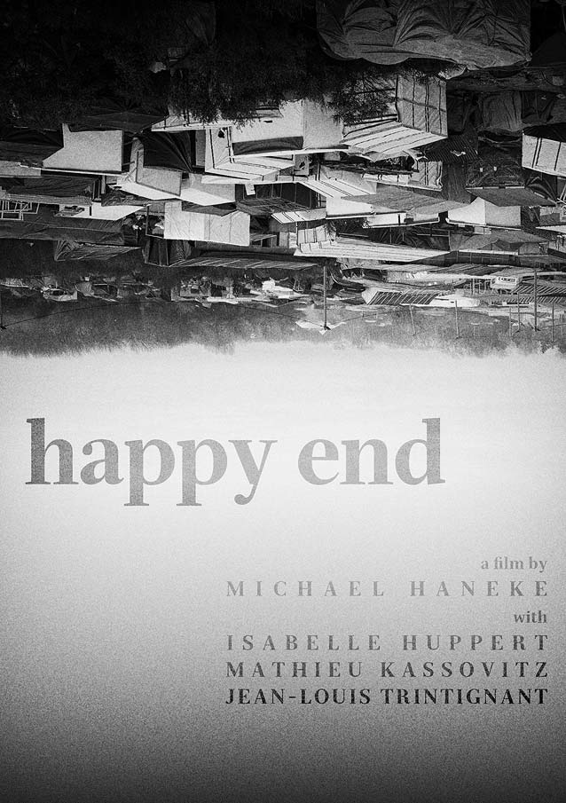
|