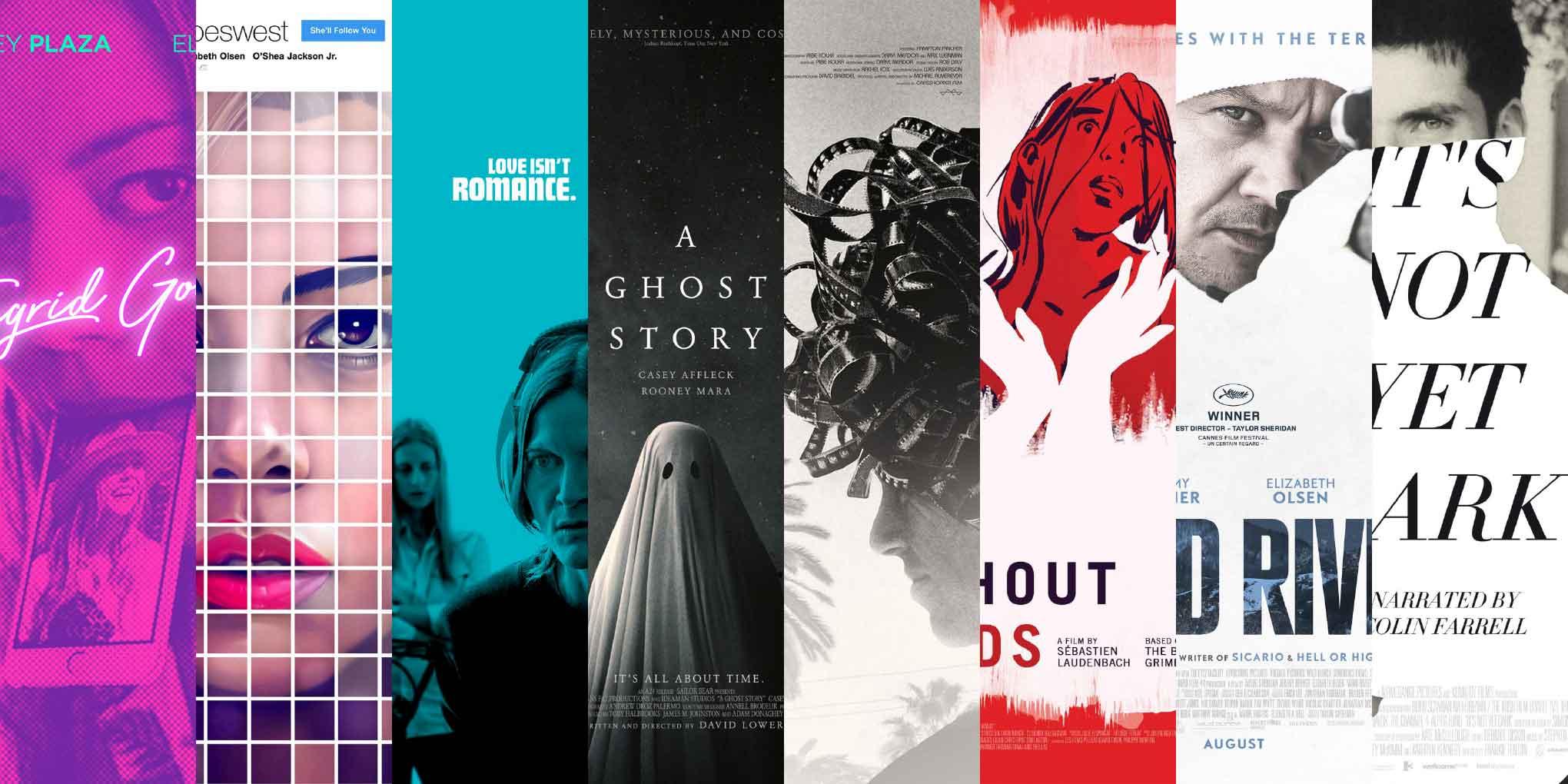
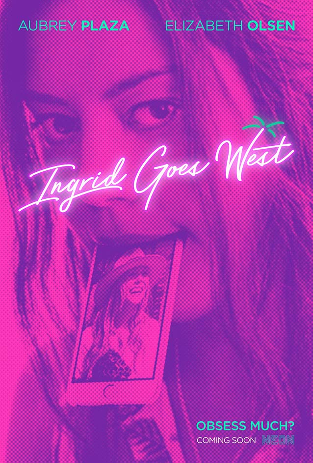
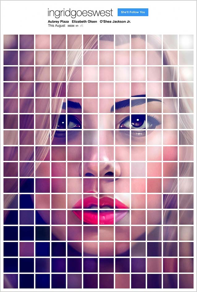
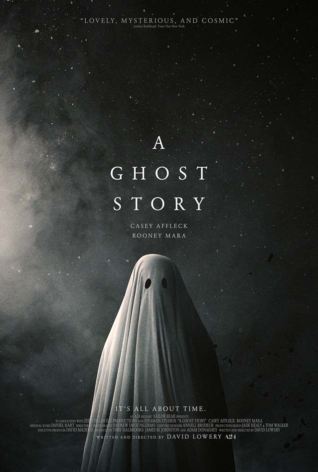
A movie-poster cliché rears its creepy head, and—maybe—a new one lashes out. This ghoulish Halloween episode peeks at posters for Blind, Ingrid Goes West, Women Who Kill, A Ghost Story, Escapes, La jeune fille sans mains (The Girl Without Hands), Wind River, and It’s Not Yet Dark.
By Bald Condensed
Formulas
About seven years ago, I was researching my first movie-poster talk. I came upon French film distributor Christophe Courtois, who, in the spring of 2010, had started compiling examples of movie-poster clichés. His series became a viral hit after being mentioned in a number of popular blogs. Courtois and I ended up exchanging ideas and discussing observations over email.
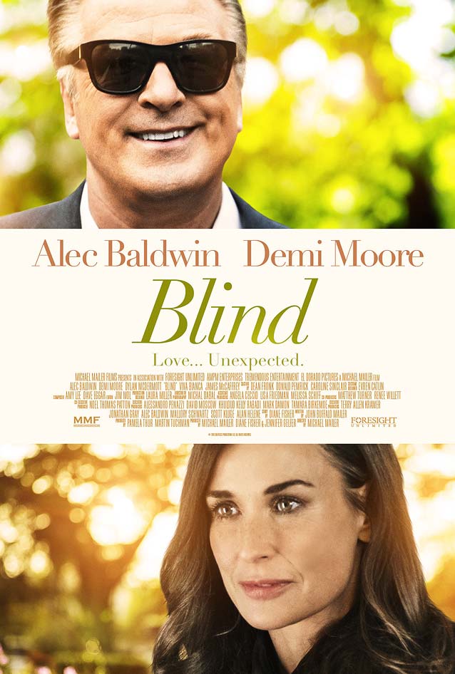
Blind
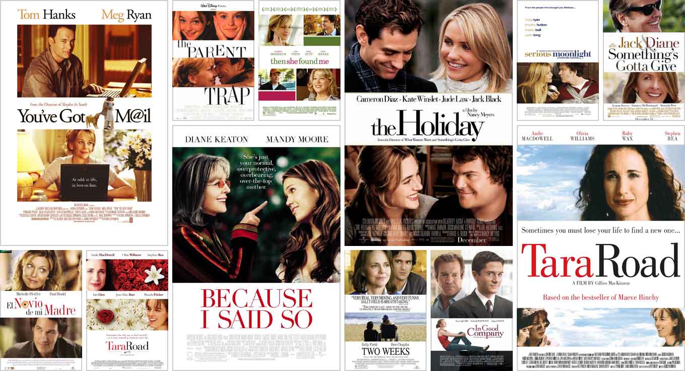
I told Courtois that, although I admired his thoroughness, I had discovered a gap in his collection: what I’ve come to think of as the horizontal-band style. Posters using this strategy alternate landscape images of the main protagonists with white horizontal bands. The typography is delicate and refined: mostly high-contrast Didones, with the occasional insipid sans serif thrown in for good measure.
Examples of the horizontal-band style.
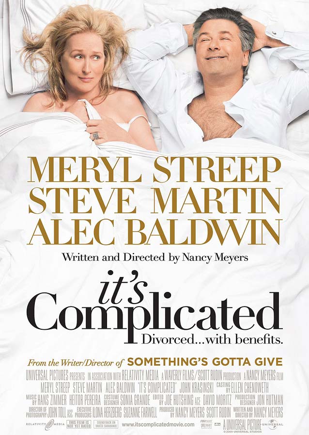
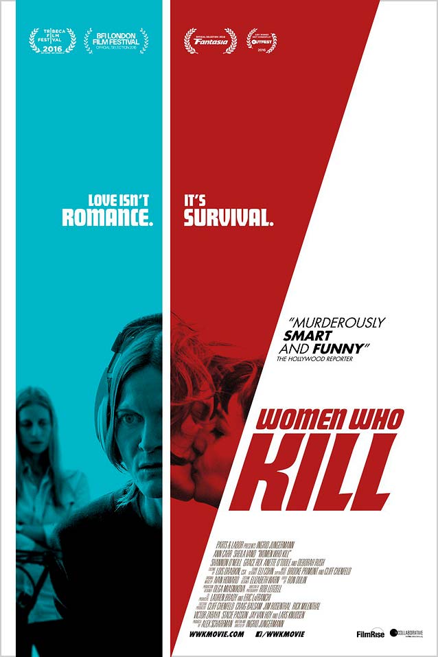
These posters are the signature style for romantic comedies like Blind. Stockholm Design dutifully sticks to the formula with tastefully tinted Linotype Didot. Comparable high contrast can be found in the largest optical sizes of families like Font Bureau’s Benton Modern and Escrow, GarageFonts’ Freight Big, and Carter & Cone’s Miller and Stilson. Slightly disconcerting, however, is the total lack of contrast in Alec Baldwin’s facial expression between this poster and the one for It’s Complicated. Managing to freeze that exact same smirk on his face for eight years is a feat both impressive and eerie. Baldwin clearly deserves his Emmys, but this is very scary.
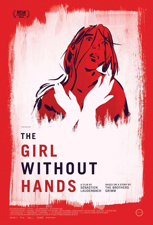
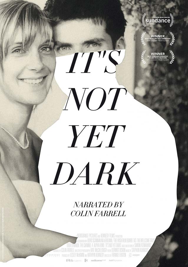
Greek designer Vasilis Marmatakis’ character sheets for The Lobster are undoubtedly among the best posters from the past year. When I reviewed them last summer, I described them as “some of the most appropriate, most sensitive and most touching posters I have seen in a while. . . . The images of the principal actors hugging the void exude an immense sadness, making their emotional isolation and helplessness almost palpable.” The movie’s magical realism is masterfully evoked by erasing one of the characters in each design and leaving a white hole—a splendid use of negative space. To my surprise, I found no less than three one-sheets for this episode that employ similar tactics to great effect.
La jeune fille sans mains (The Girl without Hands)
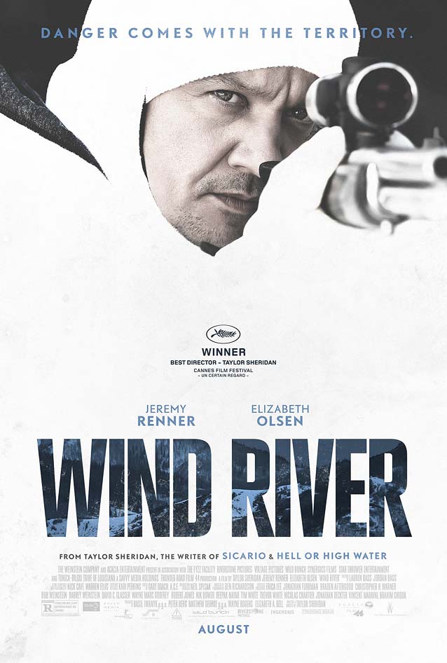
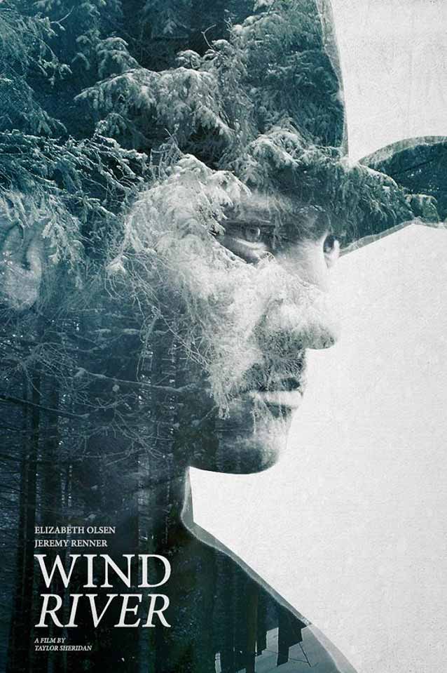
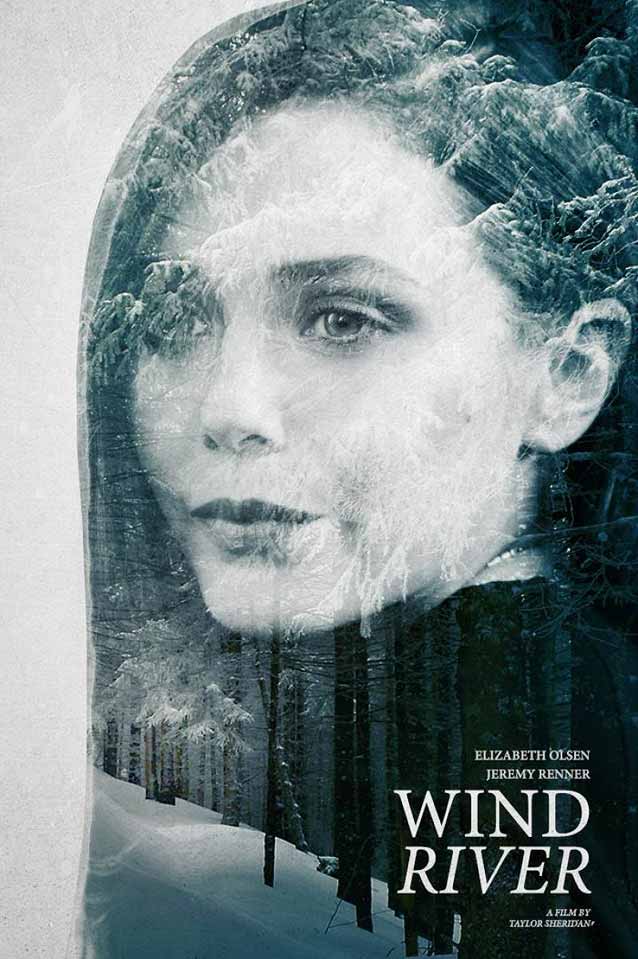
The two Wind River character sheets merge portraits of Renner and Elizabeth Olsen with shots of the snow-covered forest in the same blue hues. The result is beautiful, although Minion is a little disappointing as the titling face.
Just before publication, I was saddened to learn that Simon Fitzmaurice had passed away. On this emotional endnote, I think I’ll reside a little in the cold, negative space between now and the next ScreenFonts.
Bald Condensed, né Yves Peters, is a Belgian-based rock drummer known for his astute observations on the impact of letterforms in the contemporary culture-sphere. A prolific writer on typography, he has a singular knack for identifying the most obscure typefaces known to humankind.