ScreenFonts: February 2019
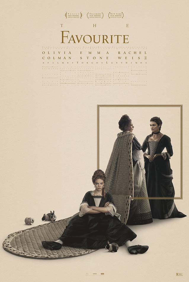
Questionable typesetting can still be beautiful, as the posters for Asher, Bitter Melon, Chef Flynn, Pimp, If Beale Street Could Talk, The Favourite, The Mule, and The Front Runner attest. This episode takes a look at some perfect imperfection.
Something fun happened while I was preparing this installment of ScreenFonts. A conversation with H.P. Mendoza, which started on Facebook Messenger and continued via email, made me decide to shift his movie poster from my Leftovers pile to ScreenFonts proper. When poster designers offer additional background information, it not only gives us insight into their process and makes the work more relatable, but also increases our appreciation of their key art.
Assuming I don’t drive off a cliff myself, I’ll be back next month for another installment of movie-poster goodness. And don’t forget to check out The Leftovers in a day or two!
Bald Condensed, né Yves Peters, is a Belgian-based rock drummer known for his astute observations on the impact of letterforms in the contemporary culture-sphere. A prolific writer on typography, he has a singular knack for identifying the most obscure typefaces known to humankind.
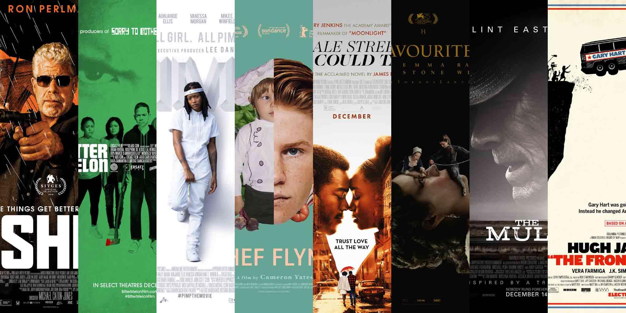
Asher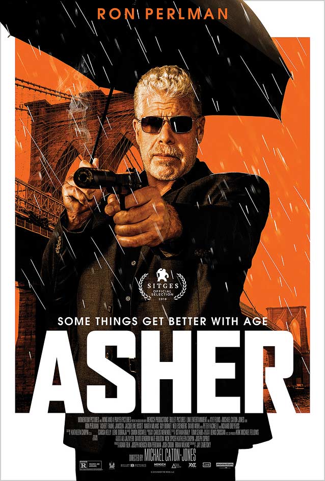
|
Bitter Melon
|

|

|
Chef Flynn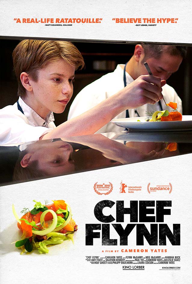
|
|
Pimp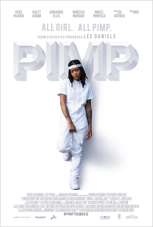
|
If Beale Street Could Talk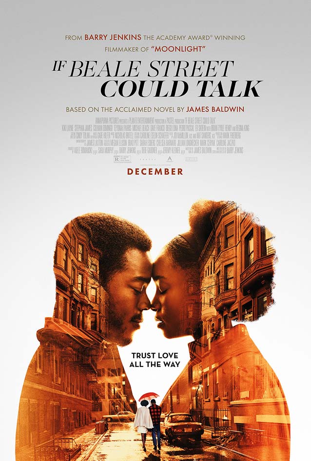
|
The Favourite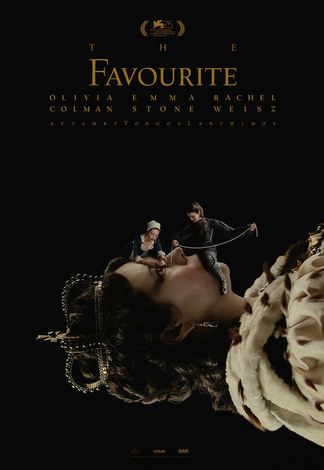
|
|
The Mule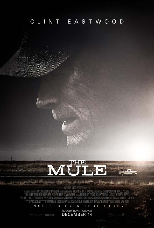
|
The Front Runner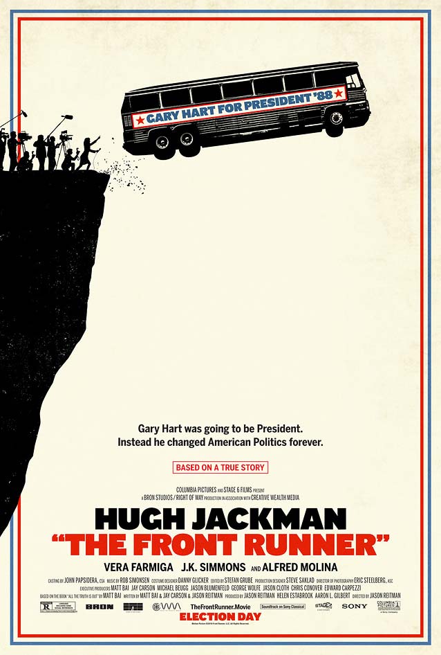
|