ScreenFonts: February 2018
Murder and mayhem, and some interpersonal tension: this episode looks at posters for The Strange Ones, Proud Mary, The Commuter, Small Town Crime, Inside, Dim the Fluorescents, The Neighbor, and A Ciambra.
This episode of ScreenFonts turned out to be rather violent, with references to guns, flights and chases, conflict, manslaughter, stalking, and other assorted unpleasanteries. January also happened to be a rather lean month on the film-poster front. Be sure to lick your plate, because there will be no Leftovers this time.
I hope you’ve had your fill this month—I wouldn’t want your hunger for leftovers to make you hallucinate colored flecks of light. Sorry, there’s simply nothing left to snack on until the next episode’s main course. ChowCiao for now!
Bald Condensed, né Yves Peters, is a Belgian-based rock drummer known for his astute observations on the impact of letterforms in the contemporary culture-sphere. A prolific writer on typography, he has a singular knack for identifying the most obscure typefaces known to humankind.
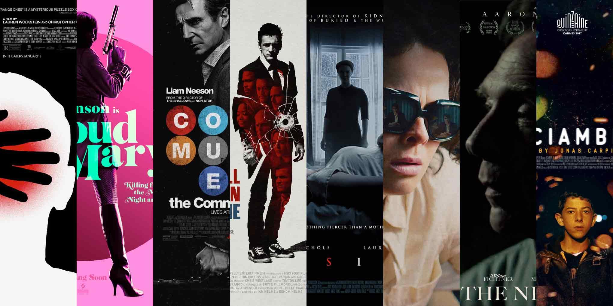
The Strange Ones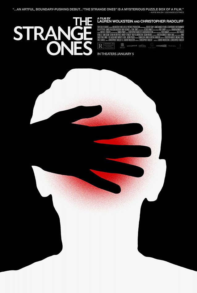
|
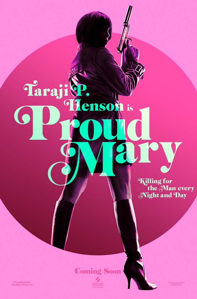
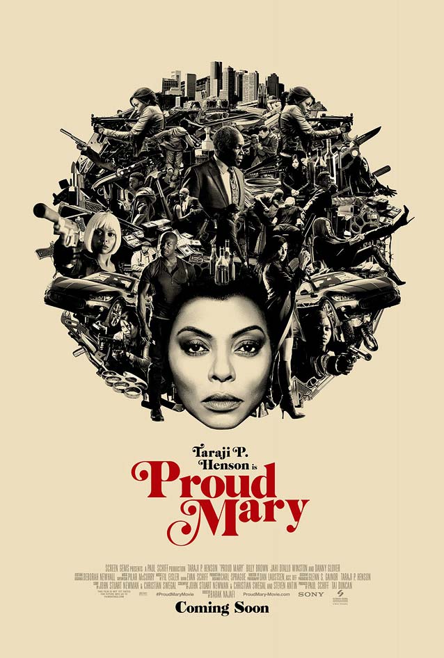
Proud Mary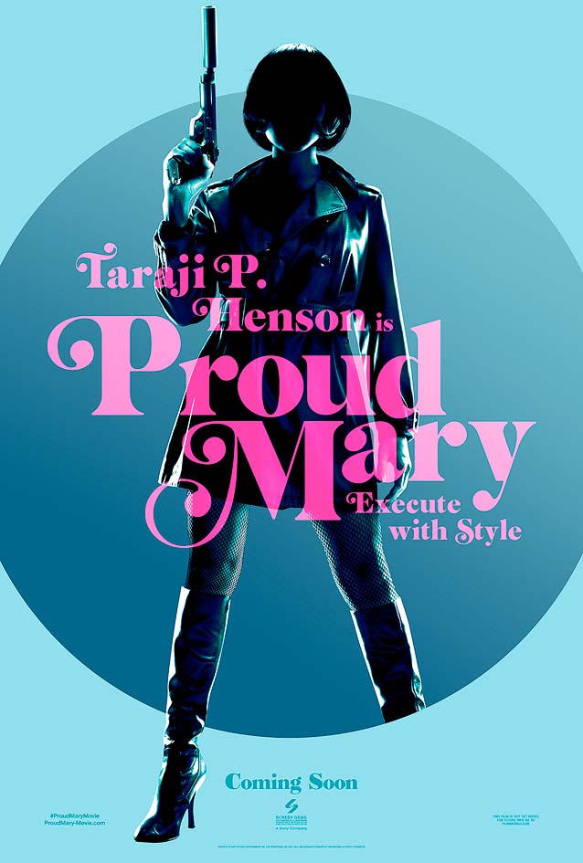
|
|
|
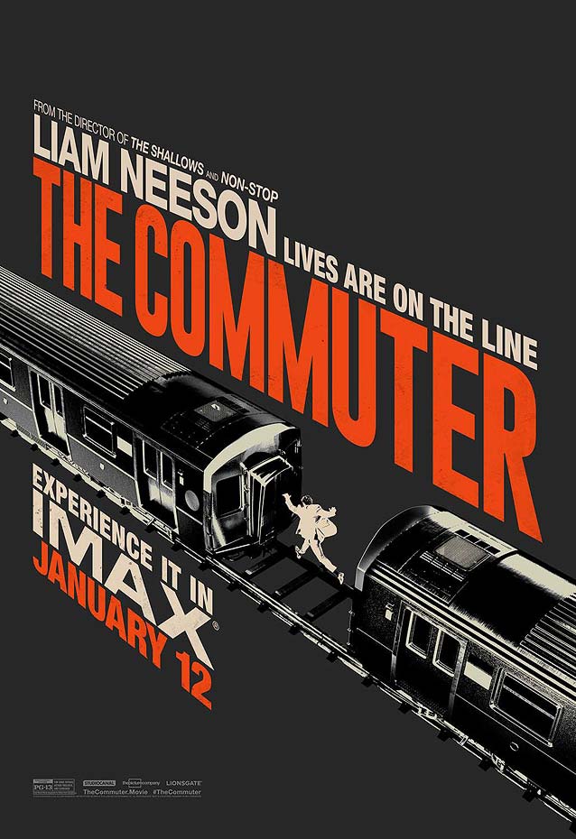
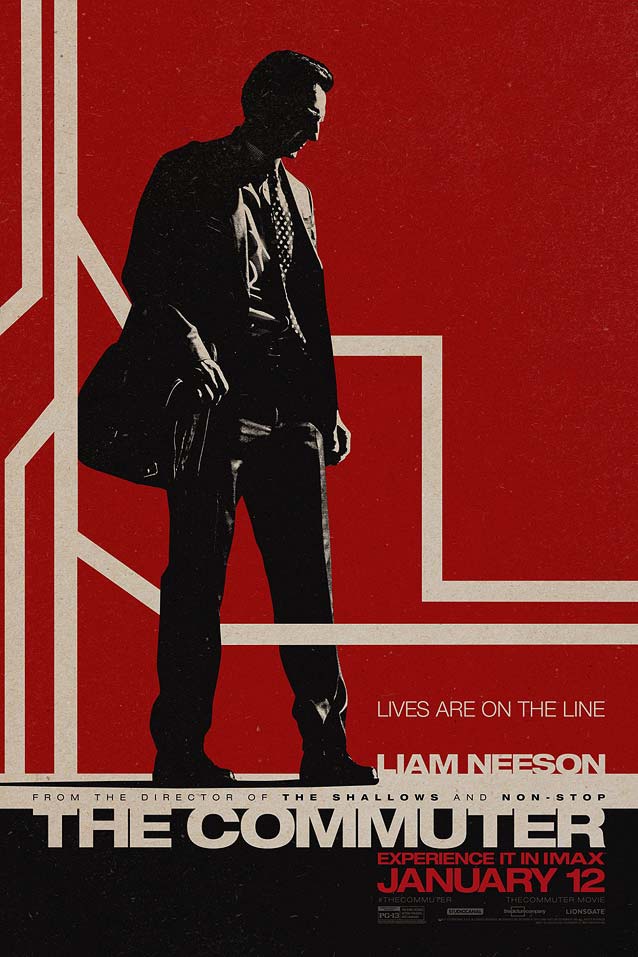
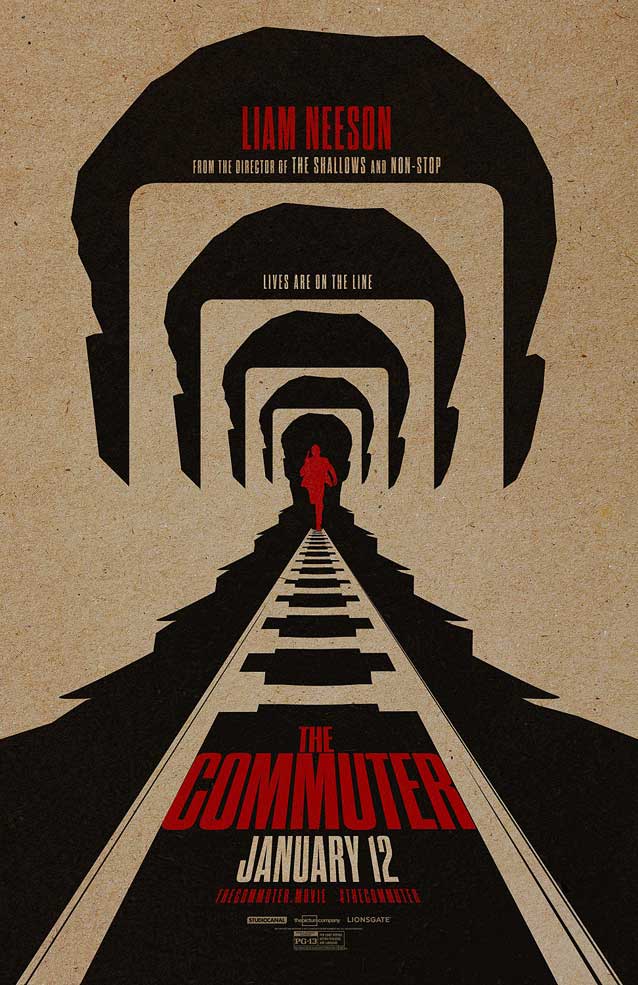
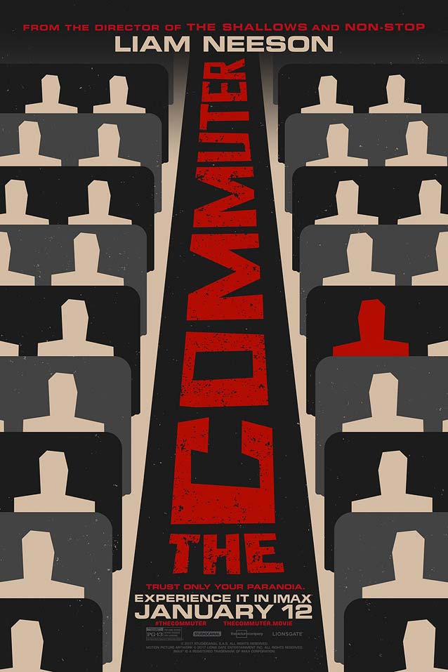
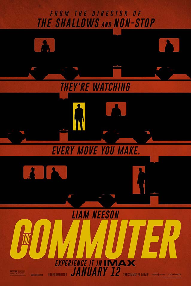
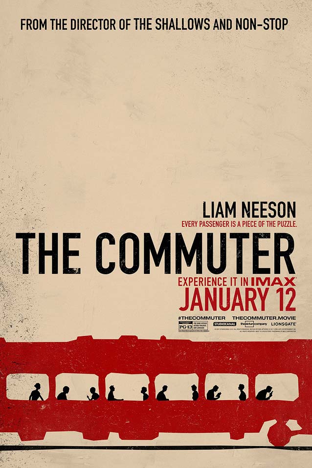
The Commuter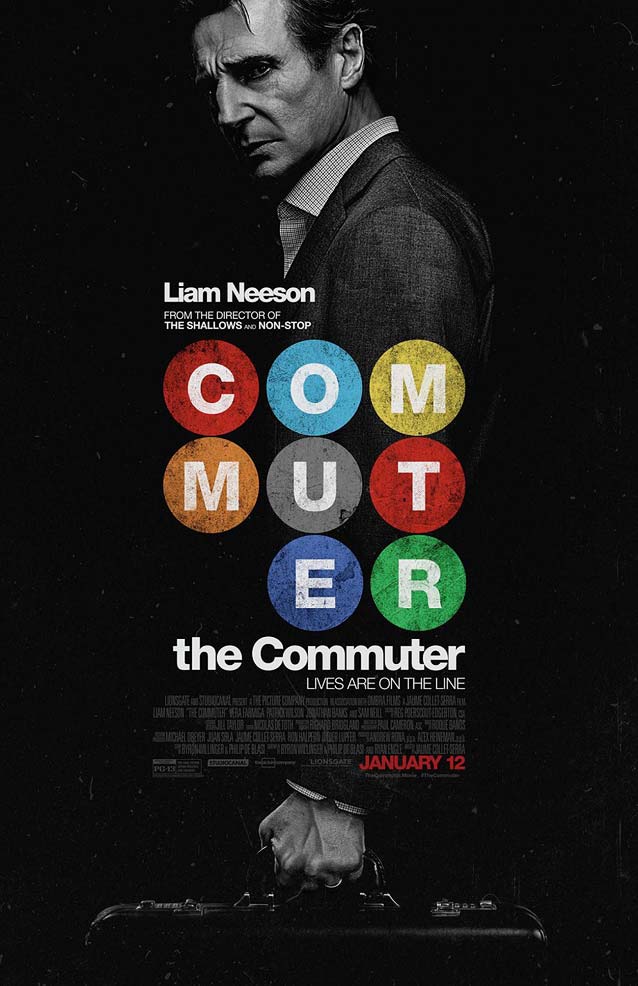
|
|
|
|
| LA created a whole slew of internet posters, most of them animated. They all adopt a vintage look by simulating rough printing on kraft paper, complete with nicks and scratches, in high-contrast black and red with the odd yellow detail. The complete series is well worth exploring on LA’s website. |
Small Town Crime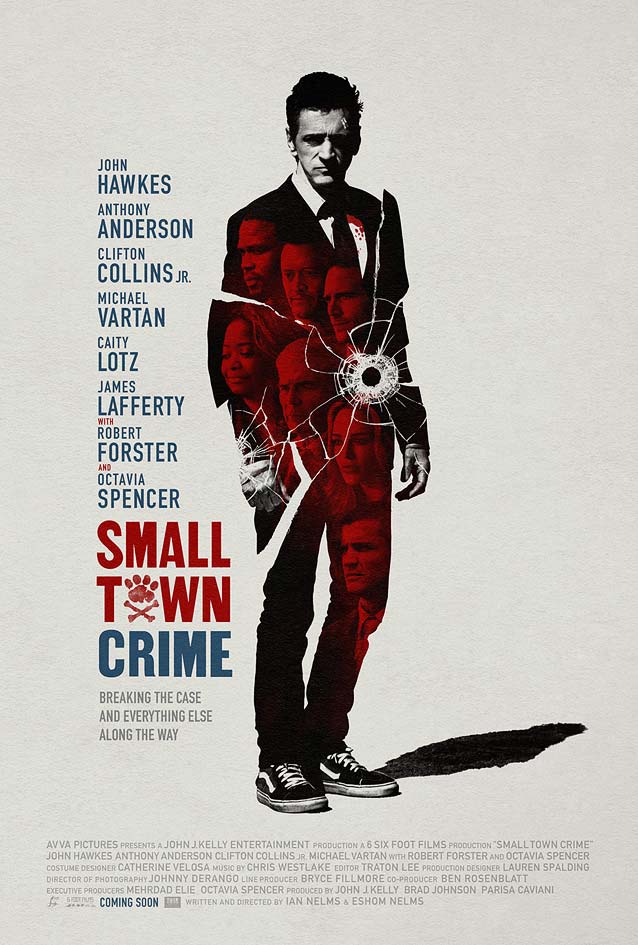
|
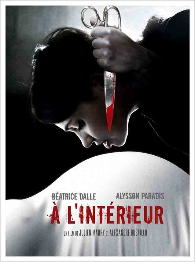
Inside / À L’intérieur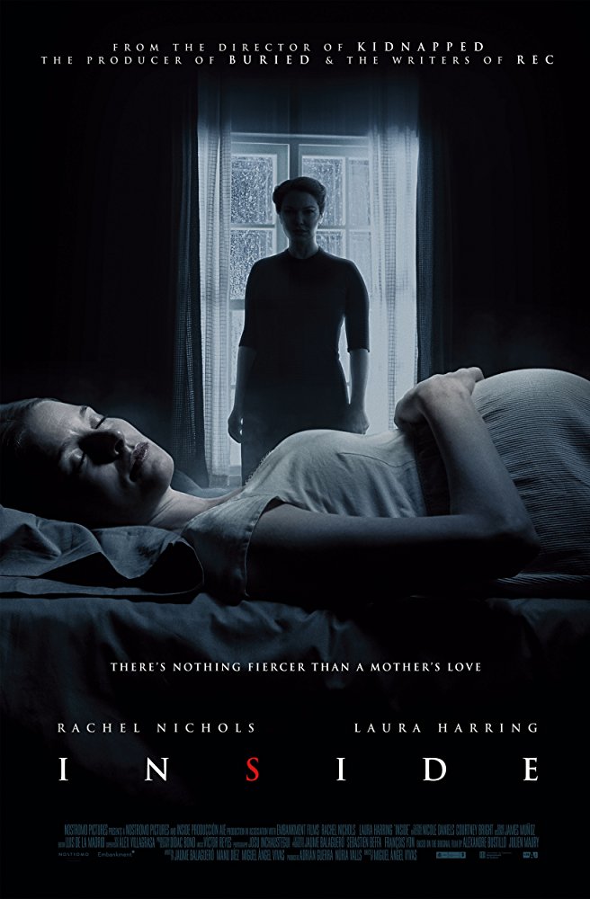
|
|
Dim the Fluorescents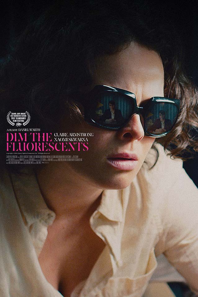
|
|
|
|
The Neighbor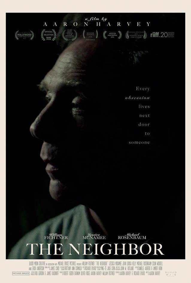
|
A Ciambra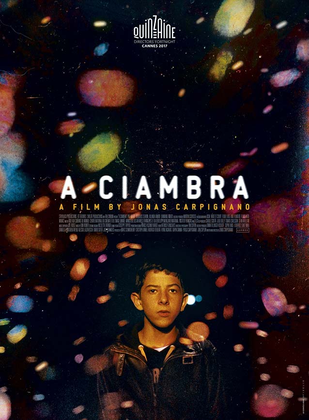
|