ScreenFonts: February 2017 | The Leftovers
These posters didn’t make the cut, but are still noteworthy for their design and/or typography.
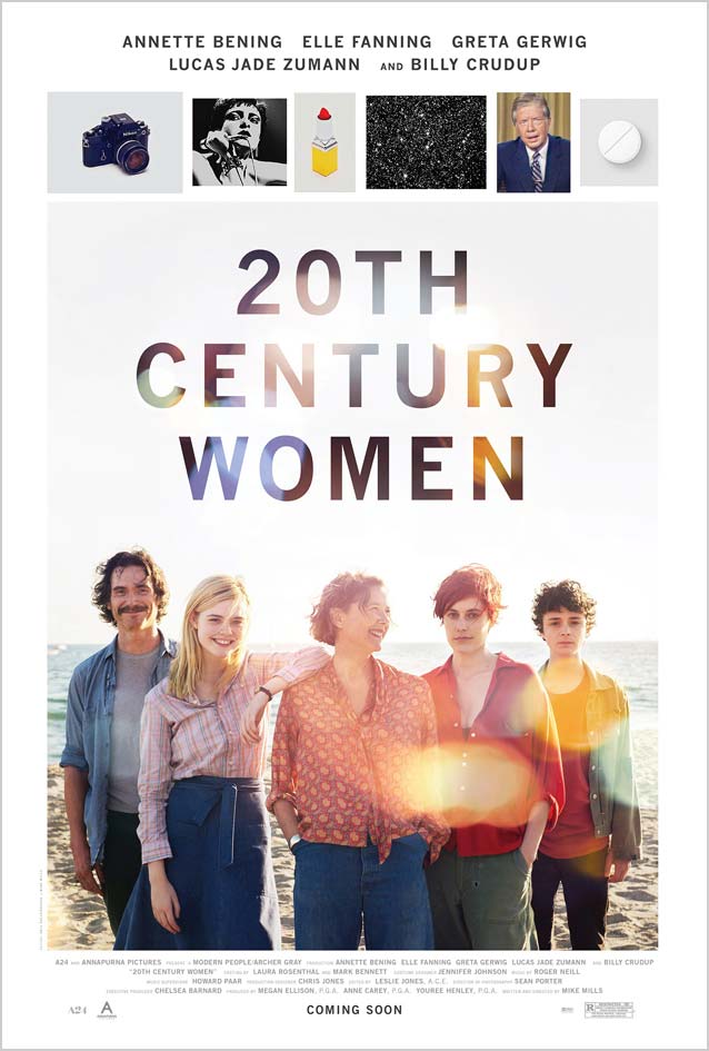
20th Century Women © A24. A lovely lens flare brings a melancholy, sun-drenched atmosphere to this theatrical one-sheet and looks beautiful in the typography. Benton Sans is an improved and expanded digitization of Morris Fuller Benton’s News Gothic; Font Bureau based the updated design on Benton’s original drawings at the Smithsonian. 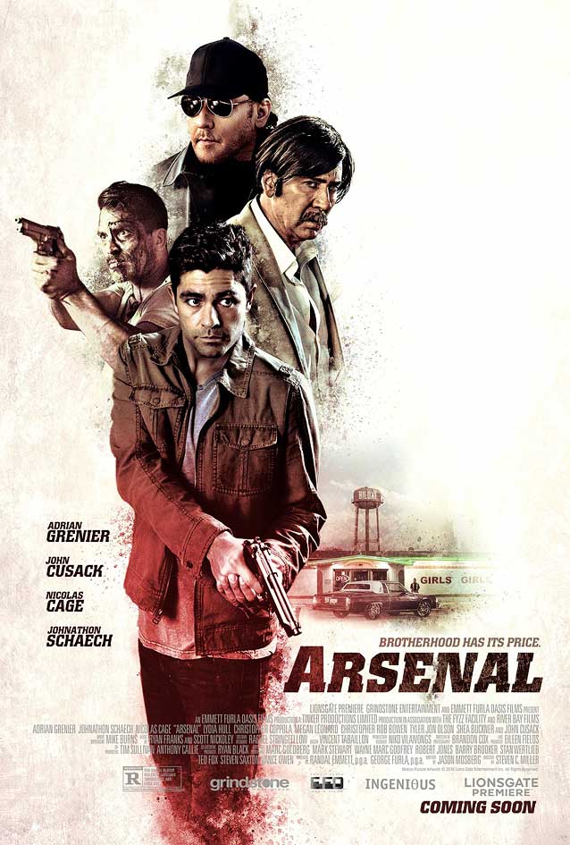
Arsenal © 2017 Lionsgate Premiere. Slanted Colossalis forcefully underscores Kustom Creative’s illustrated poster. The round inner shapes inside the angular letterforms create an interesting tension in Aldo Novarese’s slab serif. Matthew Carter’s Roster explores the opposite effect: square corners inside round shapes. |
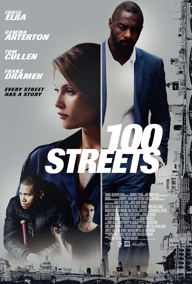
100 Streets © 2016 Samuel Goldwyn Films. The poster for I Am Michael (see the main ScreenFonts article for February) isn’t the only movie collateral to use a vertical division as a graphic device this month. In this poster, the line symbolizes Idris Elba and Gemma Arterton’s marriage under pressure. The typeface is Günter Gerhard Lange’s 1982 Imago. 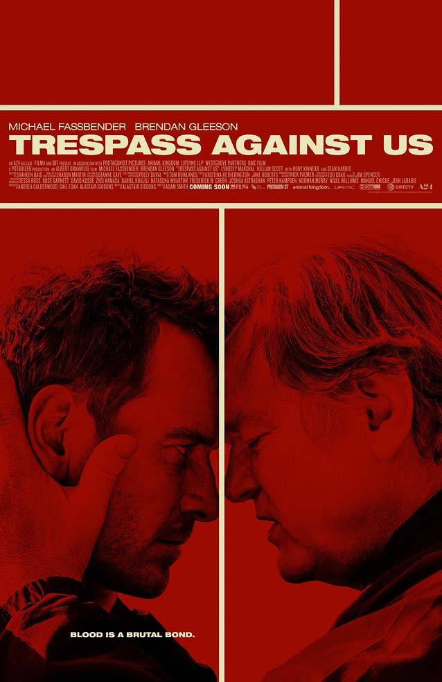
Trespass Against Us © 2016 A24. LA’s striking theatrical one-sheet uses the dividing line as a metaphor for Michael Fassbender’s efforts to break with the criminal ways of his outlaw family. The design features powerful monochrome, high-contrast photography; a simplified Mondrianesque composition; and Neue Helvetica Extended. (The extended widths of Rhode, Bureau Grot, Benton Sans, and Titling Gothic are excellent Helvetica Extended alternatives.) |
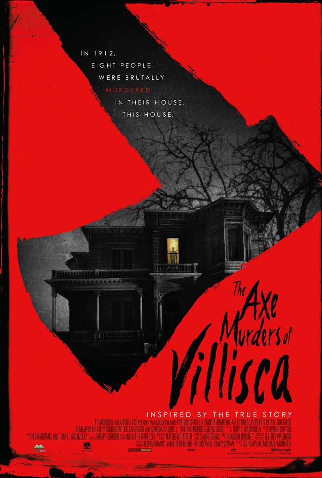
The Axe Murders of Villisca © 2016 IFC Films. Great use of the painted axe silhouette as visual motif and matching brush lettering in InSync PLUS’ poster. 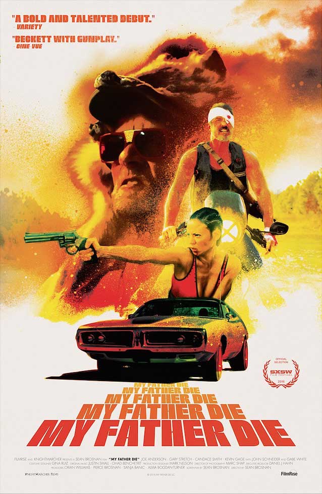
My Father Die © 2016 Knightmarcher Films. Perfect artwork with a dirty airbrush effect for this nasty rednecksploitation revenge romp features Neil Bold (digitized as Mobley Sans by Alejandro Paul for Sudtipos). |
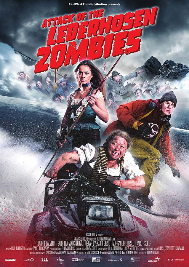
Attack of The Lederhosen Zombies © 2017 Level 33 Entertainment. This is so over-the-top I burst out laughing. Shoddy photo compositing, but what an exhilarating explosion of viscerality and bad taste! Cool pulp-fiction-style typography. 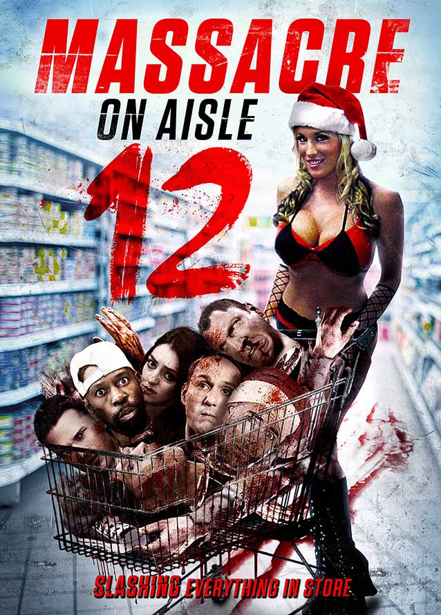
Massacre on Aisle 12 © 2016 Indican Pictures. Not as extravagant as the poster for Attack of the Lederhosen Zombies, but still insane(ly bad). It’s funny how the Photoshop jockey eventually just gave up on any pretense at realism. |
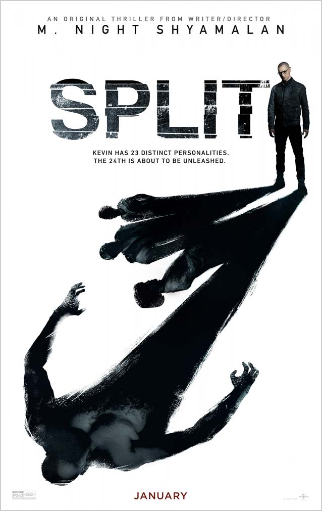
Split © 2016 Universal Pictures. In contrast to the main theatrical one-sheet, LA’s illustrated poster featuring photography by Frank Ockenfels does a much better job at depicting the inner turmoil created by personalities in conflict. James McAvoy’s shadow is split up, with the dangerous twenty-fourth personality looming menacingly over three of the others. 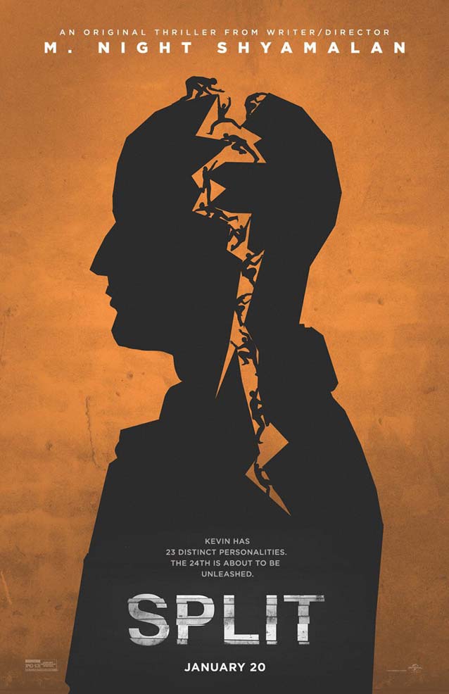
Split © 2016 Universal Pictures. The other illustrated poster by LA looks a bit too cartoonish for the horrific subject matter. |
Bald Condensed, né Yves Peters, is a Belgian-based rock drummer known for his astute observations on the impact of letterforms in the contemporary culture-sphere. A prolific writer on typography, he has a singular knack for identifying the most obscure typefaces known to man.