The February episode of ScreenFonts looks at posters for Hidden Figures, Monster Trucks, Royahaye dame sobh (Starless Dreams), The Sunshine Makers, Retake, The Founder, Split, The Age of Consequences, Resident Evil: The Final Chapter, Resident Evil: The Final Chapter, and I Am Michael. And this time, there’s a twist: Bald Condensed takes a stab at diversifying the typographic pool for movie collateral.
By Bald Condensed
You may have noticed that I’ve changed my approach to ScreenFonts a little since the series found its new home on Type Network last month. Instead of simply mentioning the various typefaces on the posters, from now on, I’ll also offer suggestions for alternatives. Marketing collateral for the film industry tends to draw from a rather limited typographic pool; we see the same typefaces over and over again. Suggesting alternatives and/or better options for overused faces will, I hope, be my modest contribution to diversifying movie typography.
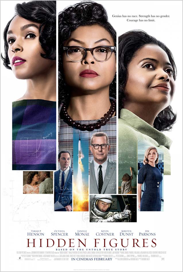
It seems fitting to start the African American History Month episode of ScreenFonts with Hidden Figures. This historical drama tells the true story of the African American mathematicians who made crucial contributions to the computing for NASA’s first successful space missions. Ignition’s main theatrical poster combines two graphic solutions often found on mainstream film posters. On one hand, in what is commonly called floating heads, the disembodied giant heads of the main characters loom over the artwork, to capitalize on their star power. On the other, the mosaic style (I don’t know if a canonical name exists for that one) is a pattern of multiple images featuring the actors, showing scenes foreshadowing the storyline, or both. The three portraits are sharply delineated against the crisp white background and segue into the smaller vignettes below. This creates a very satisfying arrangement with a color palette that nicely references the late 1960s.
The film title is set in Mercury. Like Throhand Pen and Eldorado Display, Mercury is a finer, more delicate alternative to the omnipresent Trajan.
The promotional campaign for Hidden Figures includes some lovely alternate designs by Gravillis Inc., like this painted poster by digital artist Mike Thomson, who has collaborated with Gravillis many times over the years. The artwork was actually composited with photographs and then handed over to the illustrator. Thomson digitally painted on top of the photos to achieve the lyrical effect. Although the poster was originally only meant for online use, it received such an overwhelmingly positive response that the studio produced a few printed copies of the painting for the cast of the film.
The transitional serif face on the poster is Commercial Type’s Austin, inspired by Richard Austin’s late eighteenth-century types for the publisher John Bell. Matthew Carter’s Miller Banner is a similar Scotch Roman that also features a dramatic contrast and fine hairlines.
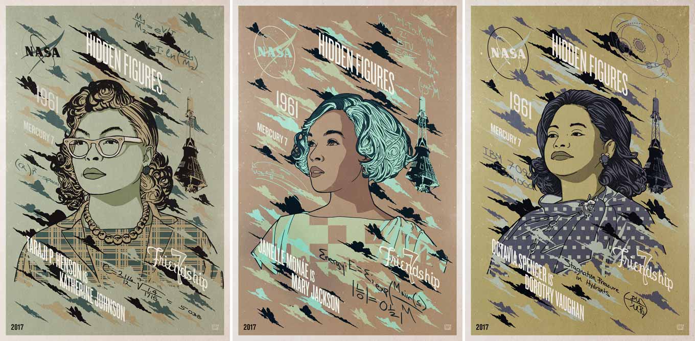
Gravillis Inc. also produced a series of character posters illustrated by Mel Marcelo. Kenny Gravillis explained via email: “Mel is amazing when it comes to vector artwork. We did have a lot of back and forth on the colors with regards to representing the time period. I’m now happy for that struggle, as I think the posters turned out great.”
The Skyline widths of Titling Gothic capture the same wood-type poster atmosphere.
I wish all alternative poster projects were as successful, but these three retro posters celebrating the film’s wide release—each featuring one of the incredible women programmers—are clunkers. The squooshed Arial in the middle one makes me cringe.
Last month, we featured work by Paul Shipper, one of the new generation of film poster illustrators. This time, we’re showcasing a pioneer of the detailed, hyperrealistic style of drawing. Steven Chorney is a contemporary of Drew Struzan; they both started out in the mid-1970s. What always strikes me about their work is the expressiveness and warmth of the characters and the rock-solid composition. These artists create organic, living and breathing images superior to any Photoshopped composite.
Take a look, for example, at BLT’s initial poster for action comedy Monster Trucks. No amount of blurred edges can disguise that this was cobbled together from parts, ironically just like the monster truck from the movie. And the way the main character was inserted sitting in his truck in the Spanish localized version or riding the monster’s tentacle in the French version is not believable. Now compare those to the illustrated poster. By contrast, Chorney’s strategic marriage of white and dark for the outlines of characters and objects has a dual, seemingly contradictory function: it separates the elements, making them pop—yet at the same time, it ties the entire composition together.
While the hyperrealistic illustration style in film posters, now four decades old, is kept vital and alive by a new generation, others take very different approaches. One stunning example is Iranian artist Ali Bagheri’s artwork for Royahaye dame sobh (Starless Dreams). In Mehrdad Oskouei’s unflinching documentary, teenage girls consigned to the Correctional and Rehabilitation Centre in Tehran explain how they ended up there and discuss their troubled lives as well as their hopes and dreams. Bagheri’s drawing, poetic yet dark, wonderfully captures the documentary’s essence. A girl appears only as a veiled silhouette, her head bleeding off the edge to signify either her anonymity or her erasure from public existence. She holds what looks like a doll’s head in her hands. This symbol of her youthfulness is trapped in an ethereal box, indicating that—even if the girls in the documentary are imprisoned—their thoughts, desires, and aspirations cannot be contained. The scratchy, irregular text perfectly matches the illustration. With its primarily gray and muted hues, Bagheri’s art might look subdued, but it packs a powerful emotional punch.
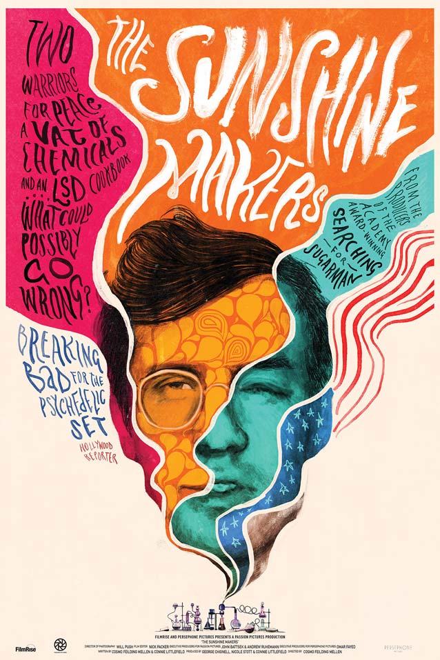
Another decidedly different illustration graces the theatrical one-sheet for The Sunshine Makers, a documentary chronicling the story of Nicholas Sand and Tim Scully, the unlikely duo at the heart of 1960s American drug counterculture. This humorous visualization of an acid trip is an updated, looser interpretation of the psychedelic posters of the 1970s. The artwork references an even older painterly style of film posters from the early twentieth century, with contemporary brush calligraphy mimicking the intricately intertwined lettering from the psychedelic age. To my regret, I’ve not yet managed to track down the author of this wonderfully trippy art.
Stills from the title sequence for The Sunshine Makers.
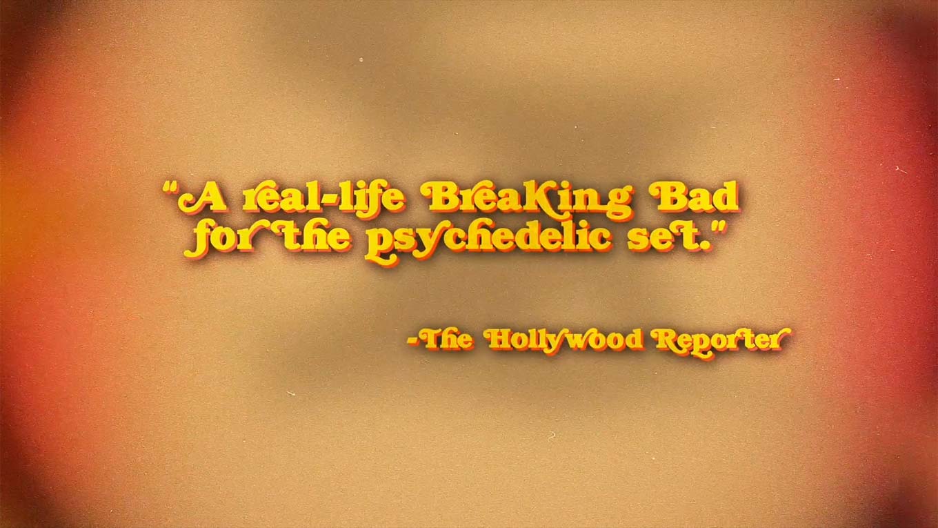
The trailer for The Sunshine Makers shows the need for good judgment when using swashes and alternates. Some forms are only meant for initial or final letters, and inserting them somewhere in the middle breaks up words. What could possibly go wrong, indeed? Turns out quite a bit. Part of the problem is that this version of Bookman only has limited options. Mark Simonson’s Bookmania, however, offers several swashes and alternates for most letters, guaranteeing you can go all out and still achieve a typographically sound result.
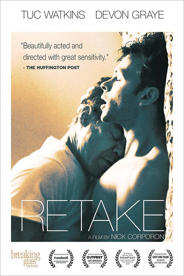
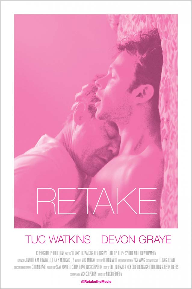
Changing the colors in a photograph can drastically alter its mood. I found two versions of the poster for the romantic drama Retake, which recounts the story of a lonely middle-aged man who hires a male prostitute to recreate a road trip from his past. The tan and petrol-blue hues in the version on the left foreshadow a darker, more melancholy story, while the pink-and-purple version suggests a more lighthearted tale. The movie logo is set in the eternal classic Neue Haas Grotesk. For a more mature and humane neo-grotesque with almost imperceptively curved stems, choose Forma DJR. And if you are a fan of very fine sans-serif capitals, you will love the thin weight of Laura Meseguer’s Multi Display.
Sometimes the source material is so good the poster almost designs itself, even though a lot of thought usually goes into these seemingly self-evident solutions. The biographical drama The Founder tells the story of Ray Kroc, the salesman who turned McDonald’s into one of the biggest restaurant businesses in the world. In Gravillis Inc.’s teaser poster, tight cropping turns the iconic golden arches into a metaphorical fork in the road, as Ray Kroc stands, hands defiantly on hips, presumably pondering which direction to take. The stark, lo-fi black-and-white image of Kroc and the recycled card texture create the illusion that the artwork was printed on one of the typical takeout bags of the fast-food chain.
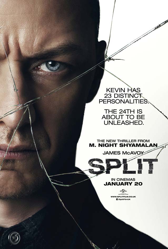
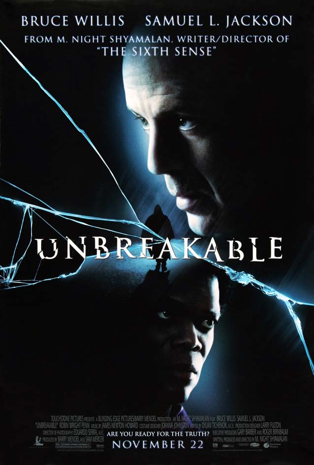
It’s funny when you discover similarities between posters for films from the same author. The recurring visual themes in the collaterals for Tony Scott’s work and for movie adaptations of Nicholas Sparks novels are but two examples that crop up in my conference talks. I didn’t really expect this from M. Night Shyamalan, though. Wonderland’s theatrical one-sheet for the horror thriller Split references one of Shyamalan’s most well-known and successful films. Whereas the broken glass motif worked well for Unbreakable, I don’t think it’s an appropriate visualization of the dissociative identity disorder James McAvoy suffers from in this film. I understand the connotation of a fractured psyche, yet I feel it misrepresents the disorder. Personally, I would have preferred something more like a mosaic or a kaleidoscopic pattern suggesting the myriad personalities living in the main character’s head.
As Neue Helvetica Extended has been done to death on film posters, allow me to suggest some great alternatives for extended sans serifs: Rhode, Bureau Grot, Benton Sans, and Titling Gothic all have very wide widths in several weights. And instead of tired old Trajan, go for Canto, which includes full sets of lowercase characters complementing the classic capitals in three finishes.
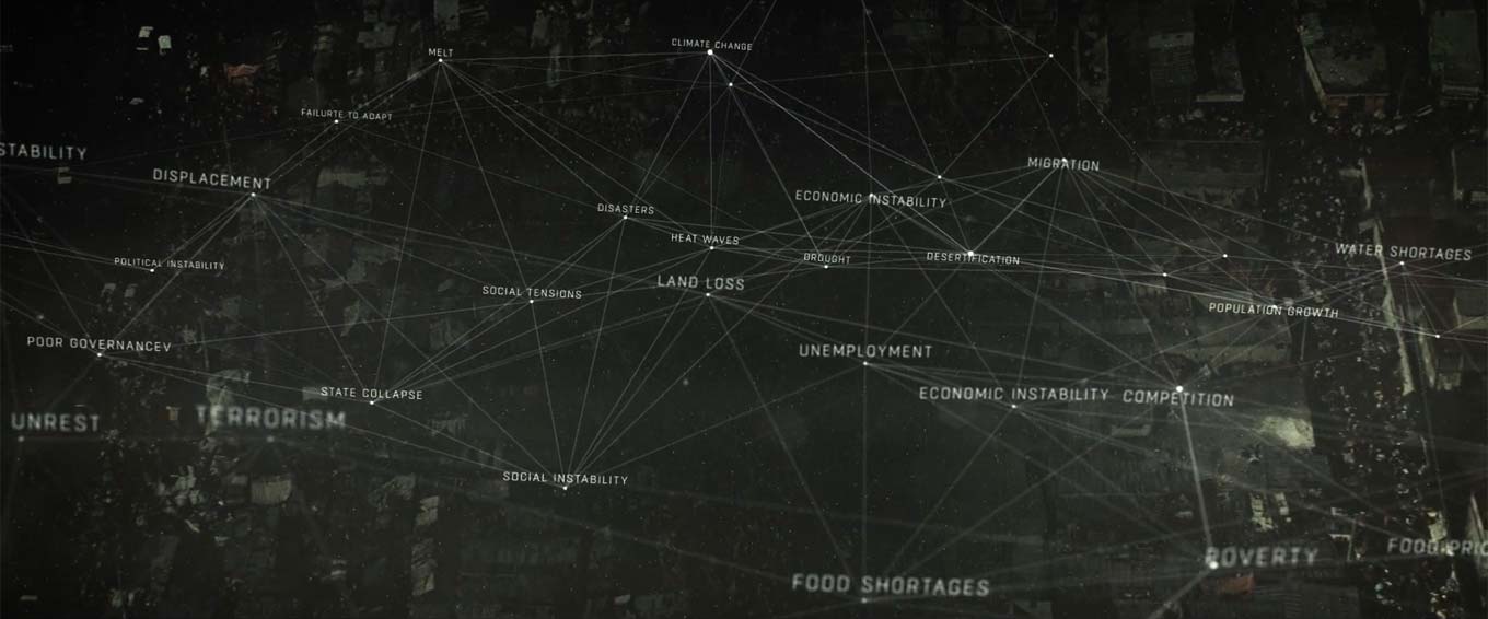
I’m not sure how efficient the film poster for The Age of Consequences is as actual marketing collateral, but it is a lovely piece of design. The concept cloud does a great job of pointing out connections that are seldom made: that climate change, resource scarcity, migration, and conflict are all interconnected problems and should not be considered separately; and how these challenges impact national security and global stability.
The sequential aspect of the film trailer makes the poster graphics much clearer, as lines start from one concept and travel along a logical path to the following ones. I originally thought the technical sans serif was GeoGrotesque, but apparently, it’s a thinly veiled look-alike which shall remain nameless. I frown upon type designers who identify a popular typeface and then develop an almost identical copy in hopes of riding the waves of the original’s success. Either use the real thing or look for another original design in the same spirit, like New Frank or DINosaur. The typeface on the poster is Roboto Mono. Stephen Coles once made a convincing case against the Android OS font, so I’d rather see something tasty like DJR’s Input Mono here instead.
Still from the trailer for The Age of Consequences.
Resident Evil: The Final Chapter is the, well, final chapter of the horror/action franchise, with Alice as the only survivor of what should have been humanity’s final stand against the undead. Concept Arts’s main theatrical poster creates a subliminal image of Milla Jovovich as an angel of vengeance. Characters from the movie and image fragments form winglike shapes sprouting from her back, and the symbol for the Umbrella Corporation becomes a halo.
The film’s logo immediately made me think of the unique, organic letter styles of Margo Chase, the influential Los Angeles-based graphic designer who emerged in the late 1980s. Some of her lettering and logo designs were expanded to complete alphabets and digitized by T-26 and Richard Lipton. The six-part headline series Shogun, the single-weight display type Talon, and the striking stencil serif Ecru all started from just a few letters, becoming striking, full-fledged typefaces in Lipton’s hands.
We end this episode with the biographical drama I Am Michael, the story of a gay activist and magazine founder who is “saved” from his homosexuality after turning to God. Dividing the poster in two vertical halves symbolizes the duality of the main protagonist. A gray line runs straight through the I of Tobias Frere-Jones’ Gotham, splitting the tagline (One man. Two lives.) in half, with a shifted baseline for extra emphasis. I find the photo compositing quite impressive. In copies of the same photo, James Franco embraces two different people; it’s almost impossible to tell which partner was in the original image: Zachary Quinto or Emma Roberts.
The typography looks messy because of the use of one typeface in a single weight at different sizes for all the copy, with italics and positive tracking adding to the confusion. An unfortunate side effect of Gotham’s popularity is that it has been overused; instead, consider Proxima Nova, an extensive superfamily that has different roots but exudes a similar atmosphere.
That wraps up this edition of ScreenFonts. I’m off to the theater in search of more of the best (and the worst) in film typography. Stay tuned for The Leftovers!
Bald Condensed, né Yves Peters, is a Belgian-based rock drummer known for his astute observations on the impact of letterforms in the contemporary culture-sphere. A prolific writer on typography, he has a singular knack for identifying the most obscure typefaces known to man.