Type Network Logo
Fonts
Foundries
Designers
Stories
Services
Search Icon
Search
User
Account
Cart Icon
Cart
Menu Icon
ScreenFonts: December 2018 | The Leftovers
These posters didn’t make the
cut
, but are still noteworthy for their design and/or typography.
By Bald Condensed
Susanne Bartsch: On Top
© 2018 The Orchard.
LA
avoided the question of how to portray an ever-changing, outrageous fashion chameleon by transforming her into a naked mannequin, with a wide sans serif impeccably anchored to her cheekbone. See
Benton Sans Wide Bold
or
Dinamit
for viable alternatives.
The Public Image Is Rotten
© 2018 Abramorama. Johnny Rotten peeks mischievously over the bottom edge of
Noah Witlin
’s striking poster, the magenta streaks in his hair shimmering against the cyan background.
Scout Condensed
would be a surprising alternative for the straight-sided sans used here.
I Am Not a Witch
© 2018 Film Movement.
Andrew Bannister
’s colorful, richly textured, eclectic style is instantly recognizable. For a great new take on the geometric sans-serif genre, have a look at
New Hero
.
Strange Nature
© 2018 ITN Distribution.
Christopher Shy
’s gorgeous painted art is based on
God of Change
, a porcelain sculpture by
Kate MacDowell
. The typeface is a slightly customized Goudy Oldstyle.
Colette
© 2018 Bleecker Street.
The Refinery
adopted an unusual color palette consisting of a variety of reds, throwing in an unexpected electric green for Colette’s signature.
The single connecting cross stroke for the double
t
in Colette’s signature in The Refinery’s one-sheet is lost in this alternate poster. Customizing such details is worth your while when using a script typeface.
This charming regional Dutch-language one-sheet mimics the advertising posters from the art nouveau period.
Mandy
© 2018 RLJE Films.
Macbeth
gives this hazy, threatening orgy of bloodred and purple the appropriate pulp/gothic look.
Nelly
© 2018 Cinema Libre Studio. Given the scandalous nature of the movie,
Alexandre Renzo
’s Canadian domestic poster is surprisingly restrained, soft-focusing on author Nelly Arcan’s search for a pseudonym as she voluntarily embarks on a career as an escort.
All subtlety flies out of the window in
Ivy Kim
’s international one-sheet, with its awkward script and sensationalist tagline. Look for the beauty of copperplate scripts in
Retype
’s
Medusa
, and
Occupant Fonts
’
Biscotti
and
Novia
.
L’apparition (The Apparition)
© 2018 Music Box Films. Since its release in 2014, I have wondered how long it would take for Trajan Sans to show up in a movie poster, given the ubiquity of the original Trajan in film promotion. Now we know. It’s funny that Richard Lipton not only has an expanded interpretation of the Trajan capitals with
Canto
(which includes a full lowercase complement and different finishes), but also released an elegant flared serif that rivals Trajan Sans:
Collier
.
Armed
© 2018 GVN Releasing. Literally mind-blowing—sorry, couldn’t help myself—key art by
authentik creative, inc.
featuring
Agency Extended
, the go-to face for action thrillers.
Slice
© 2018 A24. There’s something slightly off about
Bond
’s theatrical one-sheet. Maybe an illustrated or painted version of this composition would have worked better. The angular film title made me think of the
recently revived
Occupant Gothic
.
Bond
’s alternate poster is pretty clever: the stack of pizza boxes incorporates all of the elements necessary to understand what this film is about (see the topping options at the bottom).
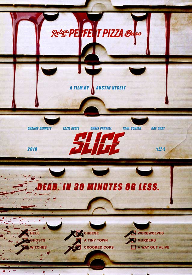
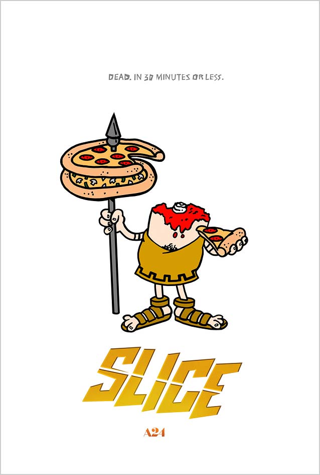
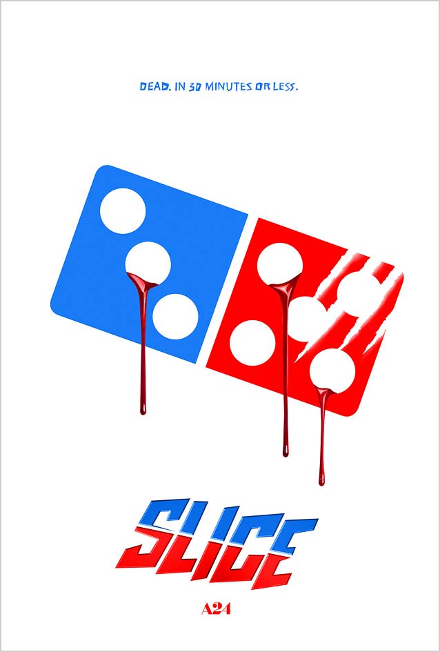
Bond
also had fun spoofing the logos of well-known pizza chains. Their gruesome take on
Little Caesars
shows its beheaded mascot.
This is
Domino’s Pizza
, bleeding from the holes in the domino logo.
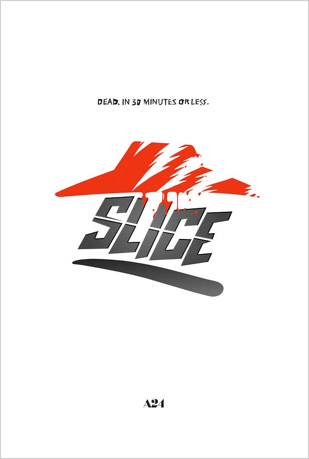
Here, it looks like a werewolf has slashed
Pizza Hut
’s roof.