ScreenFonts: December 2018
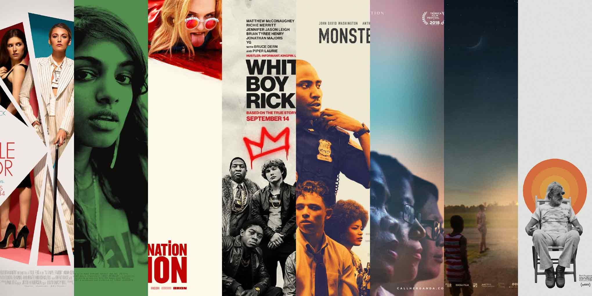
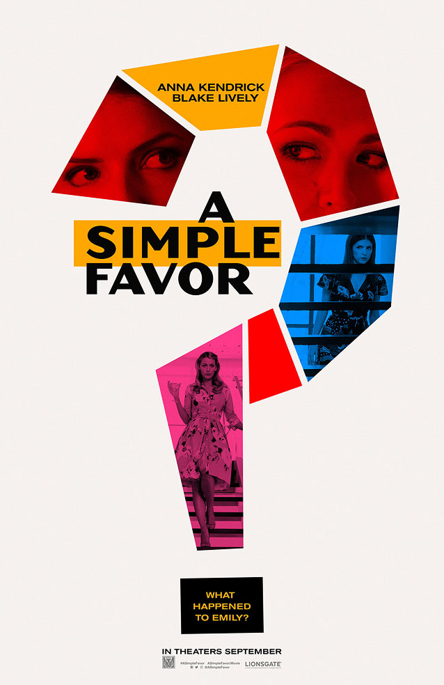
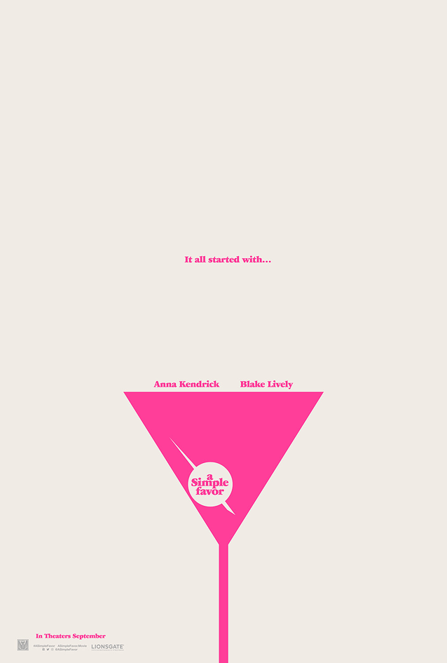
A lot happens with a little in the posters for A Simple Favor, Matangi/Maya/M.I.A., Assassination Nation, White Boy Rick, Monsters and Men, Call Her Ganda, Hale County This Morning, This Evening, and Hal. It’s all about space.
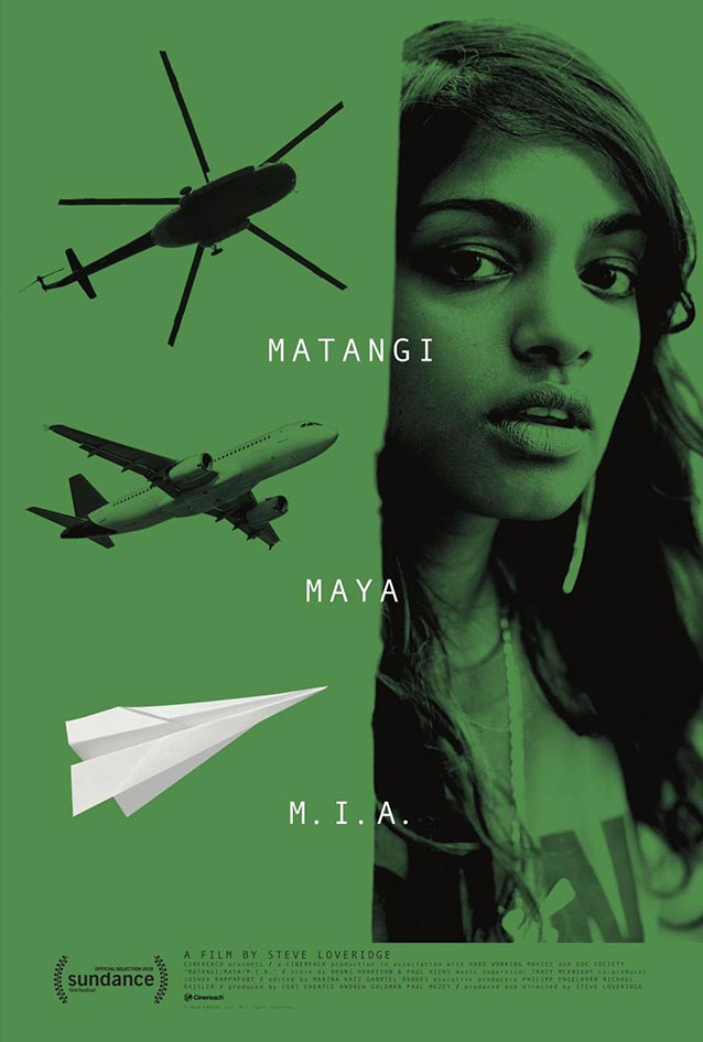
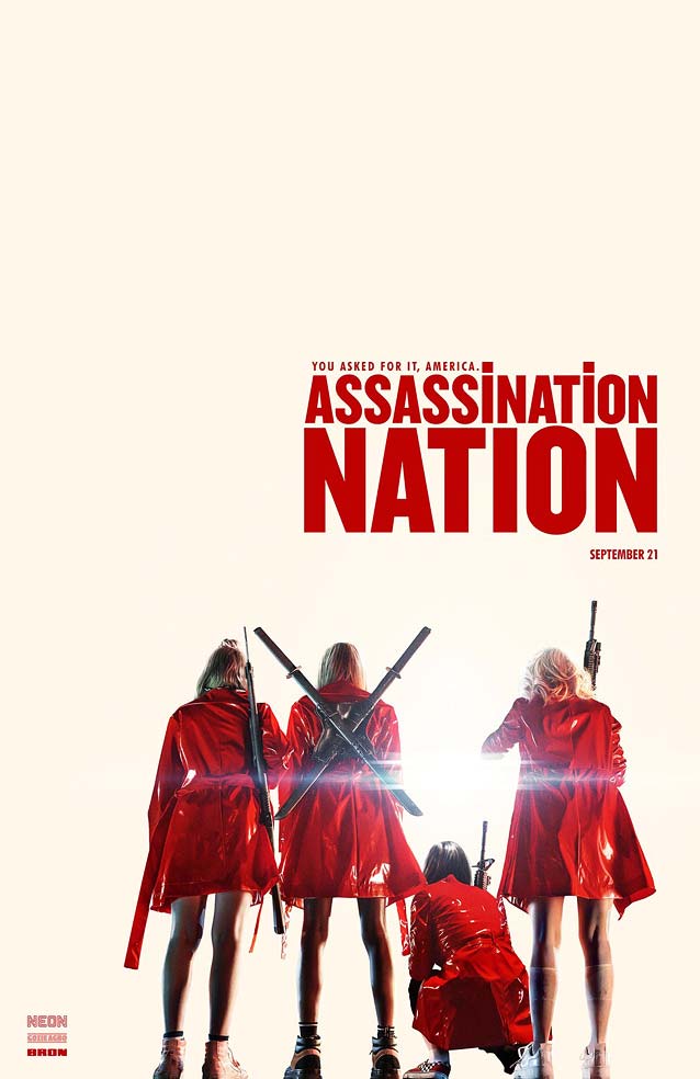
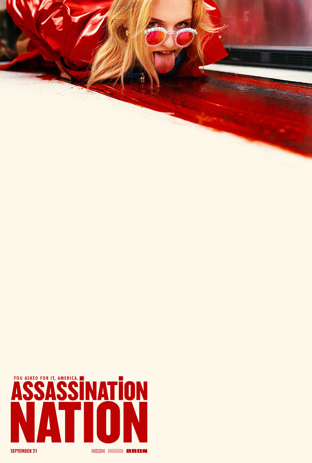
It was only after I finalized my selection of posters that I perceived an overarching theme for this episode of ScreenFonts: space. Not space as in the final frontier, but space as in so-called negative space—a purposeful emptiness. By virtually removing parts of the canvas to simulate dimensionality, leaving large swaths of it blank to direct the attention of the viewer to a specific section of the key art, using an empty area to set type, or suggesting an emotional or physical absence, the judicious use of white space provides context, adds drama, and can turn a decent design into a powerful poster.
I’m glad I wasn’t plagued by fear of the blank page—or more precisely the empty text field in the CMS—and managed to serve up another episode of ScreenFonts for your enjoyment. And there’s more—come back for The Leftovers in a few days.
Bald Condensed, né Yves Peters, is a Belgian-based rock drummer known for his astute observations on the impact of letterforms in the contemporary culture-sphere. A prolific writer on typography, he has a singular knack for identifying the most obscure typefaces known to humankind.
A Simple Favor
|

|
|

|

|
|
Matangi/Maya/M.I.A.
|
|
Assassination Nation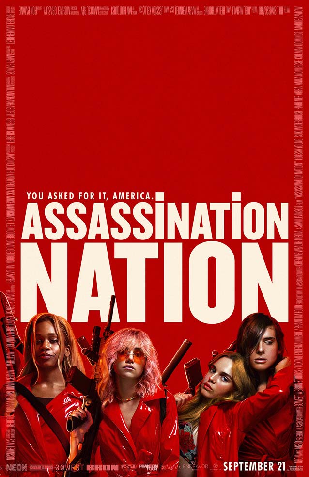
|
|
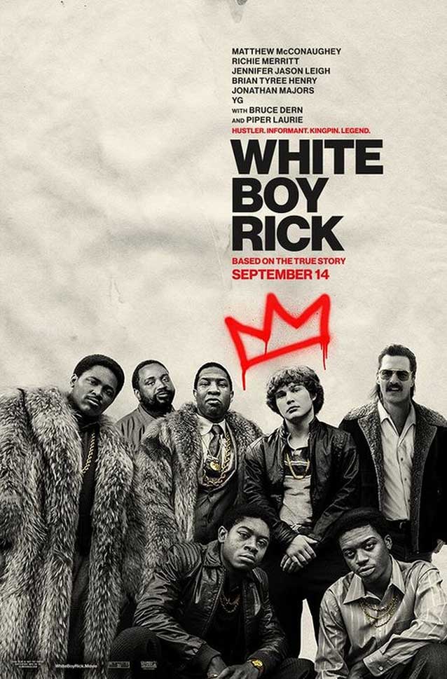
White Boy Rick
|
|
Monsters and Men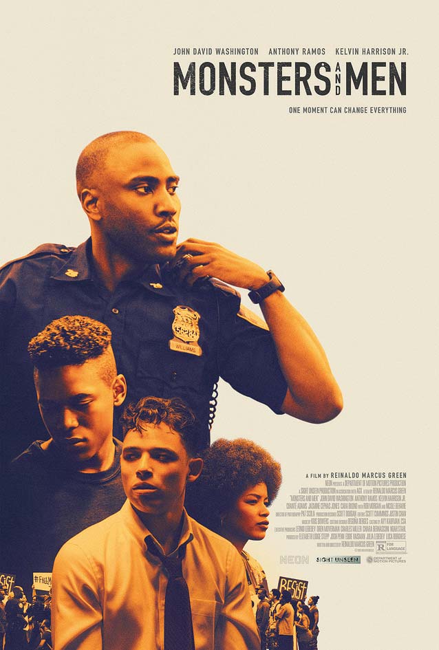
|
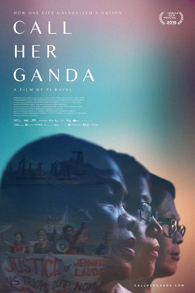
Call Her Ganda
|
|
Hale County This Morning, This Evening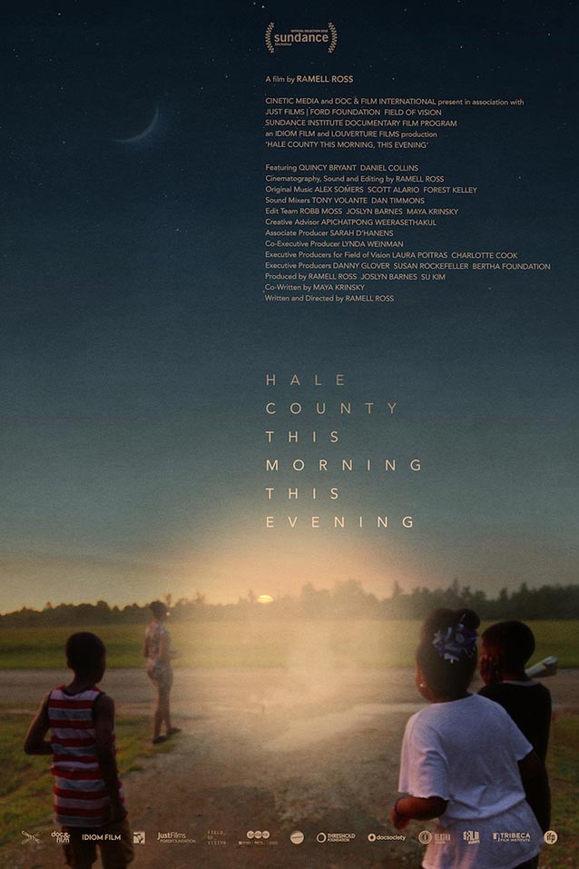
|
Hal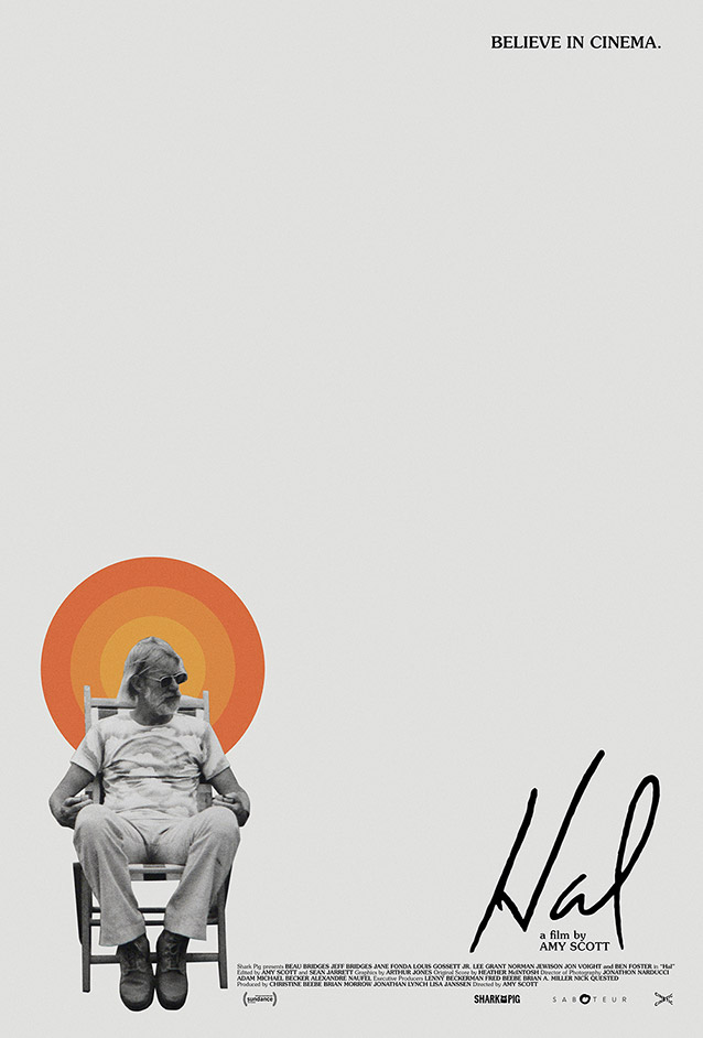
|