Type Network Logo
Fonts
Foundries
Designers
Stories
Services
Search Icon
Search
User
Account
Cart Icon
Cart
Menu Icon
ScreenFonts: August 2017 | The Leftovers
These posters didn’t make the
cut
, but are still noteworthy for their design and/or typography.
By Bald Condensed
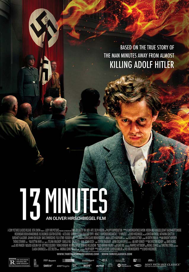
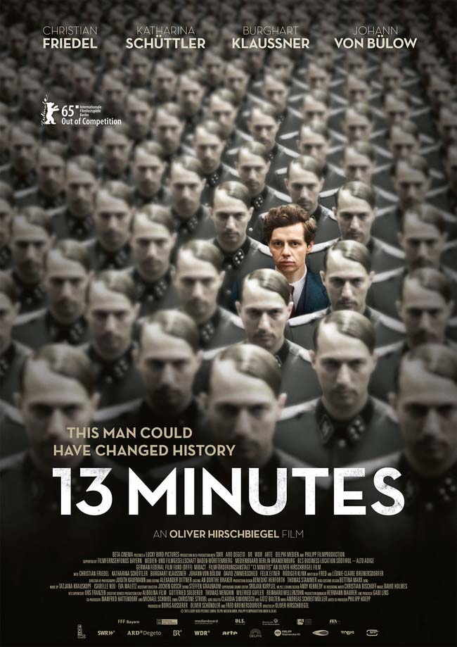
Elser
(13 Minutes)
© 2015 Sony Pictures Classics. While the composite image and use of Industria in the international one-sheet for
13 Minutes
make the film seem like a 1990s straight-to-VHS production…
…the original German poster is a splendid visual metaphor for the defiance of an individual caught in an oppressive regime—an image that immediately made me think of Franz Kafka. Art deco sans serifs in the same spirit as Neutraface:
Eagle
,
Mostra Nuova
,
Arboria
, and
Dunbar
.
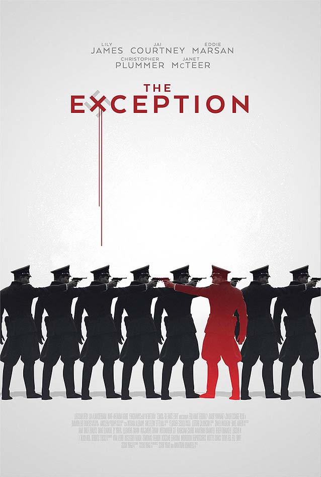
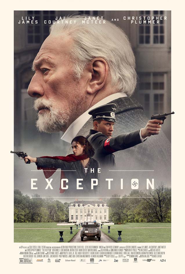
The Exception
© 2016 A24. A similar concept with a different, equally good execution. Turning Gotham’s
X
into a bloody swastika is an interesting typographic detail.
Technically speaking,
InSync Plus
’ key art is also a floating-heads design using one of the myriad digitizations of Bank Gothic or Poster Gothic, but it’s far more elegant and sophisticated than
Creative Partnership
’s hazy
interpretation
.
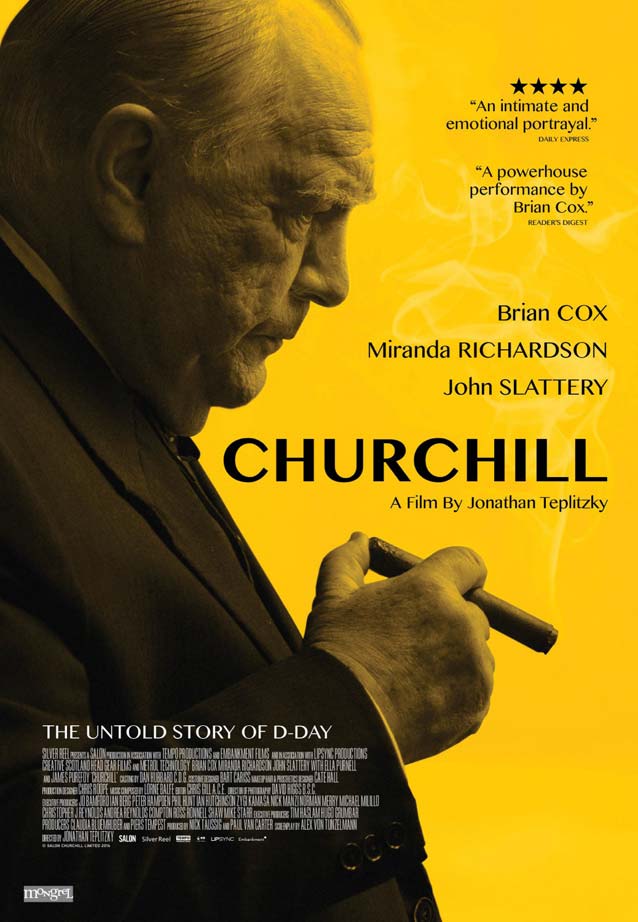
Churchill
© 2017 Cohen Media Group. Jensen Adam Design’s poster is reminiscent of
Planetfab
’s
one-sheet
for
The King’s Speech,
coincidentally (?) set during the same period.
Vinter
would be a gorgeous alternative to this stressed sans serif.
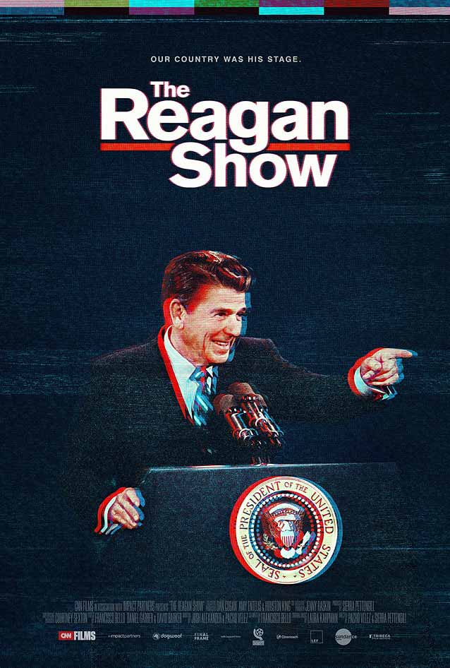
The Reagan Show
© 2017 Gravitas Ventures.
Gravillis Inc.
brilliantly uses cathode-ray tube interference to bring out the red, white, and blue in the image and create a faux 3-D effect.
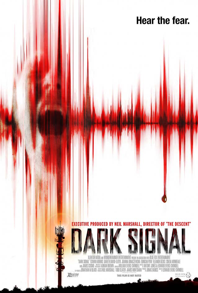
Dark Signal
© 2016 XLrator Media.
Poolhouse
adds vertical static to
Agency FB
to match the image.
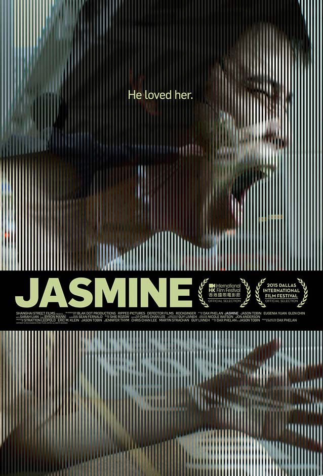
Jasmine
© 2015 Indican Pictures. A mesmerizing fusion of two images, a bit like
Kellerhouse
’s stunning design for
The Girlfriend Experience
, which I reviewed
eight years ago
.
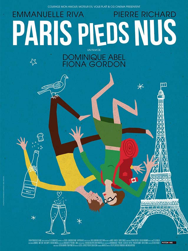
Paris pieds nus
(Lost in Paris)
© 2016 Oscilloscope. This charming, fun, and refreshing illustrated theatrical one-sheet just oozes Frenchness.
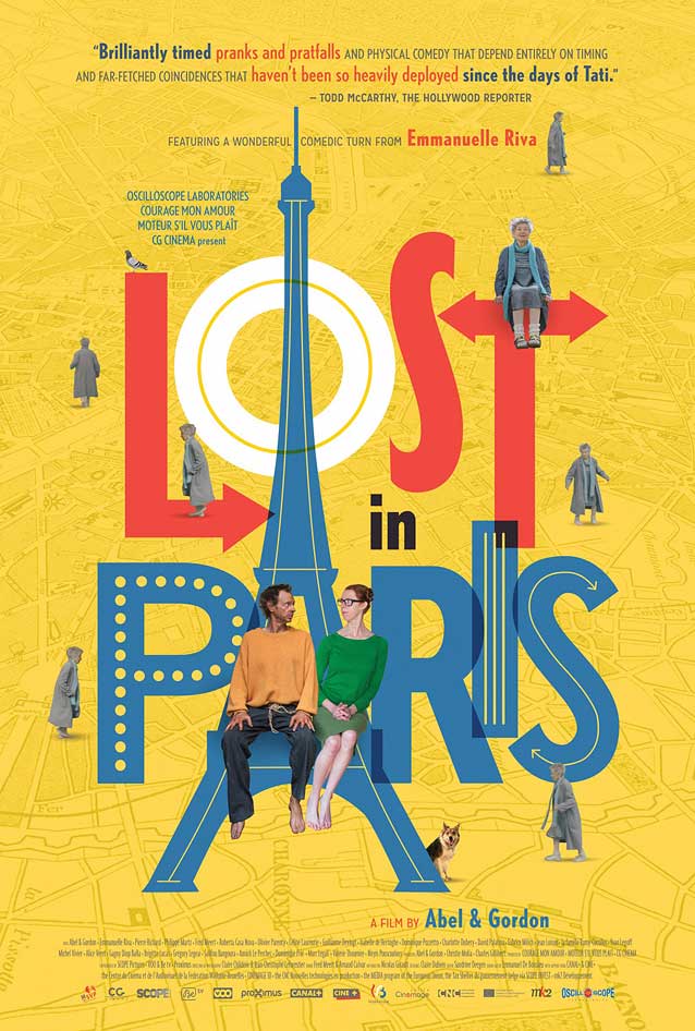
Just as amusing is the collage-style illustrated international poster that places the characters in an ebullient typographic background. The geometric sans is similar to
Nobel
.
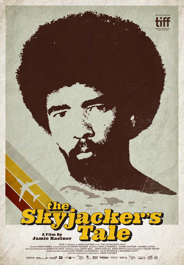
The Skyjacker’s Tale
© 2016 Strand Releasing.
Agency 71
added creases to their stylish, 1970s-style artwork to make it look more authentic.
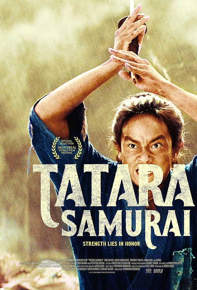
Tatara Samurai
© 2016 Eleven Arts.
Juan Luis Garcia
created an excellent customized movie title, positioning it on top of the main protagonist to enhance the intensity of the scene.
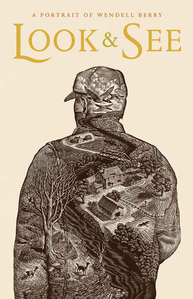
© 2016 Two Birds Film. When customizing a letter (the capital
L
in this case), make sure you respect the weight and contrast of the typeface design—here, Berton Hasebe’s Portrait Text.
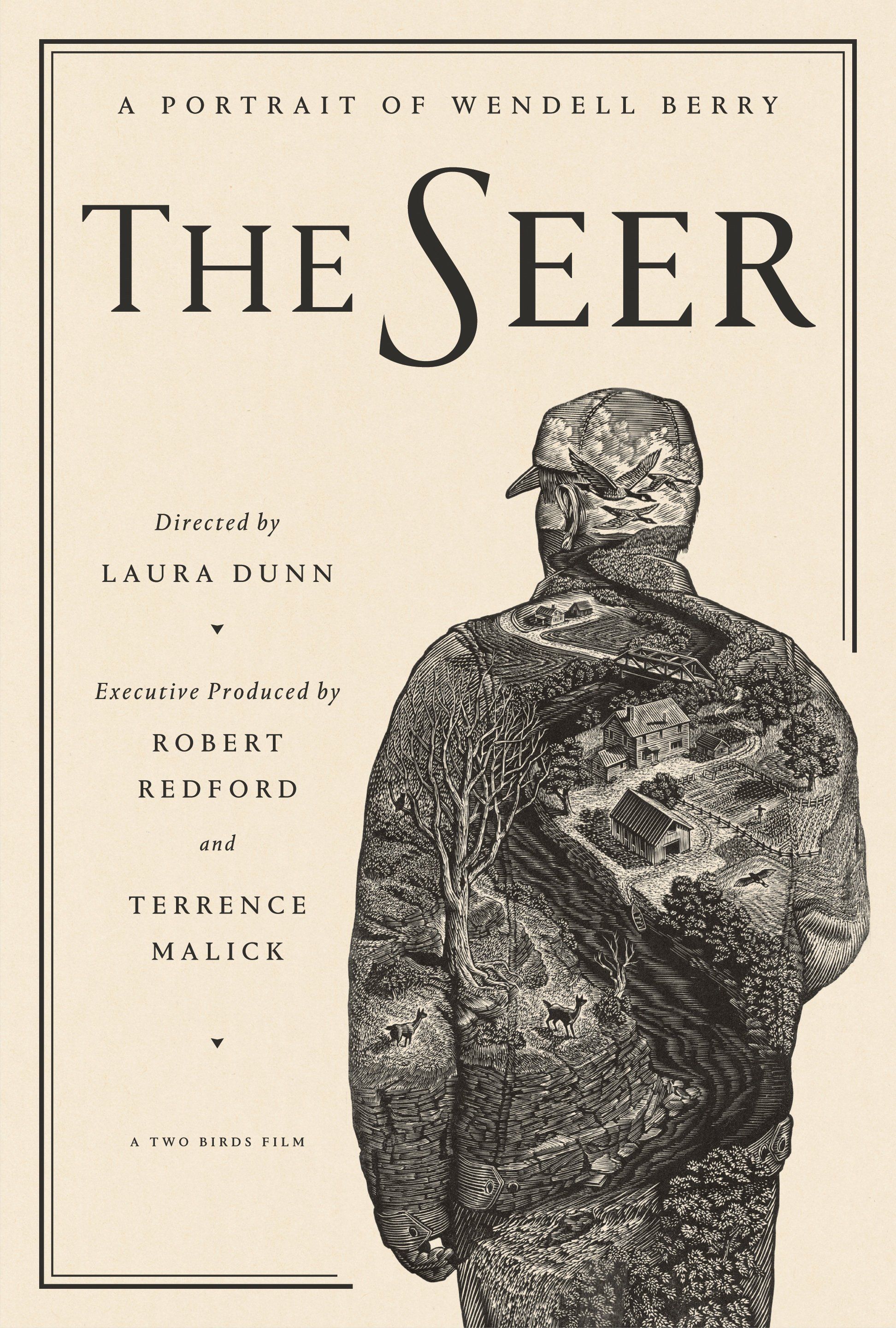
© 2016 Two Birds Film. This design, reminiscent of a book cover, matches the elegant text face and drawing style much better.