ScreenFonts: August 2017
Although it’s sunny and summery outside my studio in Belgium, this episode of ScreenFonts evokes the atmosphere of colder, darker climes. Let’s start with It Comes at Night and move on to 11:55, Kill Switch, The Beguiled, Cars 3, The Book of Henry, Baby Driver, The Bad Batch, and Dawson City: Frozen Time.
It Comes at Night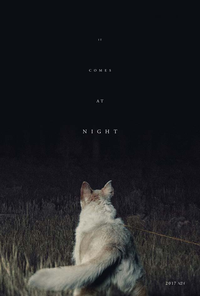
|
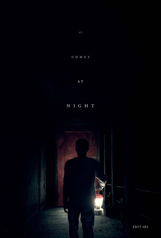
| It Comes at Night takes place as an unnatural terror grips the world. In Trey Edward Shults’ psychological thriller, a desperate young family seeks refuge in a desolate home, thus straining the fragile domestic order of the people who live there. InSync Plus’ intense teaser posters are like a breath of fresh air—I know, an odd metaphor in this context—compared to the many overly dramatic and often convoluted designs that populate the genre. No shock effect punctuated with mangled Trajan—just a quiet yet suffocating sense of impending doom as the family dog stares into the dark unknown, or the man walks toward whatever lies beyond that red door. “Quiet yet suffocating” also describes the typography. The title is broken up into separate words, set as four lines of tracked-out Garamond capitals with generous linespacing. Each consecutive word gradually increases in size from tiny to still-quite-small, implying space and motion. The words appear to inch ominously toward the viewer, building a sense of unease portending that something horrific is bound to happen. This thoughtful typesetting enhances the imagery, resulting in a noteworthy and efficient poster. Speaking of Trajan, Richard Lipton has some surprises up his sleeve for fans of classic Roman capitals. (We’ll have some exciting news for you soon.) And should you tire of the all-too-classic “soft” digitizations of Garamond, Garamond FB offers an interpretation with some bite in Text and Headline optical sizes. |
11:55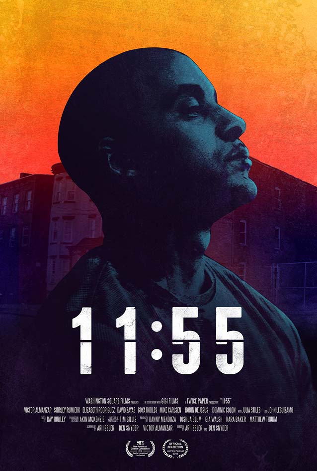
|
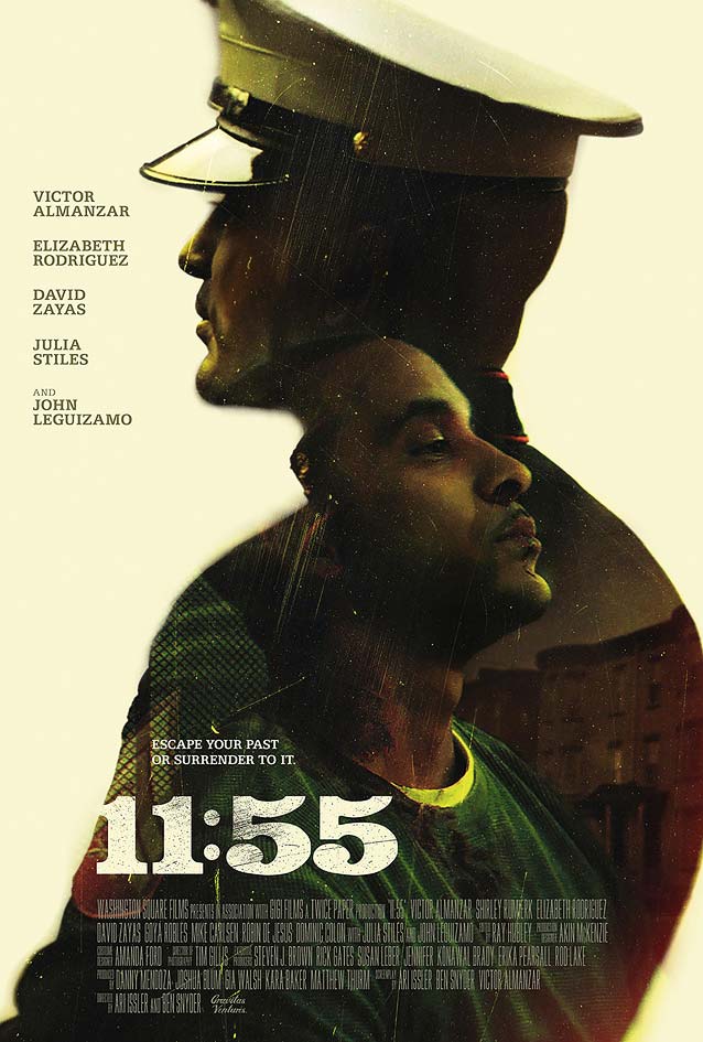
| We remain on the dark side for a little longer with indie crime drama 11:55, the story of a young marine’s attempts to escape his violent past when he returns to the hometown he fled years ago. Comparing the two designs side by side shows how the same photograph can produce two wildly different posters. Hectah Arias, who also designed and animated the title cards for the film, created a very graphic festival poster. Shifting the houses in the background and cutting out the main protagonist forms a triangular composition with him at its center. The otherworldly orange and yellow sky generates a vibrant contrast with the gloomy burgundy, purple, and blue tints. Not only is the artwork eye-catching, it visually translates the central character’s state of mind: his resignation at the inevitability of his situation. Horizontally dividing the knocked-out movie title reinforces this concept, as the halved numbers reference a classic flip-down clock counting down to midnight. The numerals’ shapes recall those of Titling Gothic FB Skyline Medium, but with a rounded finish reminiscent of Garage Gothic. Canyon Design Group’s main theatrical one-sheet takes the concept of an introspective atmosphere quite literally by framing the photo inside the silhouette of the main character in uniform. This creates an intriguing juxtaposition of a divided persona symbolically looking in opposite directions. The palette is much more subdued but no less beautiful, combining delicate pastels with gorgeous saturated greens, reds, and ochers. Beautifully matching the earthen hues, the woodtype-inspired slab serif has a hint of Belizio; consider Mønster or Manicotti as adventurous alternatives. |
Kill Switch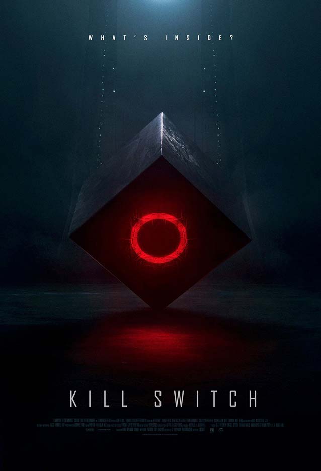
|
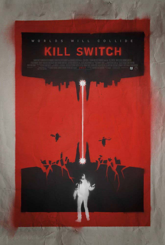
| The shapes of words don’t just convey meaning; they also send subliminal messages evoking moods. Contrary to what I used to believe, the bouba/kiki effect transcends language and cultural boundaries, and taps into our global hive mind. Designers who understand this mechanism purposefully select certain typefaces to suggest particular film genres. This is why Agency FB—seen on the left in Ignition’s teaser for sci-fi thriller Kill Switch—graces the posters of countless action, war, and science-fiction movies. Its squarish letterforms are perceived as forceful, decisive, strong, and futuristic (even though Morris Fuller Benton’s original was designed in 1932). This typeface reinforces the foreboding atmosphere in Dan Forkin’s design, giving it a distinct action/sci-fi flavor. Bank Gothic used to be the typeface of choice for these situations, but the far more versatile Agency has steadily taken over. With five weights ranging from a razor-sharp Thin to a blocky Black in five widths from Compressed to Extended, the family offers twenty-five versatile styles that can efficiently fill canvases of varied dimensions and proportions. Ignition’s other teaser, shown on the right, is rather meta: a spray-painted guerilla poster within the poster. The designer(s) abandoned Agency FB in favor of DIN 1451 Mittelschrift. Different explorations of the technical sans serif model include DINosaur and New Rubrik Edge, while Kade is inspired by industrial letters cut in metal. |
The Beguiled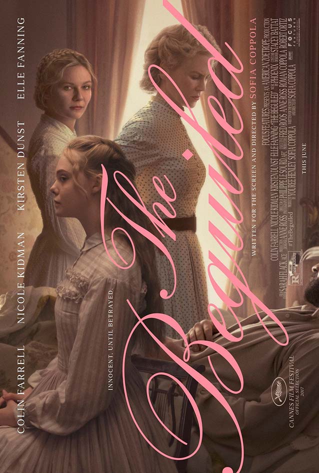
|
Cars 3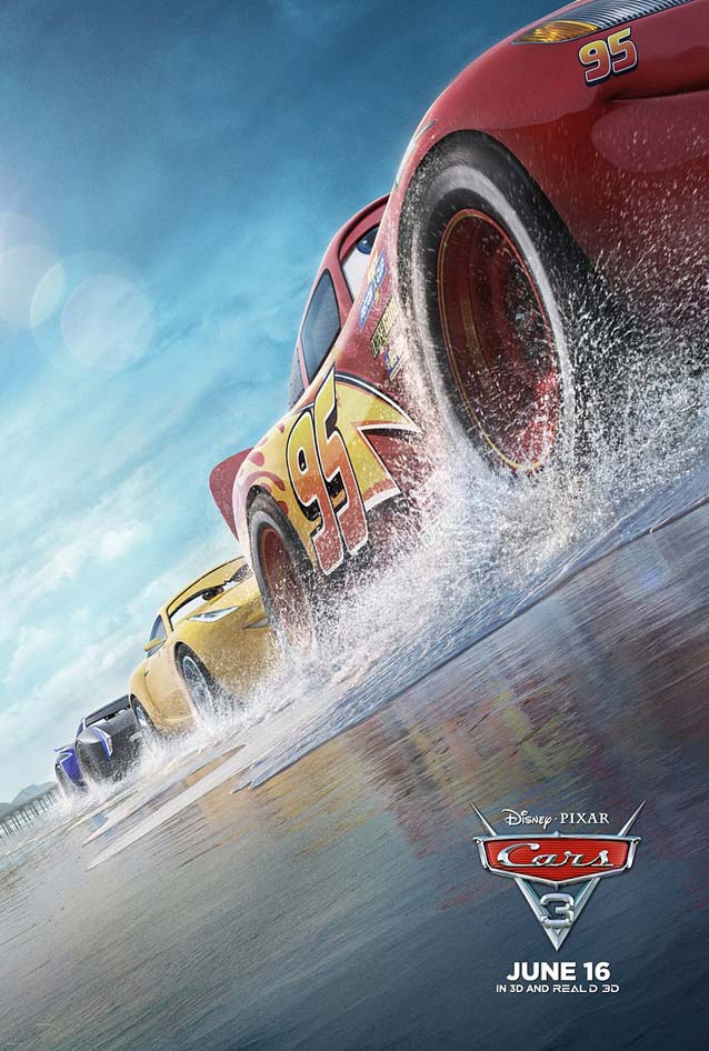
|
The Book of Henry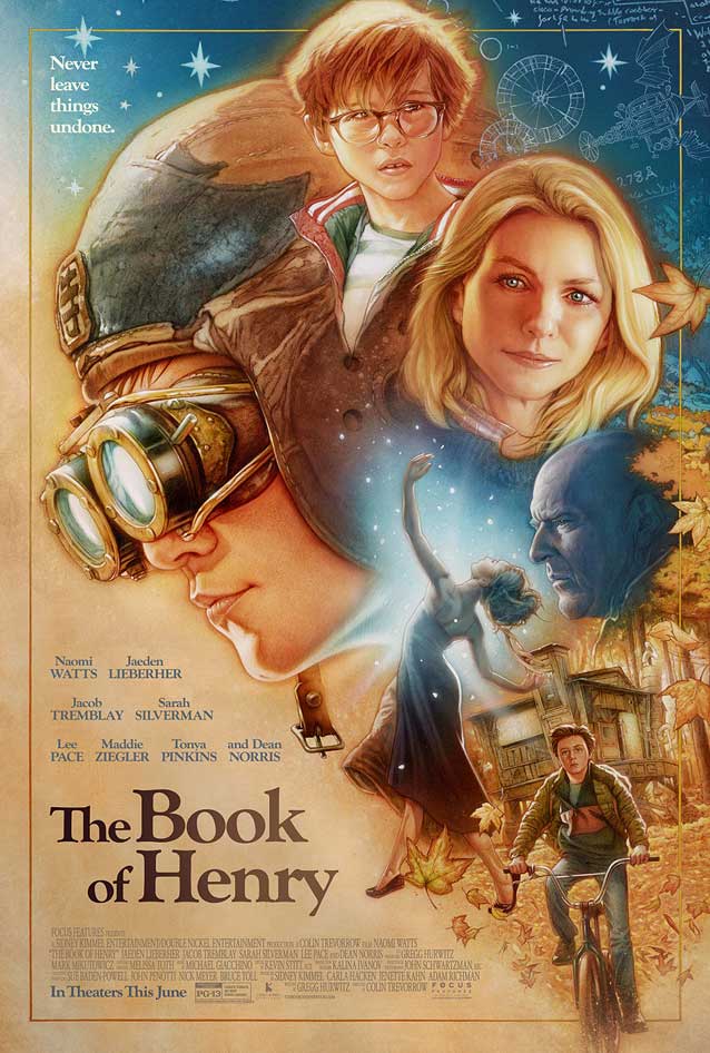
|
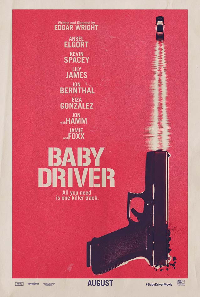
Baby Driver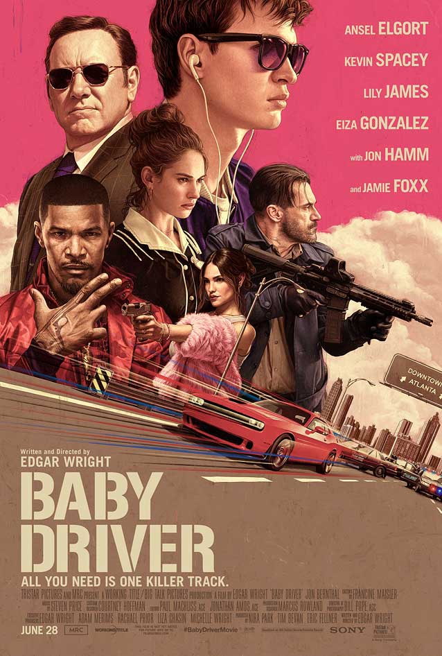
|
| A lucid, well-defined color palette often plays a crucial role in a poster’s success. Similar to the previous poster, BLT Communications’s two illustrated designs for the heist movie Baby Driver rely heavily on cranberry reds, skin tones, and warm greys. This unusual color scheme, a far cry from the prevalent orange and teal combination, keeps the posters from tumbling into nostalgia. On the left, Rory Kurtz’ artwork effectively visualizes the film’s narrative—a young getaway driver is coerced into participating in a doomed heist. The minimal design at right condenses the movie’s concept to a gun with the getaway car speeding from the barrel, an imaginative, evocative solution. I mentioned the resurgence of hand-painted movie artwork in previous episodes; Rory Kurtz is one of two designers discussing How illustrated movie posters are making a comeback. While the color scheme is surprising, the typography is disappointingly old-fashioned and dull. Selecting a modern stencil design like the striking Axia Stencil would have been the icing on the cake. |
The Bad Batch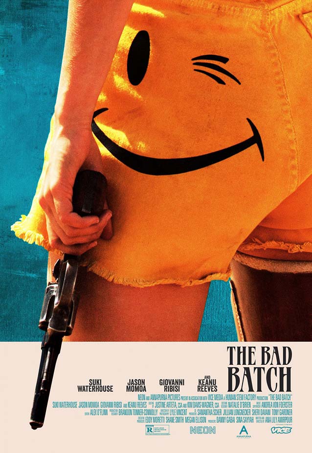
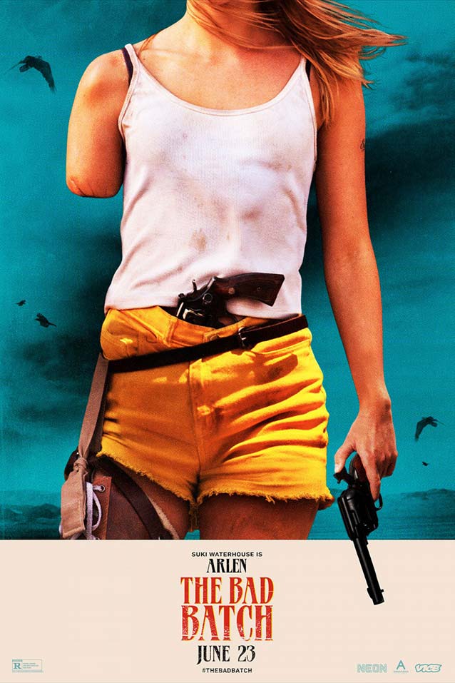
|
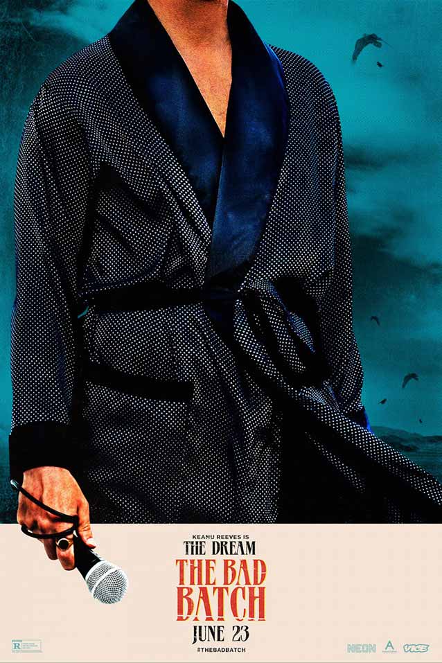
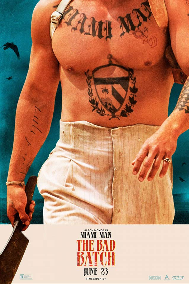
|
| Canyon Design Group’s main theatrical one-sheet and character posters for the screwed-up sci-fi horror romance The Bad Batch, a love story set in a community of cannibals in a future dystopian Texas, take a novel approach. Letting the heads of the actors run off the canvas anonymizes them, which makes it easier for the viewers to identify with their characters. I like how, in each poster, a distinctive prop—gun, microphone, or cleaver—adds dynamism by bleeding into the bottom white area. The movie title is set in an unfortunately poorly digitized version of MGB Patrician, designed in 1980 by Don Munson. The display face is like one of those lesser-known-yet-excellent eighties tunes you had forgotten about. This is how I like retro design: a contemporary interpretation in saturated colors that winks and nudges at the period it references, without devolving into a teary-eyed parody wallowing in nostalgia. |
Dawson City: Frozen Time

|
| Sometimes, though, it feels so good to unabashedly go back in time, especially if it’s to discover a mind-blowing origin story. The documentary Dawson City: Frozen Time pieces together the bizarre true history of a collection of some five hundred films dating from the 1910s to the 1920s, discovered after having been buried for over fifty years in a subarctic swimming pool deep in the Yukon Territory. There are two ways to go about creating artwork for such a film. The left option is very prosaic: a black-and-white documentary photograph of the literal unearthing of the movie reels. The solution on the right is absolutely lovely, a thoughtful and poetic composition using some of the damaged film fragments. The creamy colors somehow emphasize how fragile these relics are, leaving us to wonder how challenging it must have been to try to restore the reels. There’s also something beguiling about trying to piece together the mysterious vintage scene from the brittle, incomplete images: is it a loving moment, a moment of ecstasy, or of sadness, of despair? Nothing is inherently wrong with the distressed sans serif—BadTyp shows us that “bad” letterforms have a certain charm—but the poster on the left reveals sloppy spacing. A responsible designer would have manually kerned the film title to correct this, as they did for the version on the right. The supporting face is Bookman, restored by Mark Simonson to its original glory as Bookmania. |