Type Network Logo
Fonts
Foundries
Designers
Stories
Services
Search Icon
Search
User
Account
Cart Icon
Cart
Menu Icon
ScreenFonts: April 2018 | The Leftovers · Type Network
ScreenFonts: April 2018 | The Leftovers
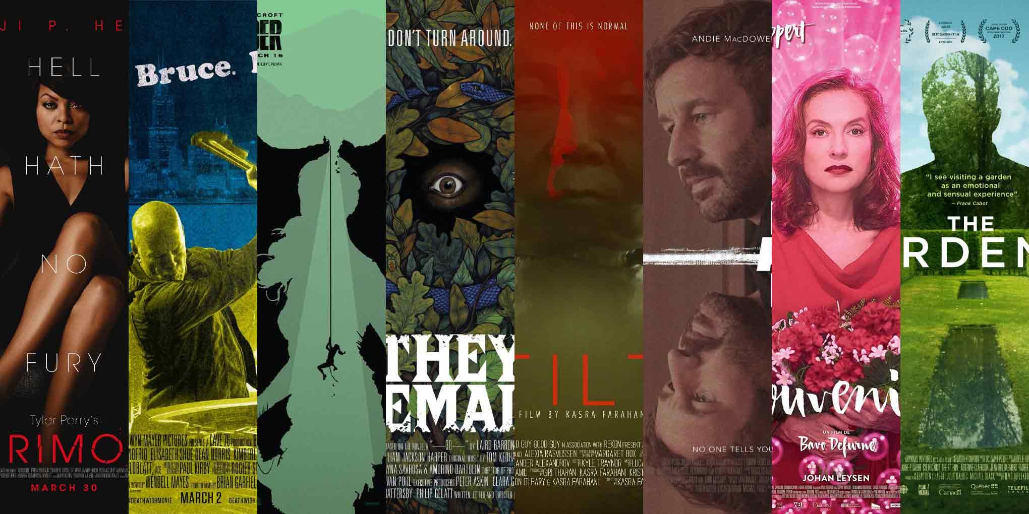
These posters didn’t make the
cut
, but are still noteworthy for their design and/or typography.
By Bald Condensed
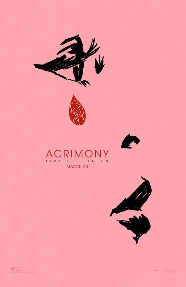
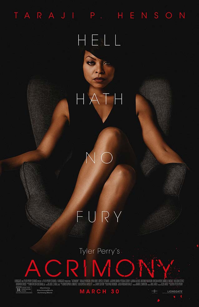
Tyler Perry’s Acrimony
© 2018 Lionsgate. Teasers for Tyler Perry movies come in two flavors—spoofs of (contemporary) classics or artful interpretations. Opting for the latter,
LA
managed to capture Taraji P. Hanson’s profile with a minimum of means.
The progressive disintegration of ITC Avant Garde Gothic in the title of LA’s theatrical one-sheet is a great metaphor for the protagonist’s growing anger and resentment.
Dunbar
and
Arboria
possess the same square proportions, and
Nobel
’s
R
even follows a similar architecture. Choose
Telefon
or
New Atten
for extra crispness.
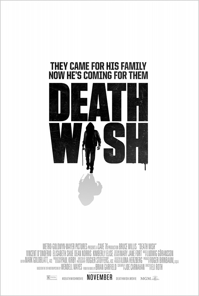
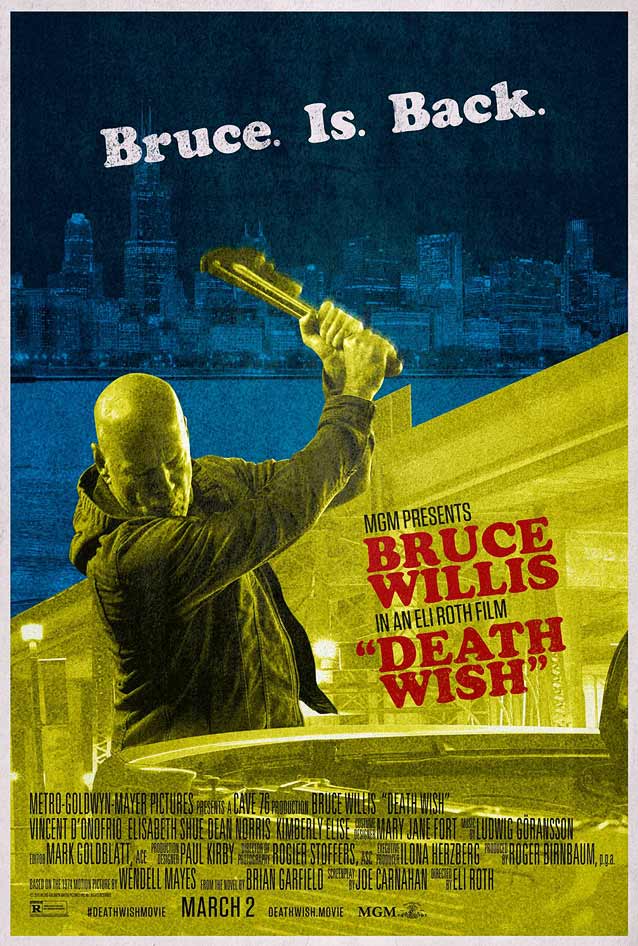
Death Wish
© 2018 Metro-Goldwyn-Mayer (MGM).
Bond
keeps it simple by replacing the
I
in the title with Bruce Willis’ threatening silhouette, in stark black on white. The compact sans serif is a little nondescript; try
Bureau Grot Compressed
,
Titling Gothic Skyline
,
Garage Gothic
, or
Antenna Compressed
for more personality.
This uncredited alternate poster harkens back to the exploitation roots of Charles Bronson’s original orgy of violence. Apart from the gratuitous use of periods, this is a dynamic, attention-grabbing effort with Cooper Black in a starring role. Underware’s
Sauna
, a wonderful contemporary take on the soft-serif genre, would work well here.
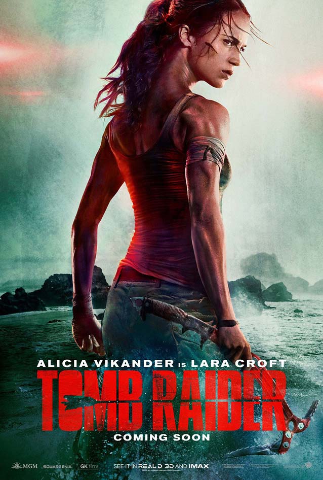
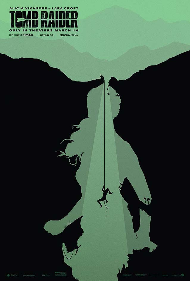
Tomb Raider
© 2018 Warner Bros. I try never to make fun of anyone, but the
viral spread
of Lara Croft’s reptilian neck makes mocking this botched Photoshop job unavoidable.
There is a clear conceptual resemblance between the negative shape delineating Lara Croft’s silhouette here and the alternate poster for
Justice League
I discussed
last December
.
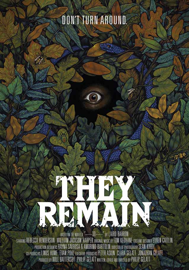
They Remain
© 2018 Paladin. In an unusual turn for a thriller, this theatrical one-sheet looks like an illustration for a children’s book. A scary children’s book, that is, with wide-eyed fear staring straight at the viewer, and an ouroboros hidden among the leaves crawling with creepy critters. The display face with triangular serifs recalls horror-book covers from the eighties. When it comes to triangular serifs, few look as sharp (literally and figuratively) as
Damien
’s.
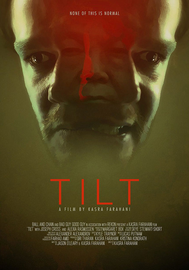
Tilt
© 2017 The Orchard. The main protagonist’s increasingly erratic behavior in the wake of his wife’s pregnancy takes the form of a bifurcated portrait, out of which a threatening face emerges. Good luck identifying a typeface from three of the most non-distinct capitals (
T
,
I
, and
L
) of the Latin alphabet.
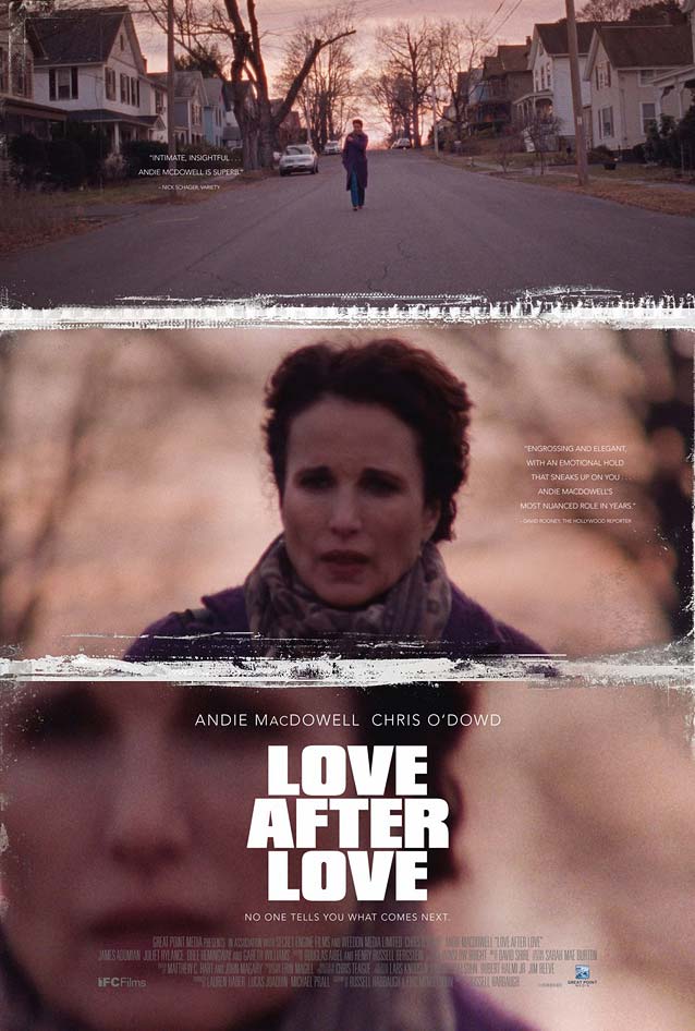
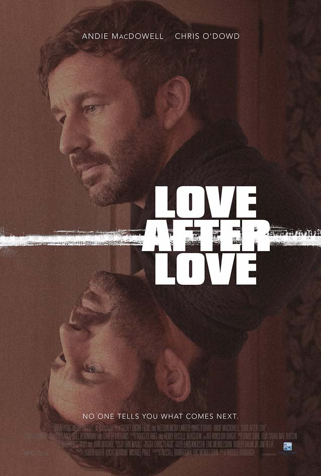
Love After Love
© 2017 IFC Films. InSync Plus adopts a surprisingly lo-fi strategy for
Love After Love
with visible image grain. The noisy white lines symbolize the fractures created in the lives of the mother and her two sons by the father’s passing.
The mirrored image is a metaphor for the “before” and “after,” further emphasized by the movie’s tagline. The squareness of the letters reminds me of
Truth
, a somewhat unsung design by
David Berlow
.
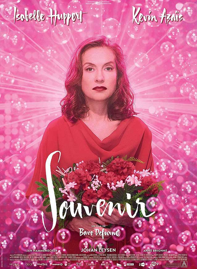
Souvenir
© 2016 Strand Releasing. I was immediately smitten by this colorful, almost rococo poster, a nod to the Eurovision Song Contest’s pomp and kitsch. The high-contrast brush script beautifully complements the bubbly pink extravaganza.
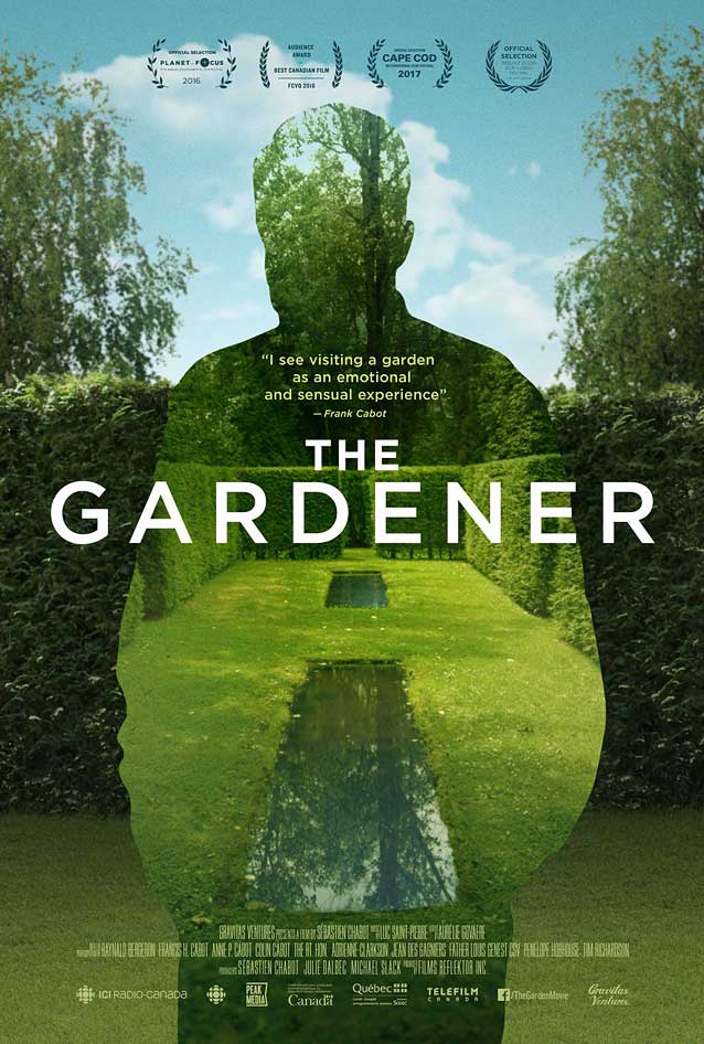
The Gardener
© 2016 Gravitas Ventures. What better way to depict the late Frank Cabot, creator of
Les Quatre Vents
, a magnificent twenty-acre private garden in the Charlevoix region near Quebec City, than to turn his silhouette into a window onto this celebrated landscape?
Proxima Nova
, one of the most widely used webfonts, would be the perfect alternative for the architectural capitals used here.