ScreenFonts: April 2018
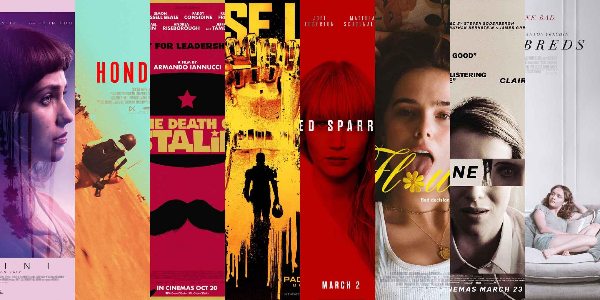
This episode features posters for Gemini, Hondros, Pacific Rim: Uprising, The Death of Stalin, Red Sparrow, Flower, Thoroughbreds, and Unsane, with some interesting interactions between the characters (the type) and the characters (the people.)
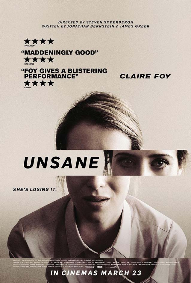
This month, the latter half of the posters in my selection feature type that interacts with the scene portrayed, either as a physical object or a virtual presence. This strategy, when it doesn’t feel forced and is well executed, injects wit into a design, elevating the artwork to a higher level.
Me, I am anything but unsane. Of course, that is precisely what any crazy person would say, so there are no guarantees. Next, follow me at your own risk on my trip through The Leftovers, then come back in a few weeks for the next ScreenFonts installment—if you dare.
Bald Condensed, né Yves Peters, is a Belgian-based rock drummer known for his astute observations on the impact of letterforms in the contemporary culture-sphere. A prolific writer on typography, he has a singular knack for identifying the most obscure typefaces known to humankind.
Gemini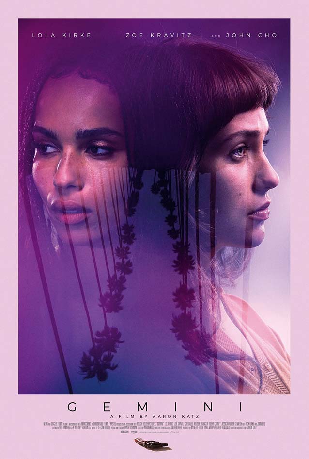
|
Hondros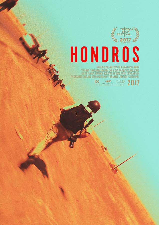
|
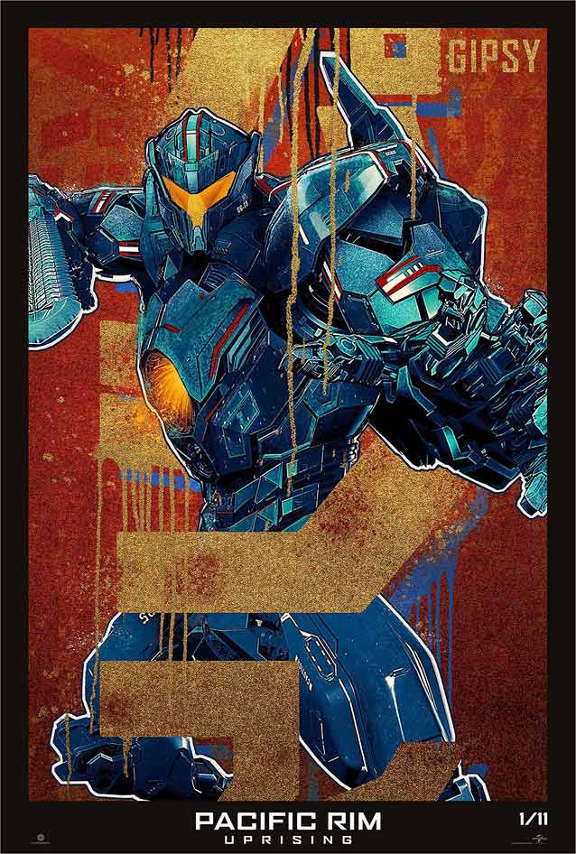
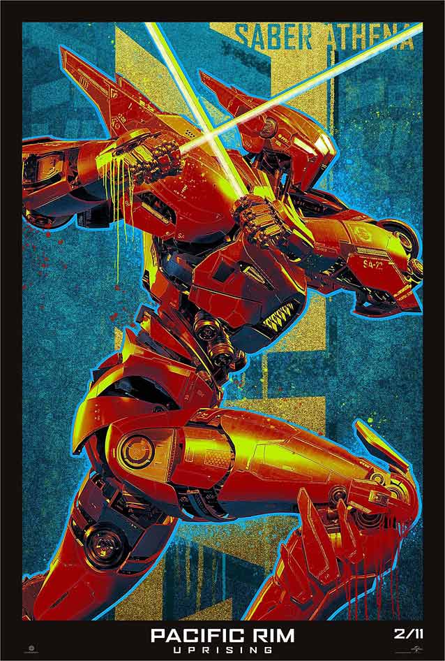
Pacific Rim: Uprising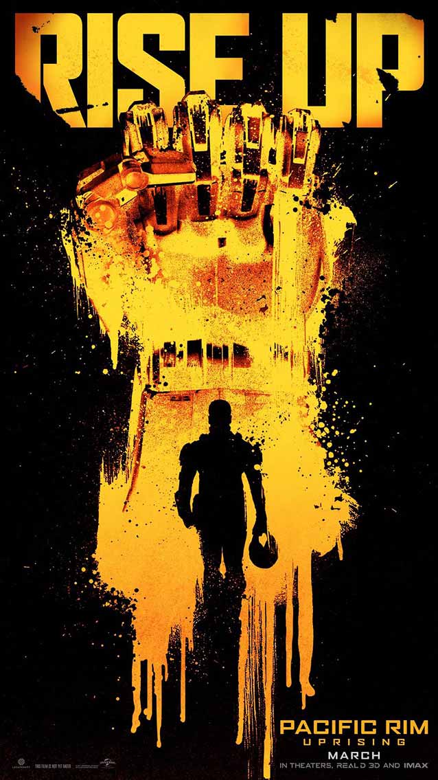
|
|
| Pacific Rim: Uprising’s expansive collection of marketing collateral (just shy of eighty visuals on GoldPoster) includes a series of stylish character posters merging metallic precision with grainy textures and organic paint streaks. |
The Death of Stalin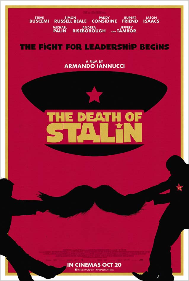
|
Red Sparrow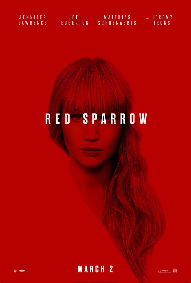
|
Flower
|
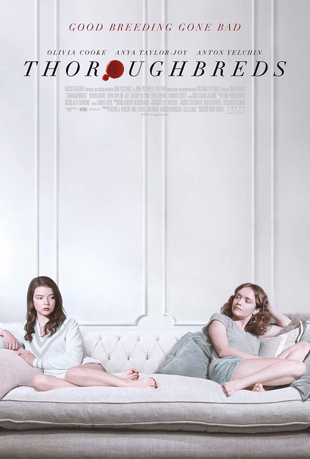
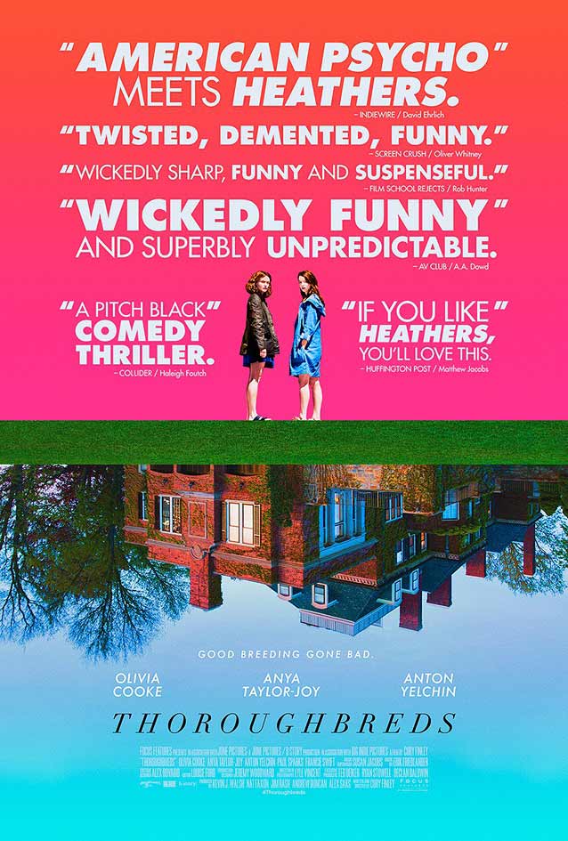
Thoroughbreds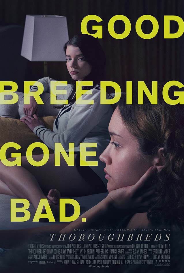
|
|
|
Unsane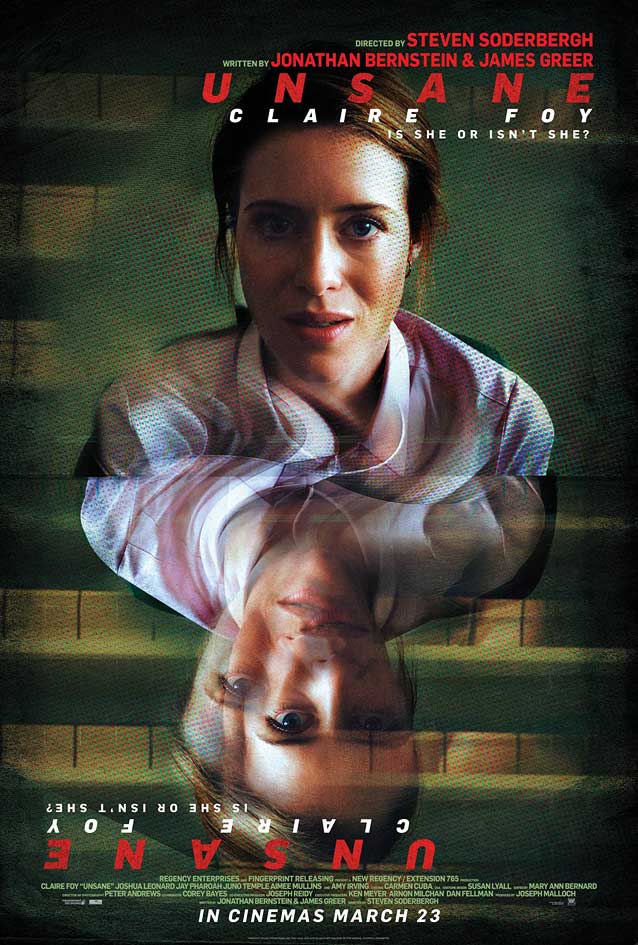
|
|