Matthew Carter’s Roster takes the visual tension of square corners in round shapes and makes this square-circle tension its underlying structure.
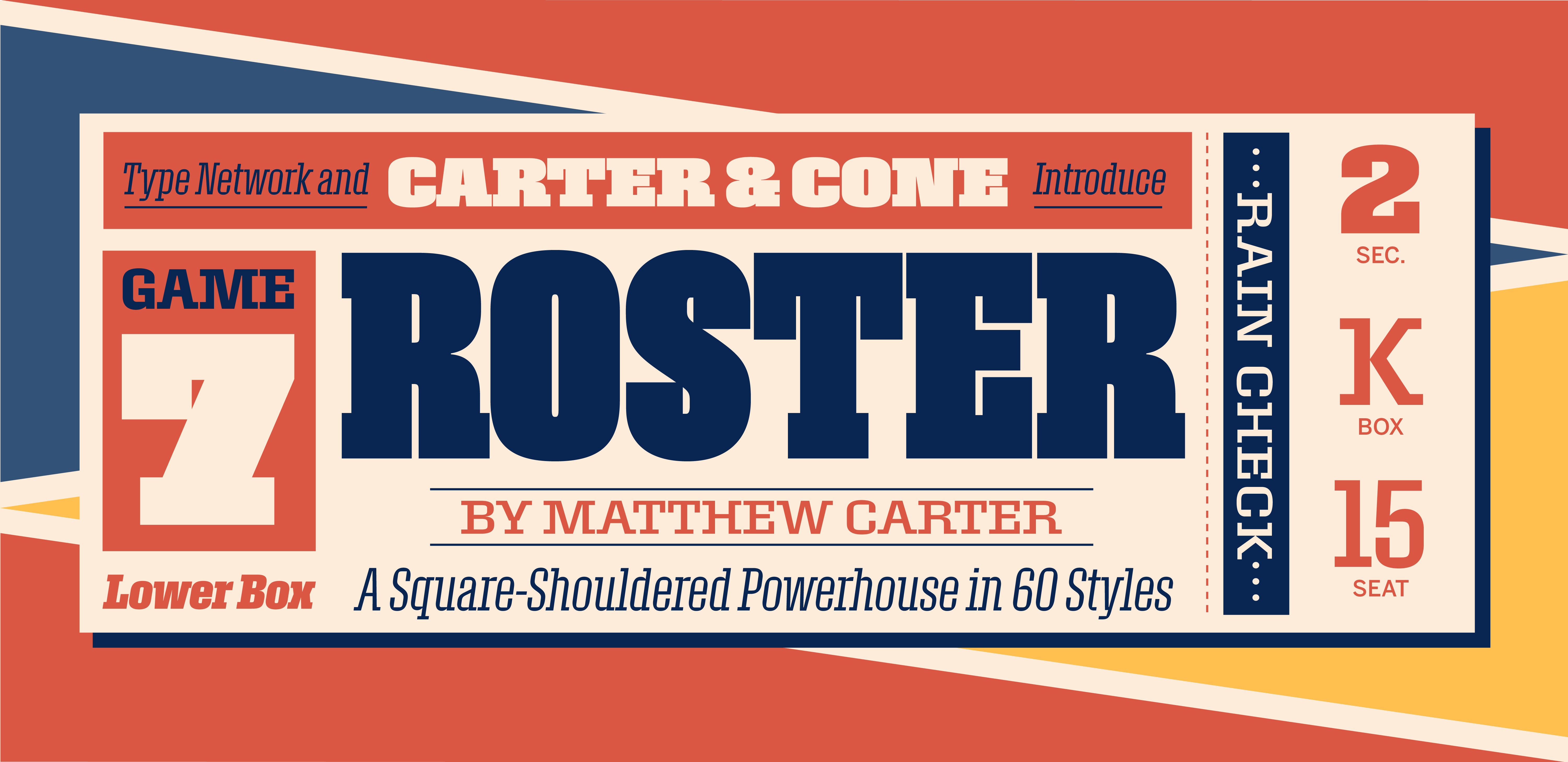
The visual tension of square corners in round shapes has long intrigued artists and designers. It’s been used in typefaces, but usually very subtly. Roster makes this square-circle tension its underlying structure. The result is a dramatic slab-serif display family, one that seems very fresh and contemporary, but also has just a hint of old-time sports lettering.
Roster’s outer shapes are large, curved rectangles. Its inner shapes have the chisel-cut clarity of counters carved out of the surrounding letter forms. The effect is both eye-catching and solid.
Matthew Carter designed Roster in the 1990s, and it was adopted as a display face for
Sports Illustrated under the name Wrigley. Jesse Ragan was instrumental in later expanding the family from its original seven styles to the current 60.
“Miller and Wrigley are two examples of faces that began speculatively but found good clients and generated good business,” said Carter in a 2011 interview, after he was awarded a MacArthur grant for his work.
Steve Hoffman, who had commissioned the typeface for Sports Illustrated, was responsible for the name “Wrigley.”
“In the early 1990s, I asked Matthew Carter to design two typefaces for Sports Illustrated. One, a slab serif headline font, was intended to express the bold graphics of American sports, and the other, an elegant serif, to modernize SI’s long literary tradition of great writing. When we were close to the point of presentation to the editors of the new fonts, I suggested the names Wrigley and Fenway. I detected a somewhat puzzled expression on Matthew’s English face. I explained that these were the names of two of America’s oldest and most beloved baseball venues, and it would be a delight for Sports Illustrated’s editors to have their new typefaces named for theses venerable ballparks.
“Like all great type designers, Matthew understood that selling a client a typeface with the right name was a sound idea. Although both faces were superb, it would not be an overstatement that to say that the names Wrigley and Fenway were what was so resonant with the editors that both were grand slams. Another new term for Matthew.”

Now Carter & Cone and Font Bureau are releasing an expanded family of this typeface. The name was changed since the design had nothing to do with Wrigley Field, the Chicago Cubs, or the famous chewing gum.
Roster’s Black weight is noticeably denser and blacker than the next-heaviest weight. Black is suitable for a short, all-caps headline like “WAR!” or “GOAL!” The other weights scale gracefully down from Bold to the slenderly distinctive Extra Light, which looks skeletal yet elegant. (If Bold and Black imply rugged, big-shouldered football players, Extra Light suggests a whippet-thin long-distance runner.)
Roster comprises 60 styles—6 weights (Extra Light, Light, Regular, Semibold, Bold, and Black) in 5 widths (Expanded, Normal, Narrow, Condensed, and Compressed), all with Italics.
The character set is Font Bureau’s Extended Latin. OpenType layout features include case-sensitive punctuation, basic fractions, and standard ligatures, along with special ligatures for certain combinations in the Bold and Black weights.
Roster is a typeface intended for display: the very smallest size for it that Carter recommends is 30pt (“although the very heavy and compressed styles may need to be bigger”). It flexes its muscles best at truly large size.