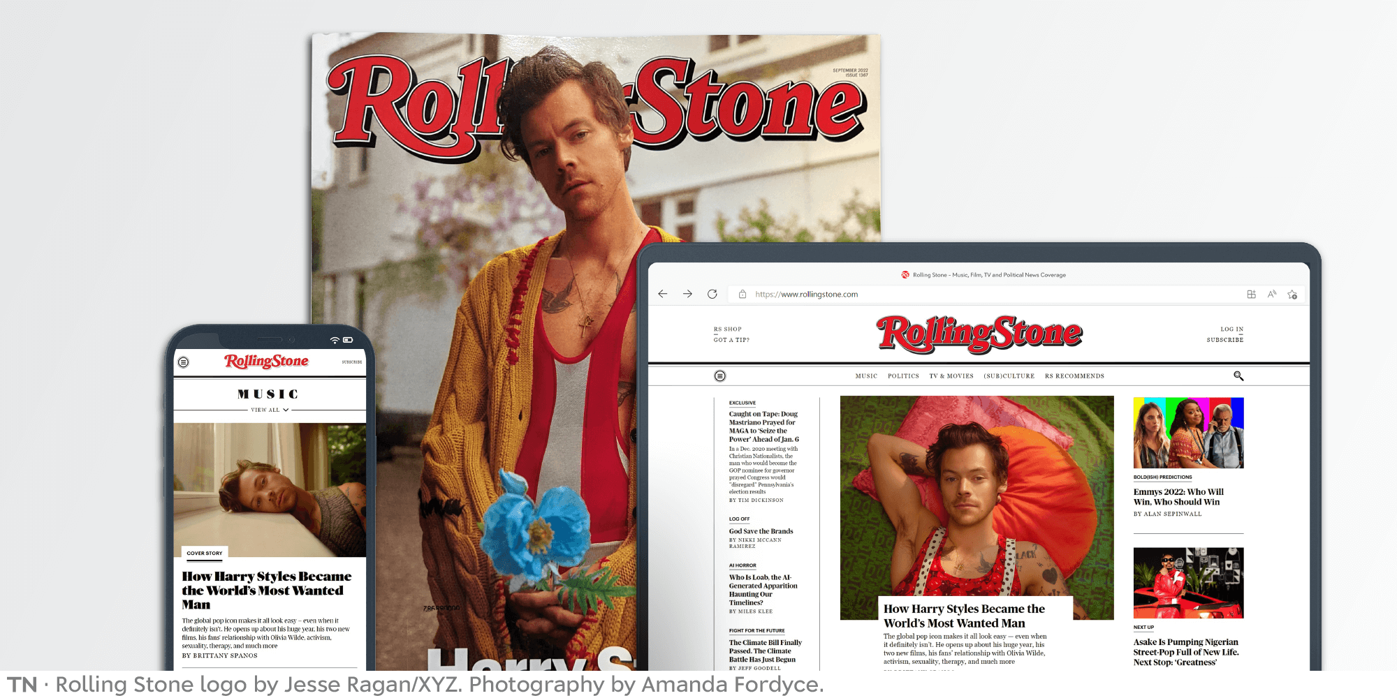
Redesigning an icon: How Rolling Stone got its new logo
In 1967, a rock ’n’ roll dreamer in San Francisco sought to press his passion for music onto the page. Jann Wenner borrowed from friends and family to publish the first issue of Rolling Stone. Today, Rolling Stone is at the pinnacle of music and culture, and a newly designed logo recalls its history.
Earlier this year, Rolling Stone decided to redesign its logo as part of an overall refresh. They wanted to blend a more contemporary design for their digital presence while honoring their print traditions. Joe Hutchinson, now in his 15th year as Rolling Stone’s design guru, came to Type Network with the project, knowing our foundry partners were perfectly suited to the challenge.
First, some history.

The 1967 logo, sketched by Rick Griffin.
The first Rolling Stone logo was a sketch by Rick Griffin, the psychedelic poster and underground comic artist whose work was plastered around San Francisco in the 1960s. A lively art nouveau design, like much of the lettering of the period, it was printed without ever going to final! Griffins’s features—like engraved shading, outlines, inner shading, and drop shadows—paved the way for its predecessors.

The 1975 logo, designed by John Pistilli (as digitized by Jon Valk).
Rolling Stone quickly gained traction and respect two-weeks at a time. With an editorial lineup that was right-on (rock and roll plus anti-war politics), and a set of writers that included Hunter Thompson, Cameron Crowe, Tom Wolfe, Jan Morris, Joe Eszterhas, and Ben Fong-Torres, began to sell hundreds of thousands of magazines every issue. With the scale came advertising, and more resources. To mark this growth in 1975, art director Tony Lane commissioned a cleaner logo. He chose lettering artist John Pistilli, the co-designer of the typeface Pistilli Roman. Pistilli elevated the original logo while keeping the trademark features of the original.

The 1977 logo, designed by Jim Parkinson.
In 1977, Lane’s successor, our own Roger Black, introduced a new design for the magazine with a custom type family by Jim Parkinson, which was later digitized as Parkinson. A new logo, matching the typeface, was drawn by Parkinson as well. He incorporated the outline and engraved shadow of number two, but rethought the rest. It was a big change; Black admits now, perhaps too big a change. But it seems right for the stature of the magazine, now long past the Summer of Love. This logo first appeared on the iconic tenth anniversary edition, filled with photographs by staffer Annie Leibovitz.*
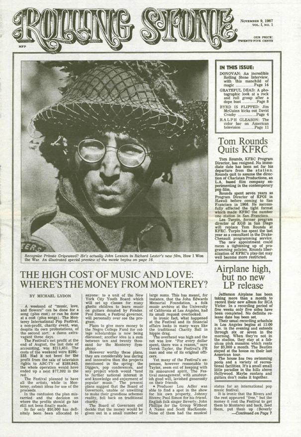
The first issue of Rolling Stone featured John Lennon and the oxford rule which came to define the magazine.

The 1981 logo, designed by Jim Parkinson.
Only four years later, Wenner decided they had gone too far, and got Parkinson to revisit the logo. Working with the design and Wenner’s own markup, he stretched out the tail of the R and revived the inline of the original.
And so it was for the next 30-or-so years, establishing itself as the mental image for Rolling Stone.

The 2018 logo, designed by Jim Parkinson.
Inexorable change absorbed the media world. The web and mobile apps took over publishing, or at least most of the ads. Jann Wenner decided to sell the magazine in 2019, and, eventually, to retire.The new owner, Penske Media Corporation (PMC), rolled up a number of big entertainment trade publications: Billboard, Variety, and Hollywood Reporter. Jay Penske, the chairman, had successfully pushed each title into the digital arena. He had quick success, and Rolling Stone focused on the digital market.
“Of course,” Hutchinson says, “We wanted the logo to work better on the apps and the website.”Penske also wanted to keep intact the legacy of Rolling Stone, including its design. To make sure that happened he hired Gus Wenner, Jann’s son, to be Chief Operating Officer, later making him the CEO. So, in 2018, Joe went back to Parksinson, for the next evolution of the logo. The two went through dozens of iterations before landing on the most prominent design shift yet: Flat, with only a few swashes, and no filigree. But still Rolling Stone.
However, after working for a few years with the flat logo, the team decided on another shift. Hutchinson wanted digital immediacy, but a bit more of the tradition.
A phone call to Roger Black started the conversation. Hutchinson and Black had been friends since the 1990s, when Hutchinson was an art director at the Baltimore Sun, which Black redesigned. In the early 2000s they worked together on new typography for The Los Angeles Times. And they’ve kept in touch, including a reunion of all the surviving art directors of Rolling Stone at an SPD conference in 2018–sponsored by PMC.
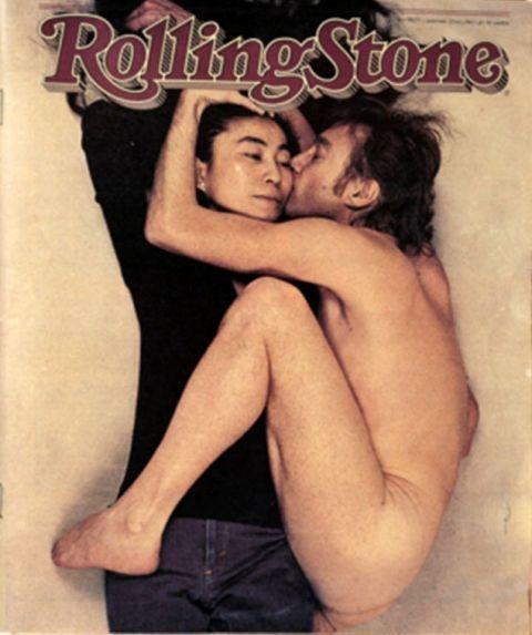
The first cover with this new logo became the most famous Rolling Stone cover of all time, showing John Lennon and Yoko Ono in naked embrace. It would be the last portrait taken of Lennon.

Ben Kiel and Jesse Ragan make useful, quietly offbeat fonts at their independent digital foundry, XYZ Type, which operates in the interwebs between St. Louis and New York.
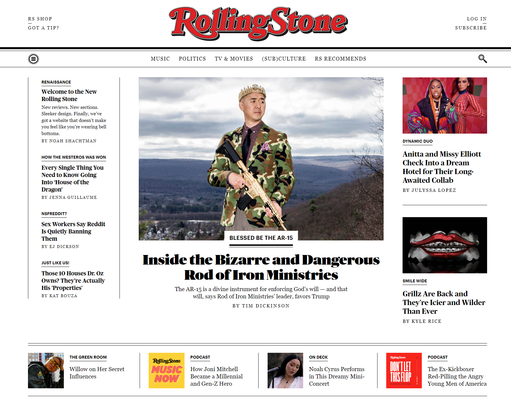
Rolling Stone was ready to rethink the logo again, but Parkinson, too, had retired. Black suggested that after working out the brief, the schedule, and the budget, Type Network could field four foundry partners who had the historical knowledge, technical expertise, and artistic creativity suited to Rolling Stone. Each did a presentation, and Hutchinson decided to work with Jesse Ragan from XYZ Type. Given Ragan’s experience rebranding historical entities (such as Carnegie Hall, a short walk from Rolling Stone’s office), Hutchinson knew he was the perfect fit.
As an exercise, Ragan asked himself, “How many things can we change about this iconic logo before it's not the Rolling Stone logo anymore?” The biggest technical challenges—and branding opportunities—came from the demand for a logo that could play nicely across all digital, print, and social media environments. Trying optical size adjustments, accounting for reverse contrast and various pixel densities, and more, Ragan produced a pile of variations.
Working with a type designer to produce a logomark is a dream experience as a creative director. Jesse Ragan has all the design skills and creativity one might expect from a talented identity designer, plus a treasure trove of technical knowledge and typographic experience to make the logo actually work. We wanted the logo to be perfectly readable and recognizable at all sizes: That’s why we worked with a type designer.
— Joe Hutchinson, creative director, Rolling Stone
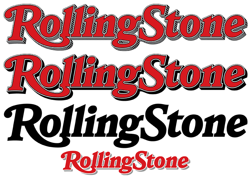
The result is a harmonious new design that recalls the previous logos, with more options to fit the context . . . and the size.
“While great attention was paid to the legacy and the impact of the visual brand, don’t miss the upbeat grace that Jesse has brought to the logo,” says Black. “The letterforms are refined and elegant, but have a sense of fun, a bit of rock and roll.”
Ragan delivered not one, but several final logos, including a primary version for the magazine’s cover, a small version to be used at small sizes on the website and occasionally in print, a simplified ‘RS’ mark, and more. To accompany these files, Type Network wrote a short style sheet, showing uses for each variation.
The logo is on the website now. The September issue will carry the new logo.
—Abigayle White
For more information about the logo design process, read this case study by XYZ Type.
*The first-person history is told by Jann Wenner in Like a Rolling Stone: A Memoir, to be published Sept. 13. The book was designed by Roger Black, with lettering on the jacket by Rodrigo Saiani, head of Plau, a TN partner foundry. But that’s another story.
If your company wants to revitalize its logo across every medium—print, digital, and beyond—work with experts. Type Network can handle project management, typographic applications and the delivery of tested digital files. And, most importantly, we can offer the best talent. Contact us to start the conversation.
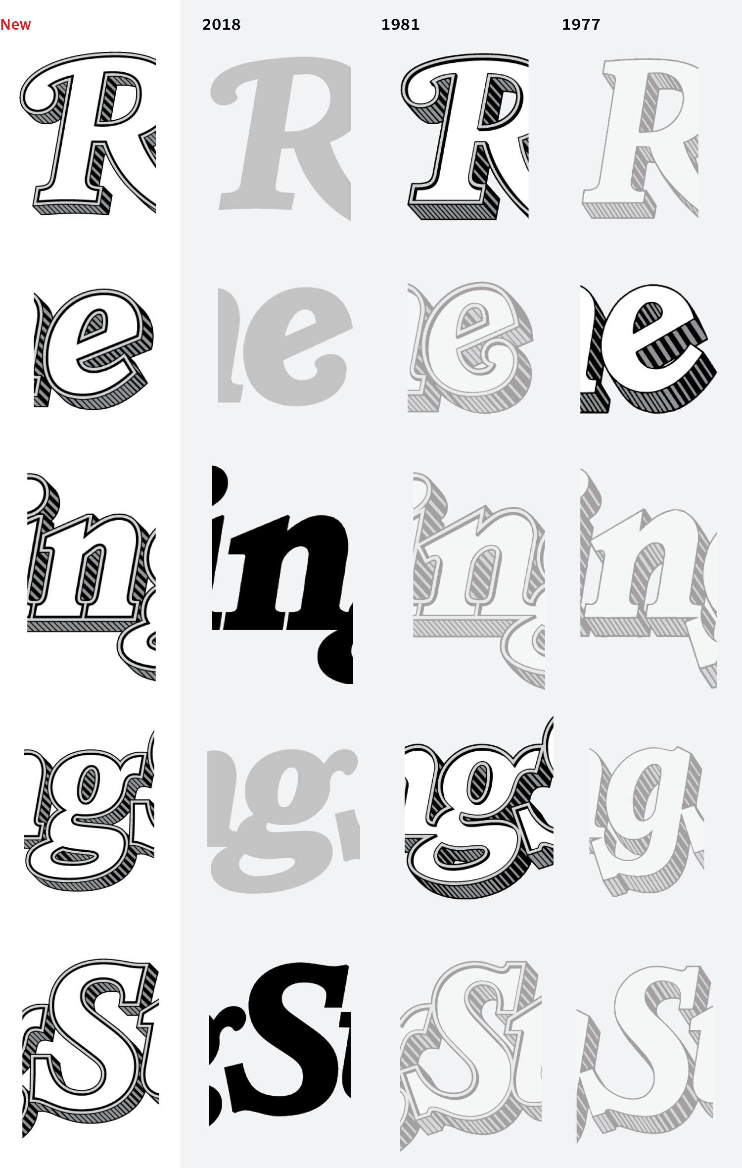
Comparing new letterforms to previous iterations shows the delicate mix-and-match Ragan accomplished, combining elements of old logos to make something cohesive.