Richard Lipton and Mindy Seu
In their conversation, Richard Lipton (Lipton Letter Design) and Mindy Seu (Cyberfeminism Index) connect over their collaborative approaches to teaching, Seu’s appreciation for low-fidelity designs, and how Lipton’s unofficial sign-painting apprenticeship imbues his type designs with warmth.
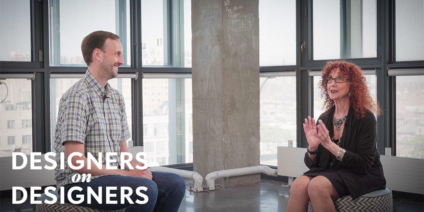
Next up in our Designers on Designers series, Type Network’s foundry partner Richard Lipton speaks with designer Mindy Seu about teaching type design and typography, the balance between perfection and authenticity, the cyclical nature of style, and more.
The more type I’ve done—digital type—the less calligraphy I’ve done. There’s been a tradeoff in making letters by hand to the digital process, which in a way removes you from the warmth and humanity of it. You have to build that back into digital type, and that’s a challenge for type designers.
—Richard Lipton on the evolution of his design practice.
The first class is spent with a calligraphy workshop. I want my students to understand the nature and origin of Latin letterforms. The best way to do that is with a broad-edged pen.
—Richard Lipton on his students’ first lesson: calligraphy.
When you’re approaching technical material, people come into the class with a certain fear or intimidation, because they have a preconceived notion of what that [technology] does. When I’m teaching a coding class, people say ‘I don’t know how to code,’ but they’ve never coded before. When you teach them the scaffolding and how playful it can be—how we actually expect things to break, and maybe if they’re not breaking, then you’re not taking enough risks—then that removes the fear. We’re not seeking perfection.
—Mindy Seu on how to overcome students’ doubt and fear about learning new technical skills.
Most of the text typefaces that my students design are really very legible, and some are aesthetically pleasing. I always enjoy seeing shapes I’ve never seen before. At some point, as a type designer for 45 years, you feel like ‘I’ve seen everything. I’ve seen every approach.’ But I love to be surprised. I love teaching because I’m always surprised.
—Richard Lipton on his students’ work and what he enjoys most about teaching type design.
The tech we have access to now is faster and lighter. It allows you to make things that have a little more high-gloss than things made 30-years ago, understandably. That said, I do think there’s a resurgence of this ‘old web’ aesthetic now. Even my personal website is just the very basic HTML and CSS.
—Mindy Seu on the authenticity of today’s smooth, crisp visuals and the return of crude designs.
Visit the Cyberfeminsim Index.
Filmed at The Cooper Union during Typographics 2022.
August 2, 2022
In their conversation, Jesse Ragan (XYZ Type) and Carol Wahler (Type Directors Club) speak about how they each got into type, where the name for Ragan and Ben Kiel's foundry comes from, the importance of community within the type world, and more.
Designers on Designers
Get a window into the personalities and processes behind some of the typefaces and designs you love. Subscribe to the TN YouTube channel see each new video.

Calligrapher Richard Lipton develops original typefaces as well as custom fonts for international clients.