An architectural brand for Rice Architecture
In 2010, the Rice University School of Architecture wanted to breathe new life into its brand. TN partner Kontour was perfectly situated to the task: Within a short timeframe the award-winning creative studio delivered a new logo, typographic palette, and color palette tailor-made to Rice’s needs. The project not only refreshed Rice Architecture’s identity but also spawned the successful Kontour typeface Axia.
Founded in 1912, Rice Architecture boasts a student-to-faculty ratio of 5-1, and as the smallest professional degree program at a top research university, the school has much to be proud of. Unfortunately, their brand wasn’t helping tell that story.
Enter Sibylle Hagmann of Kontour, a creative studio with a focus on type. After studying at the Basel School of Design in Switzerland, Hagmann made her way stateside, where she completed her MFA at CalArts before moving to Houston, Texas.
A powerful import of European design, Hagmann was the ideal partner for the small School of Architecture’s refined sensibilities. “The scope of work for this project included a visual identity system: a logotype and letter mark (RSA initial applied on book spines), the subsidiary typographic palette, and color palette,” writes Hagmann.
Service: Typeface development
Partners: Kontour
Date: 2010
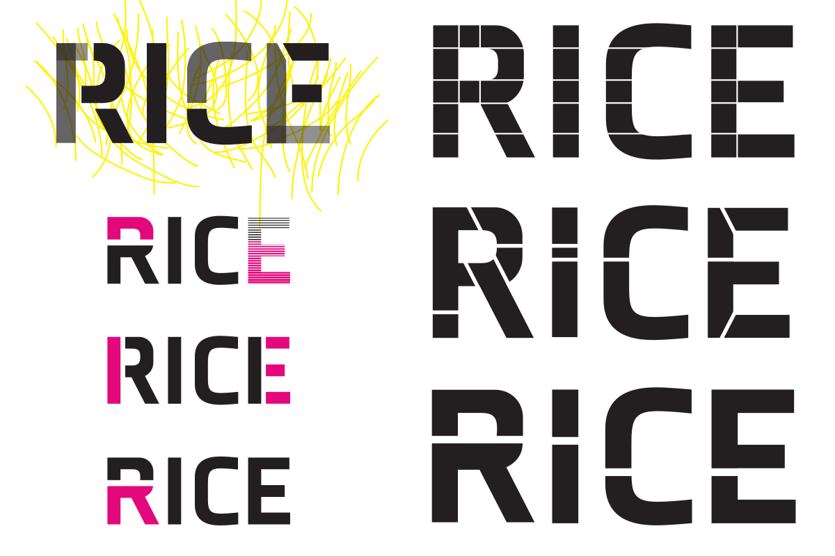
Various sketches throughout the logo-design process all kept two things in common: stencil-style and the same basic type outlines.
More than just a type foundry, Kontour specializes in robust design projects with a typographic lean. For inspiration, she looked to the school itself:
This had to work for a dynamic school of architecture. Flexibility of the identity was one of my main concerns. Some of the process sketches show the suggestion of varying background forms in tandem with type — a direction the client was less inclined to pursue. Inspiration was mostly drawn from the topic of architecture itself.
—Sibylle Hagmann, Kontour
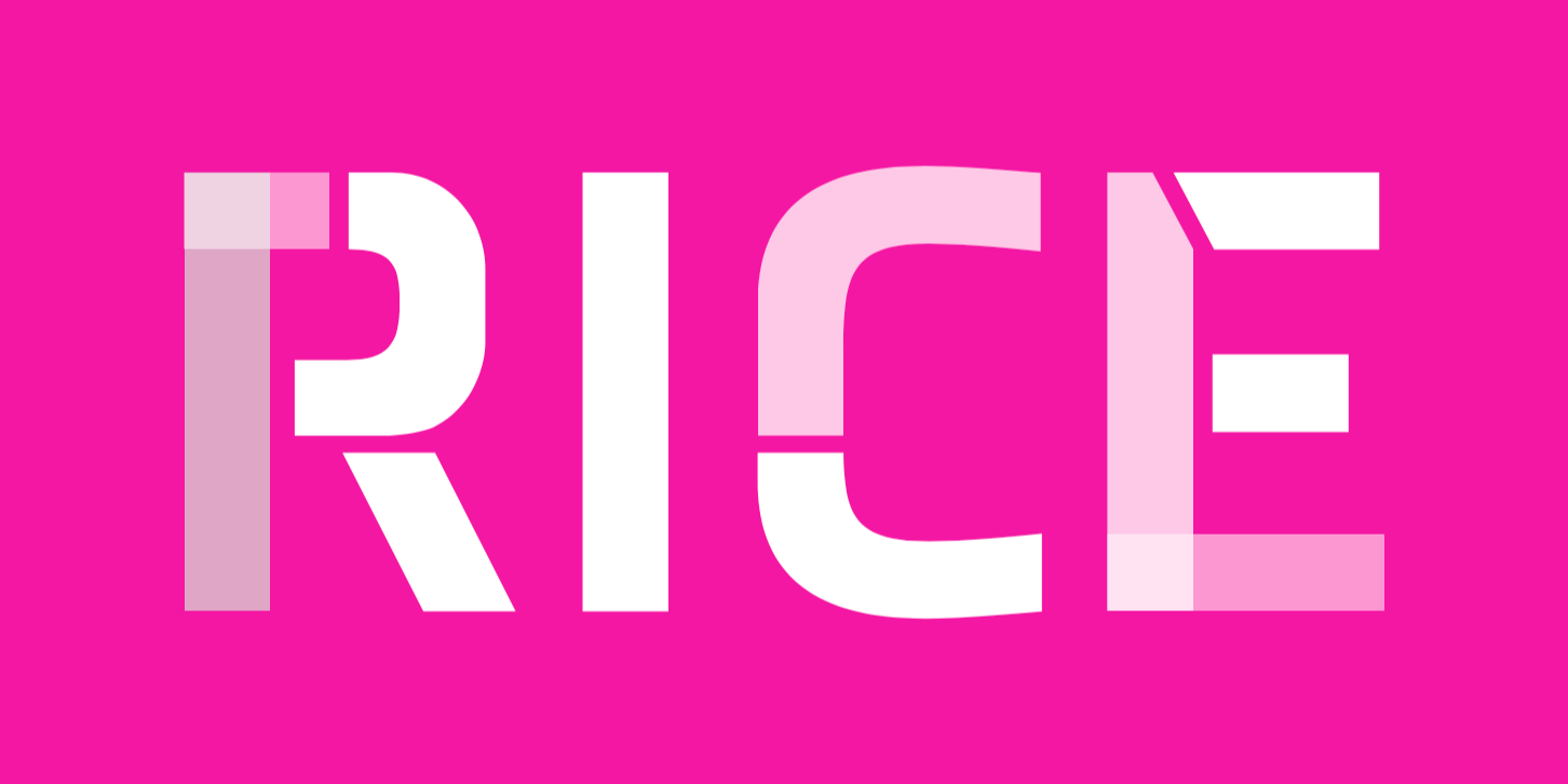
Hagmann began with the logo, which “came from a type family that was in progress. Not all the styles existed solidly yet.” The decision to base the logo on a yet-to-be-released Kontour face allowed for “broader visual communication that created cohesiveness within the school's visual system.” The type family in question went on to become Axia (2012).
Kontour is a creative studio with a focus on type design. Founded by Sibylle Hagmann in 2000, the studio practices graphic, typographic, and type design.
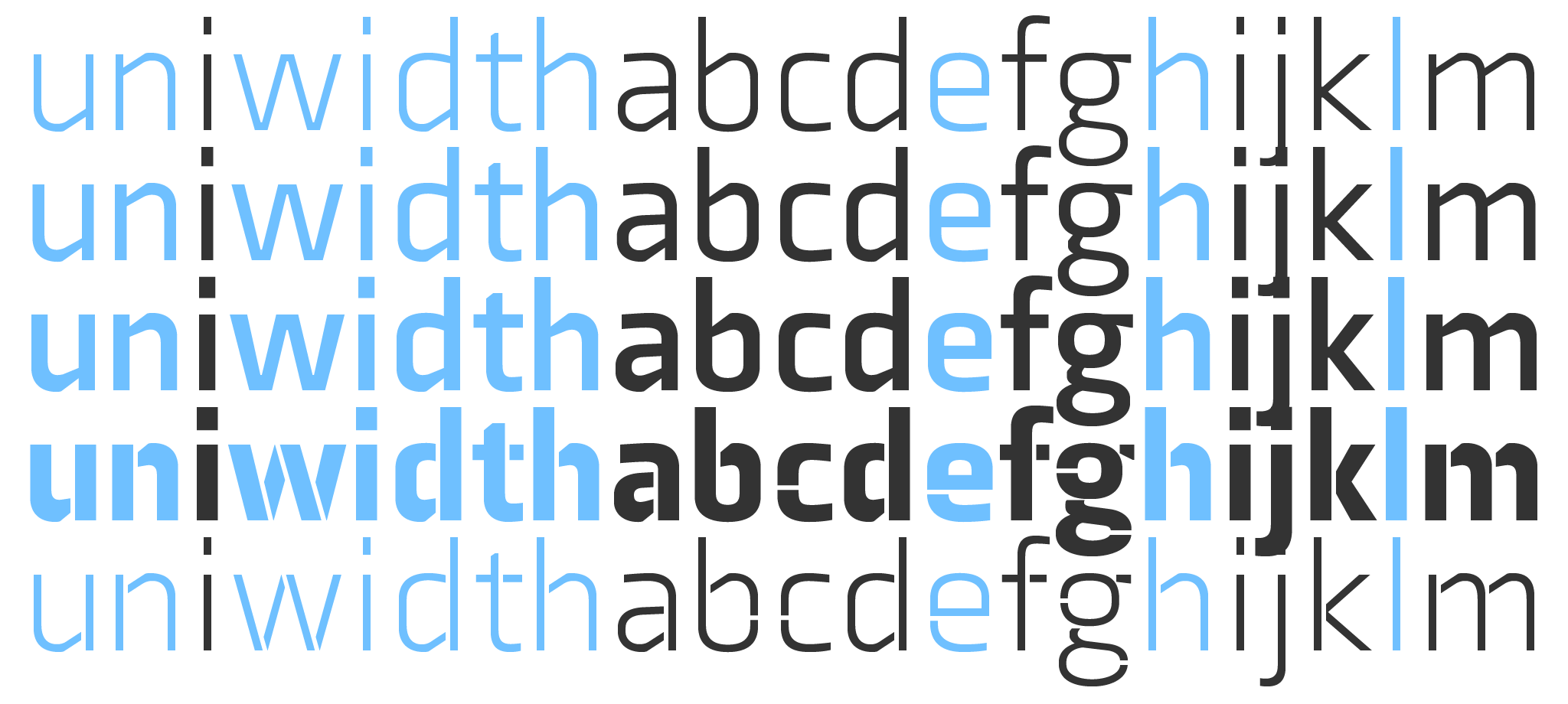
Hagmann's approach to Axia's uniform width makes it a versatile face for setting big or small, ideal for a single-typeface typographic palette.
The logo itself, which references architecture, Hagmann designed as a series of stenciled building blocks. Combining her various segmented letterforms with color opened the process to new directions. Among its most surprising results was, according to Hagmann, “its stencil quality—form segments that the eye completes—and the color expressed through levels of transparency.”
Axia is a uni-width typeface (equal-width, duplexed, or multiplexed typeface). Practically, this means that changing from Light to Black weights does not reflow text, as each character within the style system shares the same horizontal metrics. This offered design flexibility beyond Hagmann’s own designs, giving the school the means to create its own high-quality graphics that stay in-brand.
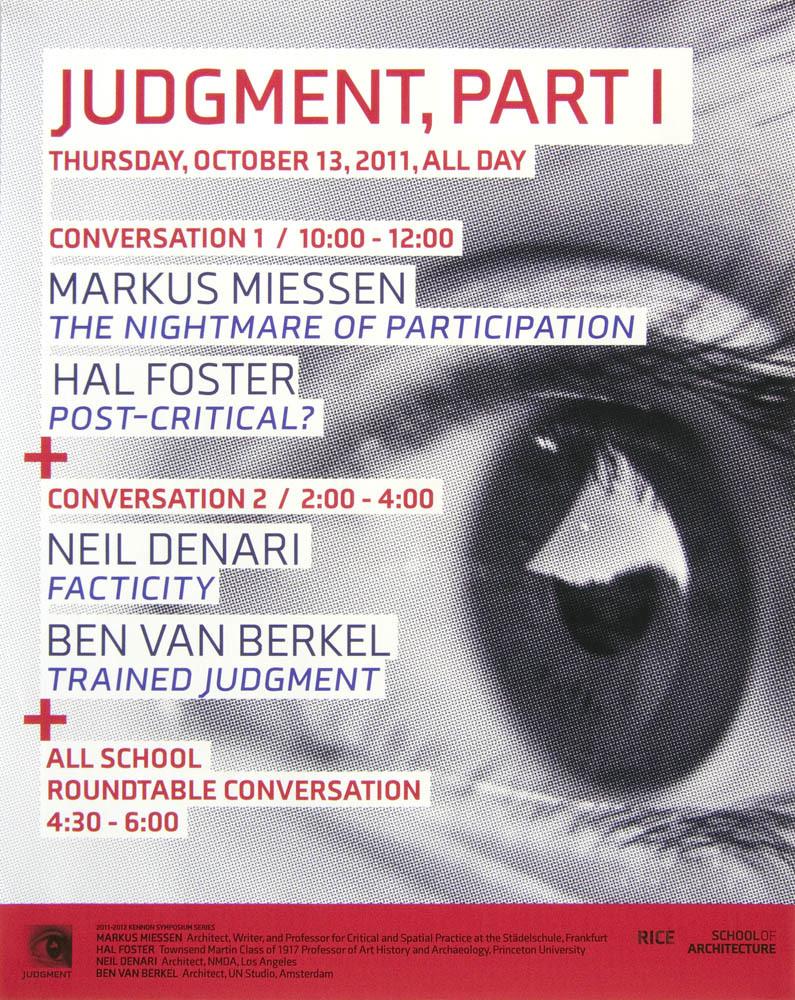
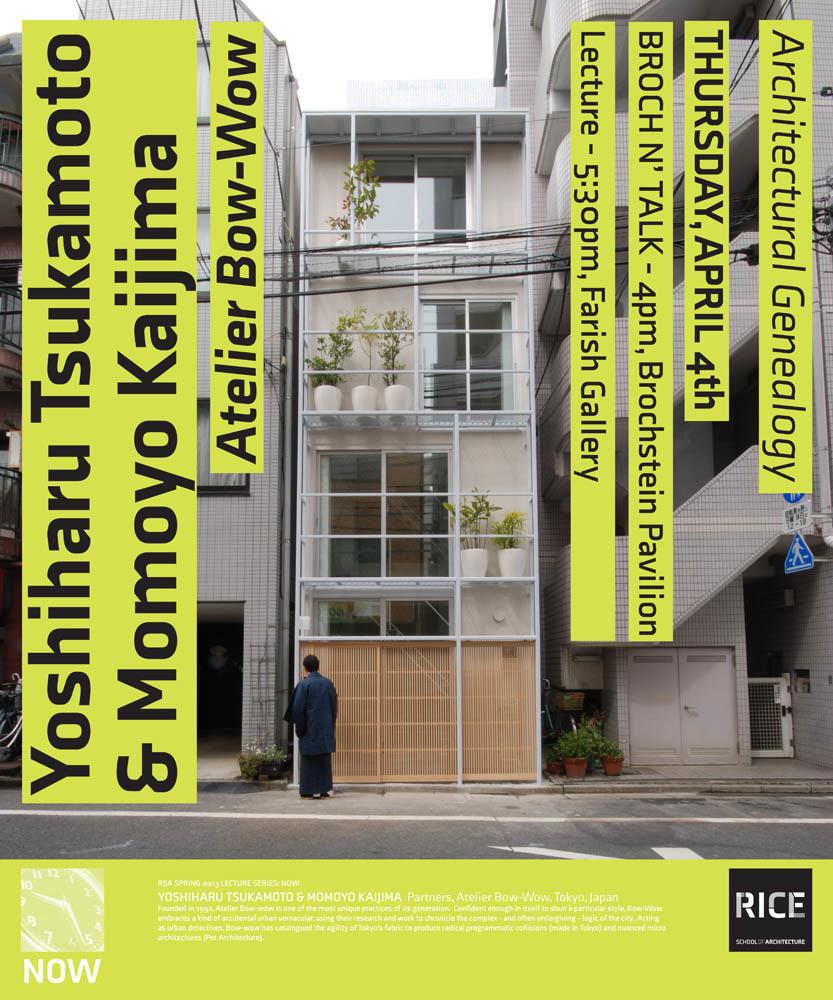
Rice Architecture event posters show the brand's versatility and graphic appeal. Combining Axia's various weights and styles with photography and color creates a distinctive poster without reliance on extra illustration: Architectural simplicity at its best.
While the work was eventually replaced during a Rice-wide identity project, this branding stood as a timeless mix of type, logo, and color. Its references to architectural structures and its consistent, adaptable typography helped the school stand out among its competitors and broke from Rice’s more traditional tone.
If your organization wants to unify its visuals with a durable identity system, our foundry partners—including Kontour—are suited to the task. Logos, type, and color should work as one, and the best way to accomplish that is with a typographic process. Contact us to start the conversation with the designers at one of our foundry partners.