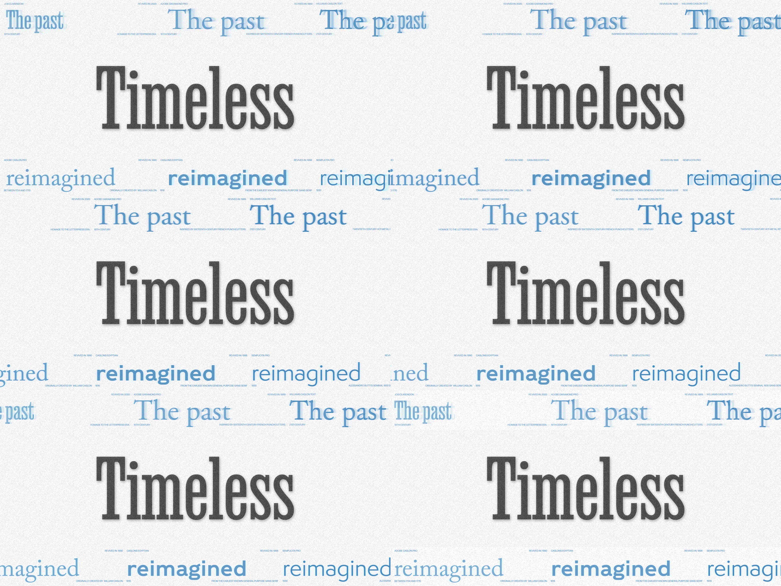
Featuring: Adobe Garamond Pro · Adobe Originals, Williams Caslon Text · William Berkson, Caslons Egyptian · Miko McGinty, Job Clarendon · DJR, Semplicita Pro · Canada Type,
Revivals that still feel new
Trends burn bright and burn out. These six revivals carry centuries-old letters into the present, and they are still doing some of their best work today.
Every musician knows the standards: songs written generations ago that still fill a room, because they were built right the first time. Type has standards too. The faces below began as metal punches, foundry specimens, and letterpress posters, and each one solved a problem designers still face, whether that is a book page that reads for hours or a headline that has to stop traffic. Revived with care, they sound as fresh as the day they were cut. Here’s tonight’s setlist.
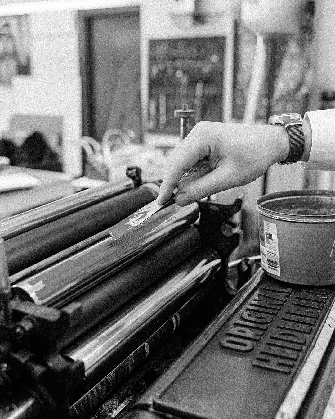
Vintage letterpress
For books, long reads, and anything meant to be savored
Robert Slimbach made Adobe Garamond the company’s first historical revival in 1989, interpreting the roman types of Claude Garamond and the italics of Robert Granjon, two sixteenth-century French punchcutters. He kept the beauty and balance of the originals while giving them every advantage of contemporary digital type, and the family has been a staple of typography and graphic design ever since. Nearly five centuries after Garamond cut his punches, it is still the house style of the bookshelf. Still rings true for: books, long reads, and anything meant to be savored.
Adobe Garamond Pro
Regular
Starting at $35
Buy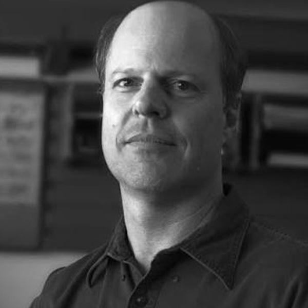
Robert Slimbach
Robert Slimbach joined Adobe in 1987 and specializes in digital type design inspired by classical typography. Awarded the Prix Charles Peignot in 1991, he directs Adobe’s type design program and has created renowned typefaces including Adobe Garamond, Minion, and Arno.


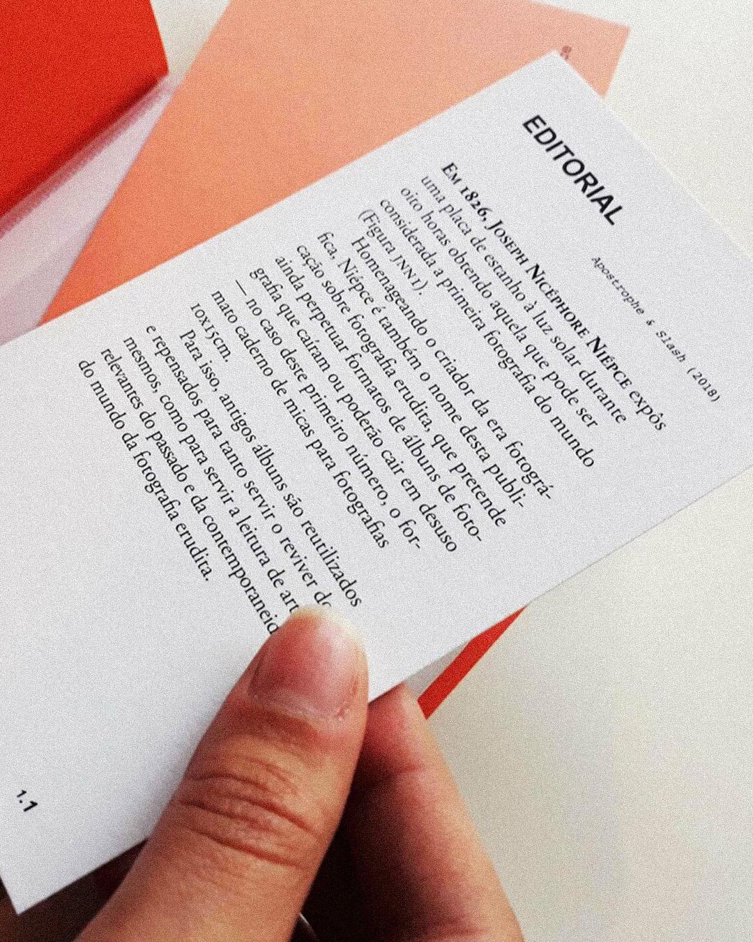
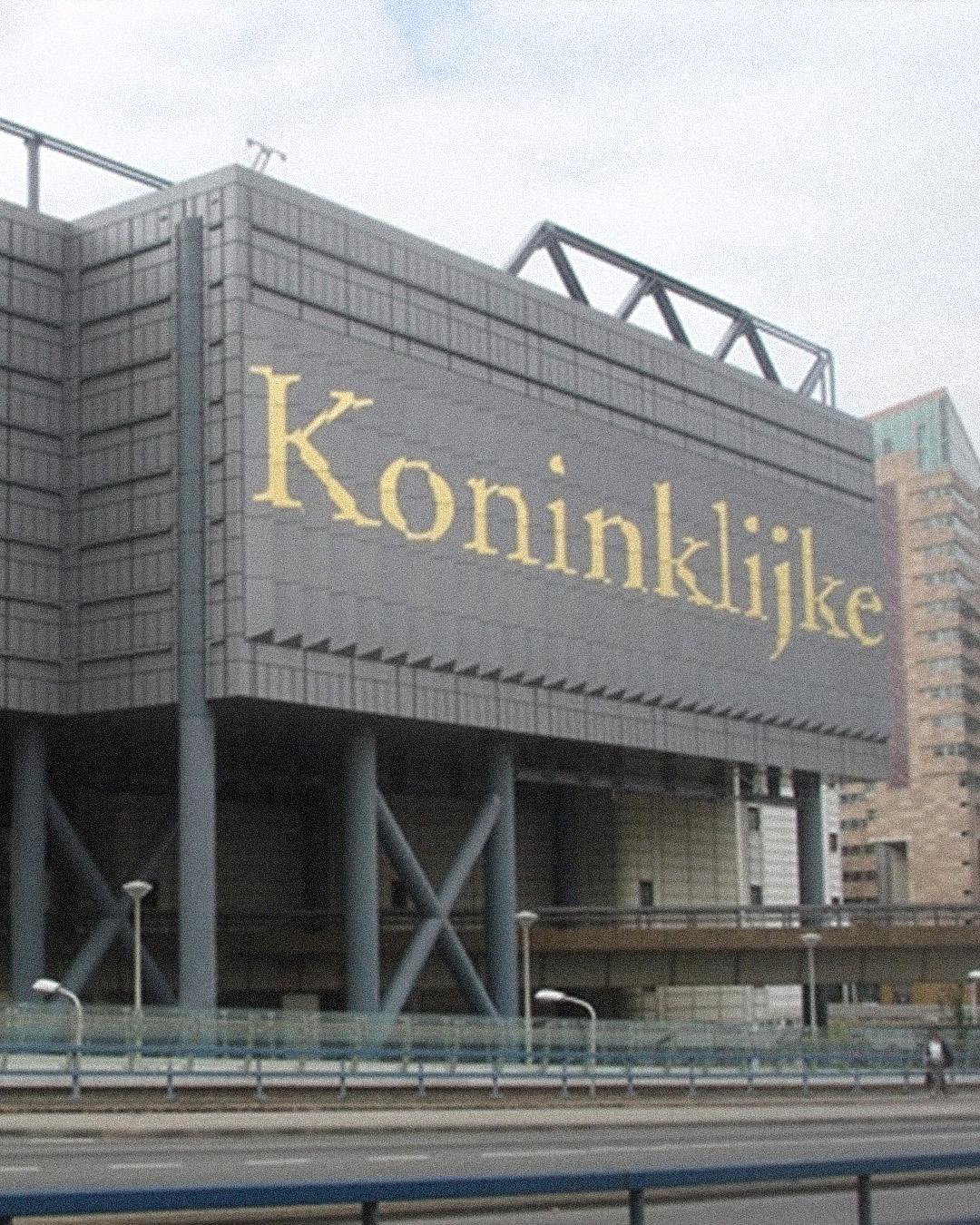
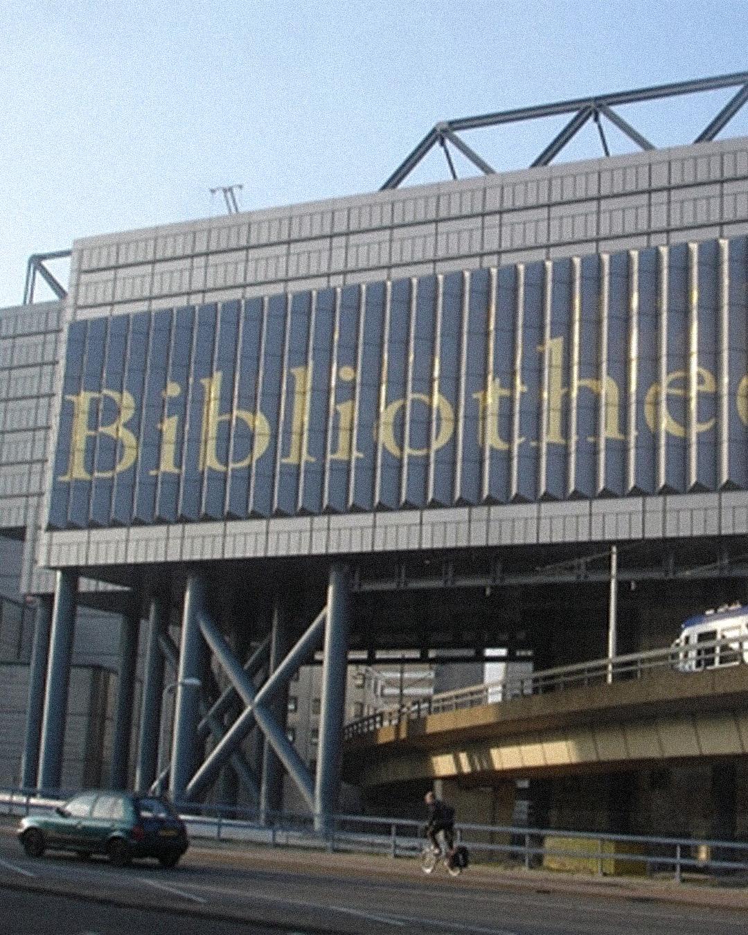
“When in doubt, use Caslon.”
William Berkson drew Williams Caslon to carry a perennial favorite into the twenty-first century. In eighteenth-century England and America, Caslon fonts came to dominate printing, and the twentieth-century hot-metal revivals were so legendary for readability that letterpress printers had a saying: “When in doubt, use Caslon.” Berkson’s digital version, released through Font Bureau in 2010, captures the warm, lively, dark, and open texture at the heart of the design. The advice still holds. Still rings true for: editorial text, essays, and any page that needs to feel trustworthy.
Williams Caslon Text
Regular
Starting at $60
Buy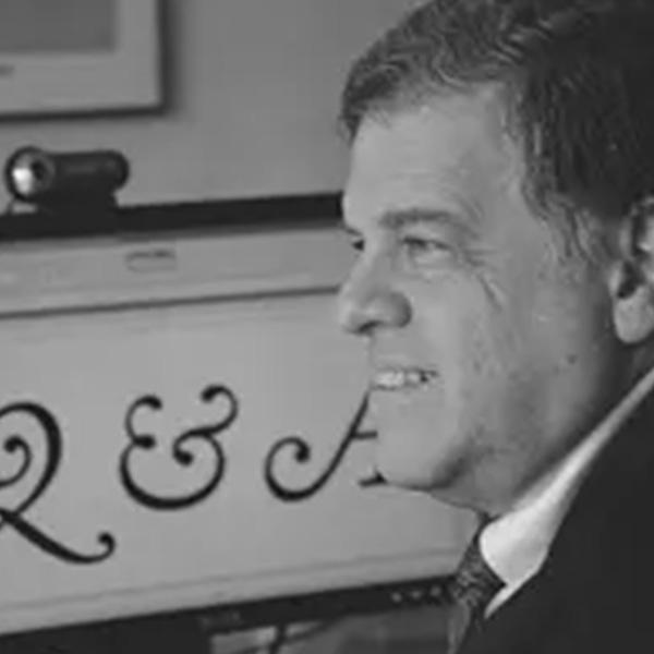
William Berkson
William Berkson is a philosopher, author, and type designer who developed a passion for typography as a teenager. He later designed Williams Caslon for Font Bureau, combining his lifelong interest in letters with his love of design.
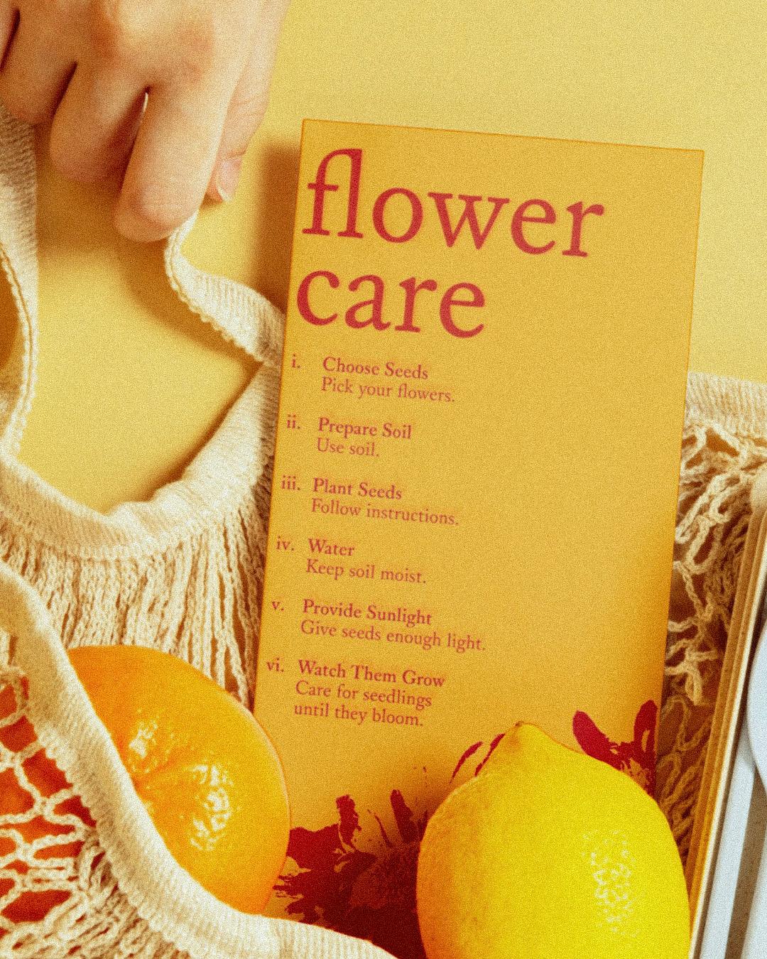
Signage, identities, and anywhere plain speaking wins
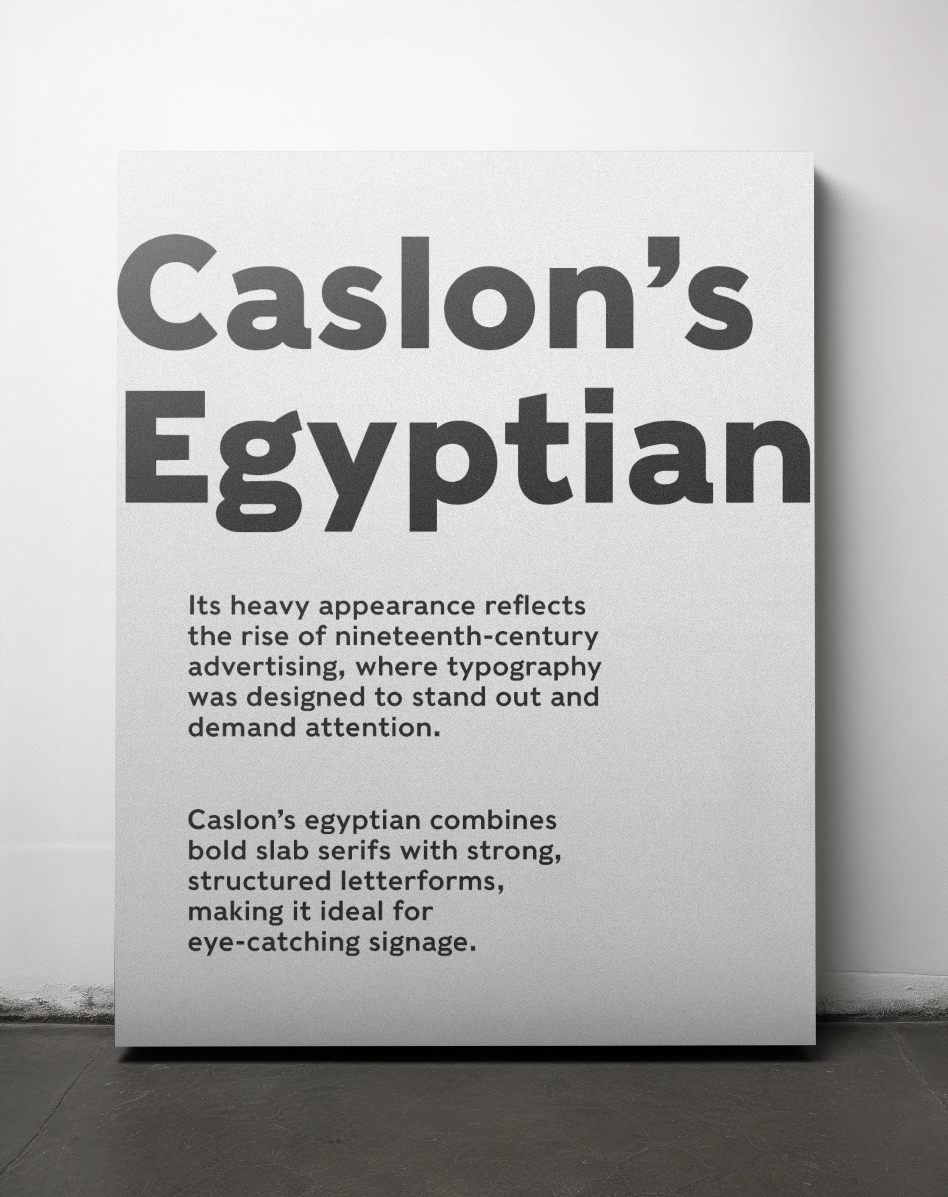
Miko McGinty digitized Caslons Egyptian from the earliest known general-purpose sans serif in the Latin alphabet: around 1816, William Caslon IV printed the phrase “W CASLON JNR LETTERFOUNDER” in plain, unadorned capitals. Matrices for 26 caps survived at the Stephenson Blake foundry, and Cyrus Highsmith and Christian Schwartz helped complete the Font Bureau revival, with Schwartz inventing the lowercase the original never had. Two centuries later, the sans serif is the default voice of screens everywhere, which is not bad for 26 capital letters. Still rings true for: signage, identities, and anywhere plain speaking wins.
Caslons Egyptian
Regular
Starting at $40
Buy
Miko McGinty
Miko McGinty is a book designer who founded her own studio after studying typography, letterpress, and graphic design at Yale. Since 1993, she has collaborated with artists, scholars, and museums worldwide, designing art books and publications.


An homage to job printing
David Jonathan Ross and Bethany Heck built Job Clarendon as an homage to job printing, the posters and flyers of the letterpress era, and to the condensed Clarendons that shouted from them. Their interpretation pushes the style thinner and heavier than most nineteenth-century examples dared to go, across 41 styles, while keeping its dense charm: chunky slab serifs, ample ball terminals, and square-terminal alternates. The original job printers sold shows and sales. Today’s designers sell everything else, and the voice still carries. Still rings true for: posters, promotions, and headlines that need to sell.


DJR is a type designer who won the 2018 Prix Charles Peignot award. He was an early creator of retail variable fonts and explores new font technology through his Font of the Month Club and work with Google.

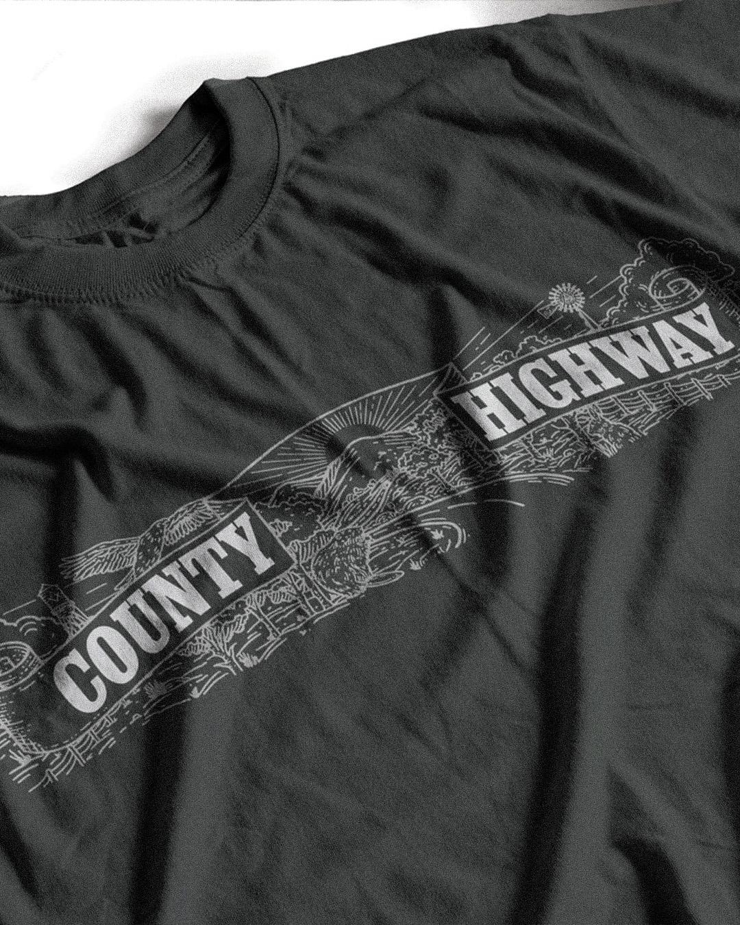
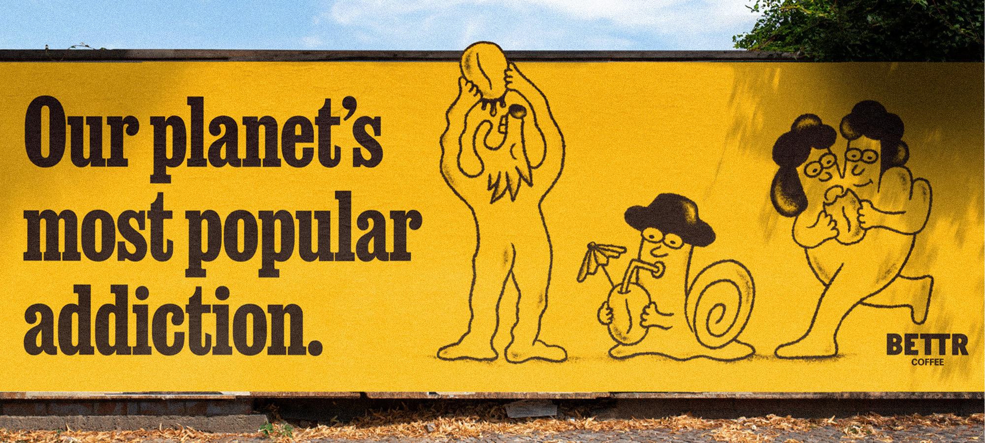
Fonts in use: Bettr (A B Corp coffee brand) Job Clarendon by David Jonathan Ross
Modernism, with an Italian accent
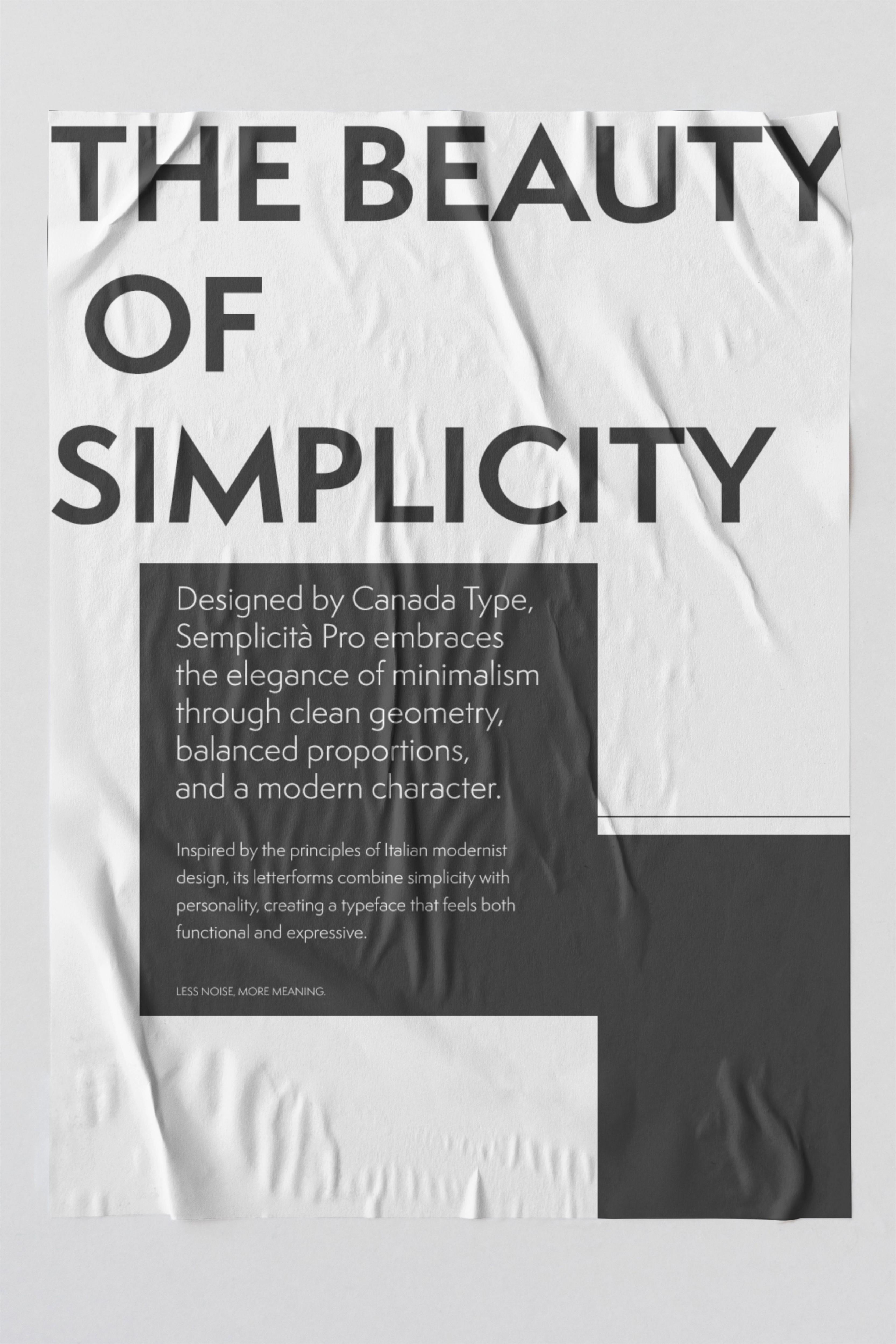
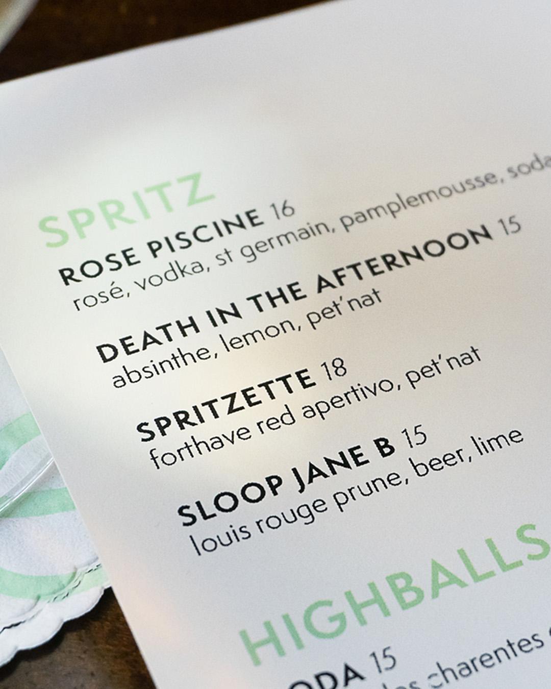
Bill Troop and Patrick Griffin started Semplicita Pro by reappraising Semplicità, Alessandro Butti’s seminal 1930 sans serif. Fueled by Futura, Butti traded its cool Teutonic geometry for warm, calligraphic forms rooted in the Italian Renaissance, and the design became a gene pool for new faces for decades. Canada Type’s version keeps that calligraphic soul while moving the most exaggerated features into alternates, making modernist letters readable at small sizes and persuasive in display. Modernism, with an Italian accent. Still rings true for: brand identities that want modern clarity with warmth.
Semplicita Pro
Variable Light
Starting at $50
Buy
Based in Toronto, Canada Type has been providing professional typefaces to global users for more than 25 years.
Trends will keep cycling through, and these five will keep playing on. Pick your standard, and meet the foundries behind these six, at
store.typenetwork.com.