Putting accessibility first
In early 2020, the State of Rhode Island turned to web typography expert Jason Pamental to design their new web platform. Using variable fonts, he led the team that produced one of the web’s most accessible and flexible collection of government websites. Here’s how he did it.
When COVID hit the scene at the start of 2020, a large-scale project in Rhode Island hit pause. Amid the global pandemic, there were bigger issues at hand than producing a new design system for their state government websites. That was, until millions of citizens needed information on COVID treatment, policies, statutes, and more. At that point, the failings of Rhode Island’s existing web systems became worse than annoying: They became dangerous.
Enter Jason Pamental. Jason is what you call a “unicorn:” Part web designer, part data-architect, and part developer. He’s an author, speaker, and practitioner who’s been in the industry for 27 years, with a focus on web typography for the past ten. He explained the accessibility challenges faced by government sites best:
If there's one thing last year made exceedingly clear, it’s that government services must be accessible to all, no matter what. So many resources around the country, and indeed the world, simply were not up to the task. Information was out of date, informational websites crashed under load, and critical health guidance was unavailable sometimes for hours or even days at a time.
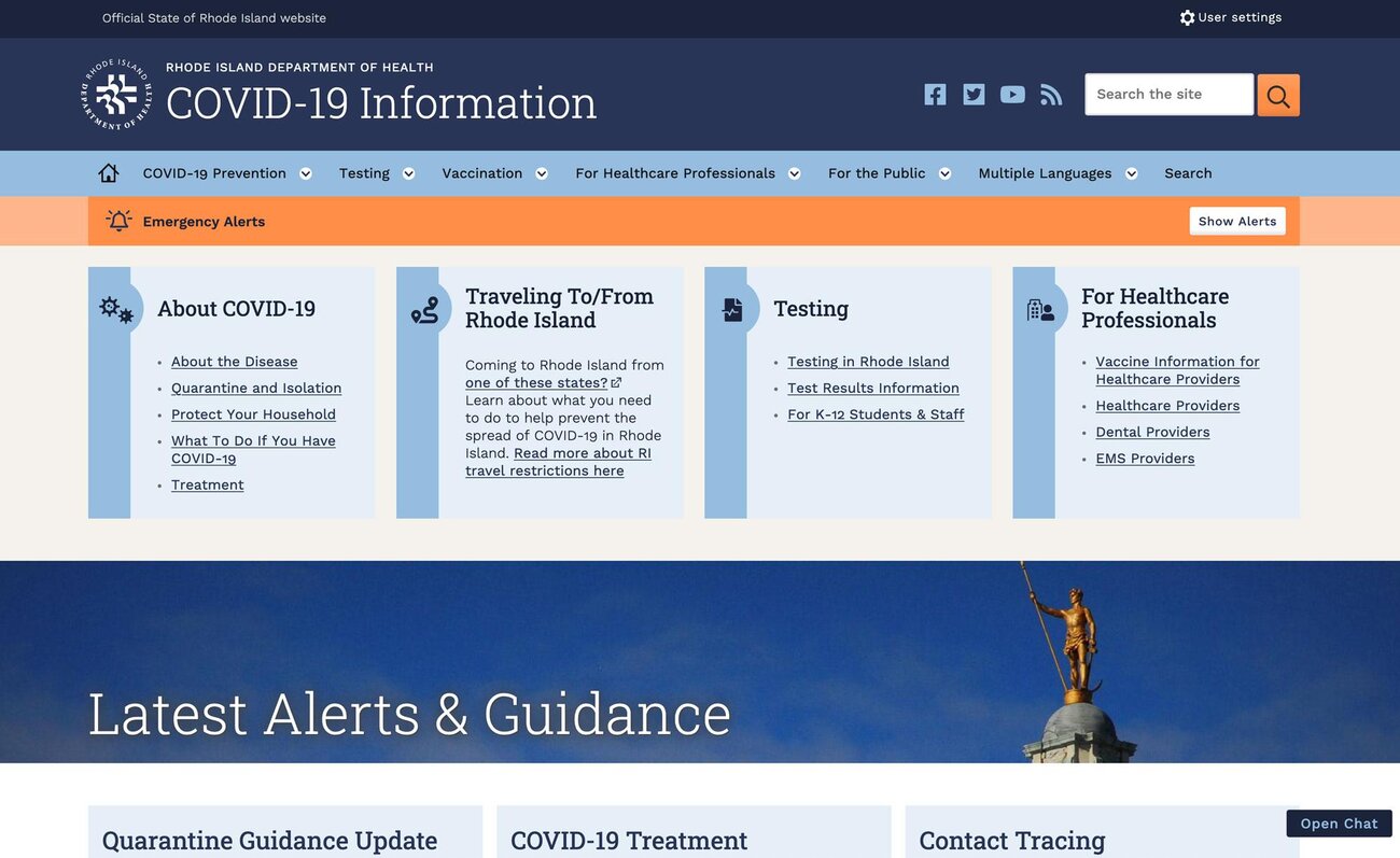
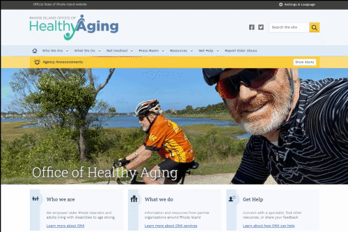
With an emerging (and dire) need to put a website together, Rhode Island resurrected Pamental’s web platform design project, this time starting with a COVID information site. The catch? He had six-months to complete the Drupal-based platform and launch the first site.
Starting in June 2020, Pamental started working feverishly, “writing up documentation, planning functionality, developing a content model, and conducting stakeholder and user research.” It wasn’t enough to launch a website, even an accessible one: He needed to create a platform that could be deployed for other government agencies and initiatives.
So many citizens access the web exclusively through their mobile phones, many others have visual or physical impairments, and everyone is short on time, so Pamental knew the site needed to be delivered with simple HTML, CSS, and “as little JavaScript” as possible. It needed to be fast, lightweight, and adaptable.
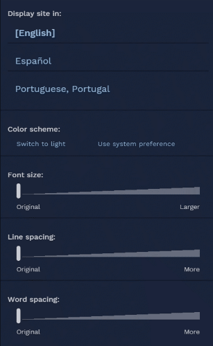
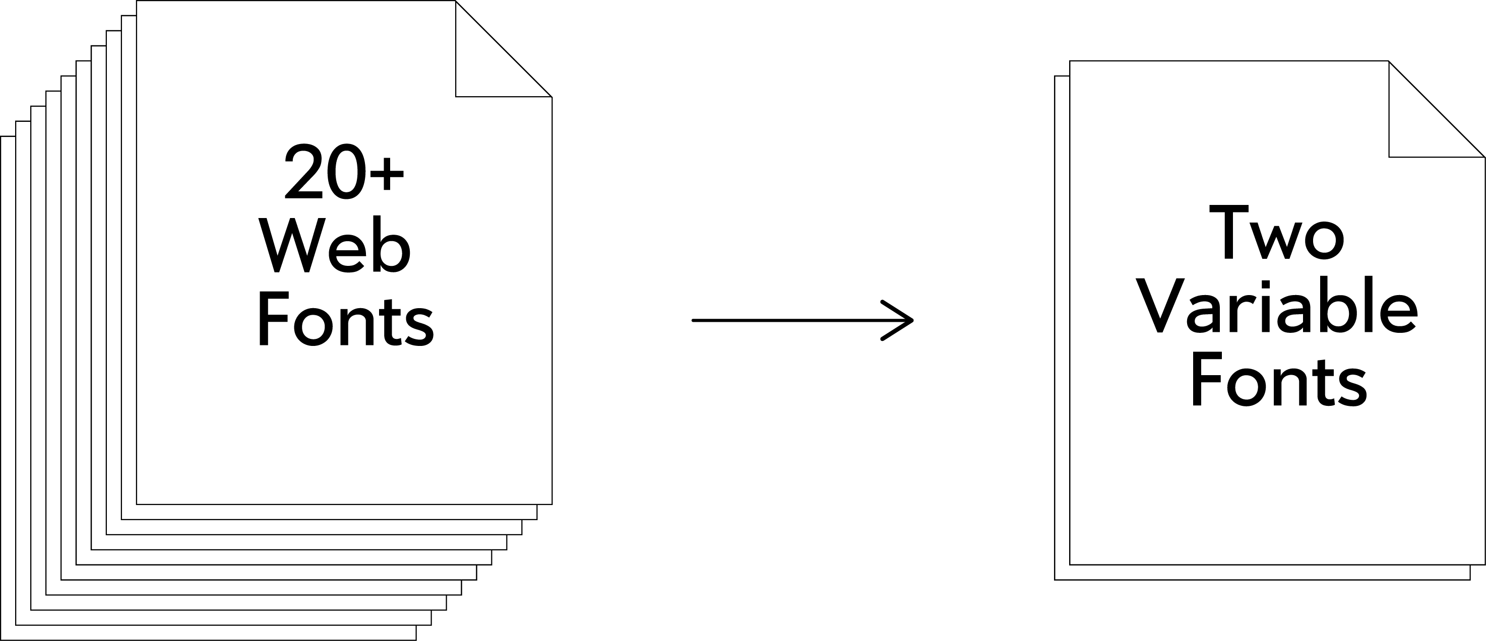
That last word—adaptable—provided the perfect opportunity for Pamental to implement his years of research into responsive typography, user customization, light and dark modes, and variable fonts. Together with Providence-based agency Oomph, Pamental devised five color themes, each with a corresponding dark mode, and a user-settings panel in which visitors can easily adjust font size, line height, word spacing, and theme. Then, based on these variables and other device settings, the system serves up unique instances of a pair of open source variable fonts, Work Sans VF and Roboto Slab VF.
Readable and flexible, Rhode Island’s COVID site launched two-weeks into December, 2020. By Fall 2021, the state had built and deployed more than two dozen sites on the same platform, including the Governor’s and Lt. Governor’s sites. The plan is to “build what we need, extend and iterate as necessary,” with more than fifty additional sites on the way.
How Pamental uses VF for web typography
Creating clear typography on the web poses both challenges and opportunities compared to printed typography. In print, you know the page size, paper qualities, and—within reason—viewing distance (books are held while billboards are driven-by, for example). On the web, you don’t have these constants on which to base your typography. This is the main challenge of web type: unknowns.
While some of web type’s opportunities are obvious—animation, interaction, and so on—but new technologies have turned the web’s challenges into opportunities, too. What had been unknown is now known. Want to know the window’s width? There’s the CSS unit of “VW.” Want to know the user’s set font size? That’s the “REM” value. Want to dynamically generate font sizes, line heights, and more based on these metrics? That’s when you use the oddly named but very useful “clamp” function, which adjusts a value (like point size) dynamically between minimum and maximum values.
Combine these with “calc” functions or even simpler mathematics, and you can create a web experience that feels pixel-perfect no matter the user’s device or window.
Jason is a Principal Designer at Chewy.com, helping lead their design system efforts across ecommerce, enterprise, and native mobile app experiences. Previously, he spent much of his time working with clients to establish their typographic systems and digital strategy, helping design and development teams works smarter and faster, and running workshops about all of the above. Past clients range from state governments, type industry giants, Ivy League and High Tech, to the NFL and America’s Cup.
Learn about variable fonts
To learn more about variable fonts, subscribe to the Type Network Newsletter, where we’ll be sharing interviews, case studies and tutorials explaining everything designers should know about variable fonts.
Pamental and his Rhode Island design system take this thinking to another level, though, by mixing these processes with variable fonts. The sites, including the Department of Information Technology, display adjusted variable font instances based on the calculated point size, line height, theme, and so on. The system even adjusts the typography when switching between light and dark modes to maintain optimal visual weight of the text, all while loading less data than separate font files for each weight.
All of these touches are made possible by leveraging modern web techniques and variable fonts—with the result averaging a 3-400% increase in overall performance, and similarly dramatic reductions in data downloads. This means that with just a few lines of CSS, weight, optical size, numeral style, and other axes can be calculated and clamped in the same way as point size—creating nuanced, efficient, fast, and valid typography for every user.