Preparing for virtual reality typography · Type Network
Preparing for virtual reality typography
A few weeks ago, we opened the door to virtual and augmented reality through the work of futurist designer Andrew Johnson. In this interview, he describes typography’s important role in AR/VR, the evolution of digital type, and why designers need to pay attention to these new experiences. The message is clear: “We’ve been really focused on making sure type fits in boxes. Maybe fonts have outgrown their containers.”
Lucas Czarnecki: You wrote about native font interpolation on the web (a very similar concept to variable fonts) more than a year before variable fonts were announced. How did you see the technology over the horizon?
Andrew Johnson: An internship at Font Bureau connected me with Nick Sherman and Erik van Blokland, who graciously introduced me to the history of Apple GX and Adobe Multiple Master formats. Spending some time with those concepts, I was able to cobble together a working proof of concept, illustrating how it could be done within a web browser.
LC: Are variable fonts all you thought they might be? Are they more or less capable and expressive than you had anticipated?
AJ: Widespread adoption is tough to predict, but it’s been really exciting to see all the experiments done with variable fonts and what they unlock. Designers and engineers have come up with things I never could have imagined. I hope we’ll continue to see people experimenting across a widening range mediums and applications.
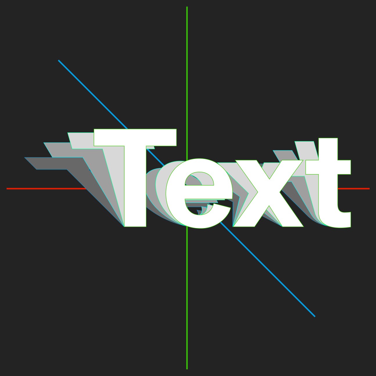
“Width and height axes can open up the compression of letterforms that normally happens when you move to a more extreme viewing angle. The squashed height of text set on a flat surface in front of you can be offset by increasing the height axis value. Likewise, the compressed width of text set on a vertical surface to the left or right of you can be offset by increasing the width axis value.” — Johnson on the angular changes to type in AR/VR environments.LC: In the years since the launch of variable fonts, you’ve been working in augmented reality (AR) and virtual reality (VR) design. For those readers unfamiliar with these concepts, can you briefly describe what they mean?
AJ: Terms evolve over time, but AR overlays information over the real world (either through cameras or projection on clear lenses). It may involve an HMD (head-mounted display) or use a mobile device as the window for viewing content. VR completely immerses you in a non-real world. We will likely see the borders between these collapse as devices allow intelligent merging of both.
LC: AR/VR headsets and mobile applications are still relatively rare; why should designers be thinking about these new modalities?
AJ: Leaps and proliferation in computing can be tough to predict, but AR/VR represents a significant shift in interaction design and will probably be transformational for certain use cases. There’s no shortage of exciting deep problems for designers to think through if they are interested in the space. More generally, having design representation is crucial for helping the medium evolve responsibly for people.
Adaptive typography adjusts to be more readable “at wide angles as you walk around the it.”LC: Many believe web typography—which has been around for decades—is still a rough work-in-progress. Does AR/VR typography offer a better route to high quality design?
AJ: It’s hard to define what high quality design is, as there are so many facets, but there is much each medium can learn from each other, despite inherent differences. AR/VR typography is still emerging and brings with it new fascinating spatial (depth perception, locomotion, human factors, etc.) challenges. Web typography has more time to spend on the details of responsiveness and layout down to micro details, which persist as challenges in AR/VR.
LC: How do designers need to think differently when creating these futuristic experiences—particularly when it comes to typography?
AJ: AR/VR carries a set of real-life expectations while simultaneously dropping traditional boundaries of what is normally possible. Designers need to be intentional with where to draw the lines.
Interfaces, and as an extension typography–are fundamentally tied to spatial interaction in AR/VR. Because of this, it’s crucial to prototype to get a realistic sense of how people and interfaces operate in space.
With augmented reality typography, the reader’s own physical location isn’t the only input. You can create experiences with physical inputs, such as page location, angle, brightness, and more.Distance from set points creates interesting opportunities. Here, Johnson creates a “Number Panel” that displays the user’s distance from each number, but the same technology could be used for interactive billboards, advertisements, signage, wayfinding, and more.LC: How can type designers prepare their typefaces for AR and VR?
AJ: Spend time with real time 3D programs and game engines! Bring fonts into the environment to gain an intuition of both design and technical constraints (there is much to solve here) and opportunities.
While familiar challenges like limited resolution remain, there are whole new sets of physical and perceptual constraints to explore, including different pixel resolutions, rendering strategies, optics, focal planes, latency and rendering.
LC: How do variable fonts play a role in this? Are they necessary components in AR and VR typography, or do they simply make it easier?
AJ: Variable fonts open up avenues for expression and function in AR/VR not available in other digital mediums. Information like viewing angle, lighting and distance become signals for typography to respond dynamically to in AR/VR. This information could be used to drive variable font axes for visual communication or making the type more readable. Entire type filled spaces can adapt to this as well, along with personal user interfaces in close proximity to the reader.
They are a road to the best possible contextual reading experiences and represent an opportunity to shift general paradigms of typography.
To stay current on all things TN, subscribe to Type Network News, our email newsletter featuring font analysis, designer profiles, type and design events, and more.