Plau wins big at the Brasil Design Award
Brasil Design Award is among the two top creative recognitions in Brazil, together with the ADG Brasil Awards. Having just completed its 11th edition, the award gathers and presents the country’s most relevant design work. The jury is of unquestionable excellence—and it’s likely the members would win awards themselves if they weren’t judging. Diversity informs not only the jury formation but also the medal selection, preserving the award’s long-lasting relevance for Brazilian designers.
Redonda
Bronze medal
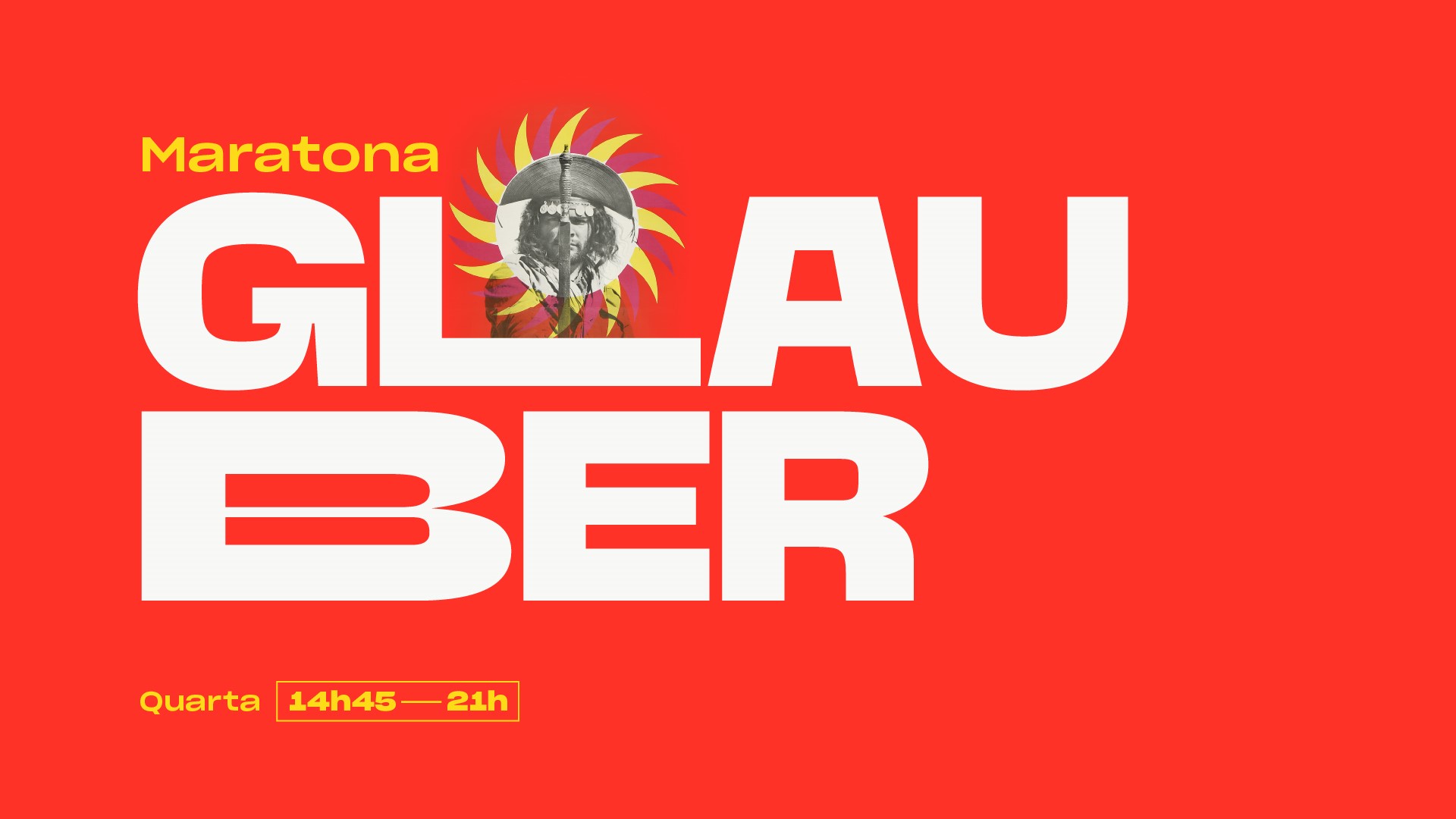
Low diacritic placement has become dear to Brazilians, and Redonda’s are no exception. It is Plau’s 10th retail release, and Carlos Mignot's (aka Cacá) first retail typeface. It began exclusively as a display, heavy face and grew into a complete family, with various weights and true italics. Plau calls it “a humanist with geometric aspirations,” since it draws from both genres.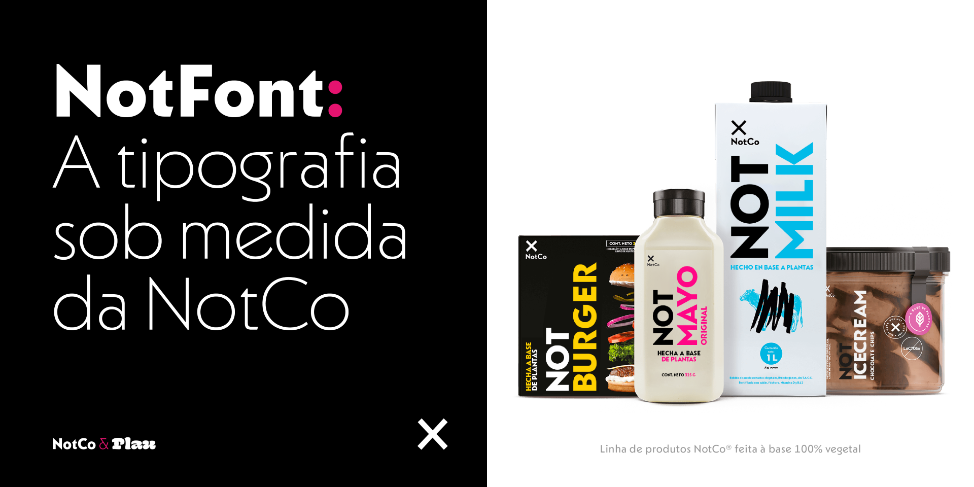
NotFont
Bronze medal
NotCo is a tech company that uses artificial intelligence to create plant-based replicas of milk, mayonnaise, burgers, and more. Plau joined forces with the NotCo creative team to design their custom typeface, NotFont. The brief was to create a typeface with “unexpected logic”—echoing their brand motto. The result draws from tried-and-true geometrics like Kabel, with bits of NotCo’s distinct personality added to it.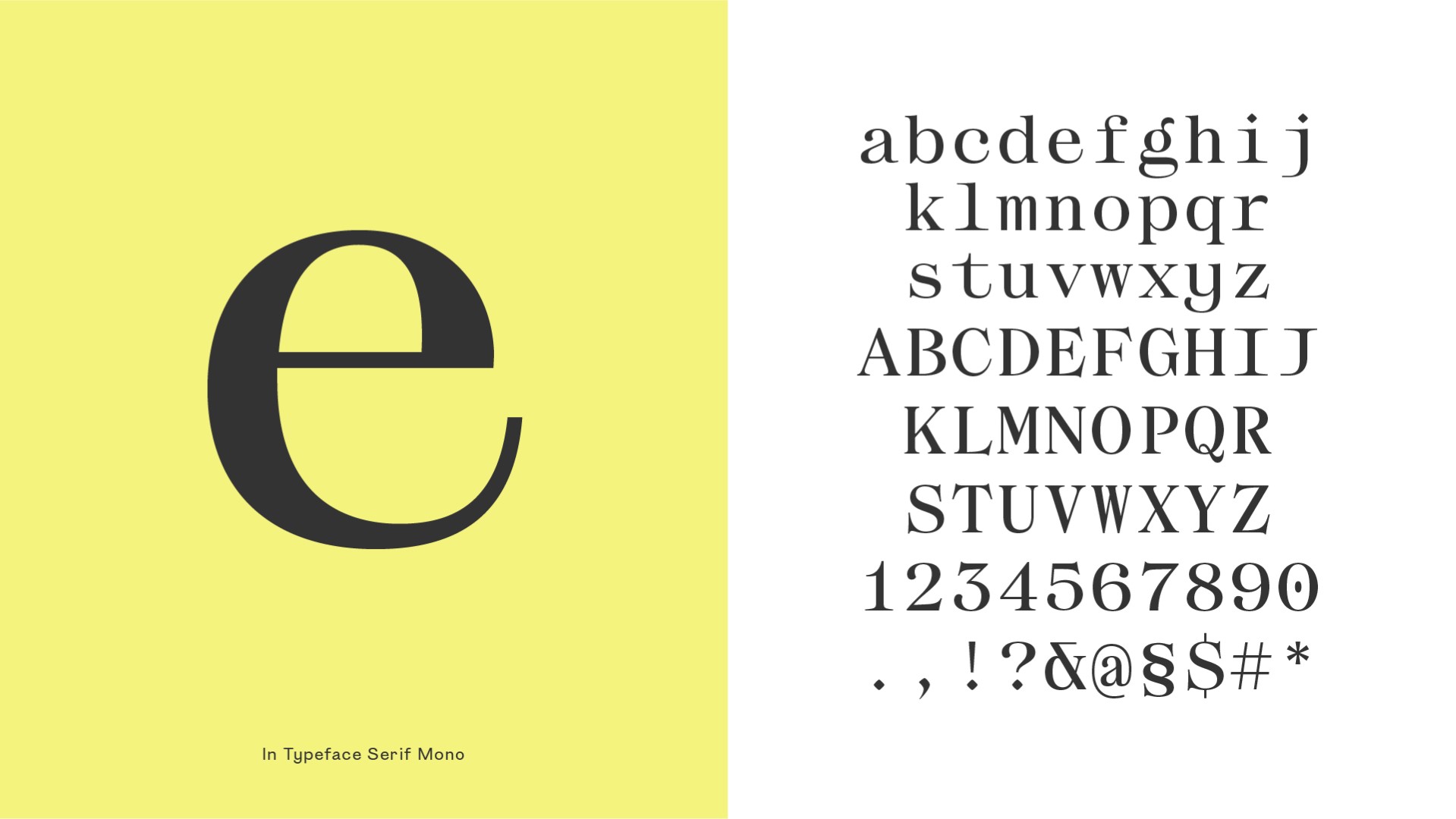
iN Type
Bronze medal
iN Brands is a branding agency based in São Paulo; after hearing Plau’s idea for a Variable Brand Voice, they decided to try it for themselves. The result is a variable typeface of serif, sans, and monospaced, representing the different personalities and markets to which their agency caters.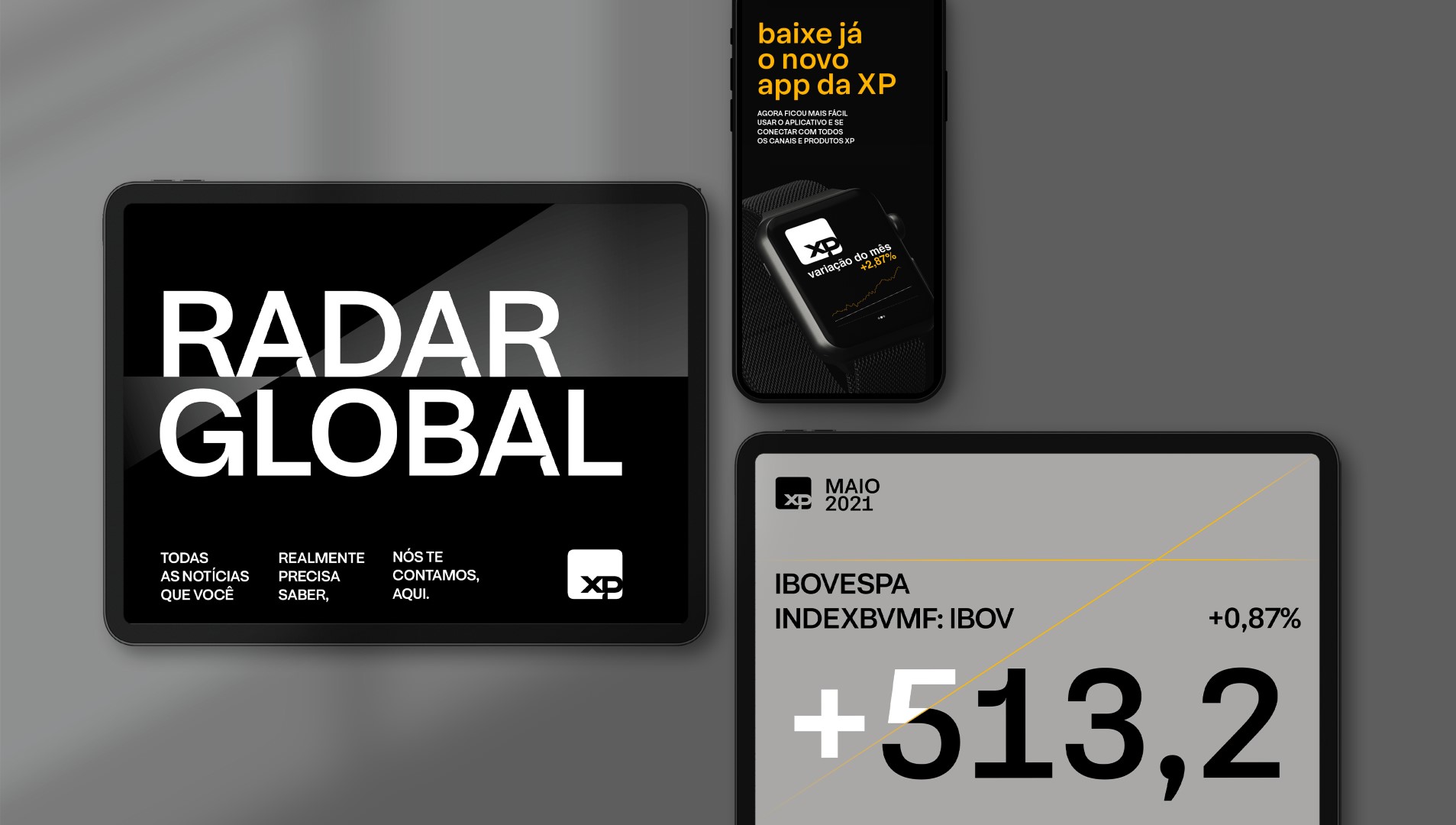
XP Lighthouse
Bronze medal
XP Investimentos is Brazil’s leading capital advisory firm and has changed the landscape of capital investments in the country. Plau refined their logo and typeface, a branding effort lead by Brazilian agency Tátil. Sometimes the smallest details define a project; in the case of XP, a shadowy ink trap was the origin for a range of display (and then text) faces. It is a workhorse in small sizes yet distinctly branded when set large.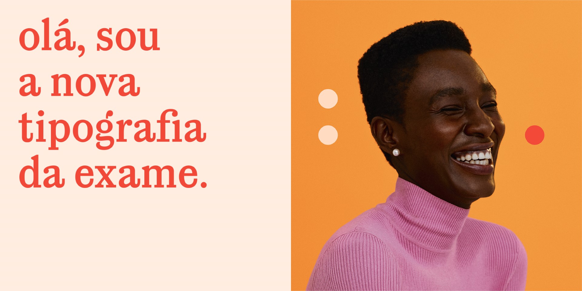
Exame Invest
Bronze medal
Exame Invest is Brazil’s go-to finance magazine. Recently, they refreshed their communication assets, including a new custom typeface for headlines and adverts. The campaign was led by GUT agency (based in São Paulo), who asked Plau to use the logo a starting point for the font—a single-weight and all lowercase. The brand is now packed with a didone-inspired face that will grow into a complete multi-weight family over the years.