
PampaType joins Type Network
Launched by Alejandro Lo Celso in 2001, PampaType can boast about more than just its excellent and diverse library of type: it’s also the first South American digital type foundry. After two decades of leading the continent across both retail and custom type, PampaType has chosen to join dozens of other trend-setting foundries in Type Network.
Alejandro Lo Celso, the founder and creative director at PampaType, was born in Córdoba, Argentina in 1970. Over the next thirty years, he developed impressive graphic design and art direction skills, working at various media firms in Buenos Aires. It was through this work that he became fascinated with type.
In the late 90s, he took his talents across the pond to earn his MA in Typeface Design at University of Reading, graduating from the program in 2000. One year later, Lo Celso obtained a post-diploma at the Atelier National de Recherche Typographique, Nancy. That same year, he released his first typeface and founded PampaType.
His first typeface, Rayuela, served as the perfect global introduction to Lo Celso’s skills and the promise of PampaType. In the year it was released, Rayuela won at the Bukva:raz type design competition at ATypI in Moscow, then its expansion won at TDC2 in 2006.
Lo Celso’s follow-up typefaces, Quimera and Borges continued his recognition streak, with the former earning widespread use in South America and the later receiving the Judge’s award at the prestigious Morisawa Competition in 2002.
Since then, Lo Celso has taken his hand-crafted approach to type design and applied it to building a world-class team, hiring not only font developer Jorge Iván Moreno Majul and type designers Francisco Gálvez Pizarro, Francis Ramel, and Óscar Yáñez, but also community manager María Laura Olcina. Lo Celso notes that as PampaType fonts have earned greater recognition, it was important for their team to “become more international and more experienced.”
Having led the typographic charge in South America, Lo Celso and his team appreciate the role of type in culture. “What matters has to be said in sharp, beautiful letterforms, with a clear intention in mind,” writes Lo Celso. For this reason, PampaType does a few things differently. For example, they check every piece of kerning and spacing by hand “rather than mathematical methods,” in order to “build an organic rhythm.”
Along the same lines, PampaType “believes in the idea of diversity,” which involves more than their employees and clients, but also their typefaces. “It is not unusual that PampaType families include various styles, some of them meant for immersive reading, some for titling or decorative use.”
PampaType launches on Type Network with four acclaimed typefaces:
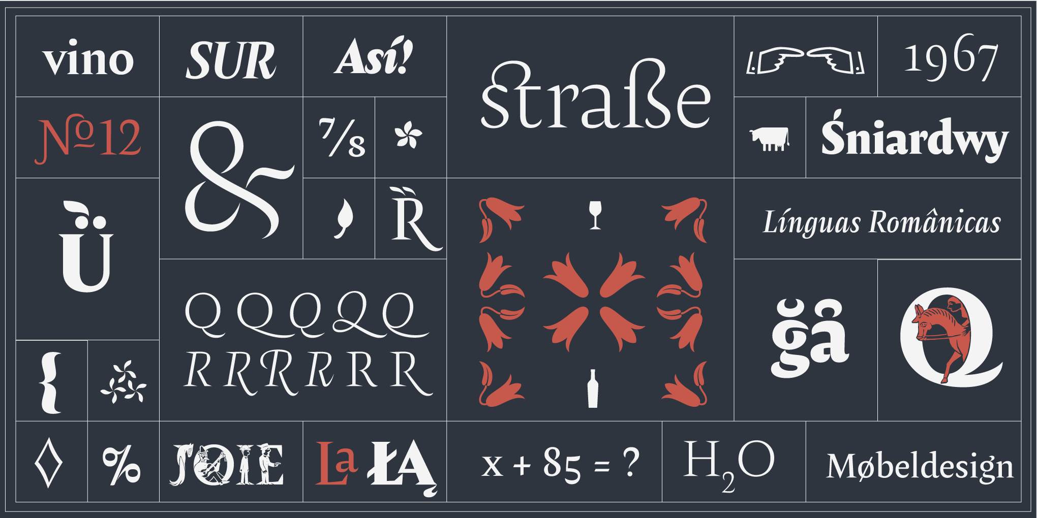
Amster
Amster is an energetic and refined design created in Chile by Francisco Gálvez. Amster combines high readability with great personality, with five weights of roman and cursive fonts, all fully equipped with smallcaps, ligatures, all kinds of figures, long and short swashes in the cursives, contextual features, symbols, smart ornaments, and more. It’s a massively robust family, usable for a wide range of applications: from screen to print, from small text to display sizes, from science to poetry.
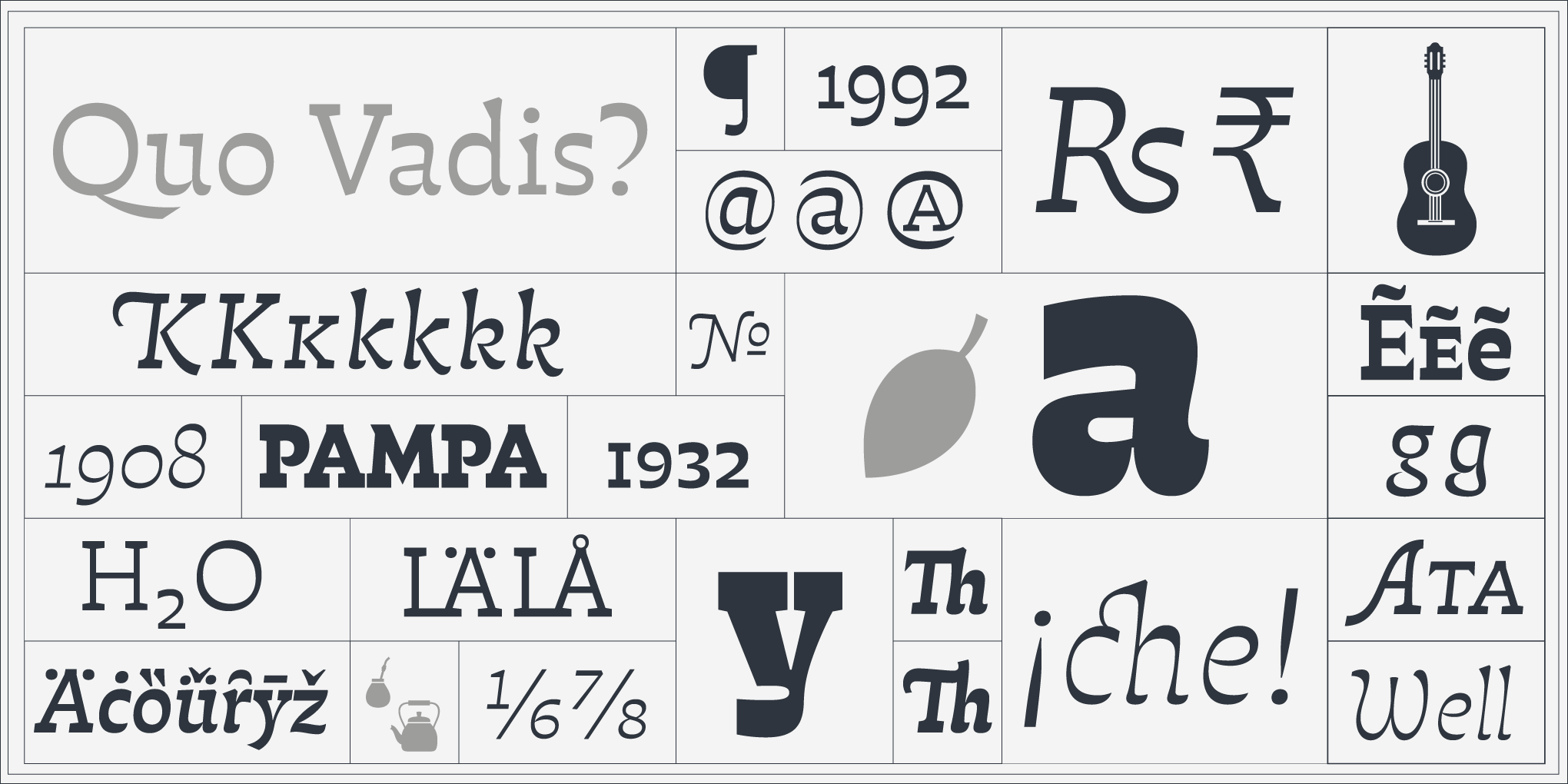
Atahualpa
Inspired by the works of Atahualpa Yupanqui, a central figure in Argentinean folk music, Atahualpa goes beyond reverse contrast, interpreting the qualities of a sturdy slab serif style with a delicate sense of drawing. This gives Atahualpa a unique spirit of power and warmth, perfectly creating gentle reading atmospheres in text as well as persuasive headings, logos, and other displays.
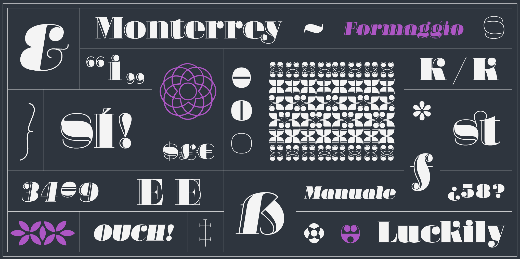
Margarita
This interpretation of the modern style—in the sense of Didot and Bodoni—takes the form of a sensual fat face for display use. Named after Giambattista Bodoni's widow, Margarita has four fonts: roman and italic in two variants, solid and engraved. It also includes a set of intriguing ornaments designed for elegant patterns and frames. Use Margarita for large type (or giant type—anything but small type.
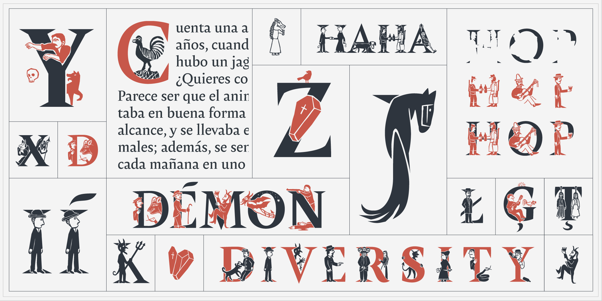
Amster Versal Iluminada
Inspired by vernacular news sheets from 19th century Chile, Amster Versal Iluminada is a set of carefully illuminated, multi-layered capitals that capture personages from natural and supernatural stories: Animals and farmers, priests and devils, citizens and drunks, victims and criminals. Ideal for creating poetic tones and when you want to stimulate readers’ imaginations.
“It’s not every day we get a chance to partner with a foundry like PampaType, with such a long history in both regional and international type development,” says Type Network’s President, Christopher Slye. “Their nuanced approach to balancing personality and usability, retail and custom—with inclusion and diversity—echoes our goals at Type Network. There’s a lot for our customers to appreciate.”
All PampaType fonts are available for print, web, applications, and ePub licensing. Webfonts may be tested free for thirty days; desktop trials are available upon request. To stay current on all things PampaType, subscribe to Type Network News, our email newsletter featuring font analysis, designer profiles, type and design events, and more.