Outside the fonts: painting Amsterdam’s curly letters
The Amsterdam Signpainters collective brings the luscious loops of Retype’s Krul back to where the vertiginous forms came into being: on the windows of the Dutch capital’s happy “brown bars.”
By Bald Condensed
Regular readers may know that I occasionally write an Inside the fonts feature where I shed light on typographic complexities like optical sizes and grades. This time, I wanted to explore a digital typeface returning to its origins as painted letters—a trip Outside the fonts, if you will.
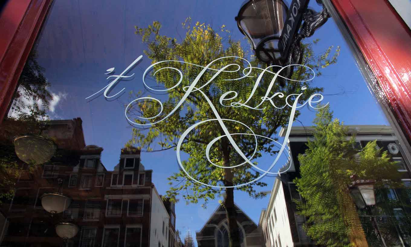
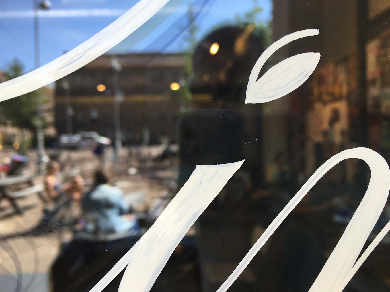
Curly letters on a bar window of Proeflokaal ’t Kelkje, located in Amsterdam’s Red Light District (a.k.a. De Wallen), painted by the Amsterdam Signpainters.Ramiro Espinoza’s Krul script is part of what I like to call his “typographic archaeology.” Ever since the Argentinian-born graphic and editorial designer moved to the Netherlands in the early aughts to enroll in KABK’s Type and Media program, he has made a concerted effort to document and preserve the Dutch typographic vernacular. Type punches, matrices, sorts, production drawings, film negatives, and so on are typically immortalized in books and specimens and as physical artifacts. Architectural lettering and hand-painted signs, however, are in constant danger of vanishing into a perpetually morphing urban landscape. Such alphabets rarely enjoy the same amount of attention as type does in historical records. Through research, interpretation, and digitization, Espinoza is striving to keep these forms from disappearing, while acquainting new generations of type users with this legacy of alphabetic beauty and ingenuity.
Krul started out as a revival of the curly letters often found on the windows of the brown bars sprinkled throughout certain Amsterdam neighborhoods. Like a true detective, Espinoza managed to track down Wim Visser, the gifted creator of the breathtakingly ornate script style. What’s more, Espinoza discovered that Visser had a dedicated successor—Leo Beukeboom—who was intent on keeping these forms alive. Espinoza recounts his fascinating research in the book The Curly Letter of Amsterdam. Since so many real-life instances of the virtuoso script are disappearing due to building renovations, replacement of damaged windows, and changing ownership of brown bars, new champions have stepped up to reintroduce the curly-letter tradition.
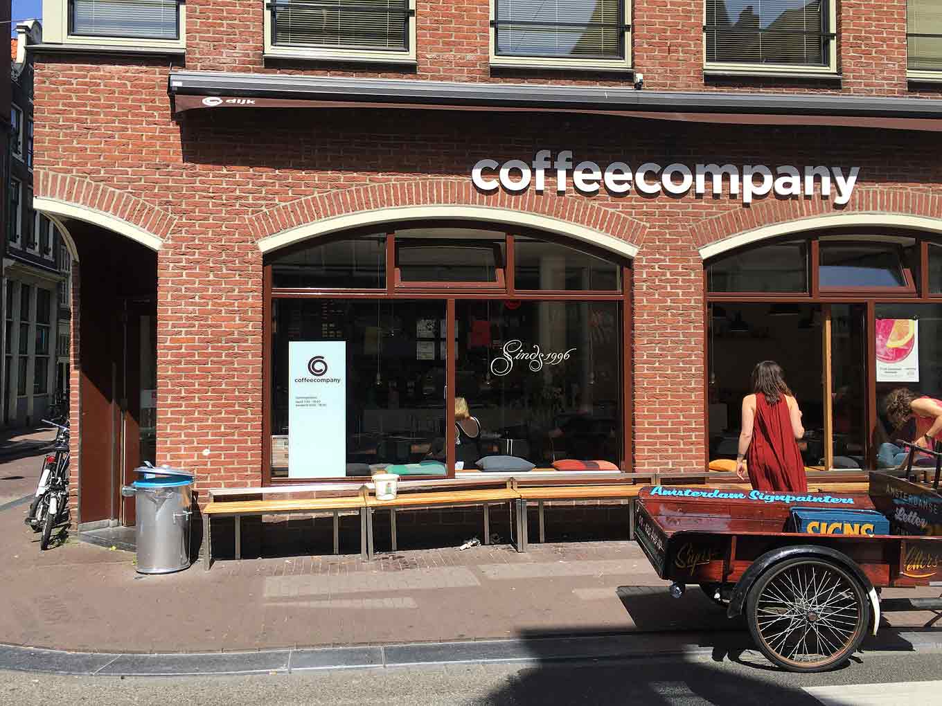
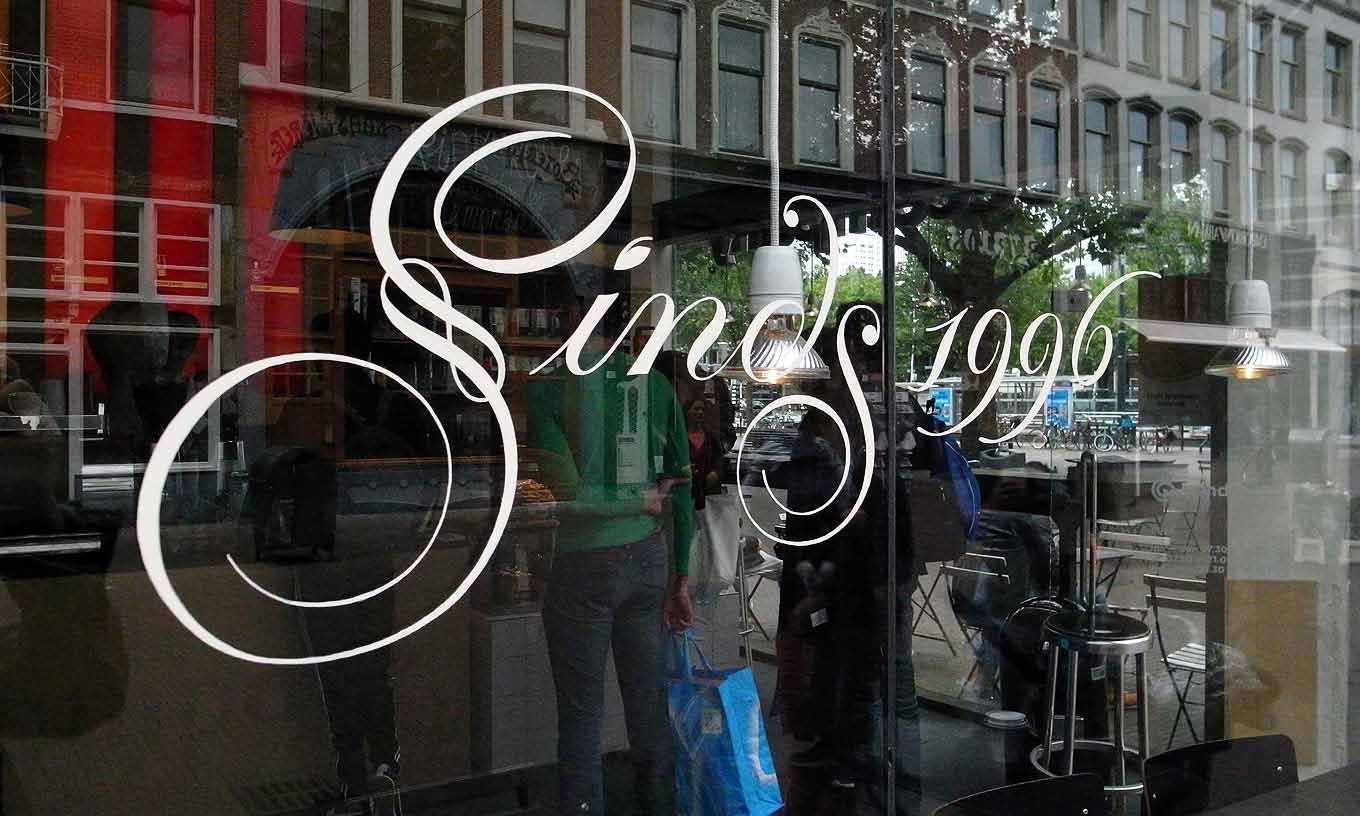
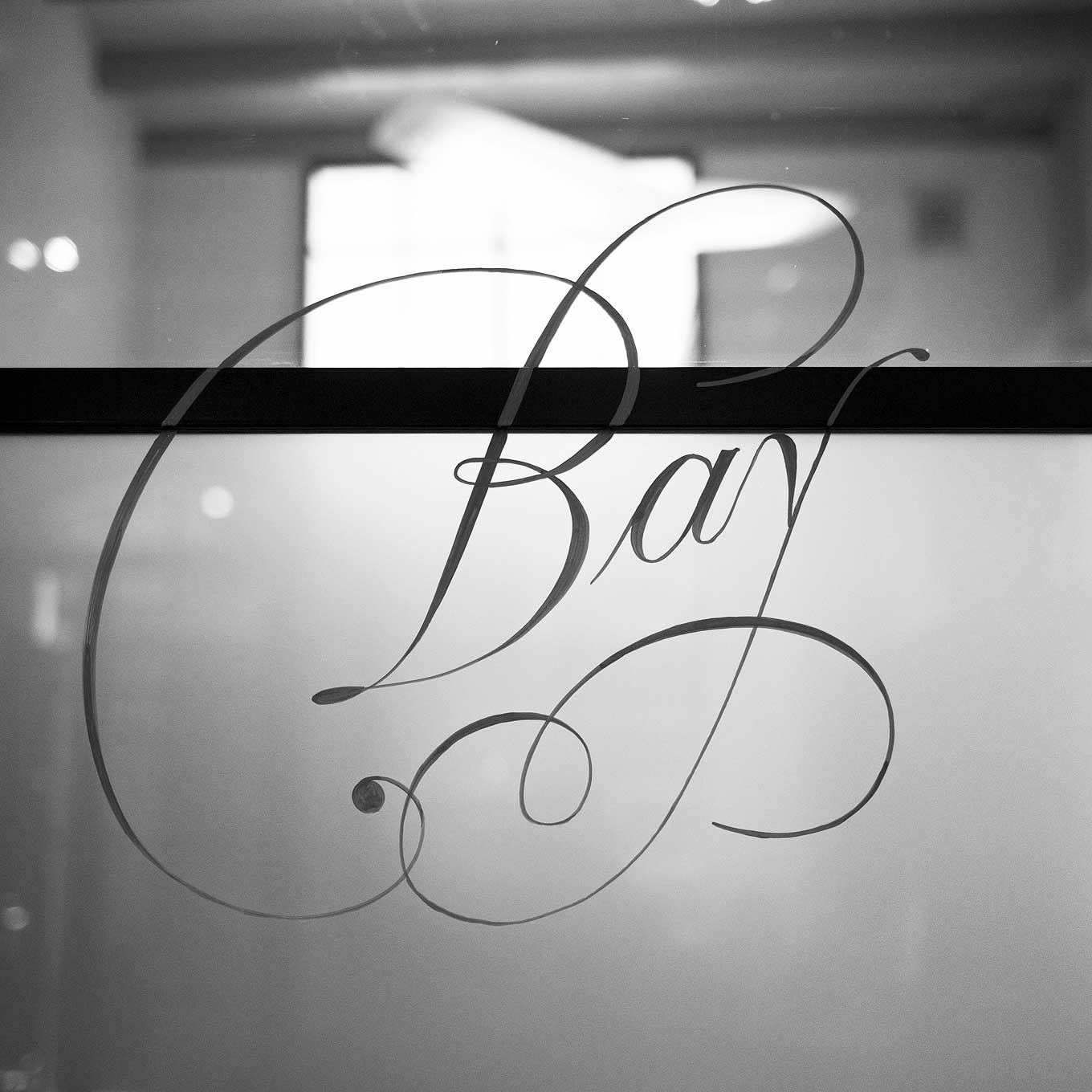
To celebrate their twentieth anniversary in 2016, Coffee Company had thirty-three café windows, spread out over several Dutch cities, painted with curly letters. Pictured in the foreground: a cargo bike belonging to one of the Amsterdam Signpainters.Pictured in the two photographs above: more curly letters on Coffee Company café windows.
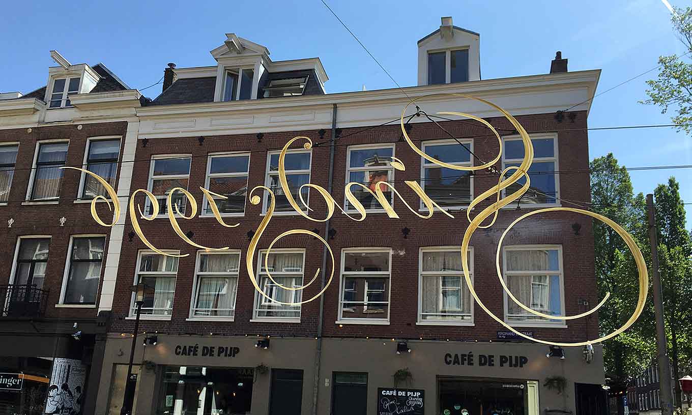
Such champions include the Amsterdam Signpainters, a collective of sign painters and lettering artists who got to know each other while attending workshops. Every member has a typographic background, each with a slightly different focus: some are quite figurative, while others are more conceptual. The members’ interests overlap and their skills are complementary, which makes the collective function well as a team. They began practicing the curly letters because, as they told me in an email, “As a sign painter in Amsterdam, you really can’t get around this essential part of Amsterdam lettering history. It felt completely natural for us to start doing something with the style.” (They take the fact that they are a collective seriously, insisting that I quote them as a group.)
The typical leaf-shaped tittle on the i.
Despite valiant rescue efforts, the curly letter is a style that can still be considered endangered. On one hand, because everything changes, “many windows, doors, walls, and the letters that grace them are being lost, often in larger numbers than we would like,” the Amsterdam Signpainters told me. On the other hand, the group’s members are pragmatic enough to recognize that change is inevitable, and don’t necessarily feel the need to save every single window. Nevertheless, they’re happy to see increased interest in the sign-painting craft from the general public. More people are learning about the curly letter and becoming aware of its cultural importance—which, the collective hopes, could help slow down the disappearance of the lettering style.
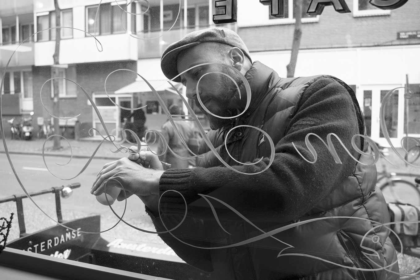
One of the Amsterdam Signpainters applies finishing touches to the lettering on the window of the seafood restaurant “De Gouden Hoek.”
The Amsterdam Signpainters are getting more commissions for curly letters. “Basically, we only paint the style when someone asks us to,” they said. The style is complicated, difficult to emulate, and technically quite demanding. It requires painstaking control of brush and paint along with a firm understanding of the logic and spirit of the letterforms. Where is the weight supposed to go? How do the letters connect? What are the proportions between thick and thin? How do the curls and swashes interact with the words and each other? The style is more or less a hybrid between handwriting and an interpretation of existing classical letters. And now, if typographers want a digital typeface that reproduces the intricacies of the Amsterdam curly letters, they can explore the wonders of Retype’s exquisite Krul.
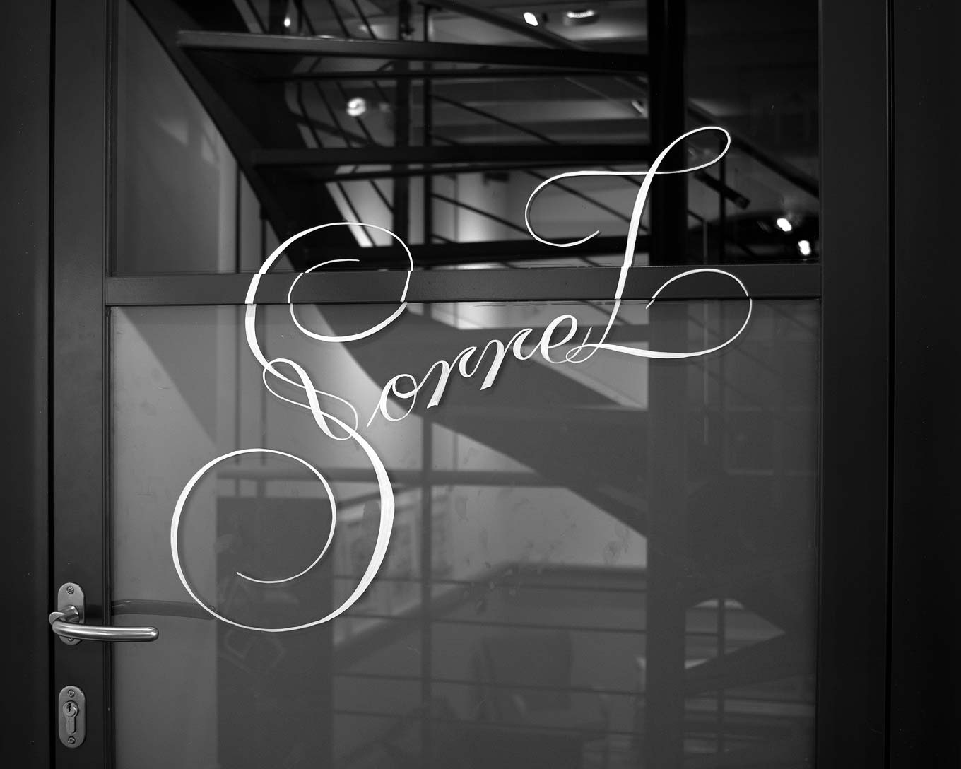
Typical Amsterdam curly lettering—with a little twist—in the Amsterdam office of independent branding agency Design Bridge.
Espinoza met the Amsterdam Signpainters in person for the first time at the book launch for The Curly Letter of Amsterdam. He was already aware of the group from social media, and because he was occasionally asked if he knew people proficient in painting the curly letters, he recognized the Amsterdam Signpainters as the perfect candidates. He decided to invest time and effort in teaching them the particulars of the lettering style and eventually embarked on a collaboration with them.
He usually prepares custom lettering pieces guided by facsimiles of Dutch writing masters’ books and the many pictures he and the collective hold in their archives. Espinoza’s pieces are then painted by the Amsterdam Signpainters. Sometimes he evaluates designs by the Signpainters, making suggestions for improvement. This working method gets the most out of the respective parties’ tools and expertise: Espinoza’s experience as a type designer, letterer, and editorial designer, as well as his extensive research into Amsterdam curly letters; and the Amsterdam Signpainters’ elevated level of craftsmanship.
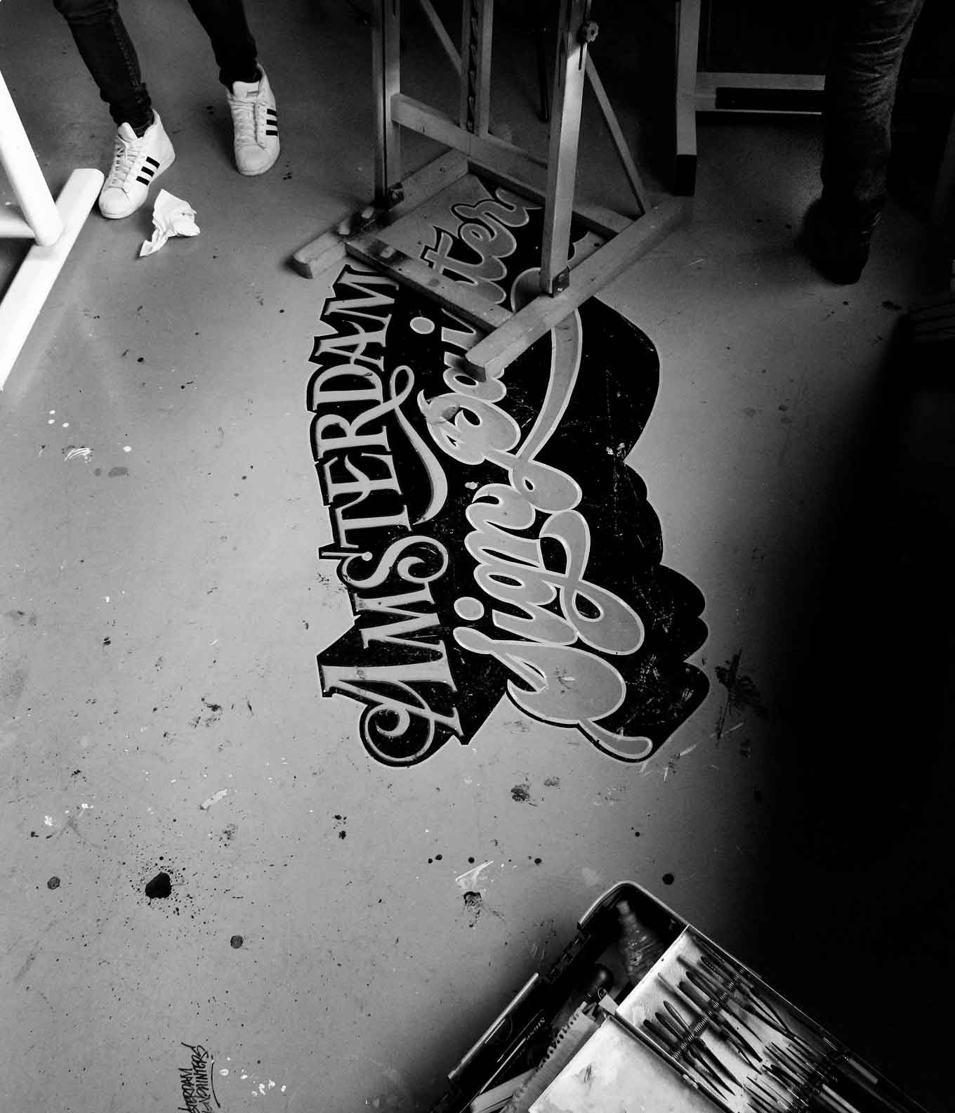
The Amsterdam Signpainters’ logo painted on the floor of their workshop.
Project by project, one window or wall at a time, Espinoza and the Amsterdam Signpainters are working hard to ensure that the breathtaking elegance of the curly letters of Amsterdam will continue to beautify the bars and streets of a city brimming with history, tradition, and ultramodern style.
Sadly, Leo Beukeboom—the gifted sign painter who revived the curly letter of Amsterdam and kept Wim Visser’s style alive—passed away on December 4, 2017.Bald Condensed, né Yves Peters, is a Belgian-based rock drummer known for his astute observations on the impact of letterforms in the contemporary culture-sphere. A prolific writer on typography, he has a singular knack for identifying the most obscure typefaces known to humankind.