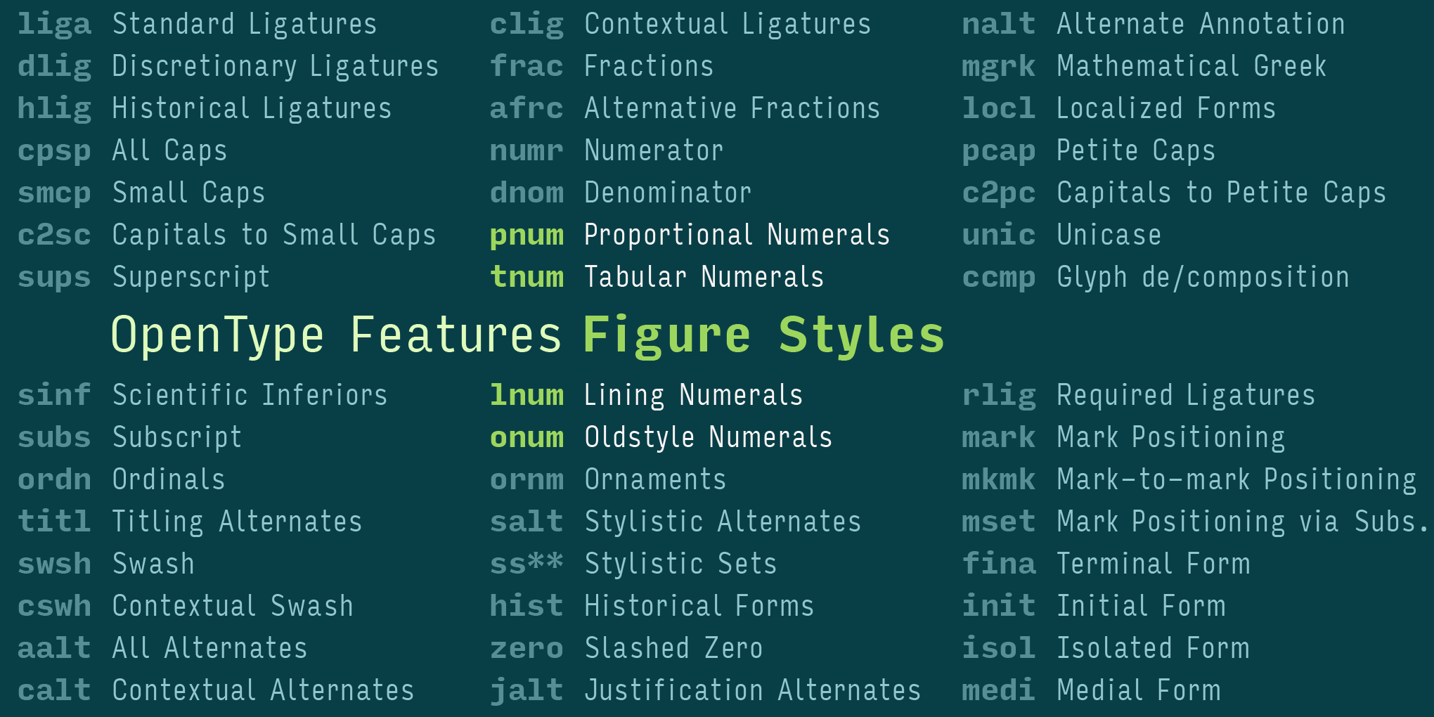
OpenType fonts can have up to ten built-in figure styles. This guide explains what they are, where to find them, and when to use them.
By Bald Condensed
Maybe this has happened to you: you’ve just licensed a font family and, eager to take it for a spin, you notice that the numerals look completely different from the samples you saw on the website. If you get confused by the many styles of numerals available in OpenType fonts, you’re not alone. I’ve been writing professionally about digital typefaces for over a decade, and I still often do a double take when hunting for the figure style I want in the font menu. The issue is that an artistic decision needs to happen with the help of technology—and the confusing setup of certain typographic interfaces doesn’t help. In this edition, we focus on the four basic figure styles.
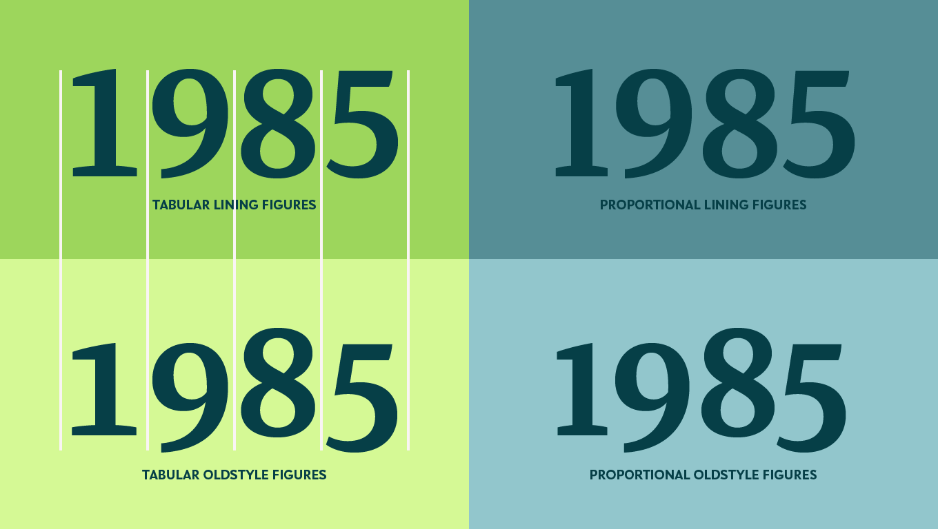
The four basic figure styles relate to each other in pairs in most cases. The heights of the two lining variants and of the two proportional variants usually correspond. However—as you can see in this example showing Retype’s Tasman—while the tabular numerals always advance at an equal distance, the proportional numerals sometimes don’t.
Why do we even have different types of numerals, anyway?
When Arabic numerals reached Europe in the twelfth century, they soon supplanted Roman numerals and became what we came to think of as medieval numerals or oldstyle figures. So-called lining figures, which correspond with capitals, are more recent: they were introduced into European typography in the late eighteenth century and stem from the tradition of shopkeepers’ hand-lettered signs.
By the nineteenth century, oldstyle figures were largely displaced by lining figures due to the latter’s use in newspapers and advertising; the lowercase numerals became rarer still in phototypesetting and eventually digital fonts in the late twentieth century. Most legacy PostScript and TrueType fonts were outfitted with tabular lining figures. Only a limited number of font families offered so-called Expert Sets, additional fonts holding anything that didn’t make it into the core font, like proportional oldstyle numerals and fractions. Since the early 2000s, however, OpenType fonts have acquired an exponentially larger capacity—currently for over 137,000 characters—with room for several numeral sets. Each has its specific use and can be accessed via OpenType features.
To determine which figure style best suits your needs, ask yourself this: Do the numbers you’re setting have to align vertically or horizontally?
The figure 1 in Petr van Blokland’s Upgrade acquires a foot serif to compensate for the extra white space around its slender form when switching to tabular figures.
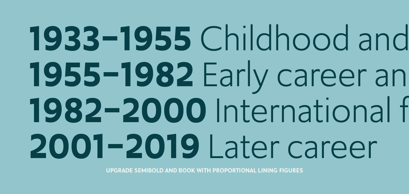
Tabular (tnum) numerals
If your numbers have to align vertically, use tabular figures (also called monospaced numbers in Apple apps). Such figures all occupy identical horizontal spaces. Their monospaced nature makes numbers in consecutive lines neatly align vertically in columns. Vertical alignment is crucial for making information in spreadsheets, financial data, math, and things like lists of dates or phone numbers more readable. In many typefaces, to compensate for the extra white space around its narrow form, the tabular figure 1 acquires a foot serif, or an existing foot serif gets widened.
The tabular figures in Miles Newlyn’s New Rubrik all advance the same distance in all weights, so you can highlight certain numbers in lists by changing their weight without disrupting their vertical alignment.
Weight duplexing
In some typefaces, the figures occupy identical horizontal spaces throughout all the weights, too. This allows users to change the weight of numerals without disrupting the vertical columns.
While they are essential for setting tables, the tabular figures in Richard Lipton’s Collier create gaps in text, so only activate them when you need numerals to line up vertically.
Proportional (pnum) numerals
Proportional figures all occupy horizontal spaces that are consistent with their design. Their spacing looks more harmonious, which makes them integrate more harmoniously with the surrounding text. Because they advance at varying widths, proportional figures can’t be used for any application that requires numbers to line up in vertical columns.
Because of its specific design, Jan Maack outfitted his spectacular IvyMode with only proportional figures in oldstyle and lining variants. Always use the lining figures in all-caps setting.
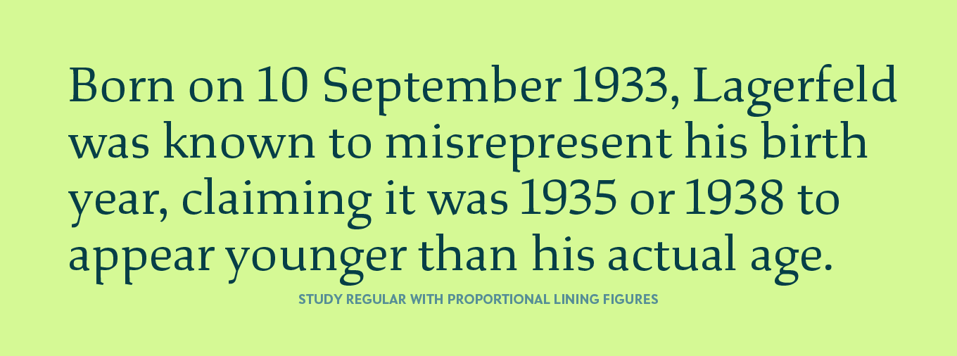
Lining (lnum) numerals
If you need numbers to align horizontally, use lining figures. As their name implies, they all have the same height. Lining numerals line up with the capitals (or are occasionally a tad shorter).
Since it is primarily a text face, Jesse Ragan made oldstyle numerals the default figure style for Study.
Oldstyle (onum) numerals
The name oldstyle figures clarifies neither their appearance nor their purpose; it simply alludes to the fact that they adopt their form from the “old” days of movable type. Because their construction follows the logic of x-height, ascenders, and descenders, they’re suited for mixed-case typesetting (i.e., lowercase with capitals).
Combined decisions
The typographic interfaces in QuarkXpress, the Affinity apps, Apple Pages, and even the humble TextEdit make it possible to select horizontal and vertical alignment independently. The Adobe Creative Cloud apps offer preset combinations.
Tabular Lining
It’s easy to understand why tabular lining figures became the default figure style. They offer the best of both worlds, allowing alignment both vertically and horizontally. Their main downside is that they stand out too much in body copy, creating a jarring rhythm for readers.
Proportional Oldstyle
Historically, Proportional oldstyle figures are the original form of Arabic numerals. They harmonize perfectly with the surrounding text in mixed-case setting. Avoid combining them with all-caps text, though—the numbers will look too small and have parts that stick out.
Proportional Lining
If you’re setting text in all caps, use proportional lining figures. They’ll align with the surrounding capitals but won’t exhibit unsightly gaps around narrower numerals like 1. Certain typefaces may have lining numerals that are shorter than the capitals.
Tabular Oldstyle
Tabular oldstyle figures are the least common of the four combinations. They can be useful in addresses where numerals need to harmonize with names, while still neatly lining up vertically.
Default figure style
Type designers decide which type of figure the font should display when a user doesn’t specify any particular style. Their decision is based on the intended purpose of the typeface: text faces often have oldstyle figures set as the default, while sans serifs commonly show lining figures by default, as do many display faces. Because the term “default” is non-specific, there is no way of predicting which figure style this setting will bring up.
Support
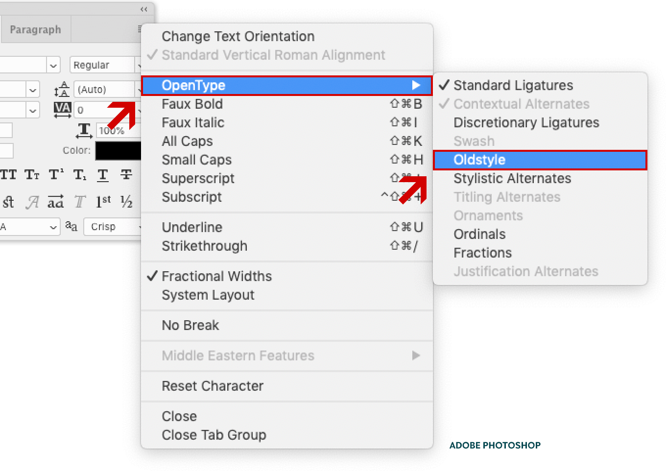
The four basic figure styles are universally supported in almost all major apps and browsers, except for only partial support in Adobe Photoshop.
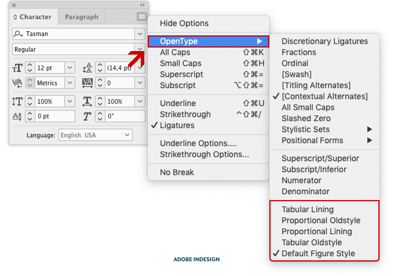
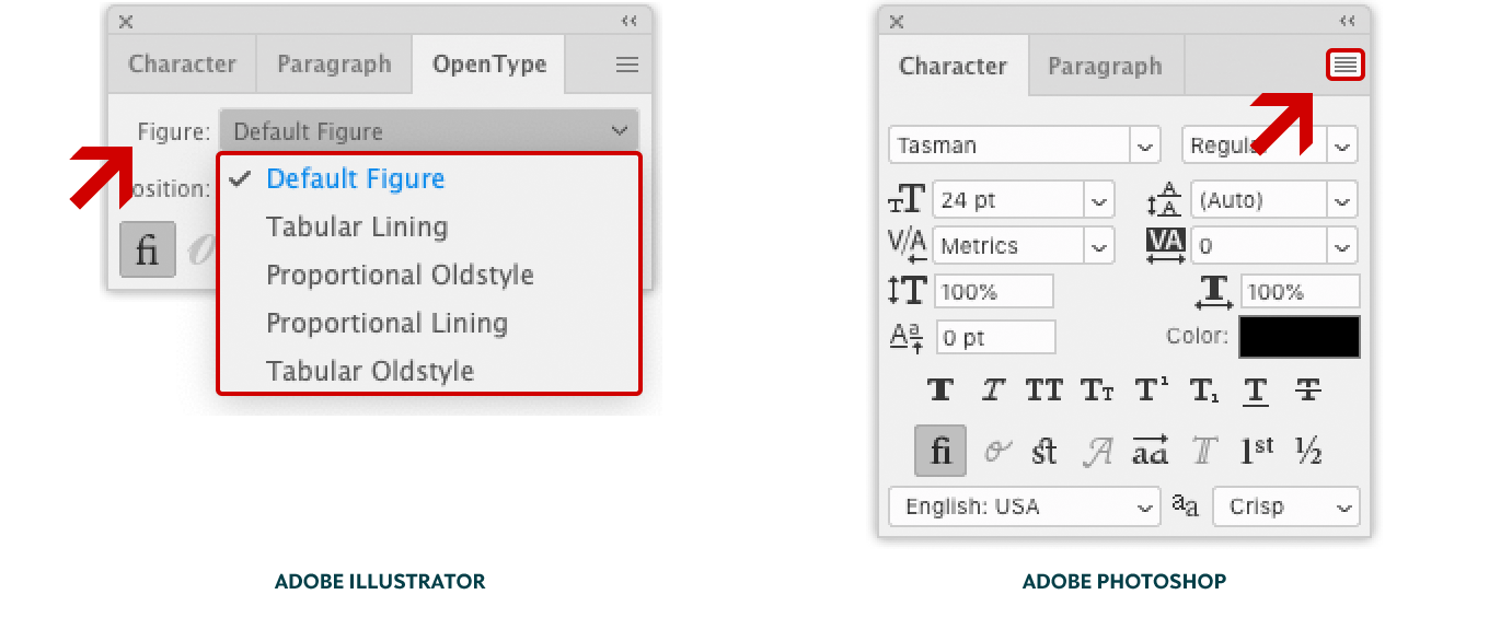
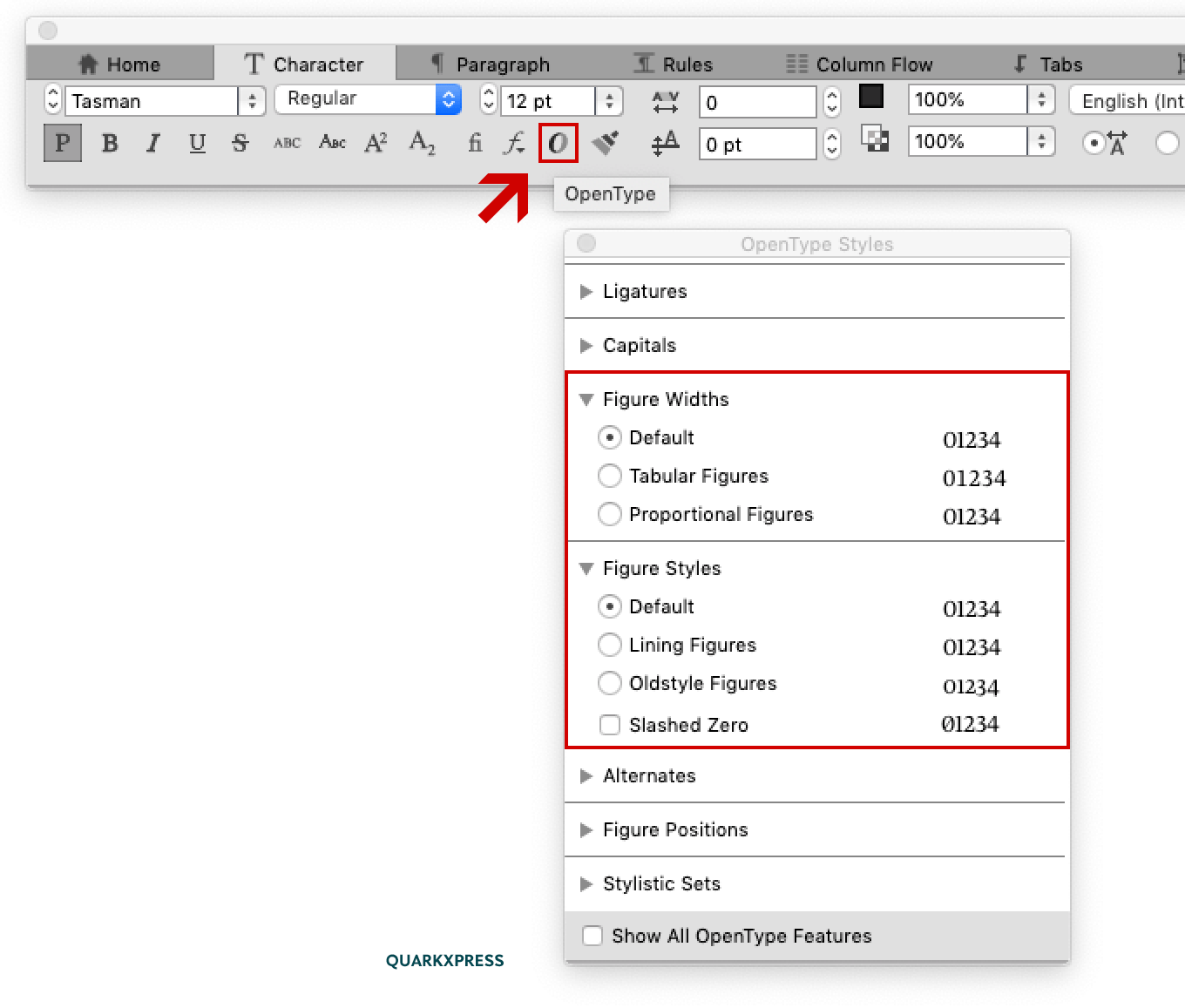
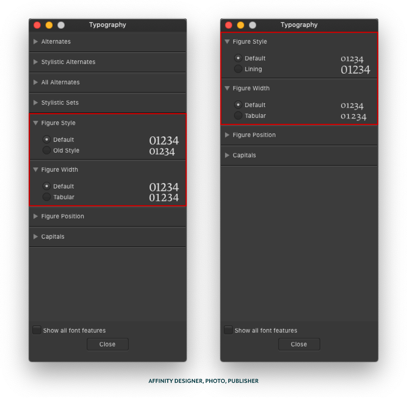
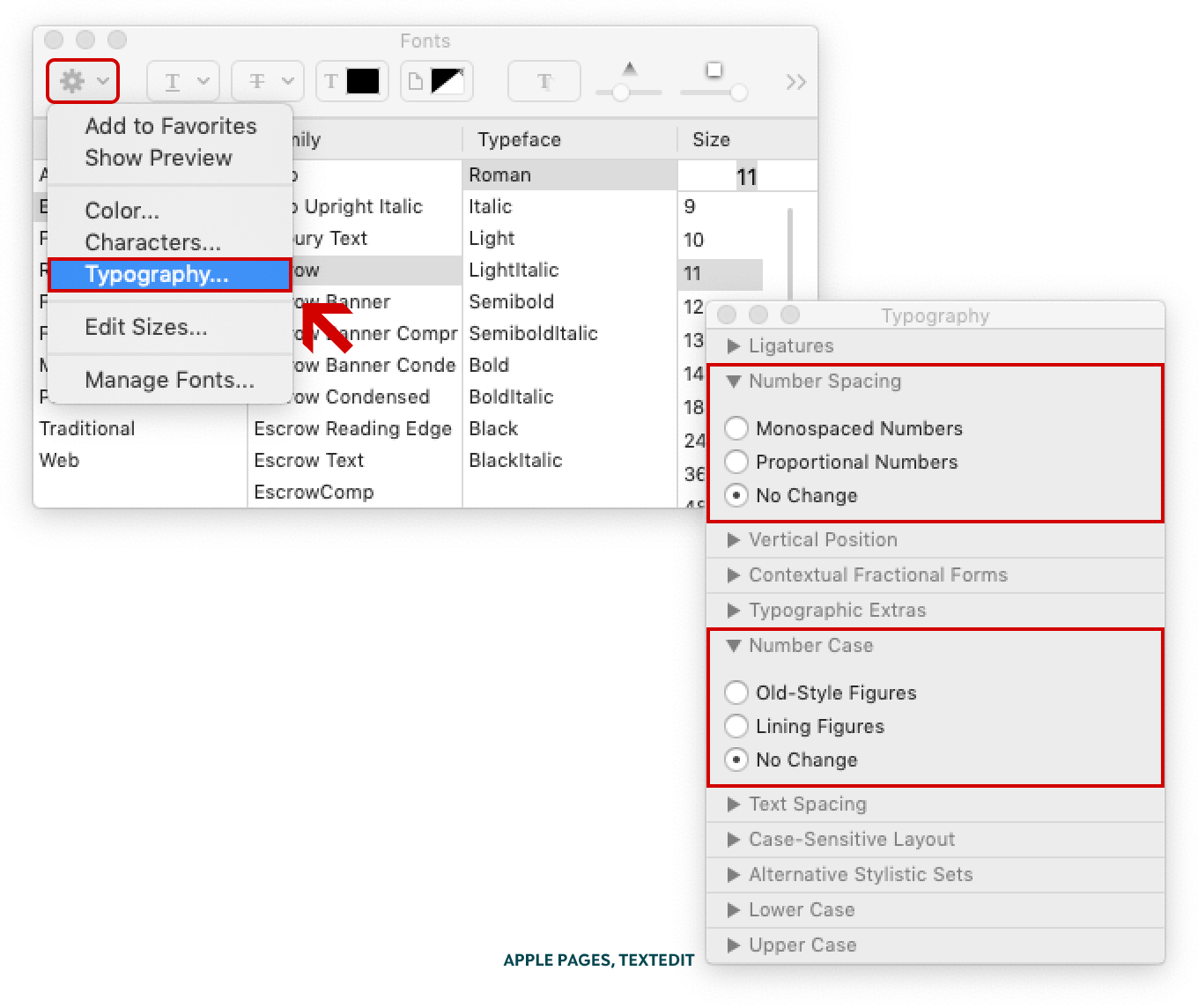
The different figure styles are located at the bottom of the OpenType fly-out menu in Adobe InDesign CC.The different figure styles are located in the Figure drop-down menu in Adobe Illustrator CC’s OpenType panel, and in the OpenType fly-out menu in Adobe Photoshop CC.Adobe Photoshop CC only lets users change the default figures to proportional oldstyle, regardless of what the font’s default figure style is. If the default figure style is already proportional oldstyle, then this is the only available style.Clicking the OpenType icon in the Measurements toolbar brings up the Opentype Styles menu window. The numerals’ vertical and horizontal alignment can be selected independently in the Figure Widths and Figure Styles sections, respectively.The Typography panel in Affinity Designer, Photo, and Publisher Beta identifies the default figure style to avoid duplicating it in the list of alternative options. Because Tasman’s default figure style is proportional lining, the user can only select oldstyle and tabular (left). Study, a text face, has proportional oldstyle figures as the default, so the Typography panel only lists lining and tabular figures as options (right).Apple’s Typography panel is a little harder to find: it appears in the drop-down menu when you click the Actions cog wheel in the upper left corner of the Fonts menu window. Some of the terminology is also different; “Number Spacing” and “Monospaced Numbers” clearly explain what you can expect, but “Number Case” is uncommon.Bald Condensed, né Yves Peters, is a Belgian-based rock drummer known for his astute observations on the impact of letterforms in the contemporary culture-sphere. A prolific writer on typography, he has a singular knack for identifying the most obscure typefaces known to humankind.