OpenType at Work | Contextual Alternates · Type Network
OpenType at Work | Contextual Alternates
Our OpenType at Work series explains what OpenType features do and how to make the most of them. My recent spotlight on Tilda inspired me to take a look at contextual alternates—programmatic diplomats that improve relationships between glyphs.
By Bald Condensed
The specific design of some typefaces can make it difficult for every single character to combine perfectly with all possible neighboring characters. Certain glyph1 shapes can cause issues when paired with certain other glyphs. Type designers get around this by drawing alternate shapes. They shorten cross strokes2 or overhangs3 to avoid collisions, for example, or remove serifs; they move outgoing strokes or alter their length to refine connections. Sometimes, designers introduce alternates simply because it makes the text look better—adding differentiation to repeating letters can achieve this, for instance. These altered glyphs are inserted via the OpenType feature known as Contextual Alternates (calt) to improve the overall word shape and setting.
As I explained in my article on standard ligatures, some people avoid ligatures because of personal or linguistic preferences. To prevent the overhang of the f’s hook from clashing into the ascender of the letters b, h, k, and l when the liga feature is turned off, the calt feature in Monokrom’s award-winning Nordvest swaps those out for versions without the top left serif.
How does it work?
The Contextual Alternates feature is basically a search-and-replace routine that examines the text. It looks at every single glyph and its surrounding context and checks that against a built-in list of sequences that the type designer has identified as undesirable. The context can be one or more glyphs before or after said glyph, or even both. Whenever it encounters such a sequence, the calt feature replaces the problematic glyph with the desired alternate glyph. This happens automatically and in the background, dispensing with the need to scour glyph tables in search of the perfect substitute. Savvy type designers extend this feature to consider every reconfigured sequence and check it against neighboring characters again, swapping out additional characters to resolve any new issues. The feature not only works on existing, imported, or copy-pasted text, but also on live text. As you type, the font continuously checks to see which characters precede the one you just entered and inserts contextual alternates wherever needed.
Bookmania already features an impressive amount of ligatures—more than eighty—and almost seven hundred swash characters, not counting accented composites. To avoid an avalanche of additional ligatures, Mark Simonson wrote calt features to allow for accents on any of the characters in a ligature. The fonts have prebuilt ligatures with no accents, as well as left or right ligature parts for characters with accents. For example, the Contextual Alternates feature changes Ch and Th swash ligatures from Stylistic Set 1 to Stylistic Set 2 with a longer swash when preceding an i, which in turn is replaced by a dotless i. This guarantees that the substitution also creates ligatures with accented C, T, h, and i, and does away with the need for ligatures for every single accented combination.
Ligatures and contextual alternates
Ligatures and contextual alternates basically serve the same purpose: they offer solutions for problematic or unwieldy glyph sequences. Although their name implies that they connect two or more glyphs, some ligatures actually solve problems by shortening letter parts, exactly like some contextual alternates do. So why are they two distinct features? The fundamental difference between them is that ligatures replace two or more glyphs with one combined glyph, while contextual alternates only change the appearance of one glyph at a time. A ligature typically resolves one single awkward glyph combination; a contextual alternate can offer solutions for many different graceless scenarios.
The outgoing strokes in Magasin are designed to create connections between letters, but look awkward at the end of words. Type-Ø-Tones solved two problems with the calt feature for this striking, stylized script. In specific situations, calt creates better connections, most importantly between capitals and certain lowercase letters. The feature also changes letters at the end of words to the proper final forms with altered outgoing strokes.
Improving the appearance of text
Contextual alternates do more than tackle occasional collisions. In connected scripts, for example, alternates can be crucial for properly rendering the typeface. Different letters connect at different heights, so entry or exit strokes may have to be moved up or down to guarantee exact transitions. And when glyphs in their default form are drawn to seamlessly connect with adjacent glyphs, their incoming or outgoing strokes may not look right at the beginning or end of words. Contextual alternates are used to modify the nature of those entry or exit strokes to create more natural word beginnings and endings, as appropriate, in the absence of any preceding or following letters they need to connect to.
Victoria Rushton challenged herself to design a script that impeccably connects using as few alternates as possible. She managed the impressive feat of needing no more than a mere four contextual alternates—r, s, x, and z with their entry stroke removed—and not one single ligature for Gautreaux.
Introducing variety
Beyond problem-solving, calt is typically the go-to feature for creating pseudo-randomness. Identical repeating characters are a dead giveaway that you’re looking at a font and not actual handwriting or lettering. To avoid having multiple occurrences of the same character in a sequence look the same, type designers program Contextual Alternates to make suitable substitutions. Designers who are especially clever can even consider proximities that are not necessarily adjacent, creating extensive and complex feature files that perform substitution upon substitution until an illusion of true randomness is achieved.
Underware is known for coding elaborate OpenType features. In this (simplified) example, Duos’ calt and liga features work together to create variation in a sequence of five repeated os. First, the calt feature applies a rotating 1-2-3 sequence. When it encounters a second o, it replaces the first o with the first available alternate glyph and uses the original glyph for the second one. Then, when it finds a third o, it switches the first o to the next available alternate, the second o to the first alternate, and uses the original glyph for the third one. When the typeface eventually runs out of alternates, it restarts the sequence. Since there are three shapes for the o in this example, this means that the glyph shape of the fourth o is identical to the first, and the fifth is the same as the second. This is where the liga feature intervenes, swapping the first two os for a double-o ligature to further diversify the glyph shapes.
Although such contextual alternates can be considered stylistic as opposed to purely functional, they don’t serve the same purpose as the Stylistic Alternates OpenType feature. With Contextual Alternates, the initiative comes from the type designer. Stylistic Alternates, on the other hand, are offered to users to apply at their discretion; the decision is entirely in their hands.
Well-coded calt features look beyond adjacent letters to consider repeated letters that are one, two, or even more letters apart, to make sure they don’t look identical.
When Contextual Alternates fail
Contextual Alternates should be activated by default. It’s always best to double-check, though, because they can be switched off. Some fonts may also include the Required Contextual Alternates (rclt) OpenType feature, which is permanently active if properly supported. Also, note that even if Contextual Alternates were switched on originally, certain actions can deactivate them without the user noticing. This can happen, for example, when you manually select an alternate glyph in a word, then copy and paste the text object and replace the existing text because you want to preserve the formatting. In her insightful and funny TYPO Labs 2018 presentation, Ulrike Rausch showcased this issue and some other instances where OpenType features fail.
The casual lettering effect in XYZ Type’s Cortado comes mostly from contextual alternates, as the typeface only has a few ligatures. Cortado’s calt feature performs a very involved and systematic series of tasks. It starts by looking for the ends of words, and turns on finial glyphs with shorter exit strokes. After turning off all connections, it turns on all allowed connections. Then it breaks up the connections according to a 3-2-3 pattern: three connections, a break, two connections, a break, three connections, and so on. The feature proceeds to clean up undesired breaks/connections, making sure that the last two letters connect if possible, and solves other fussy visual hiccups that Jesse Ragan and Ben Kiel didn’t like. Then it goes through and changes the letters to turn on the alternates in an “alt off, alt on, alt off” pattern. Lastly, it checks five glyphs backward to ensure that repeating letters don’t look identical. This adds up to about 1,200 lines of calt code.
Although many typefaces have no need for contextual alternates, it’s always best to have the feature switched on, just in case. Unlike Stylistic Alternates, Contextual Alternates are more than an aesthetic choice; they’re often indispensable for solving certain thorny problems and improving the text image. Making sure they’re activated will make your text look the best it can.
Support
Contextual Alternates are universally supported in all major apps and browsers.
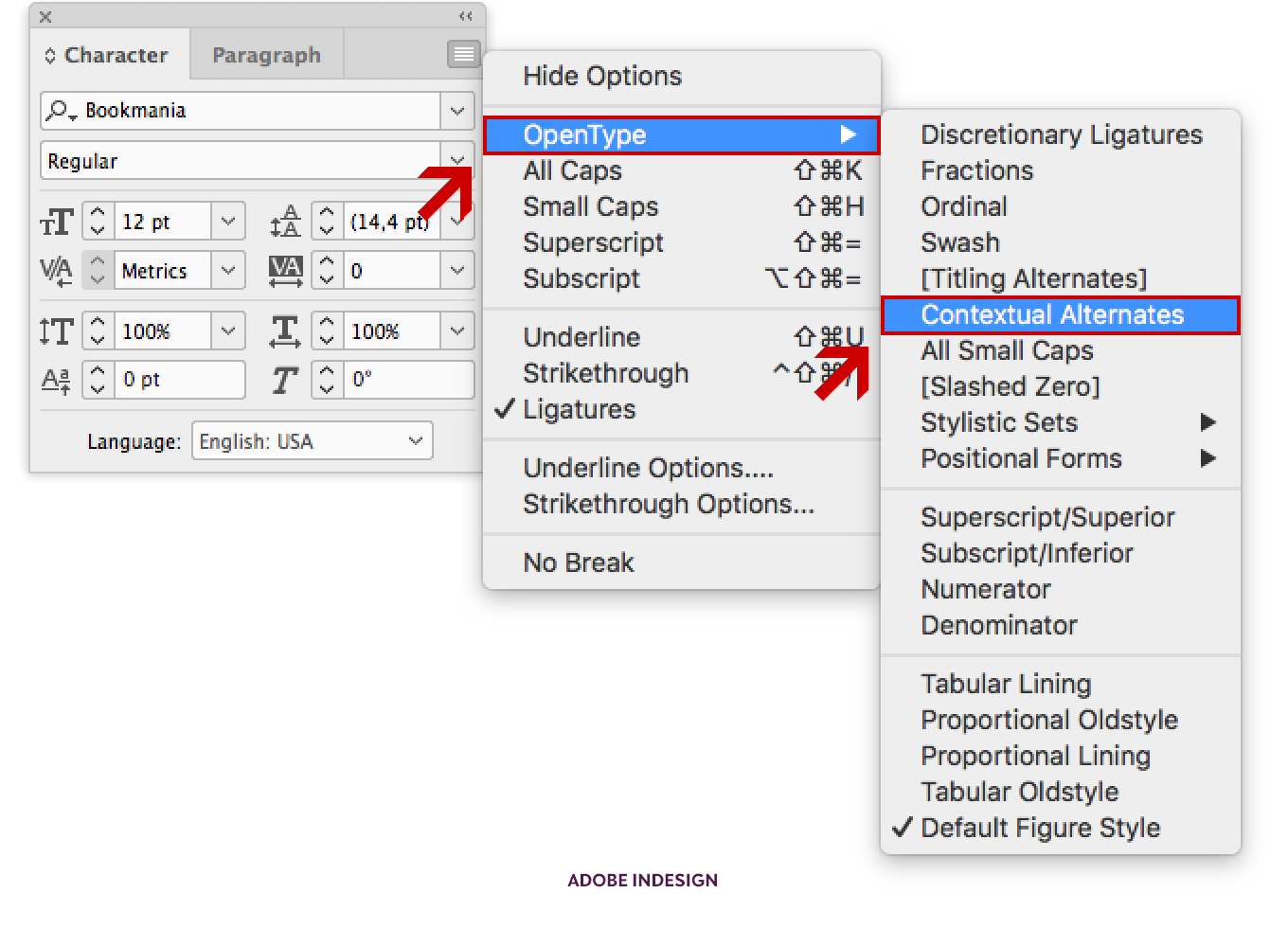
Location of the Contextual Alternates OpenType feature in Adobe InDesign CC.
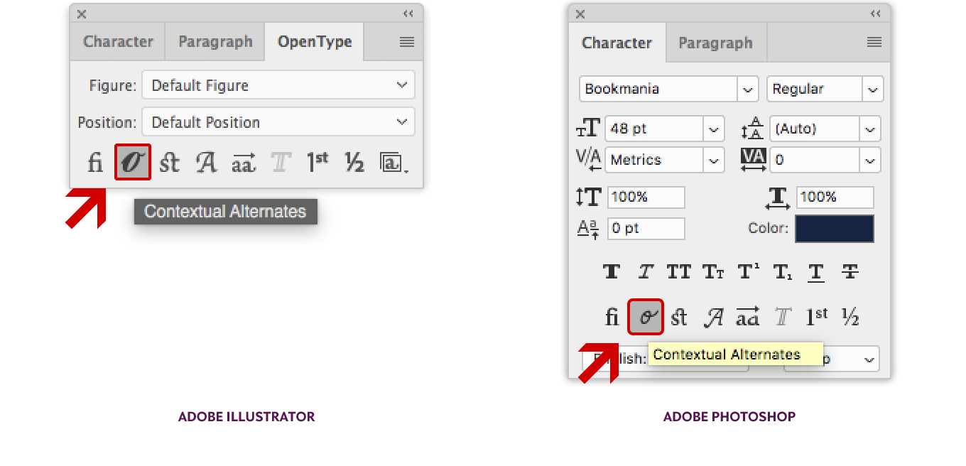
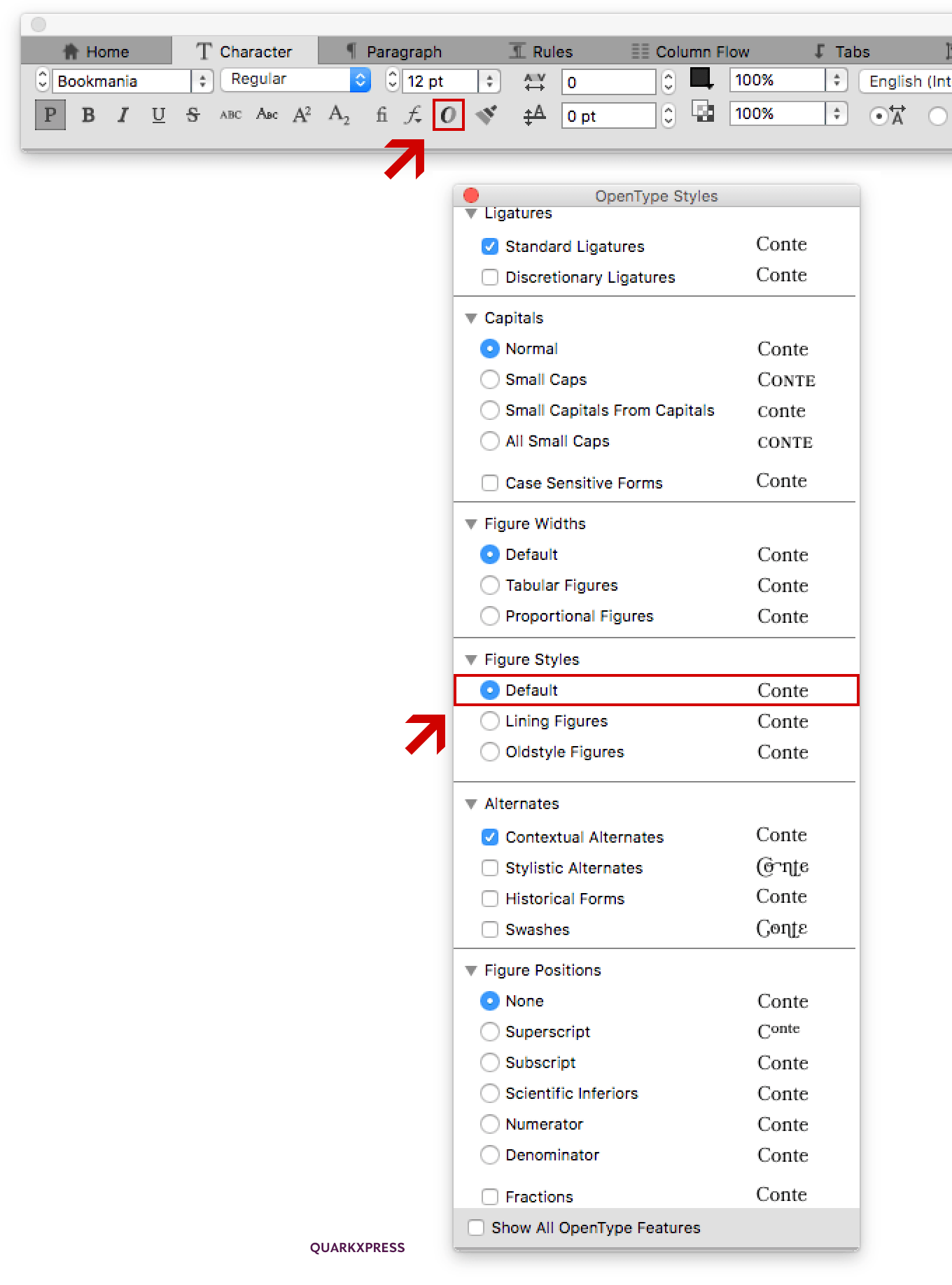
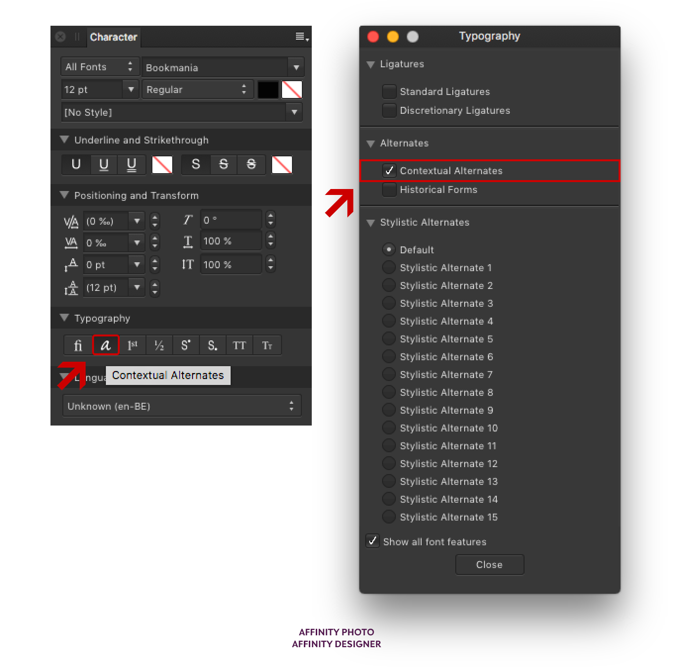
Location of the Contextual Alternates OpenType feature in Adobe Illustrator CC (left) and Photoshop CC (right).The Contextual Alternates OpenType feature in QuarkXPress can be activated in the OpenType Styles window which is opened by clicking the OpenType icon in the Character control bar.Location of the Contextual Alternates OpenType feature in the Character and Typography windows in Affinity Designer and Photo.
Notes
A glyph is the visual representation of a character, be it a letter, a figure, a punctuation mark, a ligature, or any other alphanumeric character. The capital A and lowercase a are two different glyphs representing two different characters; but if, for example, a capital letter A exists in a standard form and as a swash variant, these are two different glyphs for the same character.↑
A cross stroke is the (usually horizontal) stroke that intersects the stem of letters like f and t. ↑
Overhang is the amount any letter extends beyond its expected boundaries. For example, if the hook on the f has a lot of overhang, it will intrude into the space of the subsequent letter. ↑
Bald Condensed, né Yves Peters, is a Belgian-based rock drummer known for his astute observations on the impact of letterforms in the contemporary culture-sphere. A prolific writer on typography, he has a singular knack for identifying the most obscure typefaces known to man.