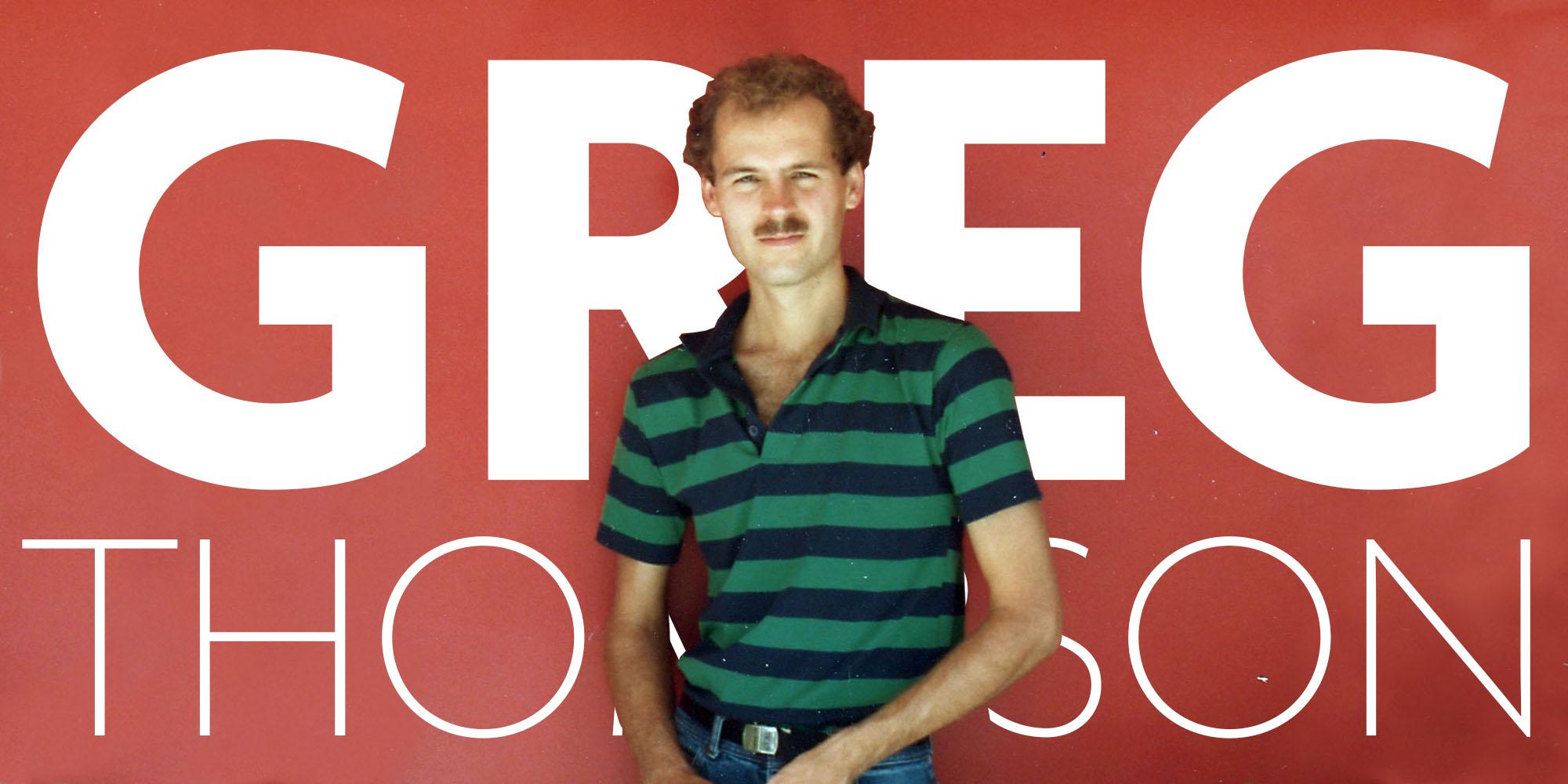
One for the Agenda
Greg Thompson’s latest design—a familiar but improved Agenda One—brings a musician’s ear, a tinkerer’s hands, and an artist’s eye to the page.
Greg Thompson has been a stalwart of Type Network, and before that The Font Bureau, for more than three decades. His best-known typefaces, Bodega and Agenda, are perennial bestsellers. Bodega Sans, a distinctive, narrow design notable for its original take on 1930s Art Deco, has proven to be very popular as a display typeface. Agenda, with its roots in the sans serif letters designed by Edward Johnston for London’s Underground in 1913, and its nod to geometric letter shapes, is a larger family, with several weights that can be used for text, and three increasingly condensed variations for headline and subhead use.
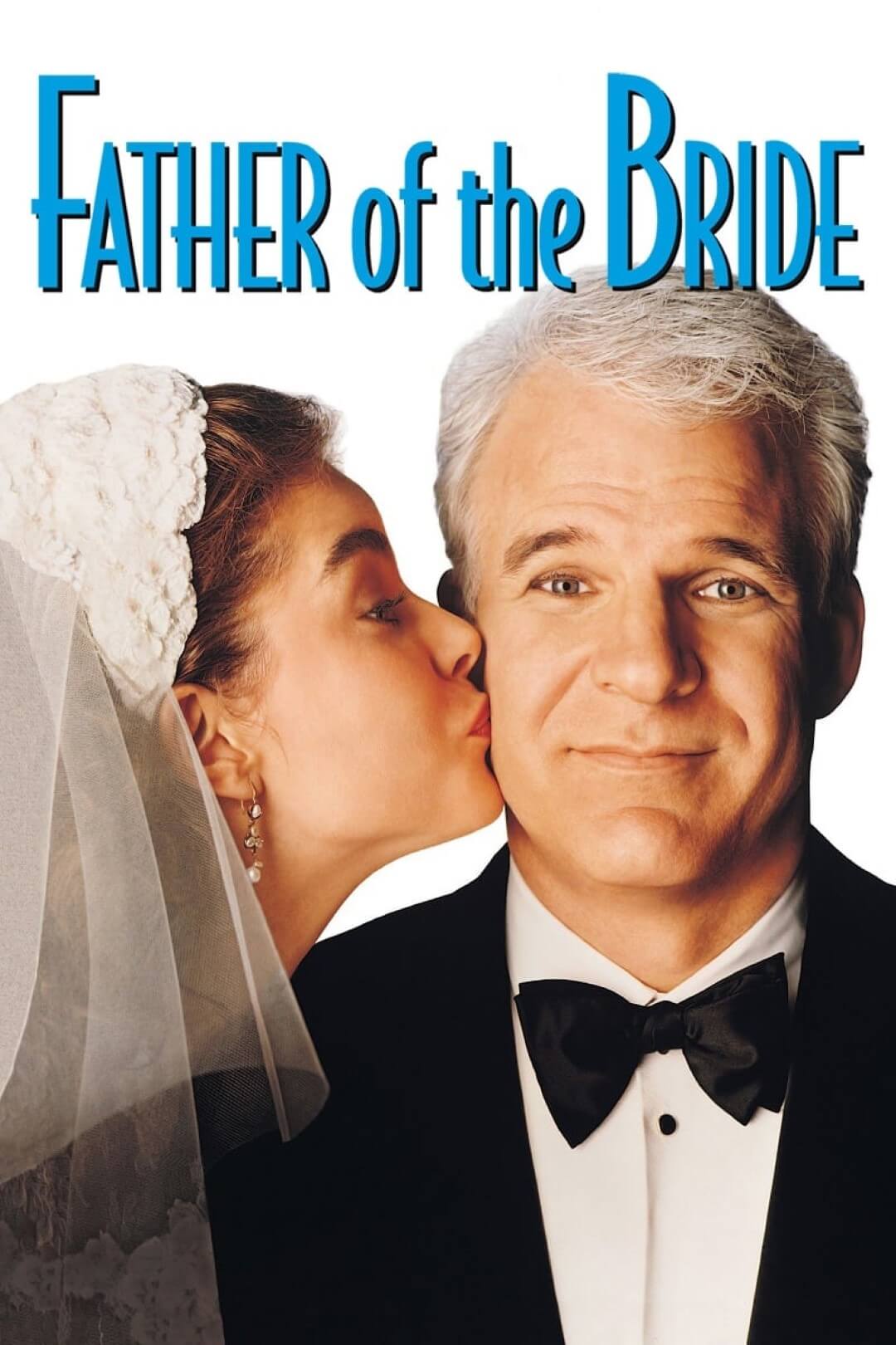
Thompson has always been pleased to see his typefaces in use. “I first saw Bodega in the wild in Los Angeles. I was driving west on Ventura Boulevard, headed home. And out of the corner of my eye, something caught my eye as I was driving. They have these little bus stop kiosk things that people can sit in and wait. And they're plastered with advertisements. I saw one and I said, ‘I think I know that.’ I clicked around the block. And it was an advertisement for ‘Father of the Bride.’ With Steve Martin, the remake. It was a movie poster, set in Bodega Sans. I was ecstatic. I was just on air; I floated home.”
This was what Roger Black calls the “gutter test,” where you look down at a scrap of paper in the gutter as you’re walking along the sidewalk, and you can immediately tell from the typeface what publication it came from.
Thompson came to type design from music. At the age of 19, he moved from his native Nebraska to Los Angeles and started working in a recording studio. His initial plan was to become a recording engineer. He had studied music from a young age, and in his teens, he says, “I discovered audio. I bought a Dynakit audio amplifier and built my own power amplifier from it.” With a turntable and some speakers, he had a component hi-fi system.
Not just content to listen to music or play it, he started learning how the components worked. At Loma Linda University, he took a course in microprocessors, learning how to build little breadboards around them. “I loved tech,” he says, “I loved the devices, figuring it all out, hooking it up to build things.” Thompson’s growing technical expertise led to his working on modifying and building the equipment in the studio.
“I learned how to do recording by watching an older man – that was the master recorder. Then I took some classes. I took tape-recorder maintenance from Dale Manquen, who had designed the first multitrack tape recorder.”
Thompson even developed a love affair with old German microphones. “This was after transistors had started being used in audio. They were being sold on the basis of their super-low distortion. They don’t have tubes, so they don’t have to warm up. They don’t go bad, like tubes go bad. So they were selling transistor microphones. But a few audio engineers said, ‘I like the sound of the old stuff better.’ And that set off a craze of collecting. So guys are traveling all around the country, going into old churches and saying, ‘Do you have any old microphones you don’t want?’ And they would say, ‘Yeah, we have these old things in the dust. We’re using these new transistor microphones and they sound much better.’ And the guy would say, ‘Ah, well, if you’ve got some old stuff that looks interesting, I might take it off your hands for a few dollars.’ Some guys could amass impressive collections just by scouring places like that.”
So how did Thompson get from the music business to type design?
It was the smoke, he says. In those days, in the late 1970s, it was still common for people to smoke cigarettes in the studio while they worked. Thompson realized that he didn’t want to keep doing that. “I didn’t want to be sitting at midnight on a weekend in a smoke-filled control room, trying to record this one line over and over again. So I went to art school.”
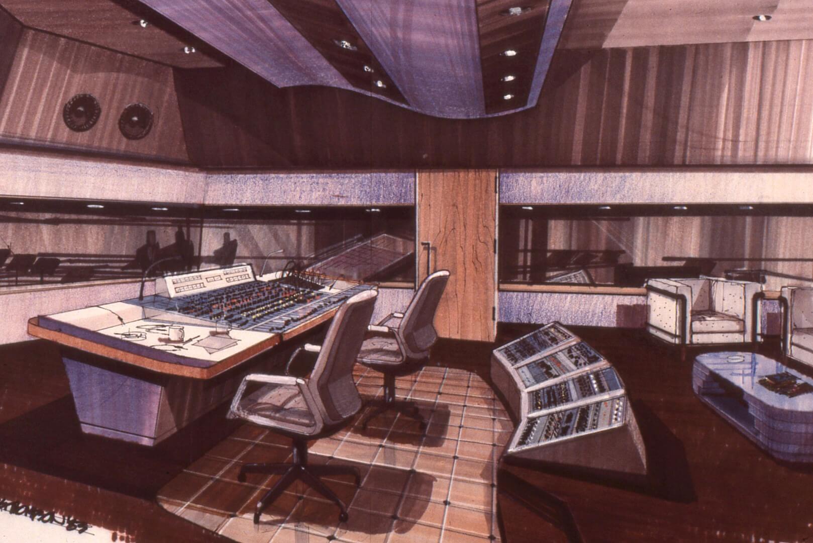
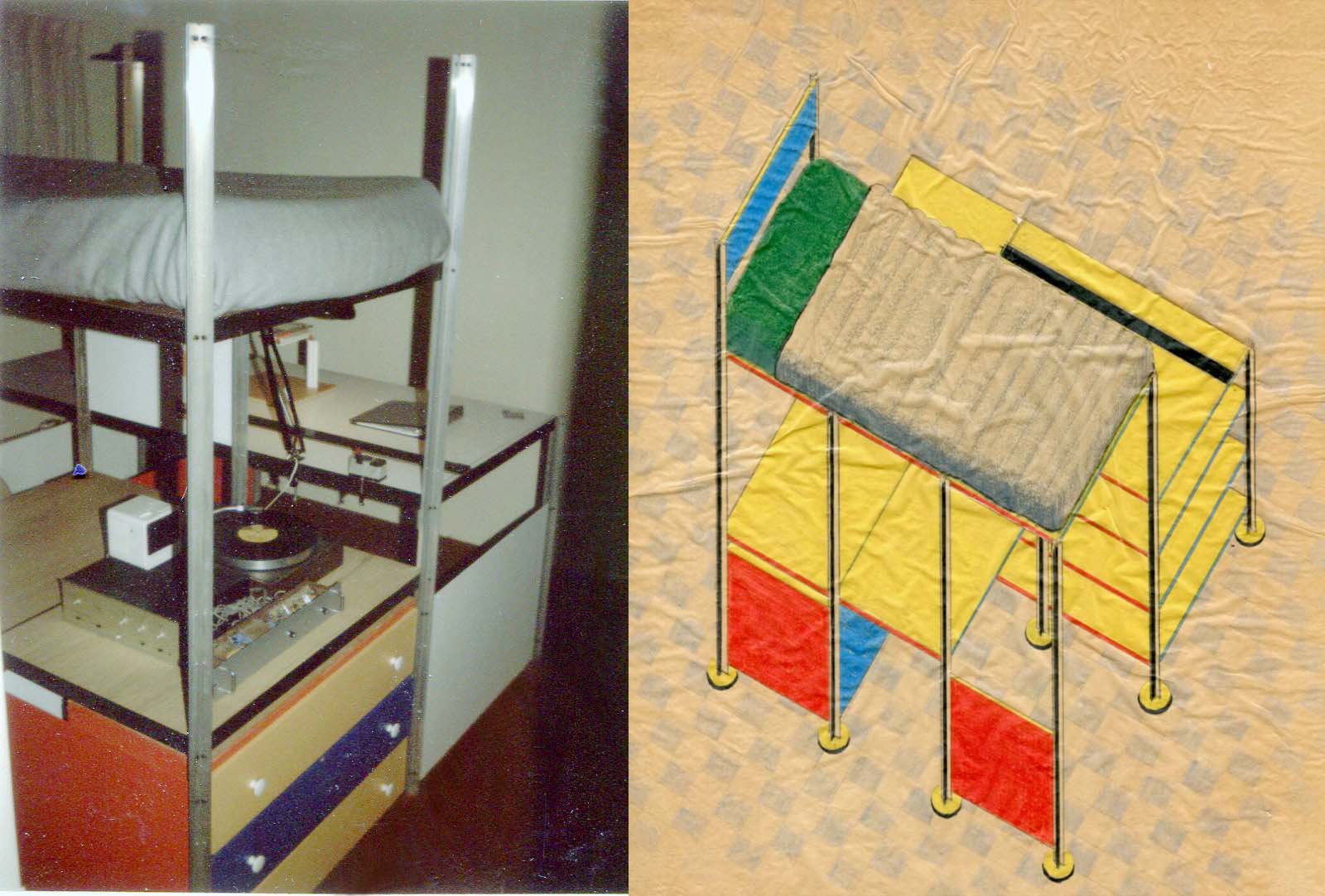
Thompson enrolled at Art Center College in Pasadena, where he began studying industrial design. “I took a specialty called Environmental Design, which was not environments like trees and rivers; it was interior architecture, basically — store design, office, commercial office design. We learned about different materials, and office layouts. Our teachers were working professionals.”
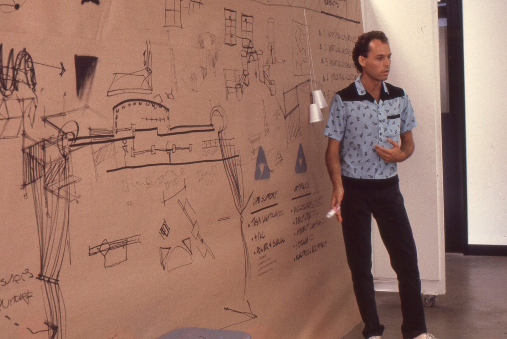
After graduation, he moved to Chicago, where he got a job in a large design agency. “It was called Bagby Design, and they did high-end design to pay for the founder’s high-end shoes that he liked to wear.”
This was still in the days of phototypesetting and paste-up. “In those days, the designers would scribble on some paper and then call a messenger, who would show up in maybe ten minutes or so. It didn’t matter what time of the day, or night or week, you know — it could be the weekend. This bike messenger would show up, and he would take the script and a little sketch to the typesetting studio. These shops ran 24 hours a day. There was a proofreader, and there was a type director who would hand it off to the keyboarder. Who would input the text into a big machine that cost as much as a house.” Then it would be pasted up on boards, proofed, corrected, and sent back to the client.
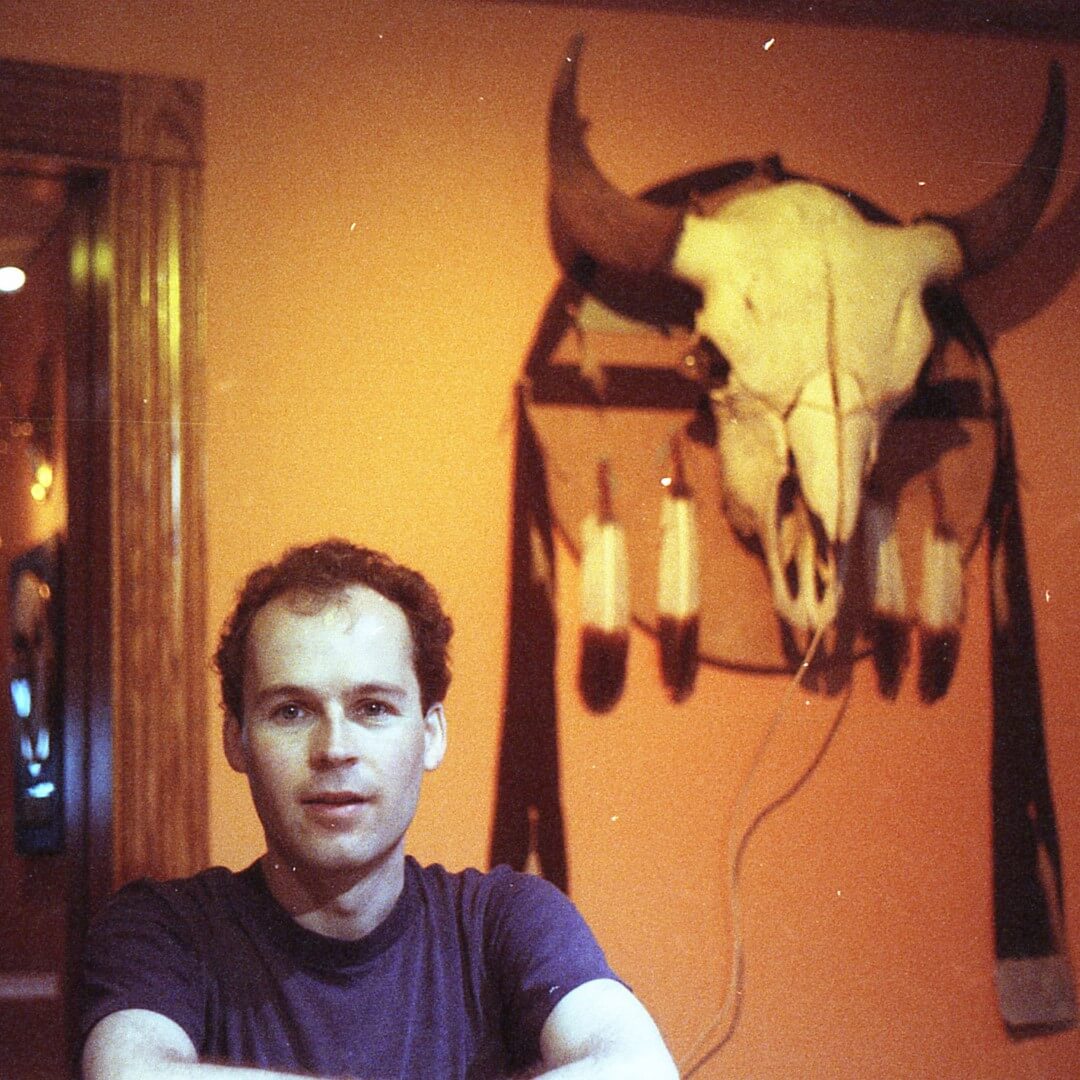
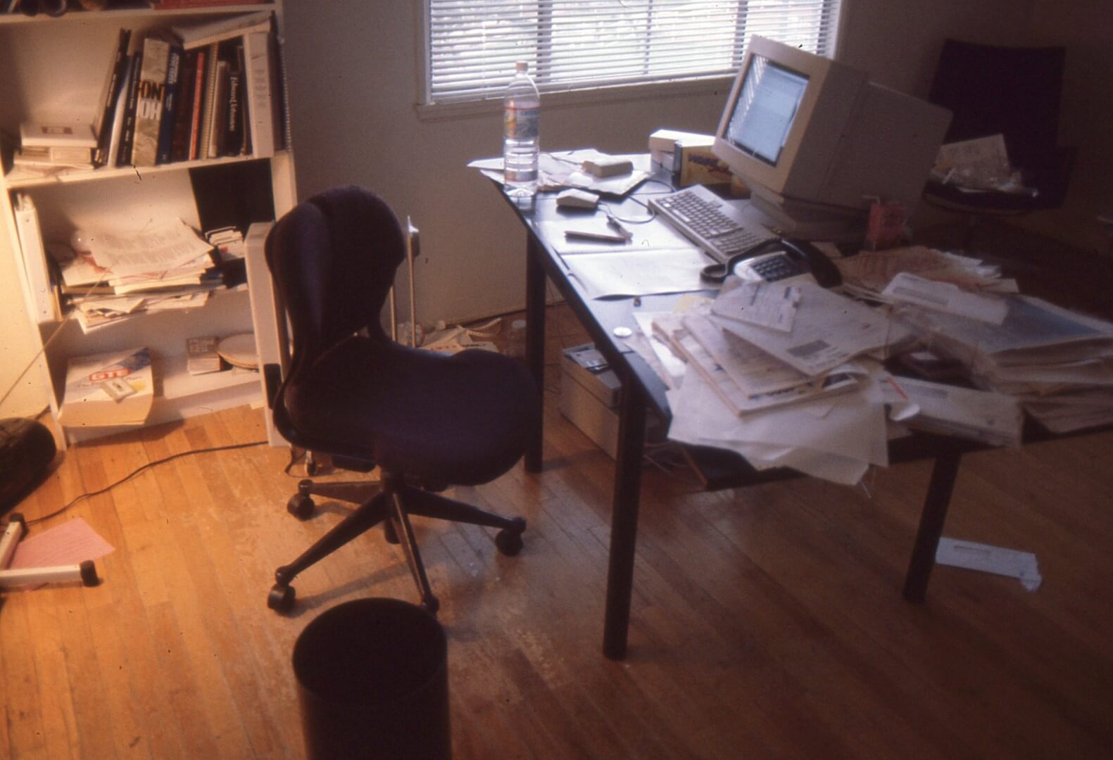
But these big typesetting systems were already an endangered species by the mid-80s, and Thompson’s technical bent served him well. He got hired by another studio to set type on a Macintosh, “right alongside all the people who were still doing things the real way.” It wasn’t long before they were hauling out the big, expensive machines and replacing them with small computers.
Thompson says that from the very first he has always designed his typefaces on a computer, even when he starts with a few pencil sketches. He designed Bodega Sans in an unfinished attic in Chicago, working on “a little Mac SE/30 with the seven-inch black-and-white screen,” and proofing his work on a dot-matrix printer. But he remembered his experience at the big studios. “I learned a lot from a designer at Bagby Design, Tom Clark – just an attitude about type. When I started working on Agenda, I thought, ‘I want to do a typeface that Tom Clark would use.’ He had just a handful, you know, less than ten typefaces that he would choose from. So that’s what I was shooting for.”
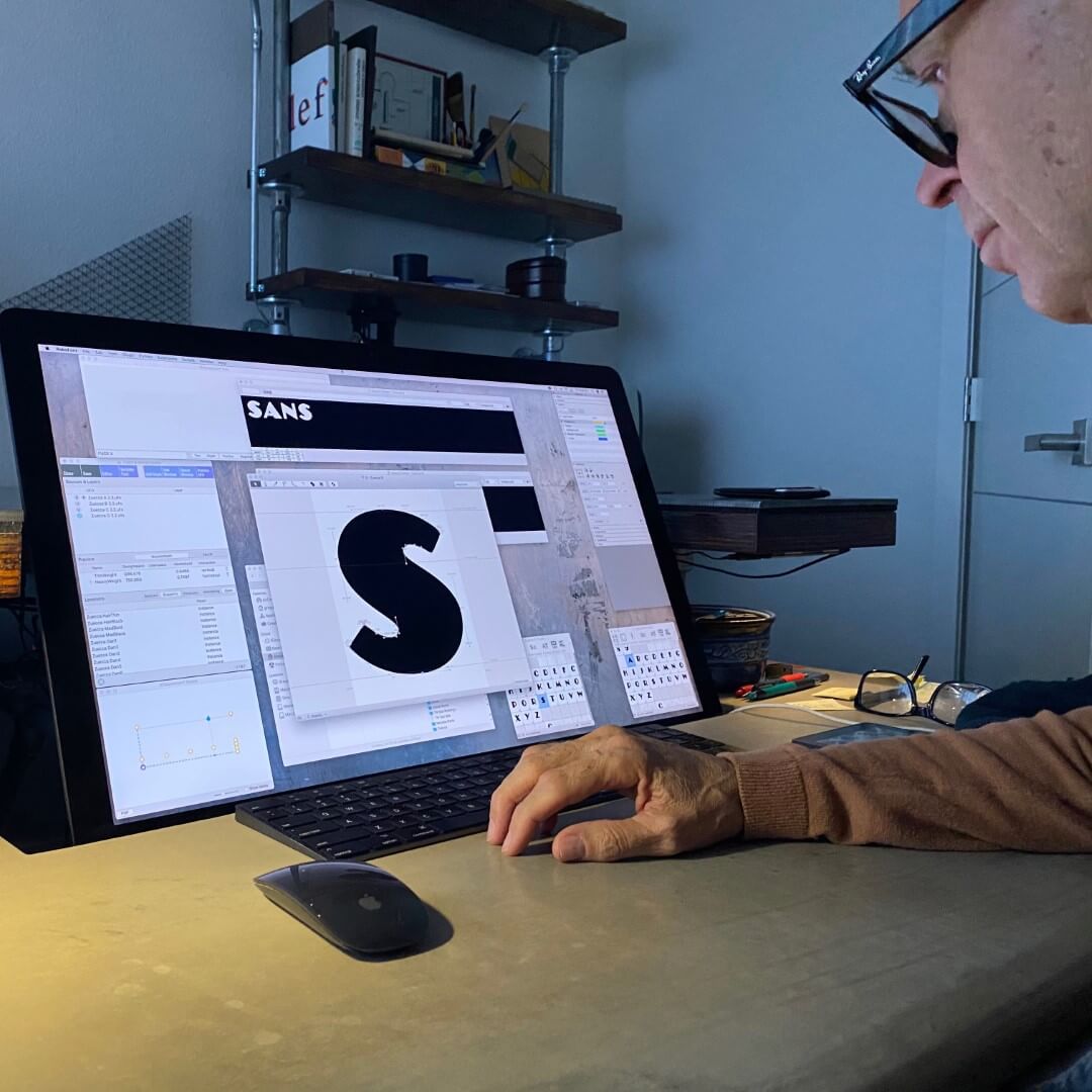
Thompson explains that he always works in what he calls a design space. “By ‘design space’ I mean a number of different fonts, different masters: the simplest would be a thin master and a heavy master. So I would draw my glyphs two at a time, the thin version of the lowercase ‘a’ and the heavy version of the lowercase ‘a’, and then I have a tool that allows me to smoothly go between the two.” He was using Fontographer and Adobe’s multiple master technology to create a two-axis design space for the font, each axis setting the limits within which he could create interpolations and variations, which he would then redraw and fiddle with until each variation was just right. This was how he designed Agenda.
Agenda is a distinctive-looking typeface. Its lowercase ‘a’ is instantly recognizable, with its portly belly, its stubby tail, and its hair hanging over its face. The diagonal cut in the snub-nosed lowercase ‘e’ is one of the Agenda’s emblematic details, which is echoed in some of the other letters. The jaunty ‘g’ is both reminiscent of Johnston’s sans and distinctive in its own right.
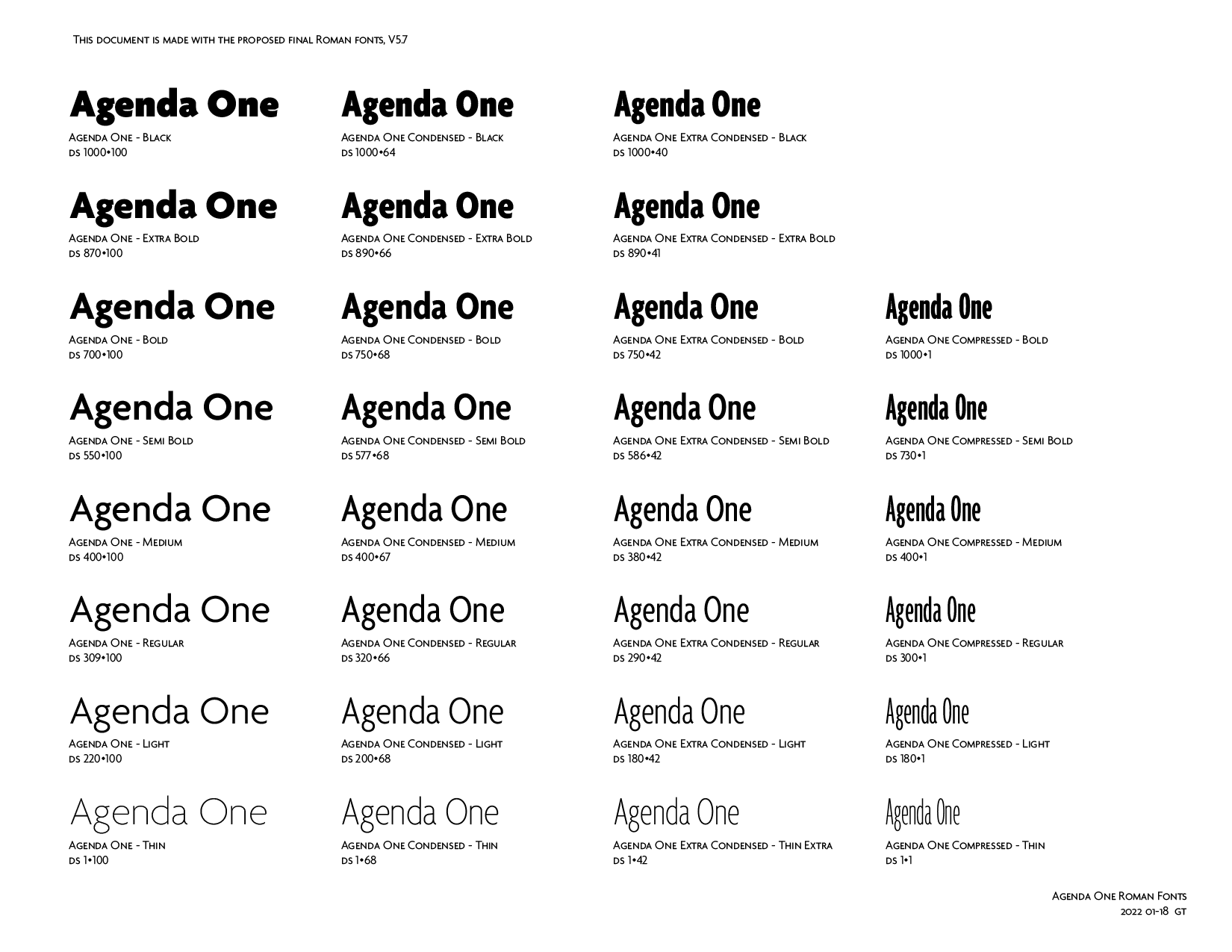
After nearly thirty years, Thompson has now reworked Agenda into a new version called Agenda One. The primary aim of the updated family is to support a wider range of languages and typographic features, adding small caps, lowercase figures, tabular figures, inferior and superior figures, and additional currency symbols, in addition to additional diacritics for the Latin alphabet. “The individual styles with their names remain,” he says, “though getting lots of detail refinements. I want users of the current Agenda styles to be able to swap in Agenda One without disrupting existing layouts too much.”
A note on backwards compatibility
There are enough slight differences in Agenda One that a document set in current Agenda retail will likely reflow just from the slight character widths when changed to Agenda One. Reflows for headlines and larger type are less likely in the wider styles and more likely in the narrower styles but guaranteed for text sizes. Because of other design differences, such as tighter top accents and entirely new kerning, users will almost certainly want to adapt their layouts to the much more satisfying Agenda One details.
While Agenda One is intended to be compatible with the original Agenda, Thompson has taken the opportunity to improve some areas that he wasn’t satisfied with, notably in the very condensed styles and in the italics. “I’m much happier with the italics,” he says now. “I think I’ve done a much better job with those.”
There’s a parallel between Thompson’s type design and his long experience with music. “It’s a sort of abstract connection, I think: the sense of music, the rhythm, the sense of dynamics, a sense of the melodic line. All these things apply to type design.” Patience is also a requirement for both. “To be a musician, you have to practice. And you have to be patient.”
He gets into a flow state when he’s working on a drawing. “When that happens, time just vanishes.” As he was getting Agenda One ready for Type Network’s QA process, he says, “The other night, during a long session, I just started typing out words and letters on the screen, just sort of playing around. Looking at it in reverse. I like to type numbers and just enjoy the interactions of the shapes. And the rhythm that I’ve worked so hard to create — this is all really pleasurable. It was just me and my screen, and the letters that I had designed and put together, and I really, really enjoyed that.”
- License Agenda One. Available in 60 Styles.