A number of early typefaces by Cyrus Highsmith have been out of circulation for a while. Now they make a triumphant return.
By Type Network Staff
Based on colorful magnetic letters bought at a variety store, Icebox evolved from its playful origins and picked up new environmental influences (like a manhole cover) to become a family in three weights and a bonus Magnet style.
A handful of Occupant typefaces—Daleys Gothic, Loupot, Occupant Gothic, Eggwhite, and Icebox—have been awfully quiet lately. But worry not. The beloved designs are being dusted off and reactivated for type users to (re)discover and enjoy. Yves Peters chatted with June Shin and Cem Eskinazi (Highsmith’s collaborators at the Morisawa USA Providence Drawing Office), who adapted the original files to current font technologies in preparation for their rerelease.
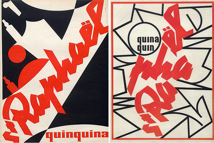
Inspired by the revolutionary logotype French designer Charles Loupot drew to promote St. Raphaël wine, New York designer and illustrator Laurie Rosenwald collaborated with Highsmith to create Loupot, an arresting script that is both industrial and calligraphic.
Shin and Eskinazi were not intimately familiar with those early Highsmith designs, but they were certainly aware of them—Eskinazi even used Eggwhite in a project for graduate school. When the pair started working on the font files, they were pleasantly surprised: compared to more recent families they’ve worked on, Highsmith’s early fonts were relatively simple. The five faces were originally created in the pre-OpenType days, when character sets were limited to 256 slots—a far cry from Unicode’s overwhelming breadth. (The current version, 11.0, supports almost 140,000 characters.) “When running the fonts through our quality-assurance tests,” Shin said, “there were only very minor fixes, like adding characters that weren’t part of the standard set back then.” Eskinazi added: “Right now we’re working on families like Heron and Scout, which have so many masters for weight and width, plus italics, and also have some nine hundred characters. So when we opened the font files for these early typefaces, we were amazed at how little work we had to do.”
Born from exercises with a steel brush and ink on paper, Daleys Gothic was named after Highsmith’s mother, who taught him how to draw.
Different generations face different problems. Shin and Eskinazi graduated last year, so they grew up with technically advanced OpenType fonts boasting extensive character sets. “The entire QA process took less than a day,” said Eskinazi. “We caught a few things that went unnoticed in those earlier, simpler days.”
Doodling while stuck in a seemingly endless meeting, Highsmith started experimenting with unconventional weight distribution. These escapist sketches became the rhythmic display face Eggwhite.
Technical complexity aside, what about the early fonts’ design? “It was interesting to discover that what you see in Cyrus’ older typefaces still is present in his current ones,” Shin said. “You immediately notice his ‘hand’ in them.” Eskinazi added: “Because the early designs were specifically display typefaces, you can see all these details more exaggerated; he plays a little more heavily. When drawing text faces, this playfulness has to be toned down, understandably.”
Drawn with the fast straight lines that dominate his illustrative sketching style, Occupant Gothic typographically embodies Cyrus Highsmith’s caffeinated vision of the urban environment.
A final cool discovery was Highsmith’s “joker” characters, as Eskinazi calls them. For every single one of his typefaces, Highsmith drew an illustration to replace the Apple glyph in the old PostScript fonts. “Because these were display typefaces, the illustrations were amazing. They really captured the personality of the typeface,” Eskinazi said. “So with every new font file I opened, I was excited to discover what the illustration was going to be.”
For each of the five typefaces, Highsmith drew delightful illustrations to replace the Apple glyph in the original PostScript fonts.
This typographic quintet was pulled from the line when Type Network launched in 2016. Highsmith wanted to make sure they met today’s exacting standards when rereleased. He’s excited to see them back in circulation, and eager to see how people will use them.
Like all Occupant fonts, Daleys Gothic, Loupot, Occupant Gothic, Eggwhite, and Icebox are available for print, web, applications, and ePub licensing. Webfonts may be tested free for thirty days. To stay current on all things Occupant, subscribe to Type Network News, our occasional email newsletter featuring font releases, foundry happenings, type and design events, and more.


