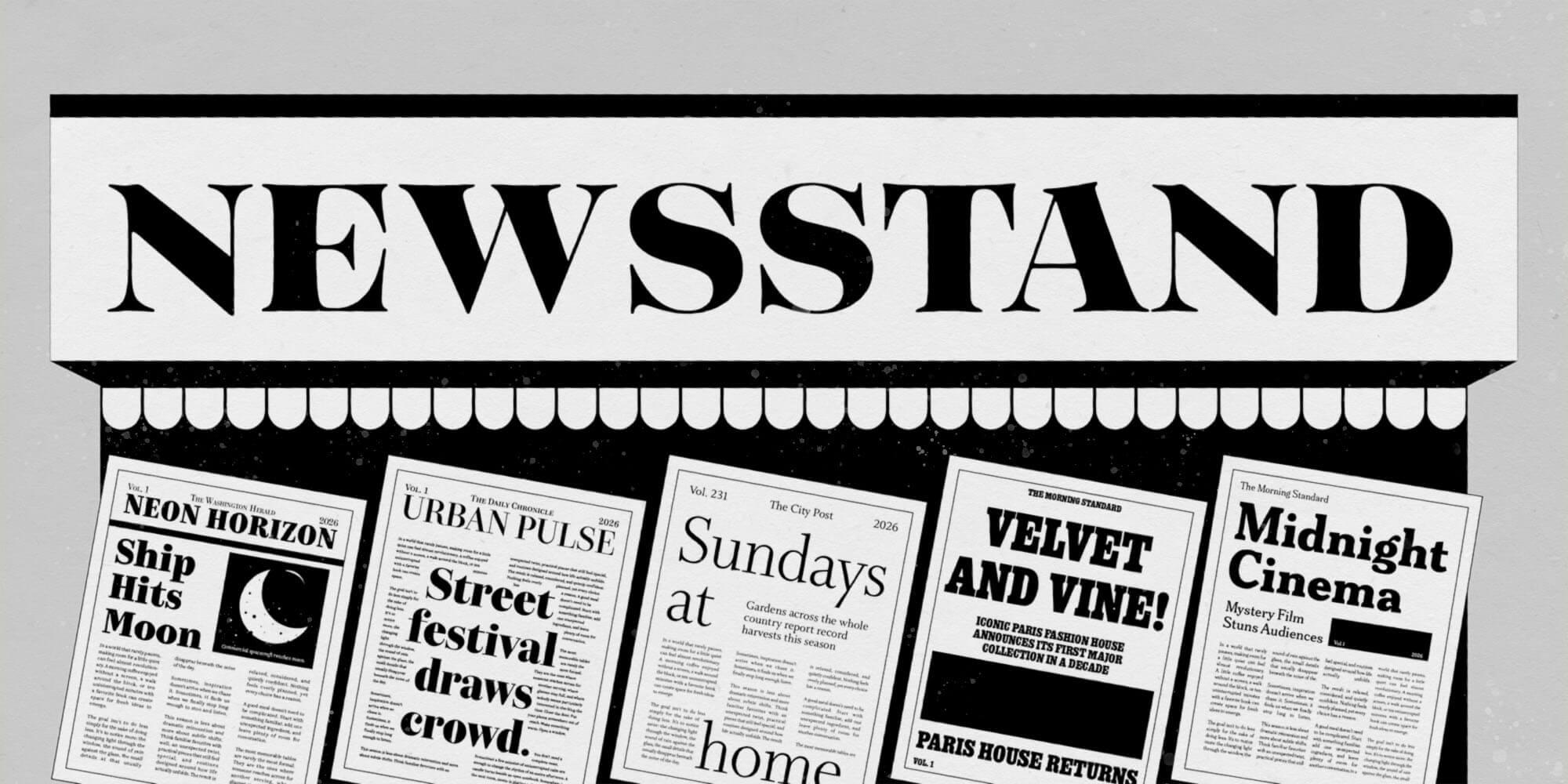
Featuring: Kazimir · CSTM Fonts, Bettoni · CAST, Whitman Display · Kent Lew, Ringold · Bijou Type, Meursault · Universal Thirst, Tenez · Plau
Newsstand energy: editorial type for the fall issue
Fall issues are cast long before they hit the newsstand, and there is no better time to audition your typographic masthead. Five faces with real newsroom pedigree, each matched to the publication it was born to run.
Editorial type has the hardest job in the business. It has to sell the story from across the room, then sit with the reader for three thousand words without fidgeting, issue after issue, deadline after deadline. The faces below have all done that job for real mastheads, and they are ready to do it for yours. Consider this the staffing plan for your fall issue.
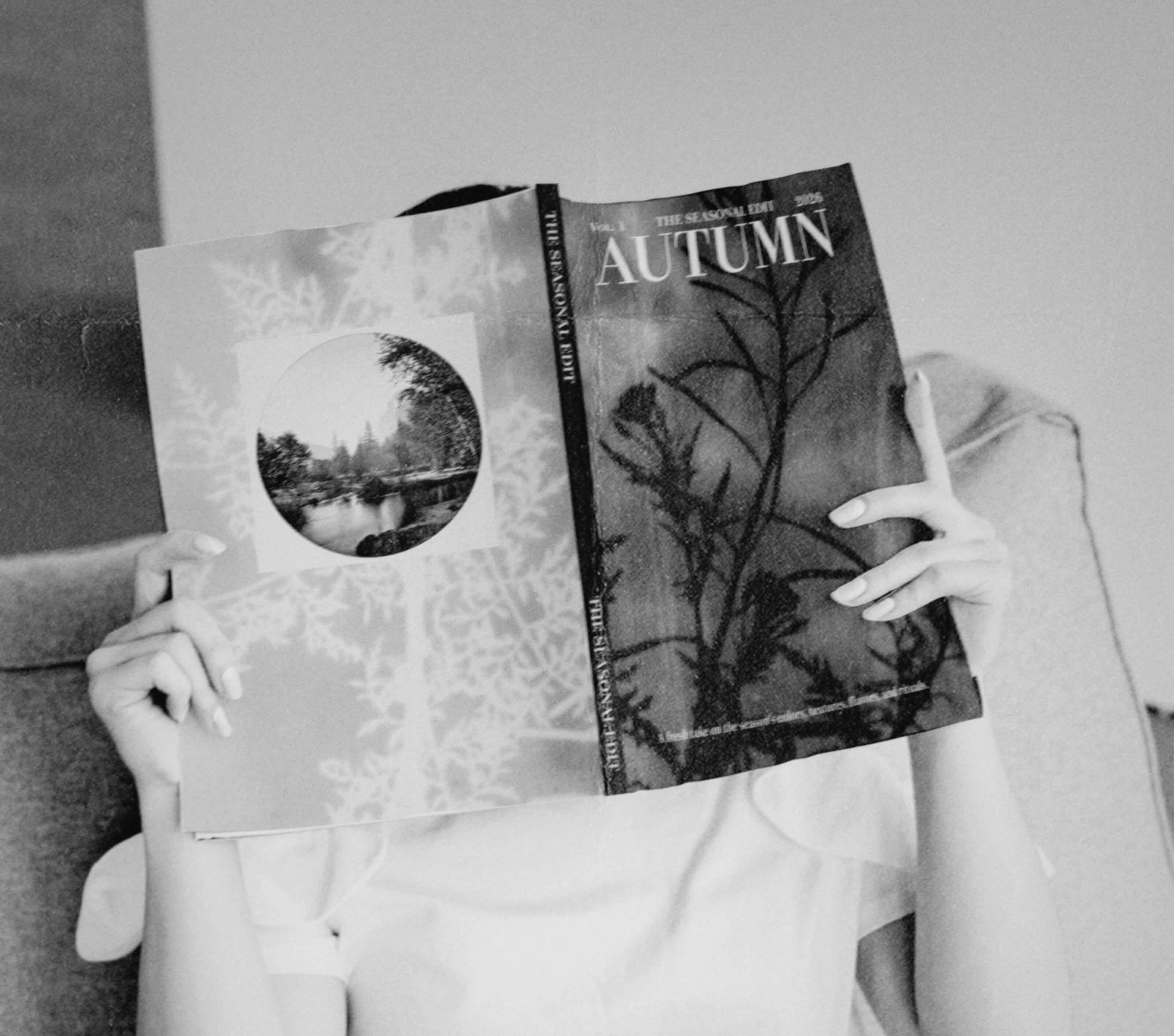
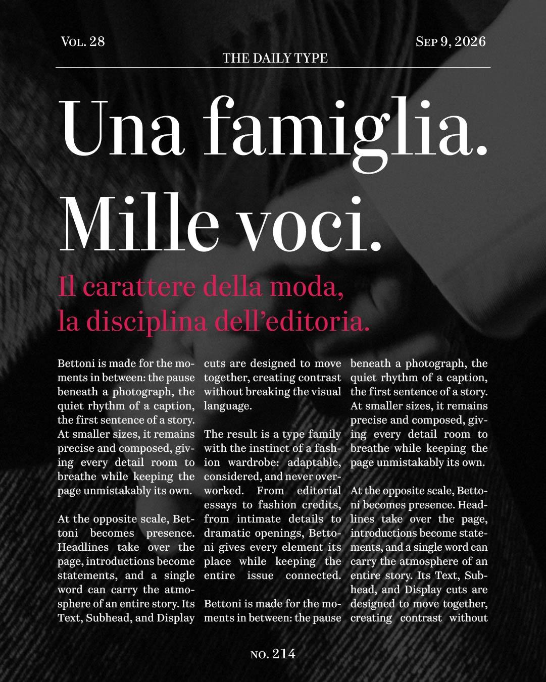
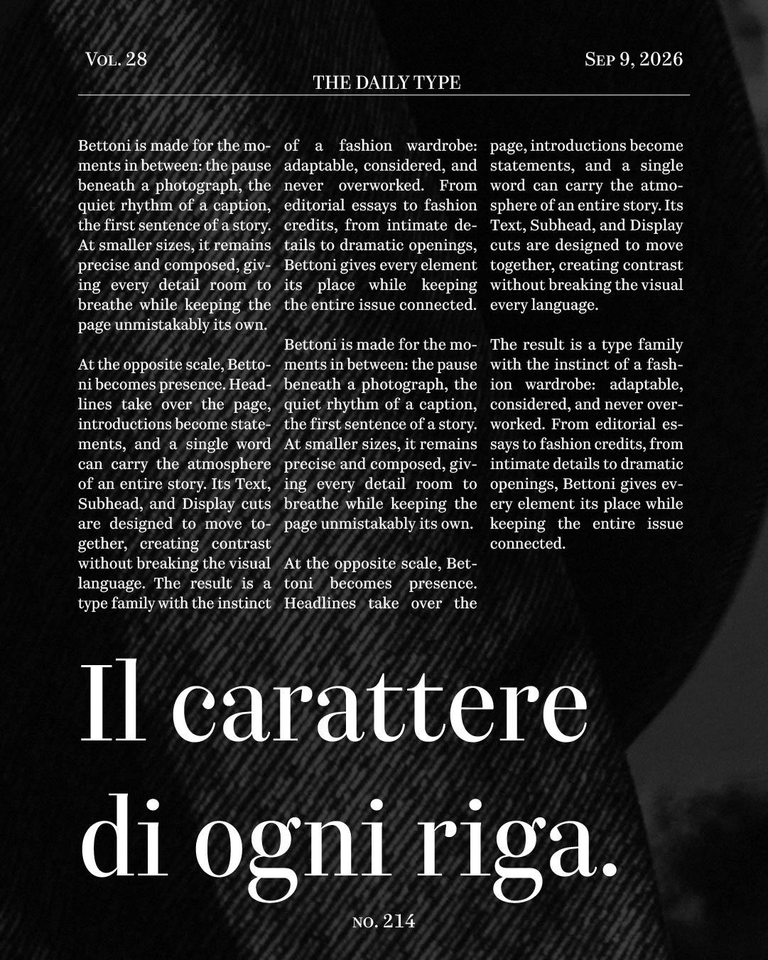
Bettoni VF in use.
A little curious, a little classic, and unmistakably its own
Kazimir
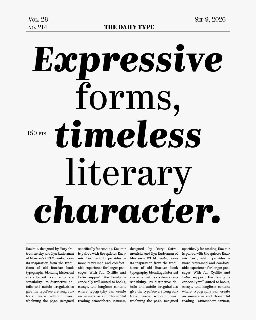
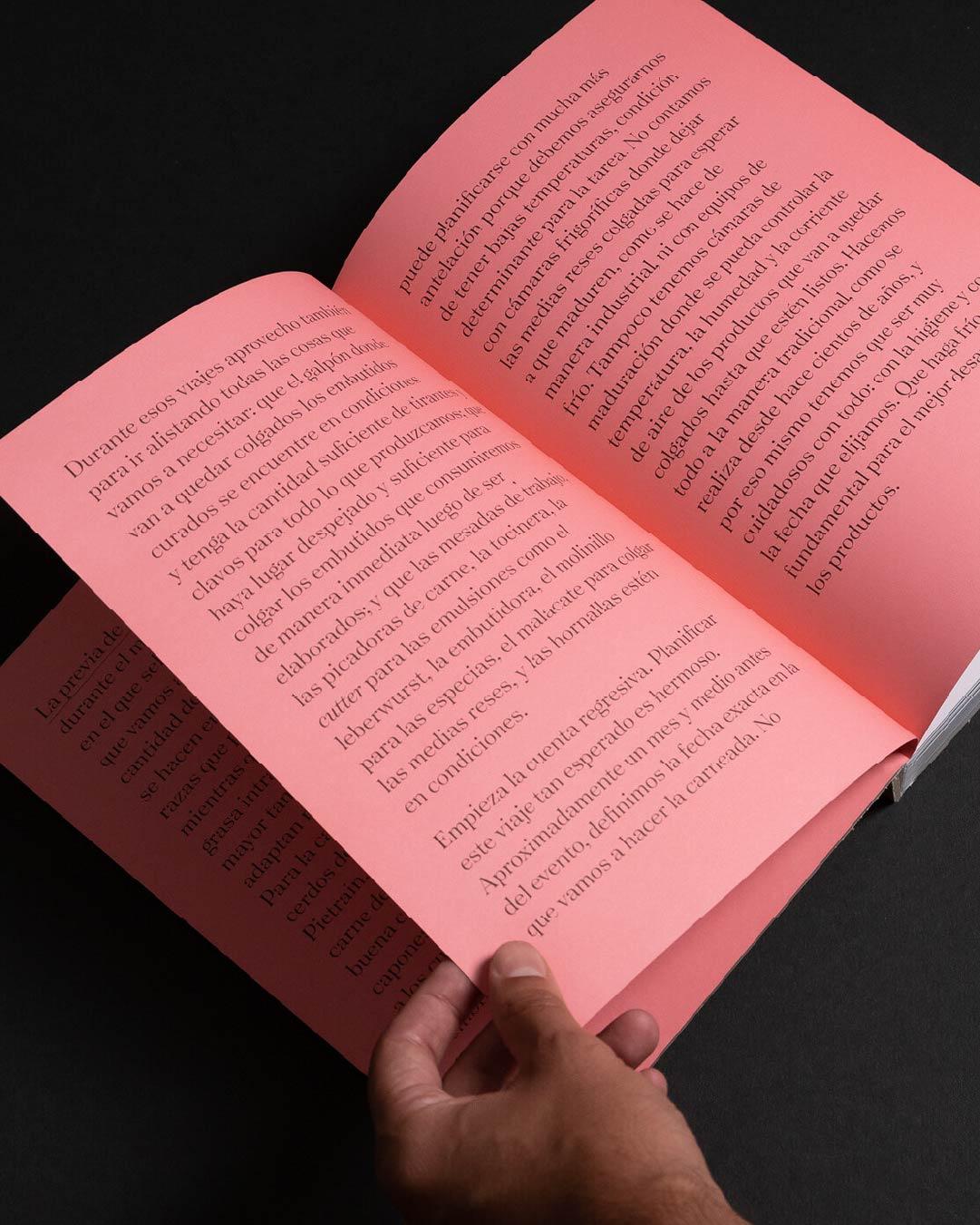
Yury Ostromentsky and Ilya Ruderman of CSTM Fonts, based in Barcelona and Tbilisi, rooted Kazimir in old Russian book typography, keeping just enough of its curious mannerisms to give the page a voice of its own. Designed for use in books, it pairs the expressive Kazimir with the quieter Kazimir Text for long immersive settings, with full Cyrillic and Latin support throughout. Best suited to: the books section and the long-form well, where readers come to settle in.
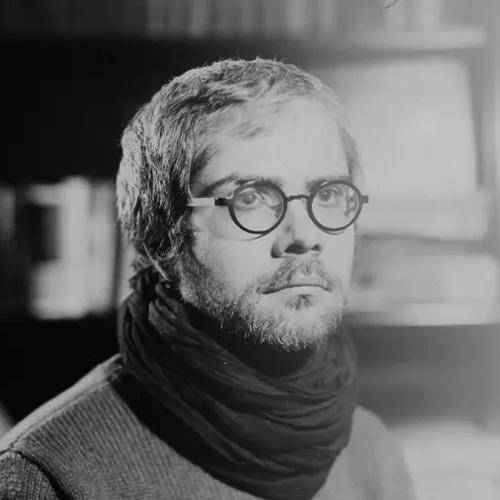
Yury Ostromentsky

Ilya Ruderman
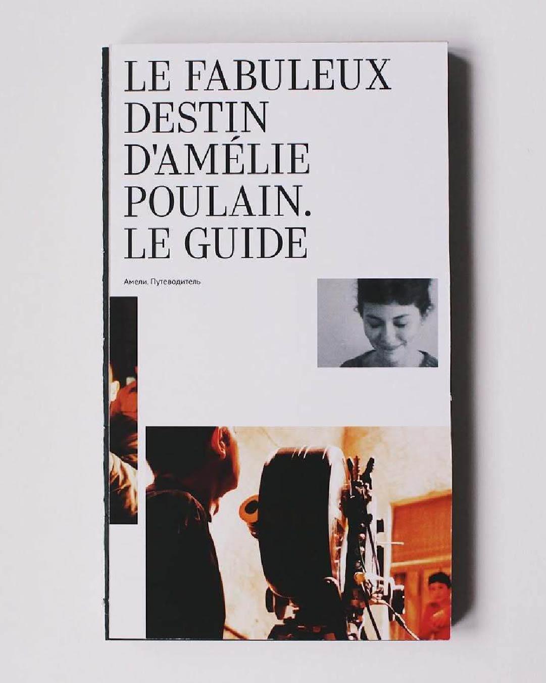
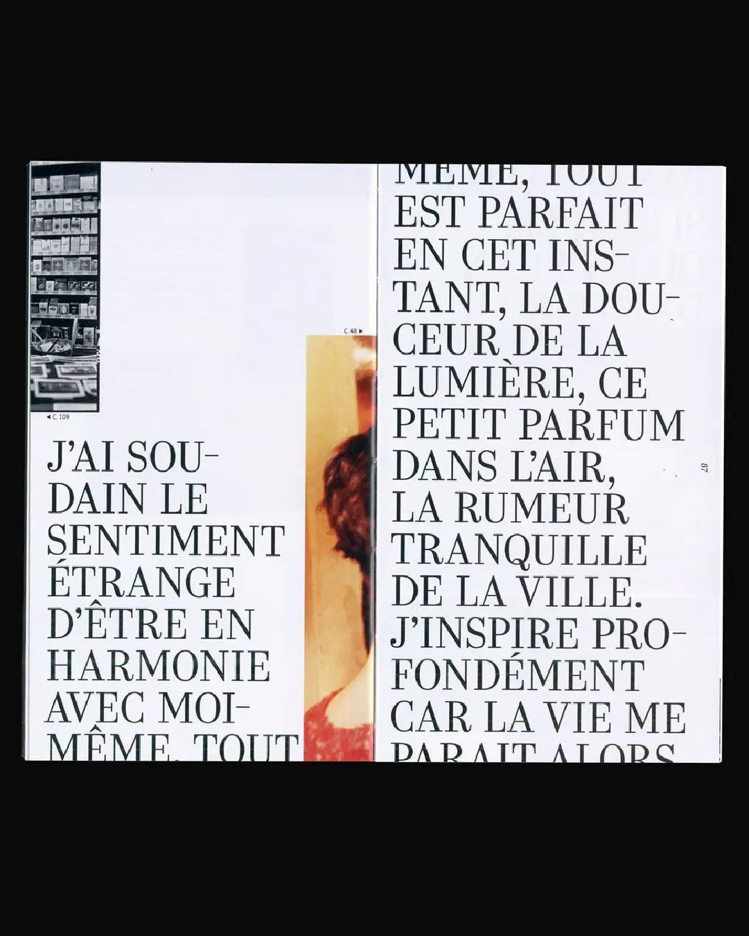
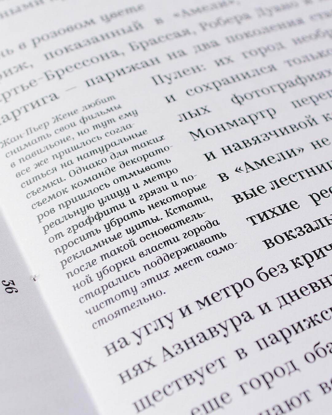
One typeface, every voice
Bettoni
Riccardo Olocco, one of the designers of CAST, the Italian type cooperative based in Bolzano, built Bettoni as a publishing family in the fullest sense: dedicated Text, Subhead, and Display cuts, plus a variable font to tune everything in between. That structure means the same voice can whisper in a caption and project from an opening spread without ever changing character. Best suited to: the magazine that wants one family on staff for every job in the issue.
Bettoni VF
Variable Text UltraLight
Starting at $230
Buy
Riccardo Olocco
Bookish precision, editorial authority
Whitman Display
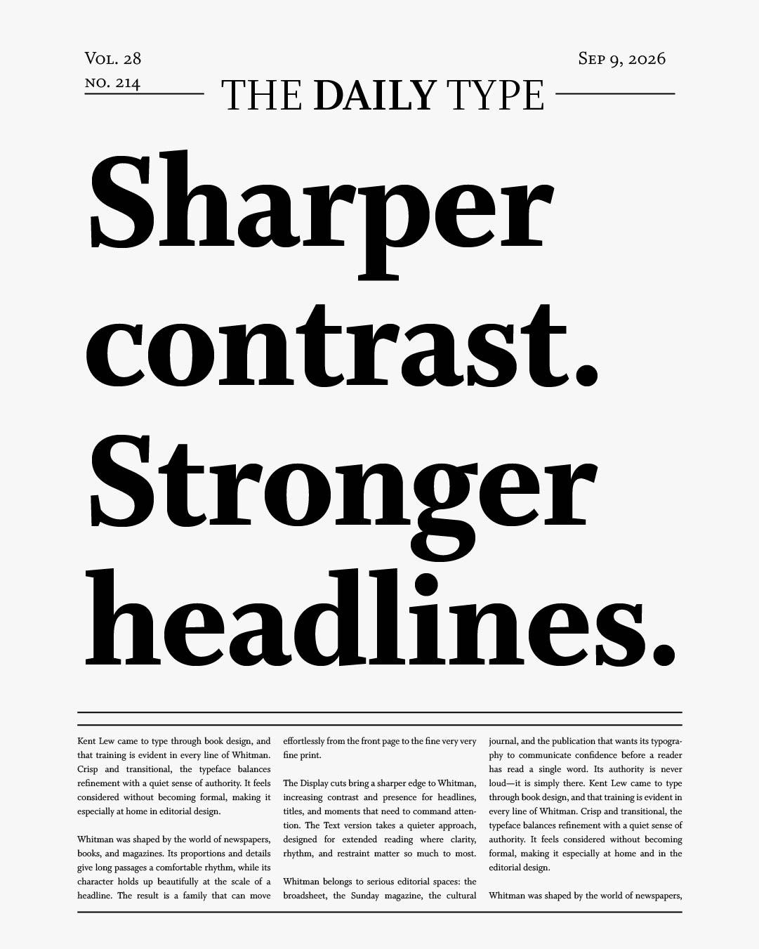
Kent Lew came to type from book design, and Whitman carries that training in every line: a crisp, transitional face with the calm authority of a well-set page. The family has put in shifts at newspapers, books, and magazines from Fortune to W, and the Display cuts sharpen its contrast for headlines while the text version handles the fine print. Best suited to: the serious broadsheet and its Sunday magazine, where authority is the whole assignment.
Whitman Display
Regular
Starting at $40
Buy
Kent Lew
Nineteenth-century punch, modern type
Ringold
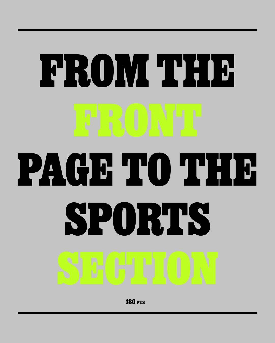
Dan Rhatigan, the veteran typographer behind Bijou Type, drew Ringold as a family of related historical voices, and its Slab and Clarendon styles are the ones built for the newsroom. Both carry the punchy, bracketed confidence of nineteenth-century headline setting, updated with modern fit and a full range of weights. Best suited to: the front page and the sports section, where a headline needs elbows.

Dan Rhatigan

One font, every width
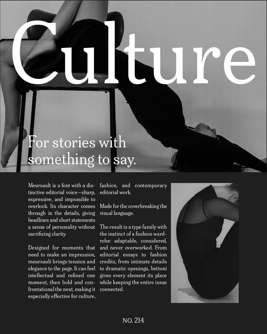
Meursault
Gunnar Vilhjálmsson and Kalapi Gajjar of Universal Thirst intended Meursault as a display face for headlines and subheadings in magazines and newspapers, and they gave it room to maneuver: widths run from Ultra Condensed to Ultra Extended, with a variable font sweeping the whole span. Whatever the column, there is a Meursault exactly its size. Best suited to: cover lines and statement headlines, at any width the layout demands.

Gunnar Vilhjálmsson

Kalapi Gajjar
Calligraphic elegance, made for impact
Tenez
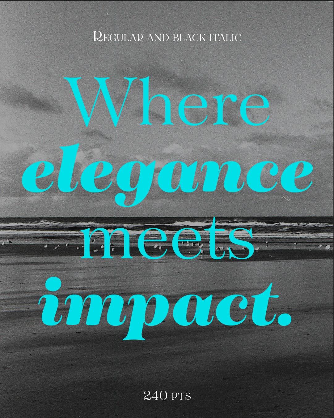
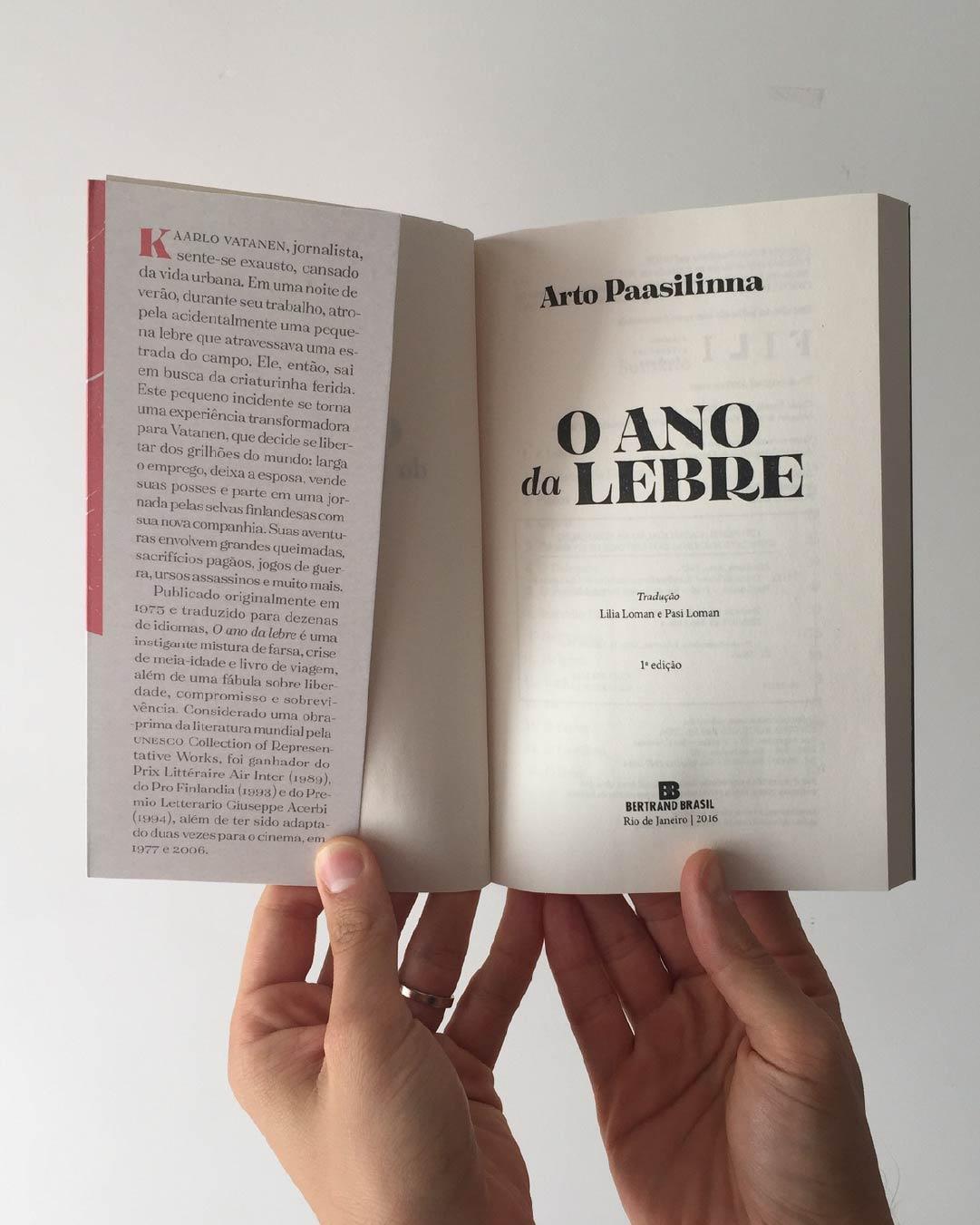
And for the masthead itself, Rodrigo Saiani of Brazil’s Plau rooted Tenez in pointed nib calligraphy, the same wellspring that fed the great Didots and Bodonis, then drew it unapologetically for display: magazine openings, drop caps, anywhere elegance needs impact. Its unusual Thin weight even picks up a typewriter-like personality as the hairlines all but vanish. Best suited to: cover lines, logotypes, and any headline that considers itself an event.

Rodrigo Saiani
A newsstand is just a room full of typefaces competing for one glance, and these five know how to win it. Staff your fall issue, and meet the foundries behind it at
store.typenetwork.com.