
New designs with classic faces
Thanks to the ATF Collection’s digital revivals, classic American Type Founders faces have reentered the popular typographic discourse. Here’s a look at some new designs featuring these timeless designs.
Formed in 1892 as a consolidation of 23 independent type foundries, the American Type Founders (ATF) catalog serves as the basis for many of today’s most popular typefaces. As the most prominent type foundry of the metal era, ATF was the go-to for handset type in the United States for the first part of the 20th century.
ATF also led the way in technical developments in both design and production for decades, establishing the backbone of the American typographic texture. Naturally, the shift to digital type and desktop publishing brought on many ATF copycats and poor revivals.
It wasn’t until Mark van Bronkhorst—along with Alan Dague-Greene, David Sudweeks, and Ben Kiel—set out to reinterpret ATF’s typefaces that modern designers could use these classics effectively in their work.
Rebuilt from the ground up for contemporary applications in mind, American Type Founders Collection typefaces add to the legacy of their predecessors with additional weights and widths, robust character sets, and new OpenType features unavailable in the 1900s.
ATF Alternate Gothic
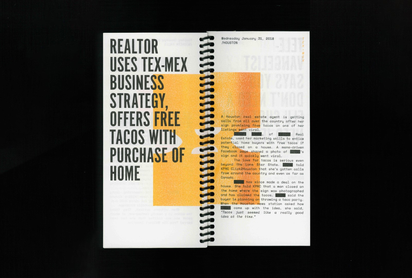
ATF Alternate Gothic is an expansion of Morris Fuller Benton’s classic 1903 design. Originally available in one bold weight, the typeface came in three widths for flexibility in copy-fitting layouts. ATF Alternate Gothic provides a wider range: ten weights with four widths each (40 fonts total). This family can be used to pack a lot into a narrow space, and the breadth of the family makes it easy to create variations for different formats and media.
The publication pictured, Anecdote, Myth & Hyperbole: Texas, from A to Z, is a spiral bound artist book exploring 24 wild “news” stories encountered by Annette Dennis during a 24-month stint in Texas. Since the content is only semi-true, Alternate Gothic adds an ironic sense of factuality to the book’s outlandish headlines.
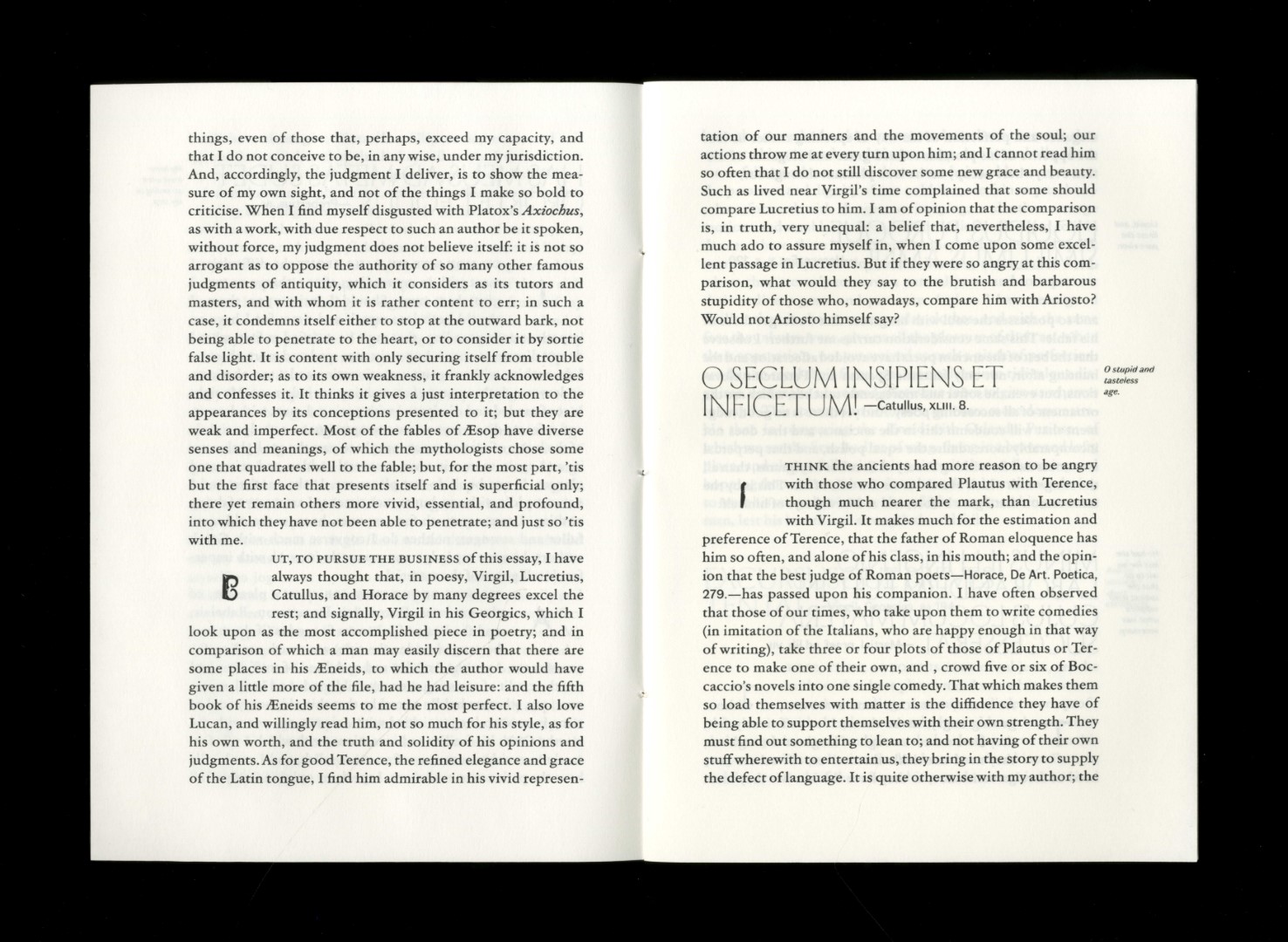
ATF Garamond
The Garamond family tree has many branches. When ATF Garamond was designed in 1917, it was among the classic’s first revivals. The new ATF Garamond expands upon this legacy of quality and craftsmanship, bringing some qualities from metal type and letterpress printing often lost in digital adaptations of historic faces.
ATF Garamond includes eighteen fonts across three optical sizes—Subhead, Text, and Micro (available by request)—and three weights, including a new Medium that did not exist in the metal. It also includes the alternates and swash characters from the original face.
Tânia Raposo and Ellmer Stefan chose to set the body text of the second issue of Opuscolo in ATF Garamond. Accentuated by a drop cap alphabet of tools digitized by Stefan, ATF Garamond intentionally focuses primarily on readability, making the text look studious without distracting.
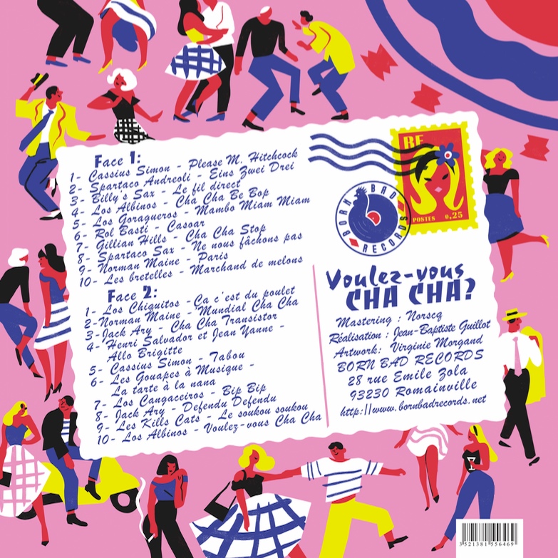
ATF Brush
Brush has been a beloved script for plumbers, mechanics, bodegas, and lunch counters since 1942. ATF Brush adds five new weights, swash alternatives, ligatures, and underline tails. It’s cleaner and smoother without losing any of that original Brush charm.
Here we see Brush used on the back of Born Bad Records’ French Cha-Cha compilation album, designed by Virginie Morgand. Flanked by other attention-grabbing faces like Choc, Banco, and Radiant, Brush manages to hold its own. In a design made to look like a postcard, Brush looks handwritten... but better: It’s lively yet readable.
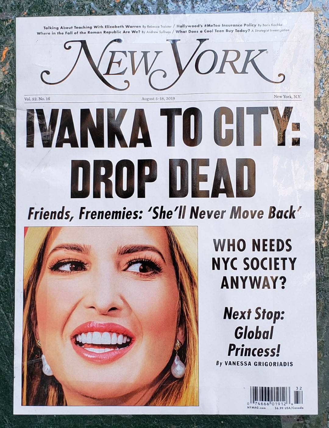
ATF Railroad Gothic
First introduced in 1906, Railroad Gothic was the industrial spirit’s essential typographic expression: bold and brash. The new version features a measured, harmonious interpretation of the original, and has been extended with four new weights. The heaviest weights are carefully designed to keep counters open, no matter how dense the overall effect may be, maintaining legibility at any display size.
ATF Franklin Gothic
Franklin Gothic has been the cornerstone American sans for more than a century. Benton’s original 1905 design was a display face in a single weight. It had a bold, direct solidity, yet conveyed plenty of character.
In addition to 8 more weights plus italics, the revival’s text weights are wider and more open than some previous interpretations. The result is quite legible for text, at very small sizes, and on screen.
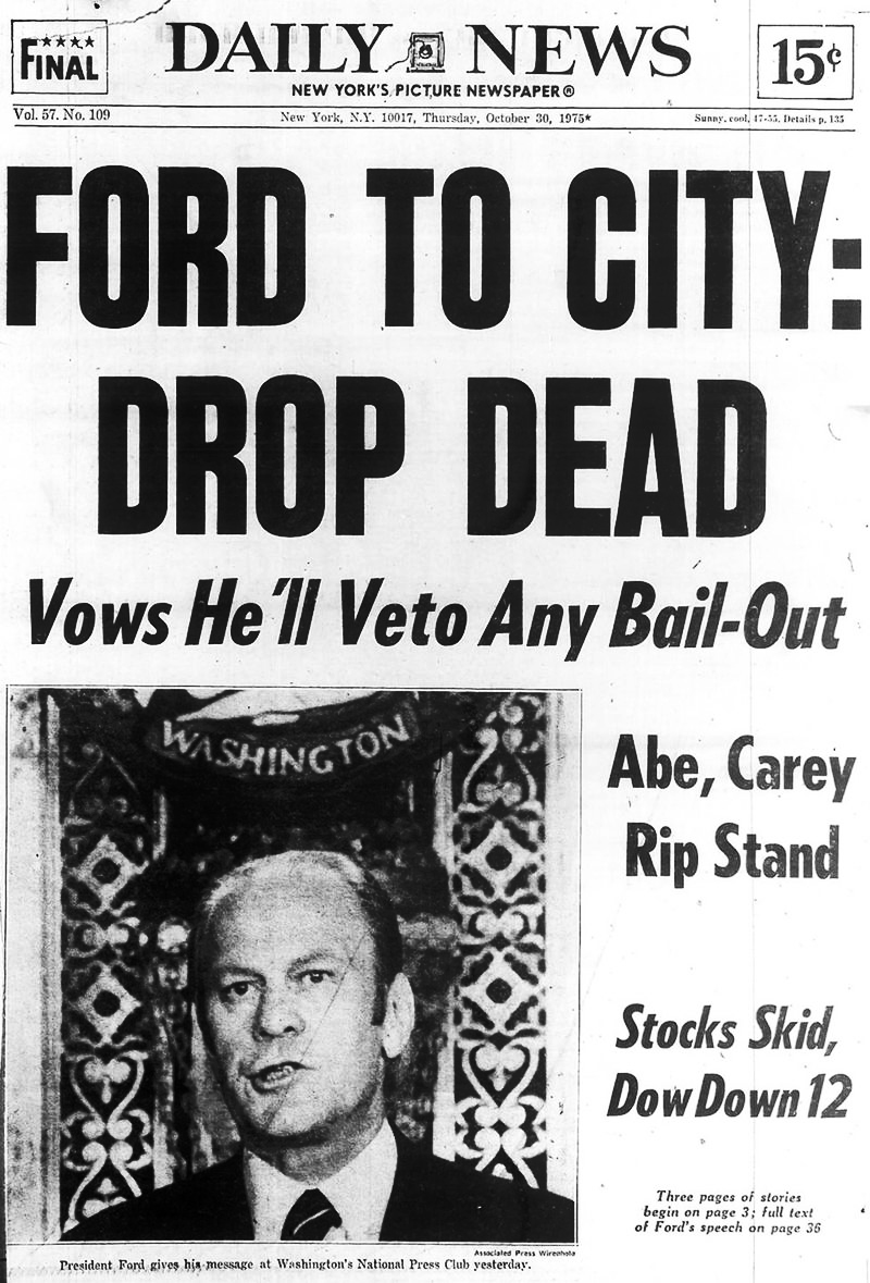
In this New York issue from 2019, Railroad Gothic, Franklin Gothic, and the layout itself reference the 1975 Daily News headline for Gerald Ford’s speech to the National Press Club: “FORD TO CITY: DROP DEAD.” Replacing Daily News Gothic with Railroad Gothic maintains the old newspaper’s authority. The addition of Franklin Gothic for smaller text leverages this revival’s improved legibility.
View ATF Railroad Gothic and ATF Franklin Gothic
The ATF Collection brings classic ATF typefaces—some of the most influential in American graphic design history—into the digital age with a newfound precision and refinement. With additional weights, styles, optical sizes, alternates, OpenType features, and more, they offer heritage and strength in modern formats.
All ATF Collection fonts are available for print, web, applications, and ePub licensing. Webfonts may be tested free for thirty days; desktop trials are available upon request. To stay current on all things ATF, subscribe to Type Network News, our email newsletter featuring font analysis, designer profiles, type and design events, and more.