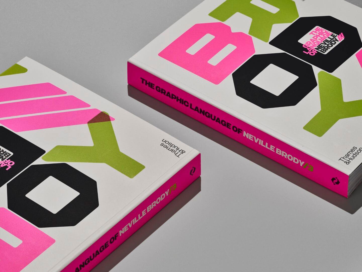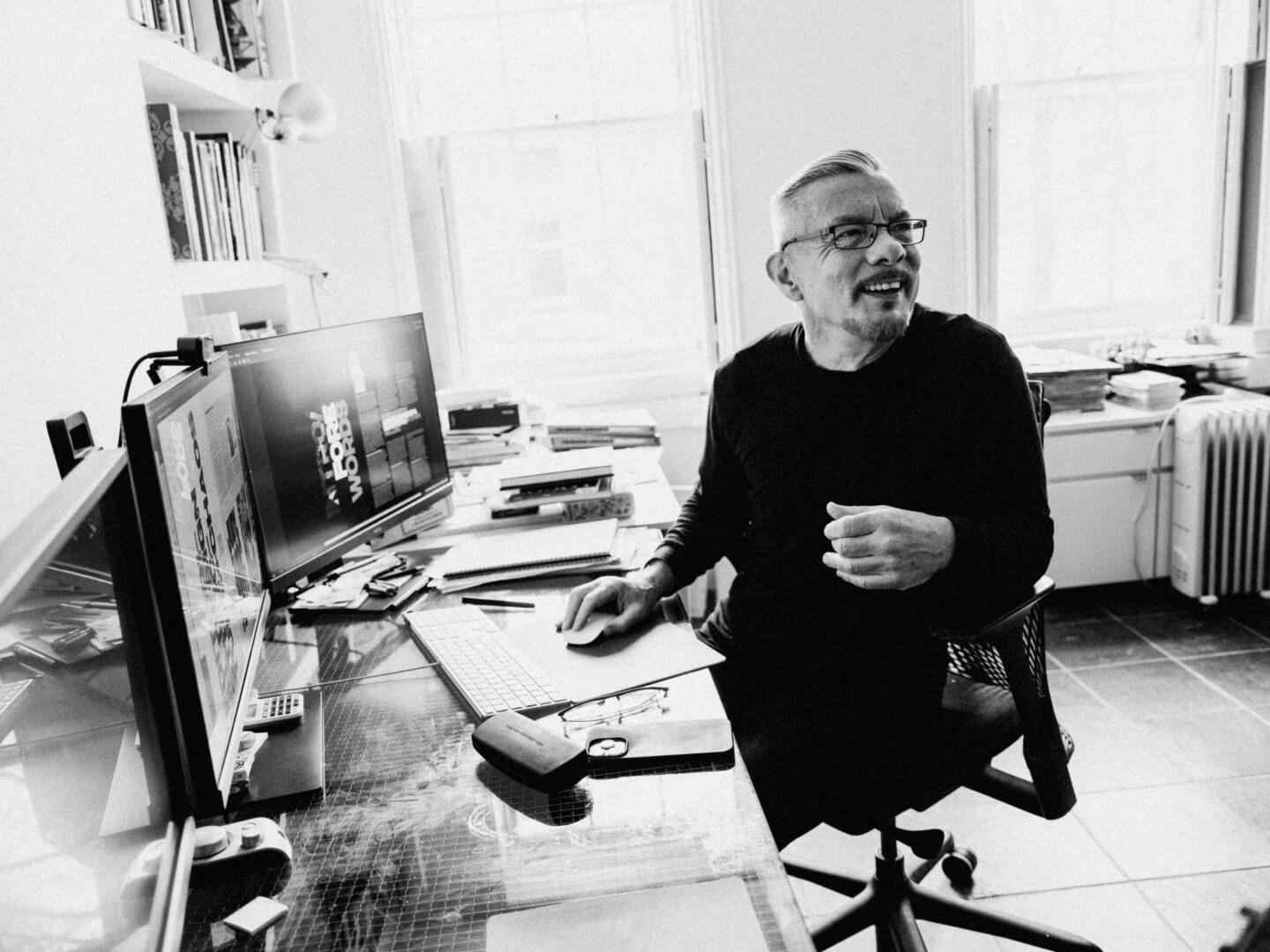
30-years later, Neville Brody’s new book arrives
The trailblazing type and editorial designer behind
The Face
magazine,
Arena
magazine, and
Fuse
, steps back into the spotlight with his latest book,
The Graphic Language of Neville Brody 3
. In this interview, Brody describes the differences between designing for clients like Samsung and Coca-Cola versus for magazines; decries the homogenizing trends in contemporary design; and shares the art of balancing experimentation with practicality.
It has been nearly 30 years since the second volume of the Graphic Language of Neville Brody was released. How did you decide to publish this new third volume?
Well, there have been a lot of changes since the last book, especially in the fields of typography and graphic design. During that time, I’ve felt our practices change a considerable amount. While documenting these changes over the last 30 years, we had no idea to put it into a book. We also realized that the studio produced a substantial amount of material during that time. Even after curating it down, it still took us six years to put the book together. I began when it was only 25 years since the previous book, so it was a nice quarter-century. Now it’s almost a third of a century, and I’m shocked.
You mentioned that the practice has changed, and the work has evolved. What are the major differences between this volume and the two previous ones, aside from the change in the author?
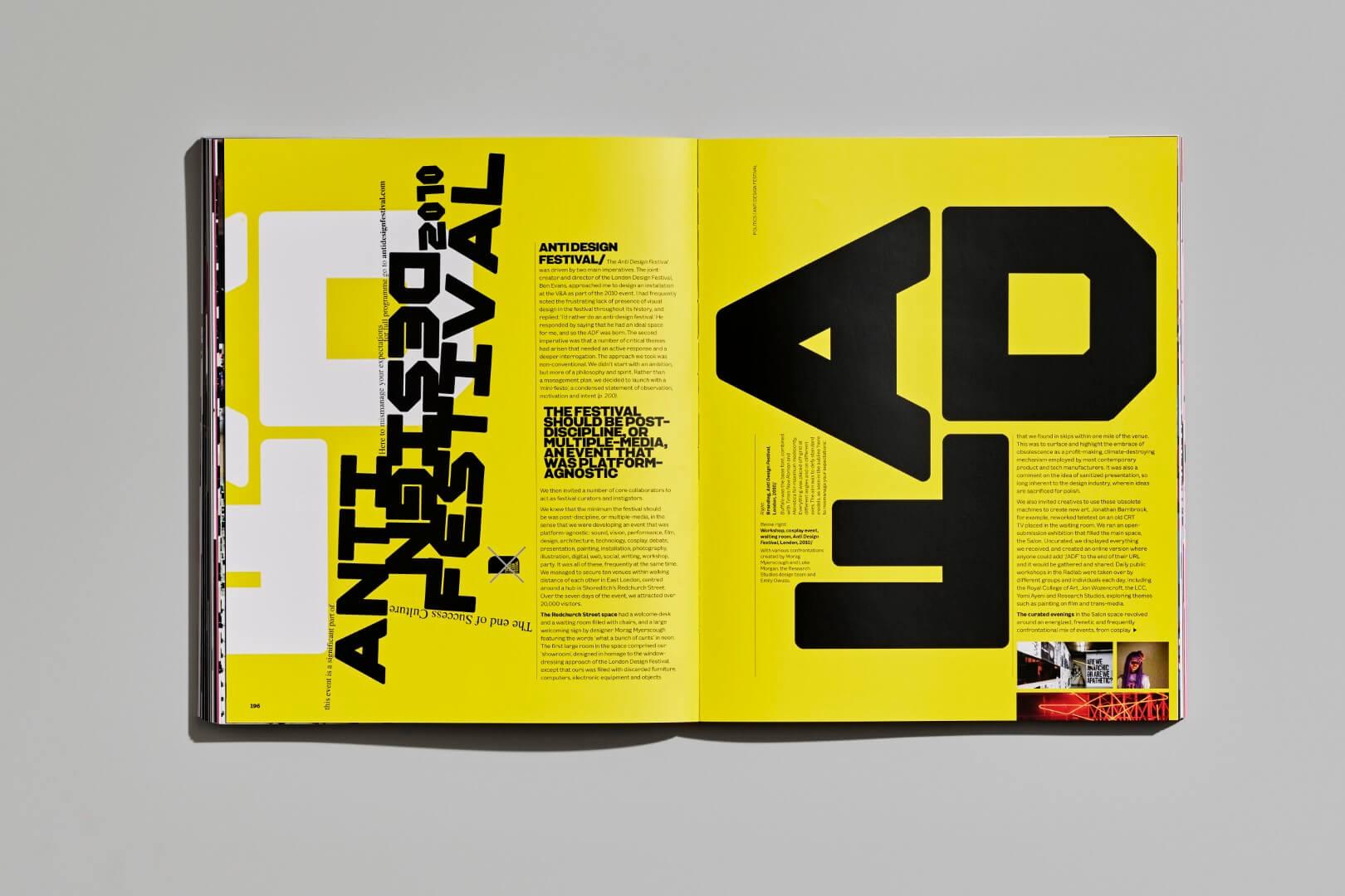
I believe the primary differences lie in the quantity of work included. There’s much more work in this volume. Secondly, there’s a different approach to rethinking what a book is. Thirty years ago, books were seen as somewhat precious due to printing and production limitations. There would often be borders around items on the page, limiting the amount of data and images we could include. The technology imposed restrictions on what we could publish; the previous volumes felt revolutionary at the time, but now, technology allows us to view books as more fluid, not as precise and structured. The book itself becomes part of the design process, offering an interesting opportunity and challenge.

Brody Fonts publishes new typefaces from Neville Brody and his studio associates, while also revisiting key moments in Brody’s typographic legacy.
With this newfound fluidity and flexibility in the book, do you feel that this new volume better reflects you and your work than the previous ones?
Yes, I do. The previous volumes captured some of what was happening at the time. But with this one, realizing the opportunity, I was challenged to push the boundaries further. It let me consider the design of the book as something poetic and unfixed, blurring the lines between fixed space and abstract fluidity. We questioned whether elements could extend beyond the page’s edge or if we could abandon grids altogether.
It was a significant challenge, but I’m very proud of the result. Given more time, I tend to want to make things even more complex. Knowing where to stop refining something—knowing where to stop cooking—is a valuable lesson I’ve learned from this experience.

For those familiar with your work, what will they find most exciting about the new book?
I believe they might find the idea that the book is difficult quite exciting. It’s rich and densely packed. While putting the book together, I didn’t fully realize how dense it was getting. When we received the printed proof and opened it, we saw how much detail it contained. It requires readers to dive in at various points. It feels like a journey, and I tried to make it as cinematic as possible.
As you move through the spreads, you experience familiarity and quotation, but there are twists that lead you in unexpected directions. It's a curated journey through the work, and as you delve into the text, you encounter different discussions that may not have been associated with the images or work before.
Is there anything that people should look out for or read before diving into the book, especially for those who aren’t familiar with your work?
No, I think the less people know about it beforehand, the better. Some may have experienced the previous two books, and this edition offers a different experience: For them, there may be connections and associations with their past expectations. As you delve deeper, you start noticing more details, and you may discover entirely different discussions within the text that you hadn't previously associated with the images or work.
Your work often features unconventional and challenging type design. How does your experience as a type designer affect your approach to typography?
Interestingly, they are two very different things. Sometimes they intersect and become symbiotic, but generally, they are distinct. You can approach design by considering what you can do with a typeface, or you can think about which typeface can help you achieve a particular design.
In the book, I explore both. There are instances where I work with a typeface like Arial and try to make it more emotive and expressive, even though it’s not typically seen that way. And then there are other spaces where I have created dynamic, expressive, fluid typeface designs and then used them in a clean, precise manner. When you try to do both simultaneously, it can become overwhelming.
I never saw myself as a typographer or type designer initially, as I came from designing record covers and sleeves. I viewed type as image-making, where headlines needed to convey emotions as well as facts. As you delve deeper into information, clarity becomes crucial. My background was in editorial design, where the focus was on engaging dramatically with content and having a visual conversation with readers or users.
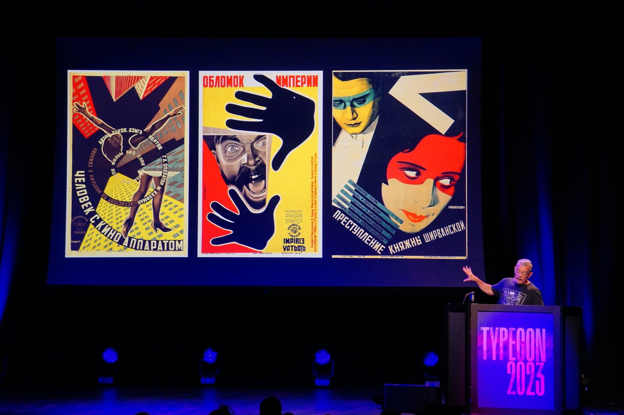
“We can't be these people, but we can imagine what they would be doing today.” — TN partner @NevilleBrody in his @typecon special presentation.
— Type Network August 19, 2023
You’ve witnessed significant technological changes throughout your career. How has the shift from analog to digital processes affected your approach to editorial design?
Looking back, there was a proto-digital aspect to the work in the 1980s, even without computers. Many motifs and approaches from that era became synonymous with digital design later on. We were creating geometric typefaces using graph pads and paper before software like Fontographer was available. We even colored them by hand, akin to how constructivists worked.
The transition to digital occurred when personal computers emerged, but there was no internet for sharing digital content at that time. So initially, digital was seen as a production tool. However, that changed when computers also became a means of publishing. Suddenly, it wasn’t just about creating content; it was about distributing it as well. It was revolutionary to be able to play with a keyboard, and then have someone use your result on another keyboard and experiment with it.
This shift was revolutionary and changed everything. It broadened our understanding of what we could do with digital design. Additionally, it introduced new concepts, such as interactivity and user engagement. It was a period of rapid evolution and learning.
When I look back at what designers made in that period, it feels so modern, so expressive, and so much more adventurous than a lot of stuff we see now. 30 years later, the kind of internet we’re dealing with is much more regimented. If we think about Instagram, Facebook, or X: These are highly restricted, highly engineered spaces; they almost feel like hospitals or airports. So, all you can do is wear a bright shirt or show some moving image.
Would you say that the same is true for type design as well?
Type design is going through a quite extraordinary phase; I suppose proliferating massively. The same way that a lot of other content is proliferating like music, images, or videos. It’s very hard to know how to make critical assessments of what’s going on. It’s now possible that there is no trend, that every trend is possible. These things come up and down on a more frequent basis. But at the end of the day, I think people are still looking for a high rate of usability and scalability: So, when a typeface is used small, it works perfectly well in that information or space, and when you enlarge it, you start to see a lot of personality.
How do we balance that cross-platform? Inevitably, technology is adapting and allowing us to create typefaces that work incredibly well in print, on-screen, and in motion graphic environments. The pressures of typeface design are much more complex than when we were creating those first few fonts, but the tools have improved substantially, too.
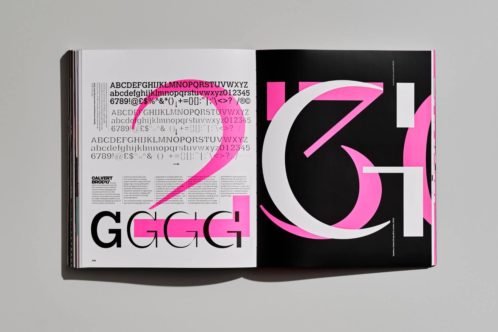
In your book, you describe typographic conformism and the homogeneity in type design. Beyond the newfound technical ease that you’re describing, why do you suppose people create so many similar type designs?
I think Ron, our product designer here, was once asked why he designed another chair when there are so many already. He said that you can never have too many chair designs. It’s the duty of a designer to keep exploring new possibilities. I think it’s the same for type designers.
The problem comes obviously with the fact that there are so many similar typefaces; things are being produced which are infinitely fractional in terms of spaces between other typefaces. And the variations are so minimal now that it requires a huge amount of expertise when you’re selecting a typeface to use. To know which is the right one.
There are a lot more platforms out there where typefaces are available, like Adobe, Google, and others, either free or as part of a subscription package. So, the question is: How do we make sure that people recognize the value of quality typographic design?
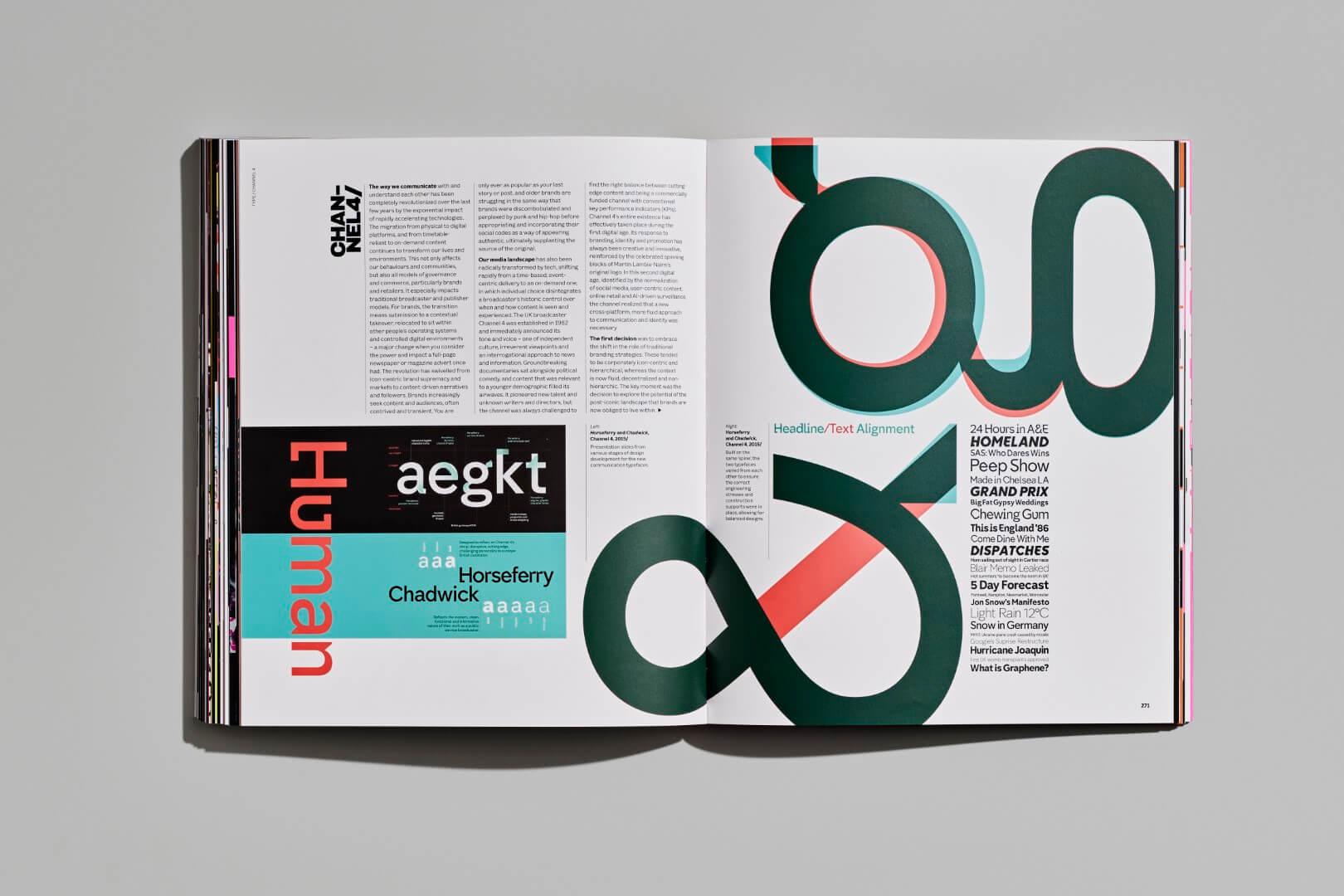
What is unique about your type design process that leads to such novel results?
Well, we’re in that exciting space which lies between custom typefaces—which we’re doing for clients—and our own, more expressive typefaces. More clients are, as part of the evolution of branding, shifting towards a post-brand era. In a way, a brand isn’t so much now about how it looks, but more about what it says and how it says it. Type becomes central in how you talk about your content and what content you talk about.
The brand logo itself is something that’s become a supportive feature. It’s not the top feature now. A brand lives or dies by the quality of its content and how it communicates that content. Brands tend to shift towards complex identities, towards ownable tools.
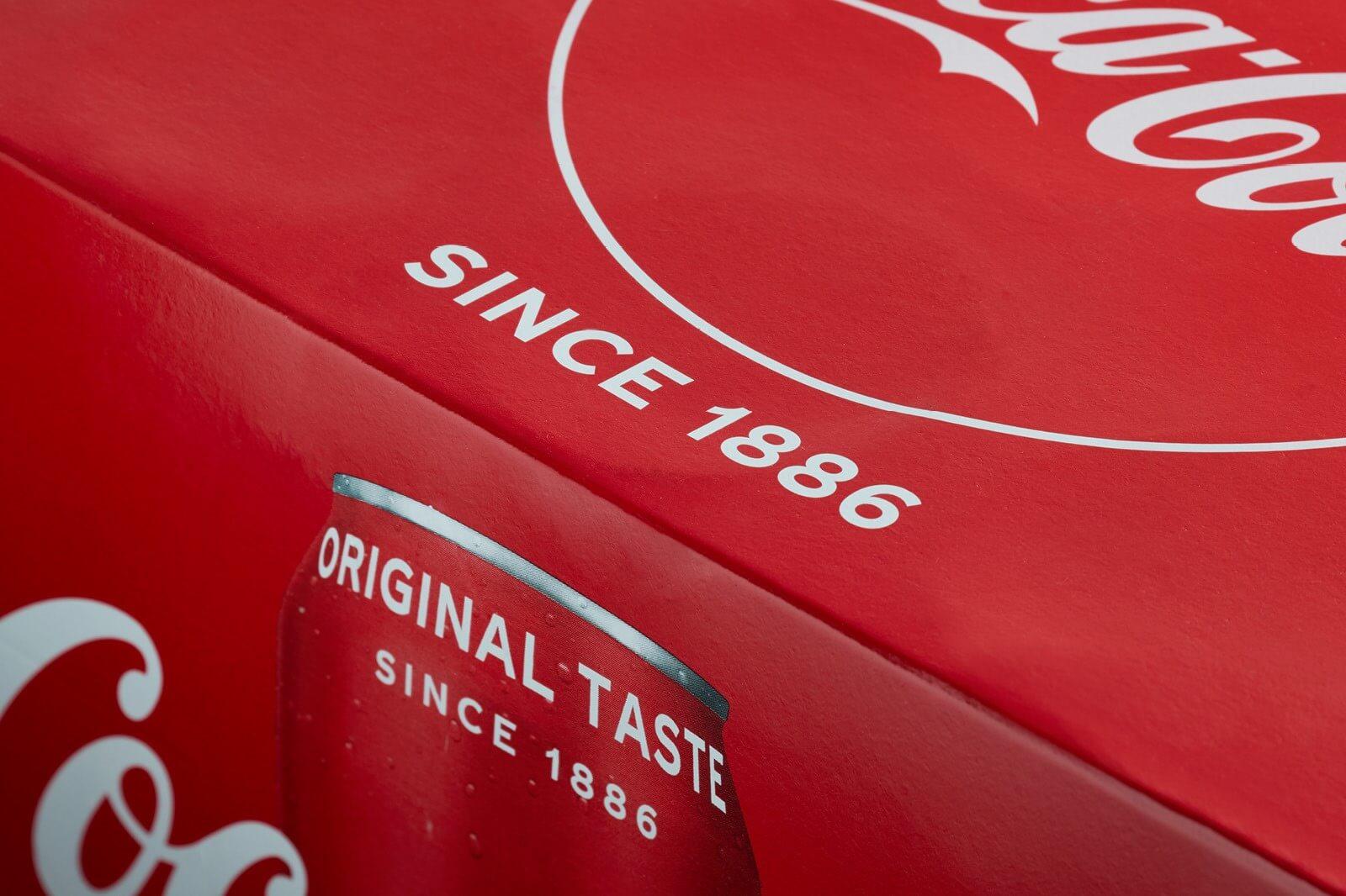
We’re doing a lot of work for clients like Coca-Cola, the Mayo Clinic, and Samsung: They need ownership and something that’s appropriate to the content. In those spaces, we don’t produce radical things. It’s about delicate nuances. It’s subtle and ownable. It has a lot of personality built-in, even if it’s not immediately evident.
On the other hand, retail and headline typefaces and editorial design are much more playful and experimental spaces. They don’t have the same limitations. So, they don’t need to follow a predetermined personality or strategy. We can play with stuff, explore new edges, and new forms. Some of those end up getting turned into commercial fonts, but that’s never the intention. The intention is how far can we push the letterform?
There are some exciting new spaces. Everyone’s looking at variable fonts now because they can, not necessarily because it serves a specific purpose. We’re seeing a lot of motion graphics with variable fonts. Again, because we can, and it’s quite new. The next question, which I think we’ll save for later, is what the impact of AI might be on all of us.
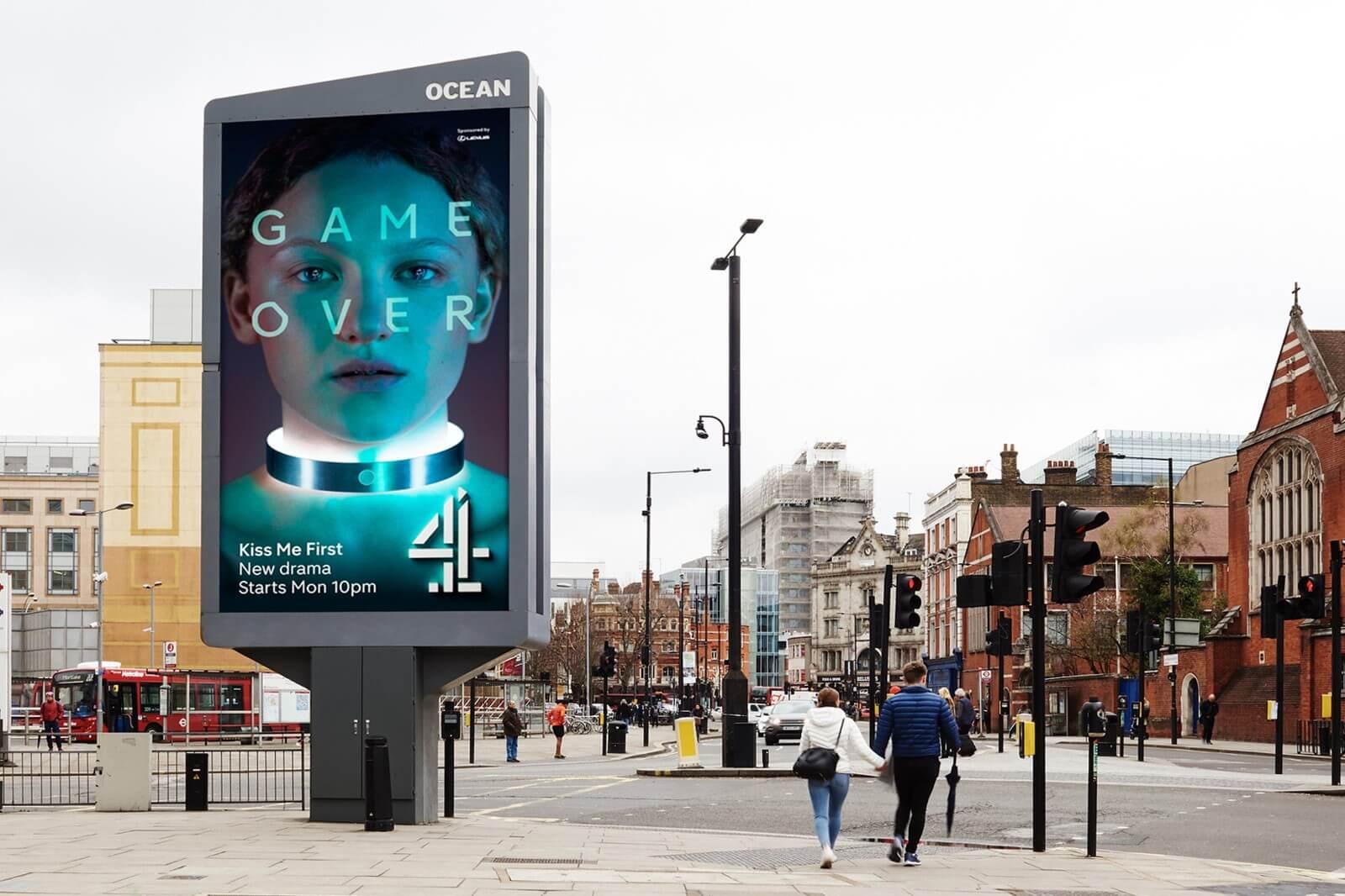
What are some of the fundamental design principles or philosophies that have guided your work throughout your career, regardless of technological advancements?
One key principle that has been consistent throughout my career is the idea that design is a response to context. Whether it’s a particular cultural moment or a specific audience, you must respond to the environment and the information you’re dealing with. Another principle is the need to balance clarity and engagement. Your design should be engaging and visually stimulating, but it should also communicate the intended message clearly. This balancing act has been a recurring theme in my work. I’ve also always believed in the importance of pushing boundaries and challenging norms, whether it’s in typography, layout, or any other aspect of design. It’s about finding innovative ways to communicate and connect with audiences. Finally, experimentation has been a driving force. Trying new things, exploring different techniques, and not being afraid to fail has been crucial to my creative process.
You mentioned doing these big commercial typeface designs for Samsung, Coca-Cola, and others. Do you prefer doing those or your own headline retail typefaces, and why?
They’re very different jobs with very different functions. There’s nothing more pleasing than creating a typeface family that a client is happy with and uses thoroughly. That’s an incredibly rewarding process.
But by the same token, if I’m working in editorial design and I’ve produced a typeface for a magazine issue, there’s nothing more exciting than playing with that, experimenting with it, and having the freedom to make changes on the fly. There’s something a bit performative about experimental fluidity; magazines should be performative.
When it comes to retail, that’s something quite different. You can approach it from the point of view of making something commercial, hoping it will sell in the hundreds of thousands or millions over time. Or you can say, I’m going to put out some stuff that I enjoy, and if people like it, great, we can sell a few. I’ve always tended to err on the side of putting out some stuff that I enjoy.
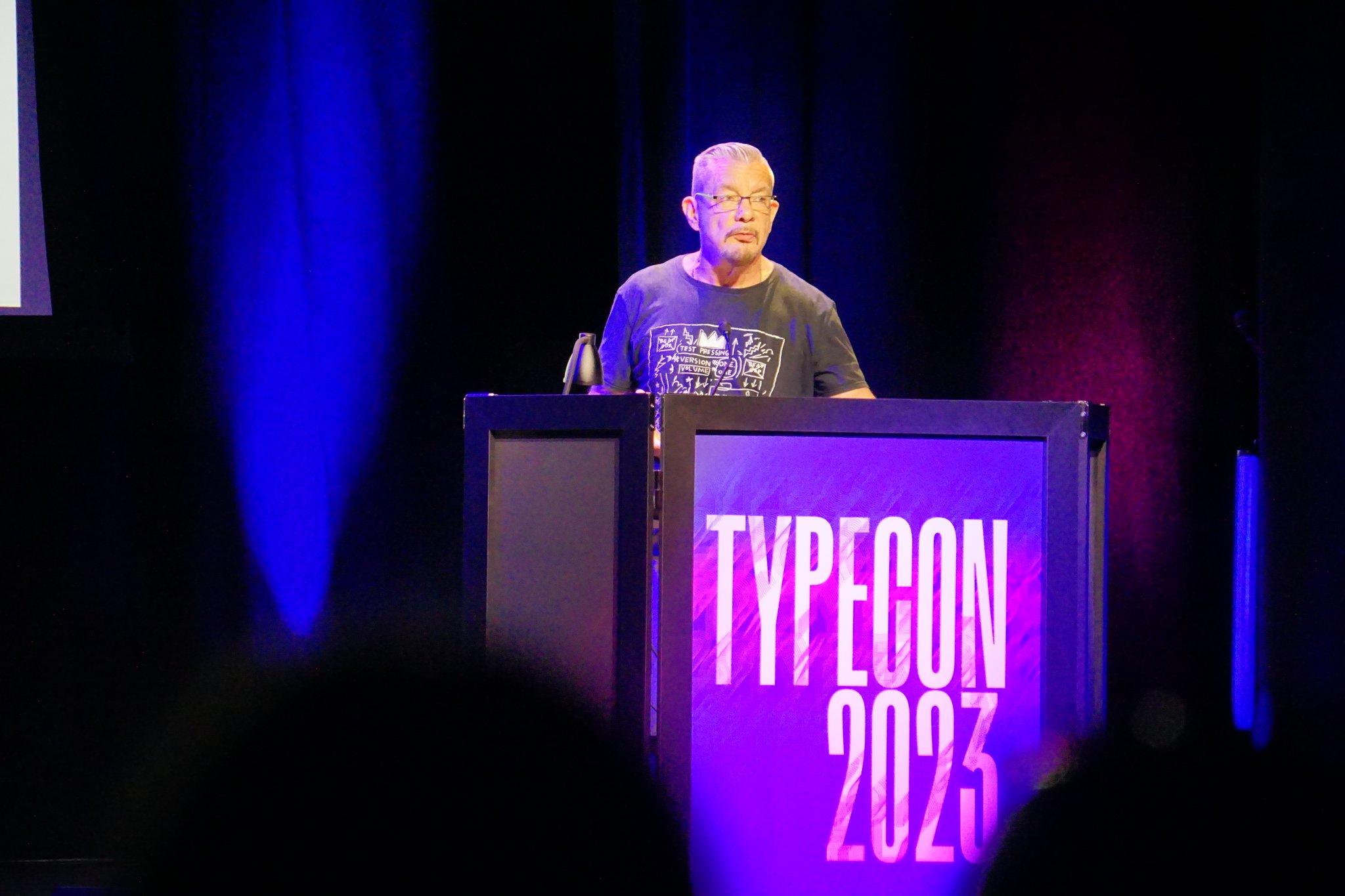
“We've moved from substance to instance.” — @NevilleBrody describing the pressure of digital media on design work. @typecon
— Type Network August 19, 2023
Tell us about the fonts you used in your new book.
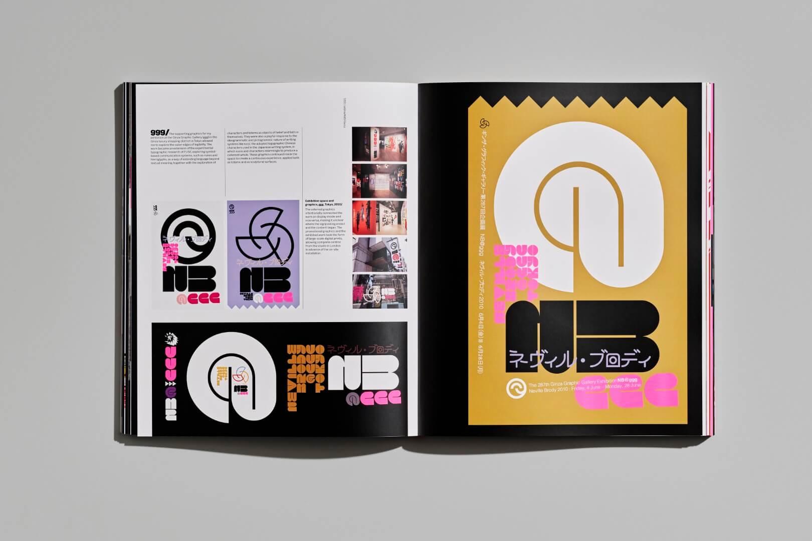
So, there are three main typefaces that I’ve used. We have a studio typeface called Brody Associates, which we developed for ourselves as the client. It’s based somewhat around a Philip Benton output and sensibility. We’ve always loved Franklin Gothic, Benton, and Interstate, but always felt that they weren’t modern enough. We felt those faces didn’t work well across platforms, and they weren’t as scalable and legible as we required. So, we designed our own typeface, heavily influenced by that field. It's semi-industrial, very hardworking, highly scalable, and very personality-driven, which actually gives it good legibility.
For headlines, I’ve used Buffalo, which is a Type Network font. I used one of the heavier weights for its impact. It was always designed to be used in an impactful headline space.
Then I used Popaganda Bold. It was originally designed as a bold condensed typeface, which I had used in a magazine context. We called it “popaganda,” not “propaganda,” for obvious reasons, given that it’s in a magazine about pop culture and fashion. We’ll be releasing that typeface on Type Network next year. The joy of intentionally creating something naive and using it at a large, impactful scale was quite satisfying. We abandoned some of the typographic norms to make something emotive and error-strewn.
Are there other typefaces that are going to come out soon?
Yes, there are a few that we’re working on. I’m working on one called “New Deal,” which is the typeface I created for Michael Mann's Public Enemy film. We’re looking at an extended set of that. There’s also a typeface called “Retro,” featured in the book, which is a more playful headline font. We’re planning to release that family on Type Network next year, among a couple of others. There are many things in production. Putting the book together was like a full-time job, but now I have the joy of picking up those pieces.
Finally, I have to ask: What advice do you have for young designers who are just starting their careers?
I would advise young designers to develop a deep curiosity and a passion for learning. Design is an ever-evolving field, and staying curious and open to new ideas and technologies is essential. Don’t be afraid to take risks and experiment. Some of the most exciting and innovative work comes from pushing boundaries and trying new things. Also, seek out mentors and collaborators who can provide guidance and support. Design is often a collaborative process, and learning from others can be incredibly valuable.
Finally, remember that design is not just about creating beautiful visuals; it’s about solving problems and communicating effectively. Always keep the end user or audience in mind and strive to create designs that resonate with them and convey the intended message.
Thank you, Neville, for sharing your insights and experiences with us today. It’s been a pleasure speaking with you.
Thank you, Lucas. I hope to speak again soon.
The Graphic Language of Neville Brody 3
"[A] glorious appreciation of the graphic designer, typeface designer, typographer, and educator’s decades-long career... The monograph’s 800 illustrations demonstrate Brody’s hyper-eclectic visual sensibility pushing through the edges of convention."
― Angela Riechers, PRINT
