
Looking ahead with variable fonts
Last year, we spoke with web, graphic, and brand designers about the tools and fonts they use and what kinds of work they want to be creating in a few years (or a few months) time. One of the biggest lessons was about variable fonts. Despite being nearly six years old, few designers knew what they were or how to use them—yet the work they wanted to produce nearly demanded this still-new font technology.
In January, we set out to explore the world of variable fonts from a variety of perspectives. Through a series of tutorials, case studies, interviews, and stories, we’ve learned what variable fonts are, what they can do, and how to use them.
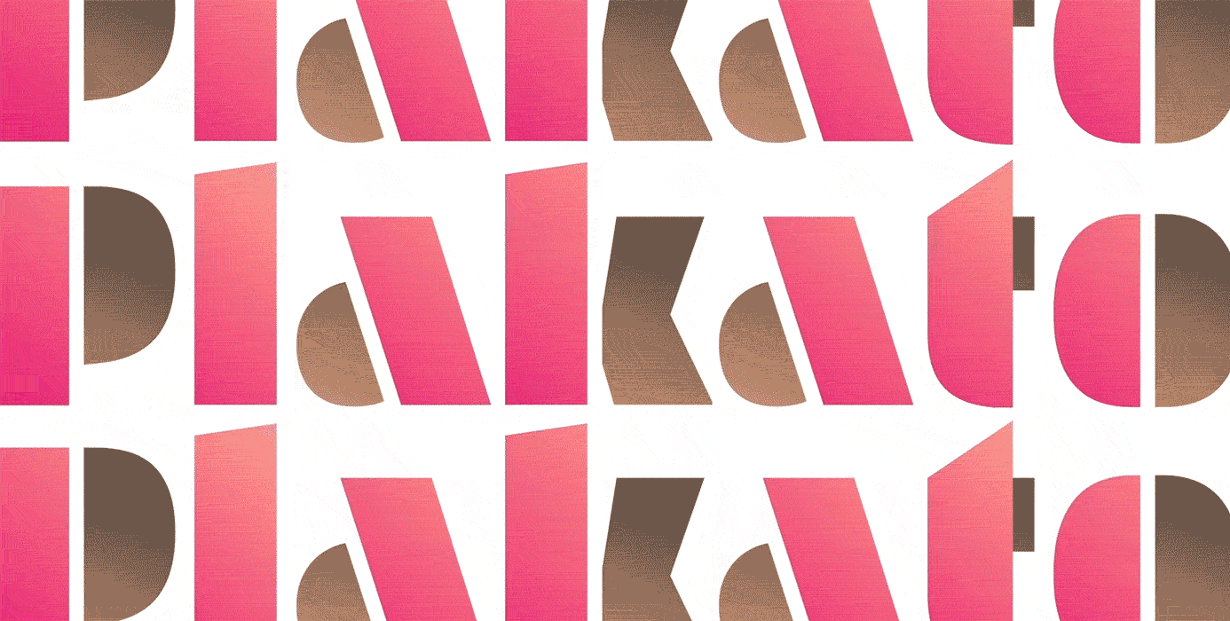
We learned from Bas Jacobs at Underware how variable fonts “can transform into anything else.” Underware pushes the boundaries of our thinking by designing axes like “push” and “time” that allow for fascinating animations out-of-the-box. VFs aren’t only about getting bolder or wider; they’re about exploring “a universe of type.” Within that universe, anything is possible.
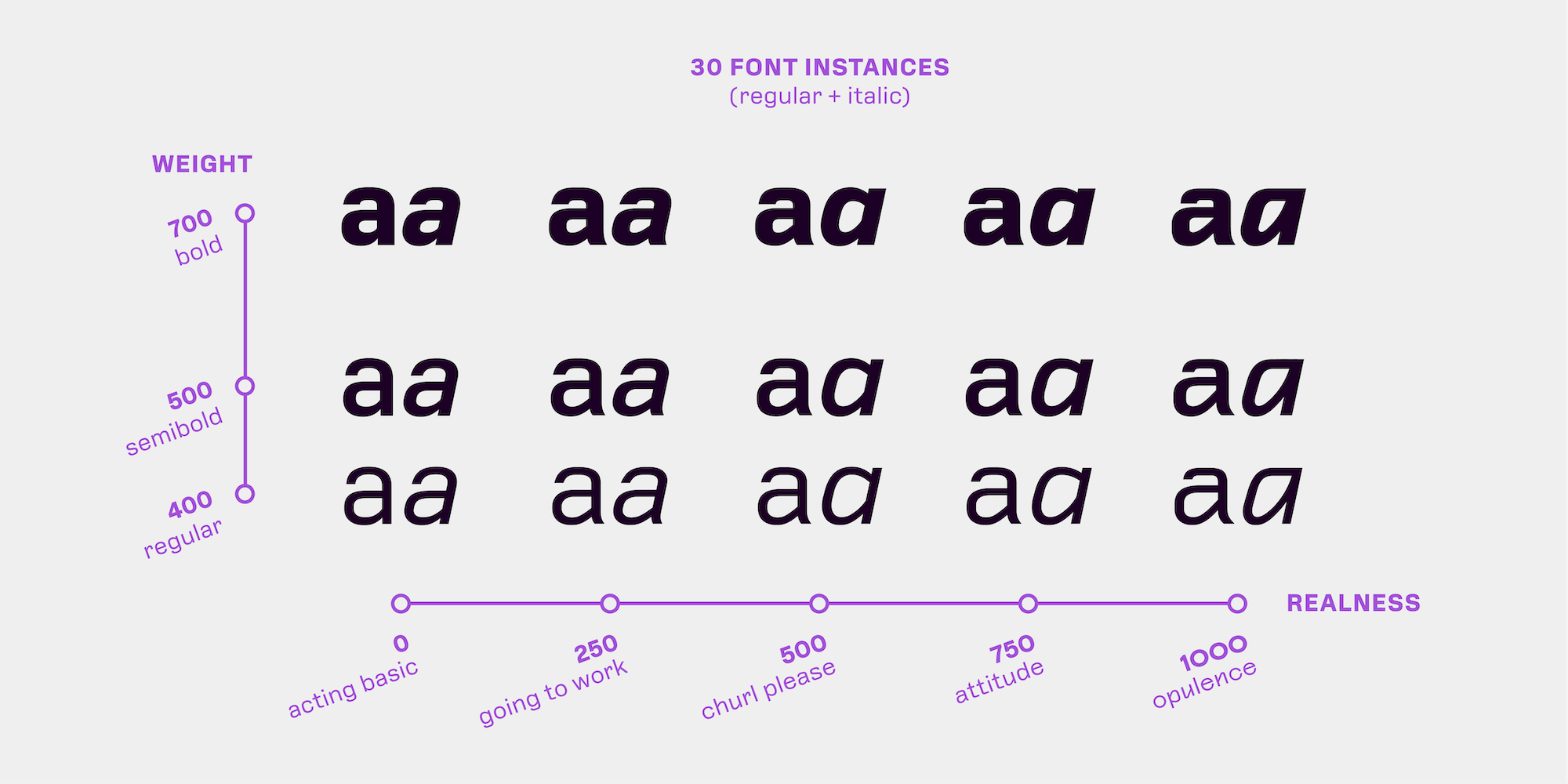
The most obvious applications of those possibilities generally fall into two categories, as summarized by Google’s Dave Crossland: “finesse and express.”
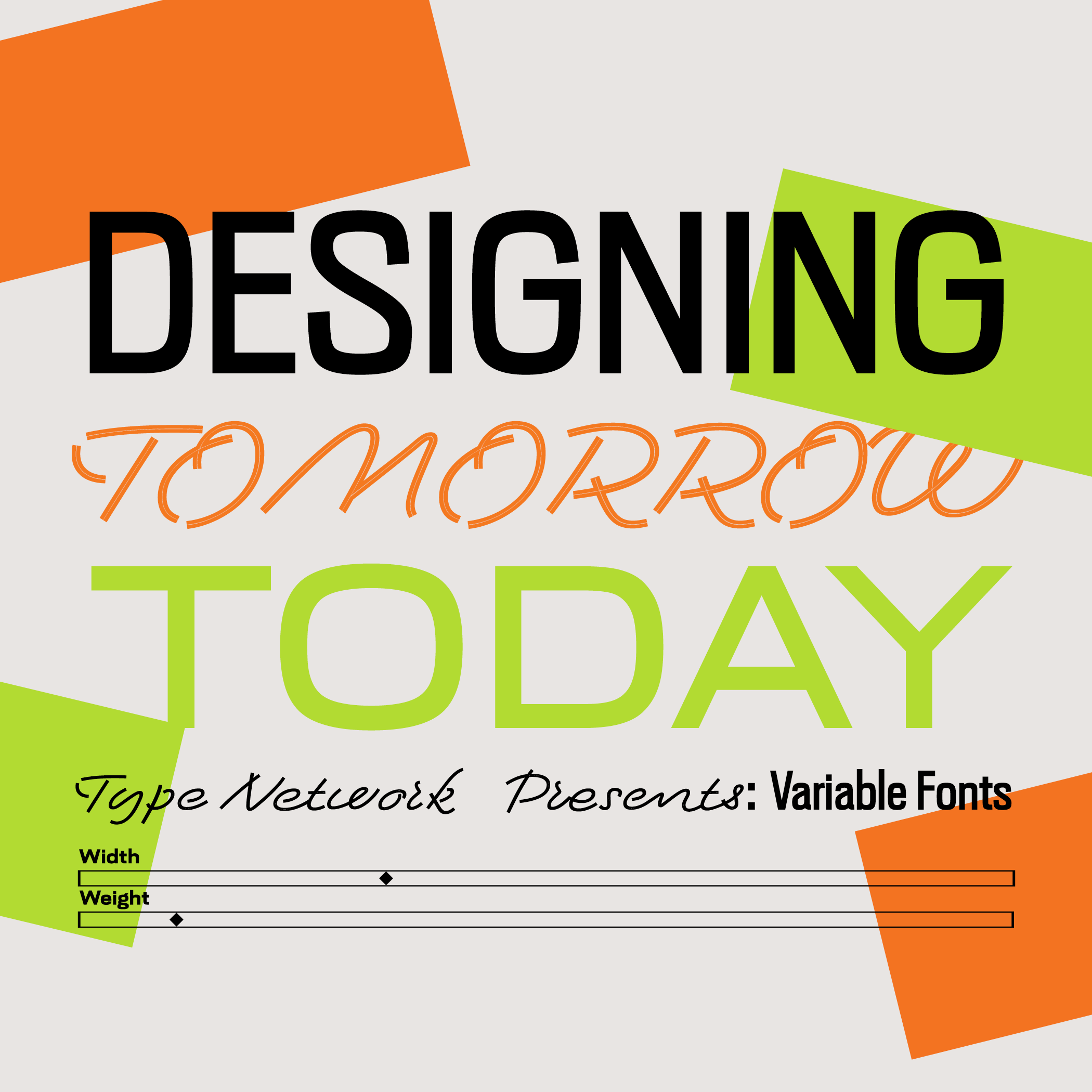
A webinar on about variable fonts
This event puts you in touch with creators at the forefront of variable fonts: Bas Jacobs of Underware, David Jonathan Ross of DJR, Rodrigo Saiani of Plau, and Lynne Yun and Kevin Yeh of Space Type.
Join us on Thursday, April 21st, at either of two convenient times for a series of talks and discussions.
Finessing text means refining it through nuanced typography. It’s something that has historically been limited to print design, when the designer knows the paper quality, audience, ink, and so on. Web and app design lacked that fine-tuning largely because it lacked the typographic tools to accomplish it. That is, until variable fonts came along.
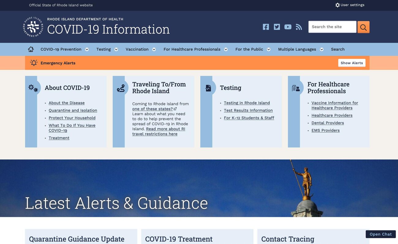
Jason Pamenthal used VF when redesigning the State of Rhode Island’s web system to increase speed and accessibility. He wrote, “If there’s one thing last year made exceedingly clear, it’s that government services must be accessible to all, no matter what.” Starting with the state’s COVID information site, the improved system has expanded to include dozens of government websites.
Google, whose user-base is among the largest in history, needs their apps and sites to be readable for every kind of person on every kind of device. To achieve this, they asked Font Bureau’s David Berlow to create Roboto Flex, a variable font that could adapt to its surroundings for maximum legibility and consistency.
Expressing with text, on the other hand, pursues impact and memorability. Advertising, headlines, branding, and anything else that needs to draw attention could be labeled expression. Before variable fonts, designers and companies were locked into static typefaces (often very common ones, at that). Now, with VF, using the same typeface as someone else doesn’t mean having the same style as someone else.
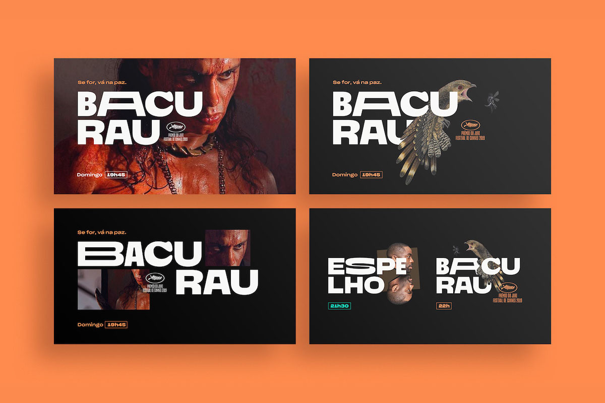
For companies that want a completely unique way to communicate nuanced messages with a range of users, the decision to commission custom type is smarter than ever. No brand has one voice or one audience; moreover, projects like Polymode Sans by XYZ Type and Canal Brasil by Plau and Tátil show what is possible when a variable font’s axes are designed to accommodate the range of a brand’s voice.
To implement variable fonts, designers have many options. Applications like Adobe Illustrator support VF (you might have one installed, and not even know it) for making graphics and designing branding. Meanwhile, it’s easy to implement VF using CSS. If that’s too complicated, platforms like Typetura make it even easier.
With each new VF-based branding project and each new VF release, variable fonts gain more momentum. While next week’s webinar concludes Type Network’s dedicated series on variable fonts, we’ll keep exploring and promoting them as the future of typography.