Loading...
Please wait while we load the content.
Please wait while we load the content.
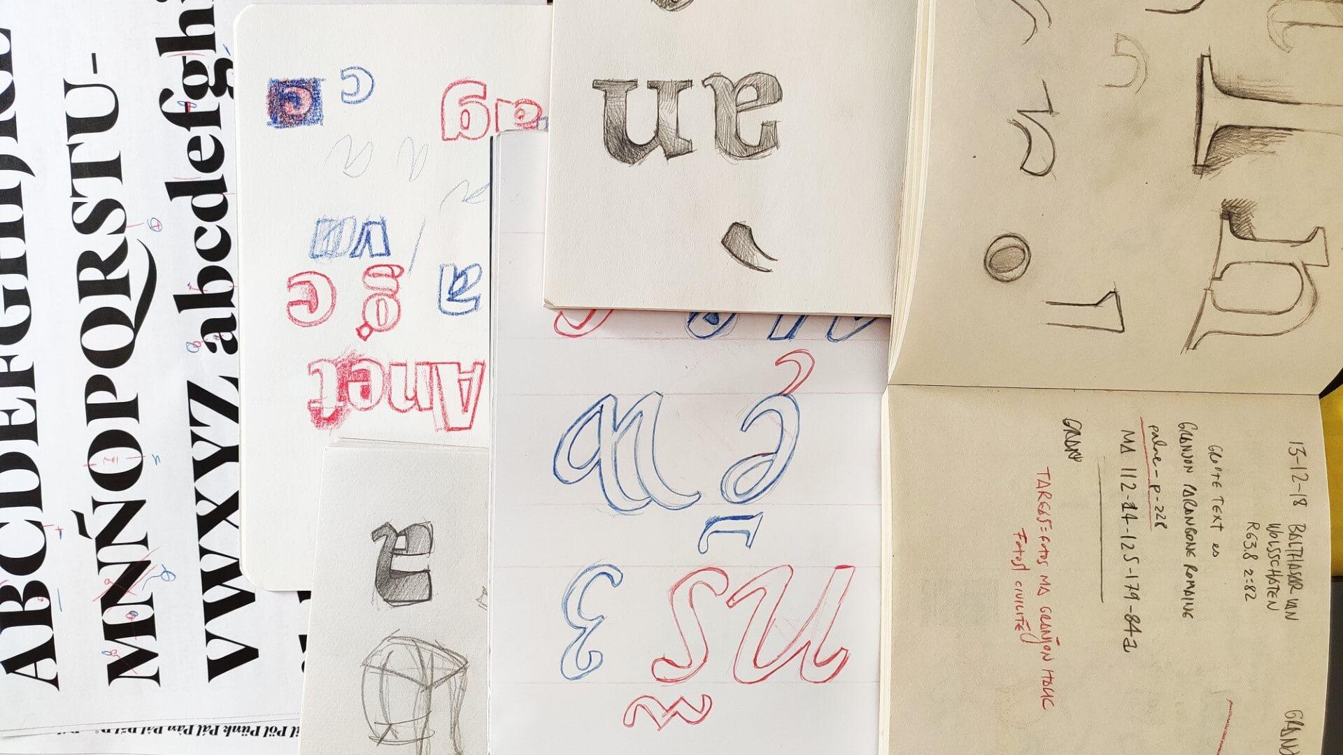
If you can remember a specific moment, when and why did you become interested in type design?
I don’t remember how lettering or calligraphy started to interest me, but I do remember that I had already started practicing a bit when I discovered that there was something called FontLab, a program in which drawings were made and converted into type. I downloaded the trial version, saw a bunch of little squares to fill in, and–with the pencil of my Wacom–I started with the A until I got to the Z. Then, bored out of my mind, I drew a-z. And then, very disgusted, I drew numbers and some punctuation marks. As I didn’t know anything about spacing or kerning I skipped those annoying steps and simply exported the drawings with my mother’s name (Paquita) and uploaded it to Dafont. It must have taken me about two hours in total to go from being interested in type design to my first release.
What is the story behind your early typefaces?
Paquita was the worst type in the world, but I found it amazing that people used it. At first they were my friends, but one day I found an American comic that used it and I started drawing more and uploading them to retailers where people, incredibly, bought them.
I was learning by reading the FontLab manual, but without a design education, I didn’t really know what I was doing. Whenever I didn’t have a design job, I would go back to my type, but without any goal. It was when I joined a digital typography course years later that I really started to become aware of how (and why) to make type.
Why did you start your own foundry, and what is the story behind your foundry’s name?
At some point I thought that a name should be given to all this. I was not very inspired and thought of Huy! which is an exclamation of surprise in Spanish. Something like Whoops! or Huh! and I think in some way it describes the diversity of my work.
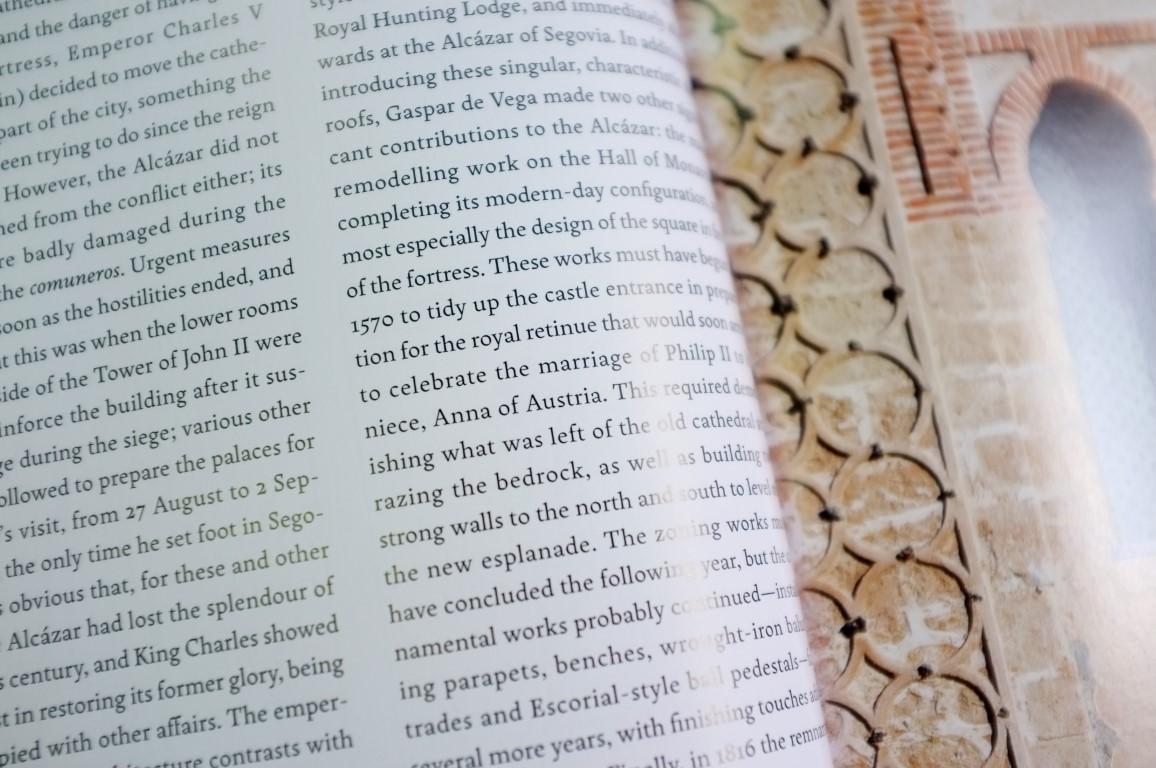

MTM is a type foundry dedicated to capturing the impact of letters in our visual culture, from Renaissance text faces to signpainting.
How do your design processes differ from one typeface to another?
With each design I learn new things, so the next project always adds improvements to the process. Apart from that, each font calls for a different way of drawing: Pliego is made without a single straight line and in a very organic way. First, I drew an alphabet very quickly and then I fixed things here and there until everything was in harmony, as if modeling a clay figurine. With Graveur, I had access to lead material from the 16th century, so tried to be methodical and faithful to what I saw under the microscope. In general, after a very restrained typeface comes a very free one.
What are your major sources of design inspiration?
My inspiration is primarily the vernacular lettering that survived through digital uniformity and surrounds me on a daily basis. I’m much more interested in 1970s pastry wrappers than I am in mainstream design history. I’m an antique flea market animal and that’s also where old books by master punch cutters have entered my interests. So old masters and junk seem to be my inspiration!
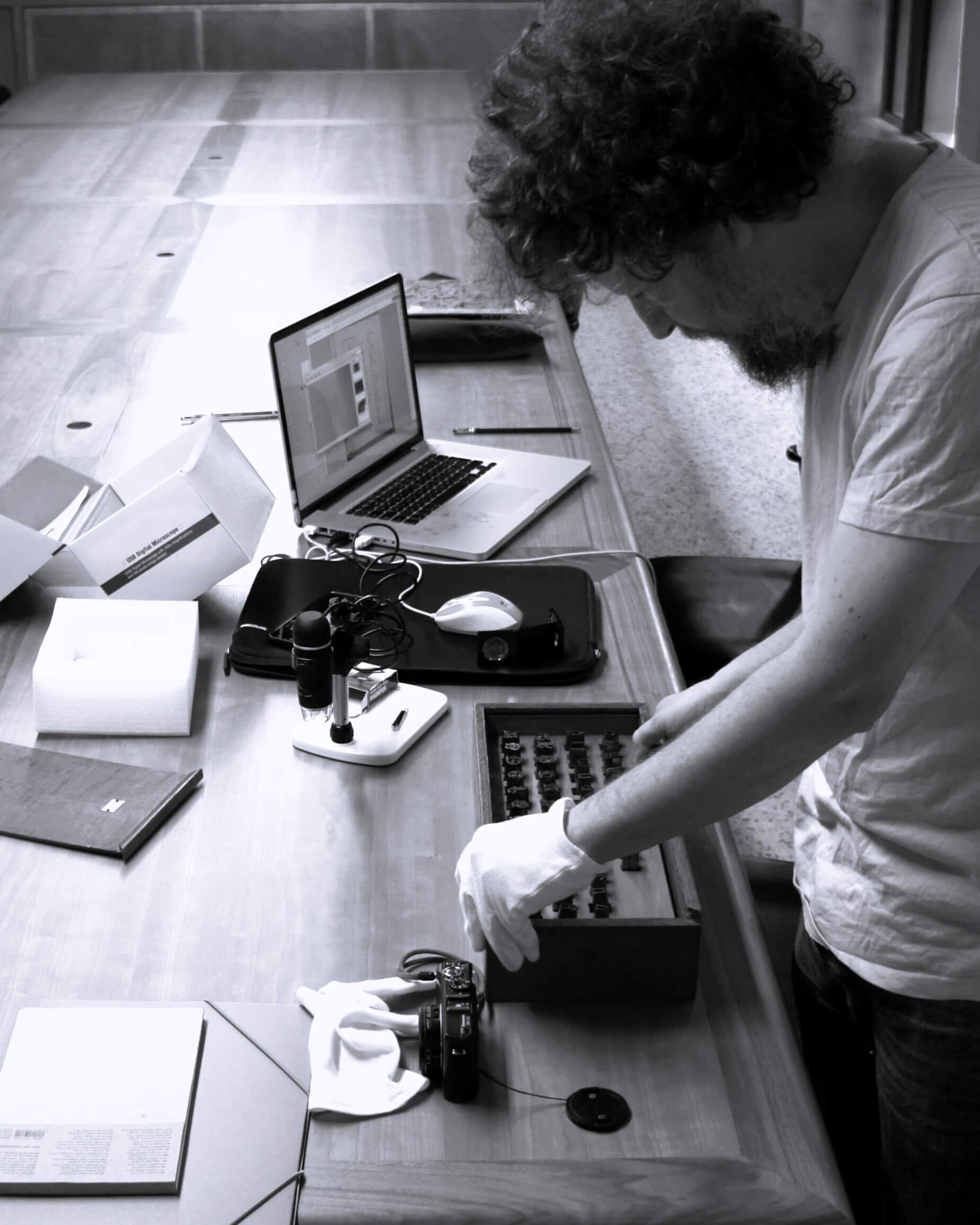
Juanjo López photographic 16th century lead type as inspiration for Graveur.
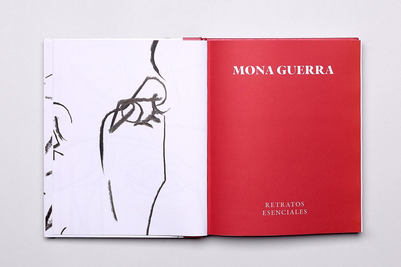
Graveur used for Mona Guerra Retratos Esenciales.
Do you have a favorite example of seeing your type used in the wild?
I’m grateful to all designers who trust in my work but, if I have to choose a favorite, there is a Finnish design studio called Studio Kiss, whose designer Tuija Tarkiainen makes wonderful books with my typeface Schotis.
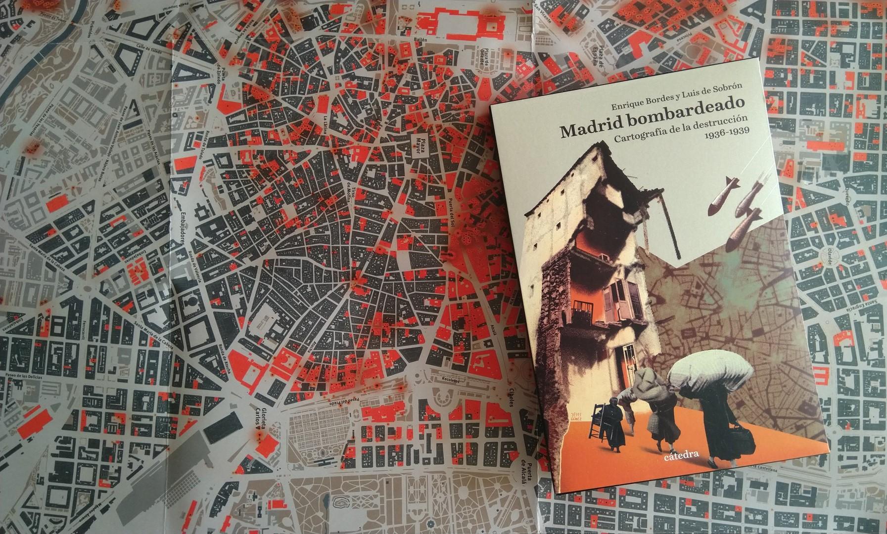
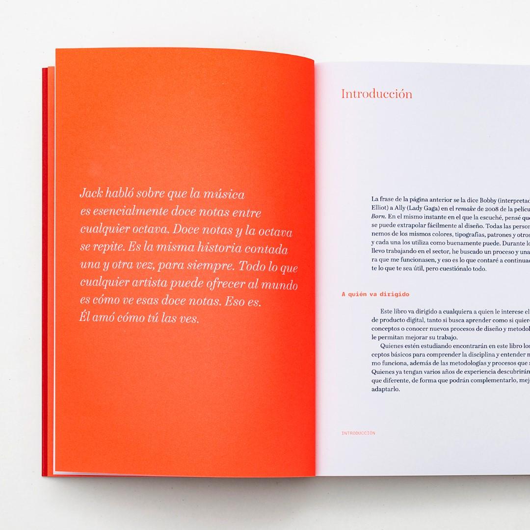
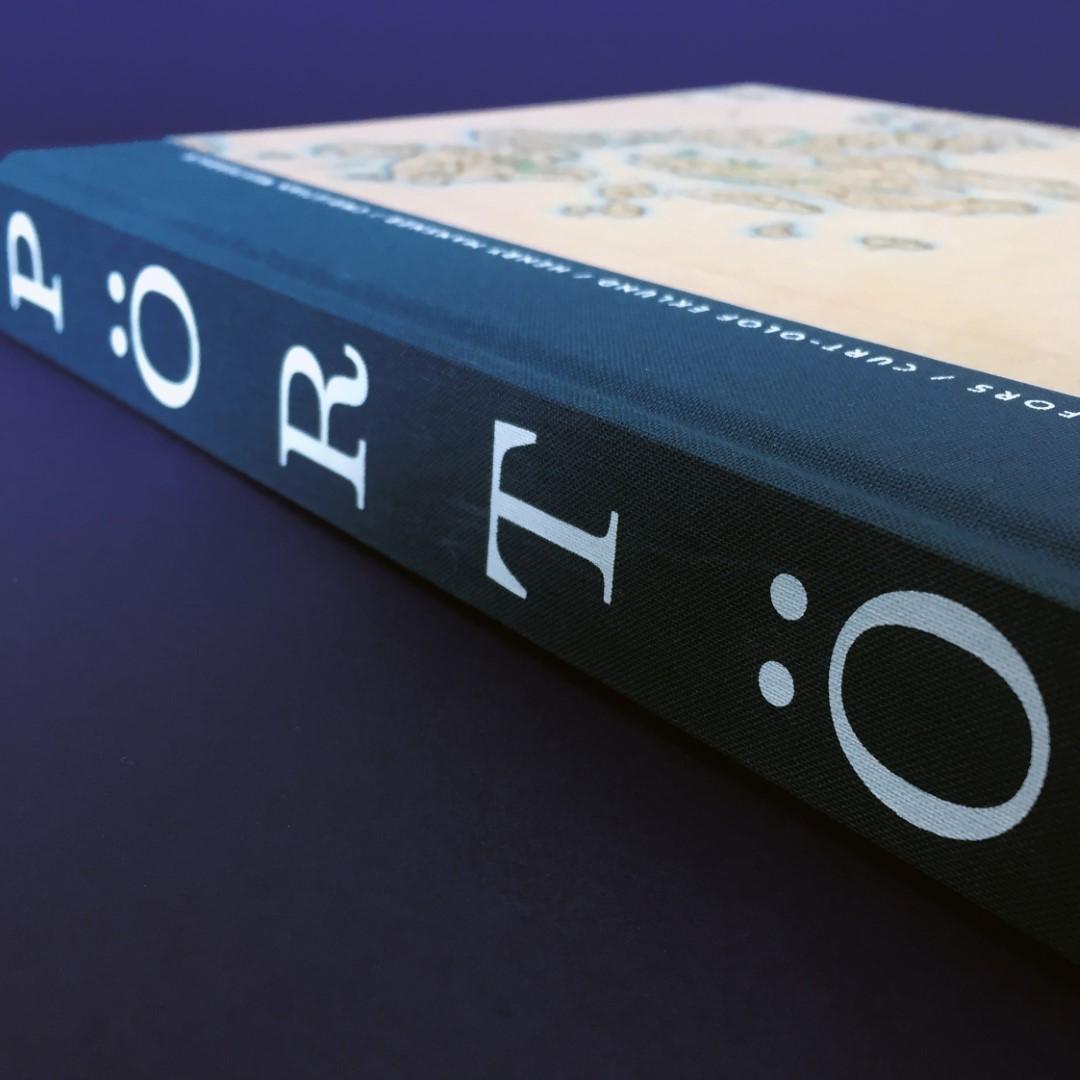
A few book designs by Studio Kiss using Schotis.
Tell me about the typefaces with which you’re launching on Type Network.
I think Type Network has picked my most useful types, the families that I like the most and which provide the greatest possibilities for designers.
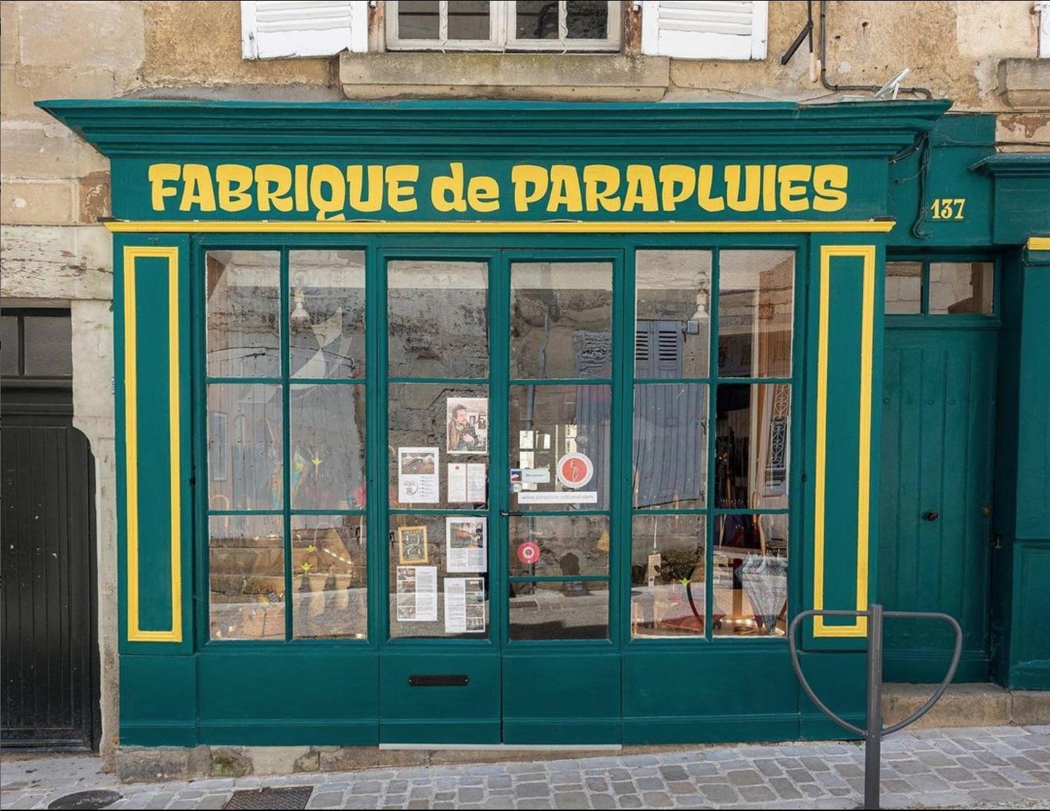
La Fabrique de Parapluies is a family business that has been designing, manufacturing, and restoring umbrellas and parasols since 1882. Their updated signage makes great use of Xunga.
What does it mean for you to be joining Type Network? Who among the foundry partners and staff are you most excited about working with?
I’m elated to be in such good company. The care with which the team of Glenda and Guido ensure we’re offering a quality product is impressive. As for the partners, in a recent Zoom meeting I took a screenshot to show off being in the same room as Matthew Carter!
What is next for you?
Huy! Fonts has grown without any order, adapting to my interests at each moment and focusing more on drawing the next letter than on promoting what I already have. Now, I think it’s time to think about publicizing my work and improving everything that surrounds the letters.
I also hope to launch, later this year, a new foundry focused on the letters of my city, Madrid. A side project to have fun playing with letters, which is the main reason for doing these things.