Stephen Coles offers clear definitions for commonly abused terms and elaborates on the differences between type and lettering, a typographer and a type designer, and a typeface and a font.
By Stephen Coles
Hi, Internet. It’s really great to see you getting into typography. Thirty years ago, word processors and font menus made typesetters out of anyone writing a paper. Today, webfonts are making typographers out of of anyone building a web page. This is a good thing. We welcome you to the club with open brackets!
Now for some tough love. Any field has a proper terminology generally accepted by its professionals. Using the wrong words doesn’t just make you look silly or inexperienced; it doesn’t just irritate the nitpicky nerds; it keeps you from getting the most from typography. Knowing the right words can help you understand and describe, design and build.
These mistakes are not limited to the web world, of course. We commonly see typographic jargon misapplied in print as well as online, by all kinds of people, including professional designers and journalists. Here are some of the most commonly confused typographic terms that get tossed around, along with simplified definitions:
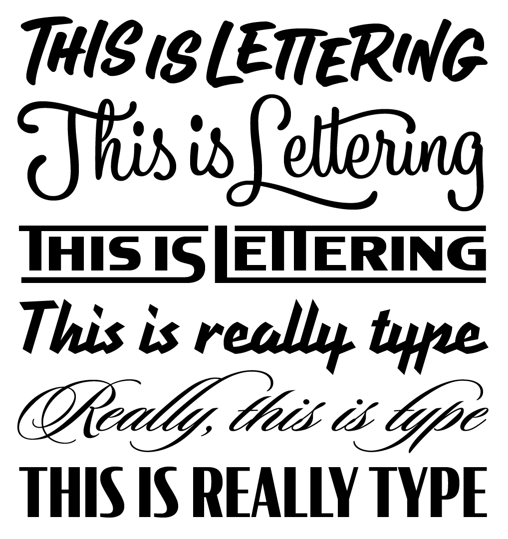
Type is not lettering.
Type:prefabricated letters that are made to be reused many times and in any order.
Lettering:one-of-a-kind letters that are made (drawn, painted, carved) in situ for a single piece.
Folks like to say “cool type” when they see anything that has letters in it. Often, however, the work they’re seeing is actually lettering, taking advantage of that craft’s advantages: unique lettershapes designed to fit together for a specific word or phrase. Mark Simonson made a nice analogy that helps distinguish the two: lettering differs from type in the same way that modeling clay differs from LEGO® bricks.
Here’s a visual example:
With lettering, the letters are usually drawn or written just once, and for a specific context. With type, repeating letters typically have the same shapes. Fonts are capable of emulating the variation of lettering through alternates and ligatures, but they are still type: a system of premade letters that can be reproduced again and again.
As an aside, “writing” is often seen as a subset of lettering, but it is really a specific and separate act. I highly recommend reading The Stroke by Gerrit Noordzij and Counterpunch by Fred Smeijers to learn more about the differences between writing, lettering, and type.
A typographer is not necessarily a type designer.
Typographer: someone who uses typefaces.
Typeface designer: someone who makes typefaces.
I often see “typographer” used to describe someone who makes typefaces, but we have separate terms for these two very different disciplines, just like blacksmiths make hammers and carpenters use them.
Now, can a typeface designer–or a type designer–be a typographer? Of course. But if you’re referring to the profession of someone who makes typefaces, be precise.
A typeface is not a font.
Typeface: the design of a set of characters.
Font: the vessel for a set of characters.
The font is the delivery mechanism—it can be a set of metal or wood pieces, or a digital file. Nick Sherman’s song/MP3 metaphor can help you understand the difference between a typeface and a font. The typeface is the way the thing looks.
Sometimes, “font” can refer to a single style and/or size within a type family—Verdana Bold, for example. But, in the clearest terms, as Norbert Florendo has said, “the typeface is what you see and the font is what you use.”
Now go forth, armed with the proper terminology! And the next time someone uses the wrong word, don’t sigh or snarl—just send them to this post. I’ll add more terms to the list whenever I see them frequently misused and abused.