
Lechuga Type opens for business at TN
To every typeface he designs, Antonio Lechuga brings his decade of experience as a graphic and brand identity designer. His foundry joins Type Network with three faces. Here, Lechuga shares how he learned type design from Paco Calles, drew inspiration from Luc(as) de Groot, and worked with David Kimura.
When did you become interested in type design?
For over 10 years as a graphic designer, type design never crossed my mind. I was content using fonts for branding or editorial purposes until one day I met the master Paco Calles, who was teaching a course on designing logos by modifying fonts, and that was the seed. Paco was coordinating a master’s course that would take place in Mexico City (2014-2016), and—with a lot of effort and support from my wife—I managed to finish it and start my way in this fascinating career.
What is the story behind your first typefaces?
As a lover of brand design, my first project was inspired by corporate typefaces with a human touch. One of my references was Thesis by Luc(as) de Groot, a versatile system used in museums, banks, and many others. So, finding that same versatility and warmth was one of my goals. I ended up calling the project Trust.
Why did you start your own foundry, and what is the story behind your foundry’s name?
I think it was the step I had to take to grow professionally, and although I am still learning, it has been a great adventure to develop projects for clients and for my own catalog. The name was the hardest part; that’s why I chose my mother’s last name, Lechuga, which means lettuce in English. It’s quite uncommon, and some people think of me that way.

Lechuga Type is a type design studio based in Quéretaro, Mexico. It specializes in custom, retail, and logos for brands and companies.
What makes your design process unique?
In some projects, I try to think in metaphors and in the spirit that typography can have. It’s more or less similar to creating a brand identity.
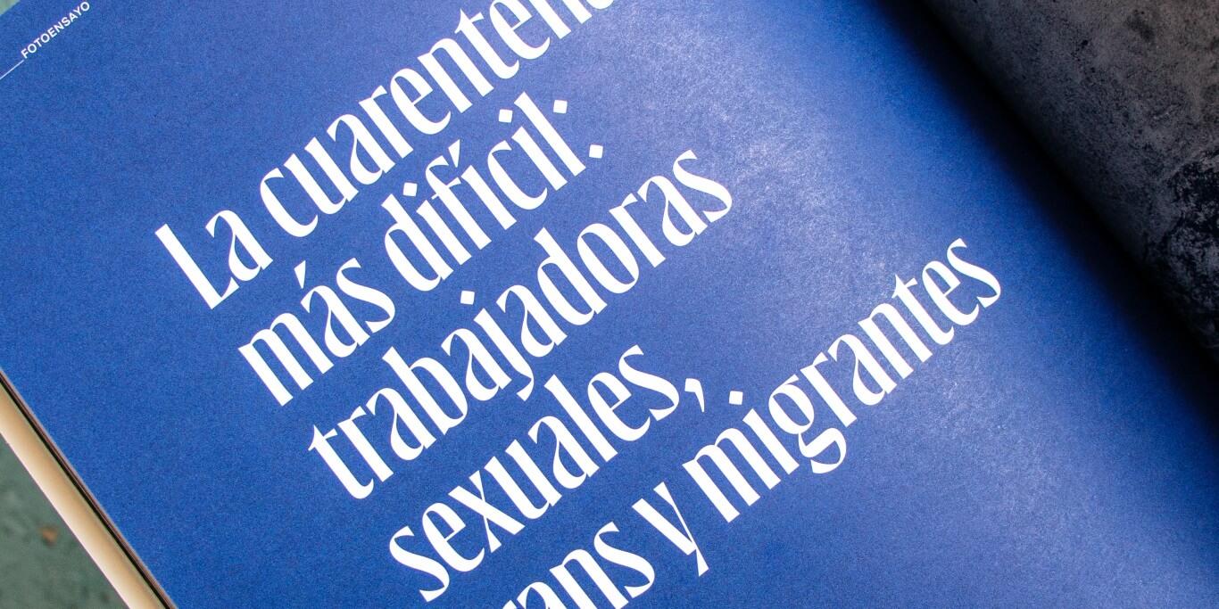
Lechuga designed the custom Gatopardo typeface for Gatopardo magazine.
What are your major sources of inspiration?
I try to look a lot at the space around me: Objects, photographs, nature, sign painting, brands, posters… especially the physical, the handmade, the old; that which has soul and history. I try to find a balance between the rational and the expressive.
Do you have a favorite example of seeing your type used in the wild?
I love editorial design, and one of my favorite projects was when one of my great teachers, David Kimura, asked me to create a typeface based on a logo he and his partner, Gaby Varela, had designed for Gatopardo magazine. The quality of the paper, the editorial design, and the meticulous care given to each issue make me very proud to have worked with them under their guidance.
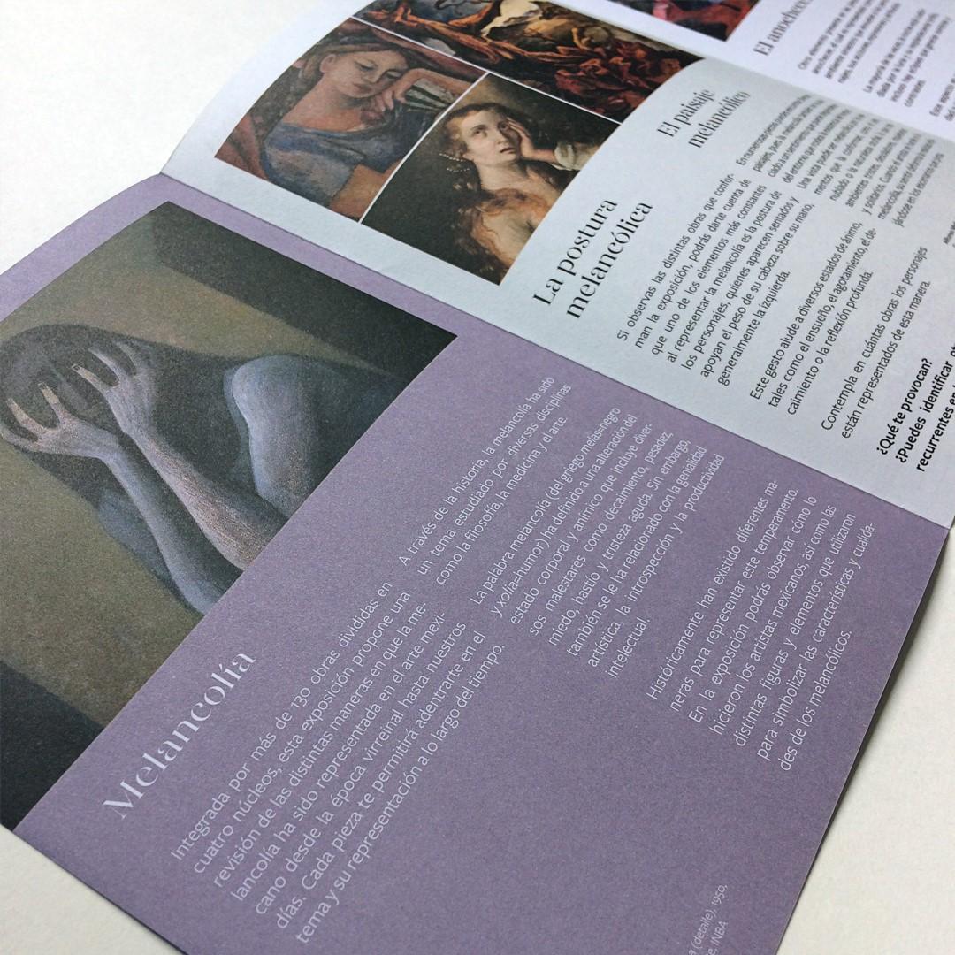
On the other hand, one of my greatest satisfactions was seeing my Gabriela Stencil typography used at the National Museum of Art for the Melancolía exhibition. I had never seen my typefaces used in works that were so important to me.
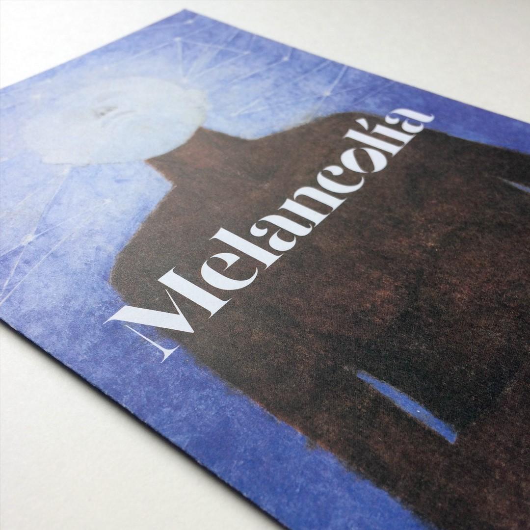
Lechuga's Gabriela Stencil used for the Melancolía exhibition at Mexico's National Museum of Art.
Tell me about the typefaces with which you’re launching on Type Network.
Bruna was a project that went through several stages of exploration before I finally launched it at the end of 2021. It’s a workhorse that is both elegant and strong.
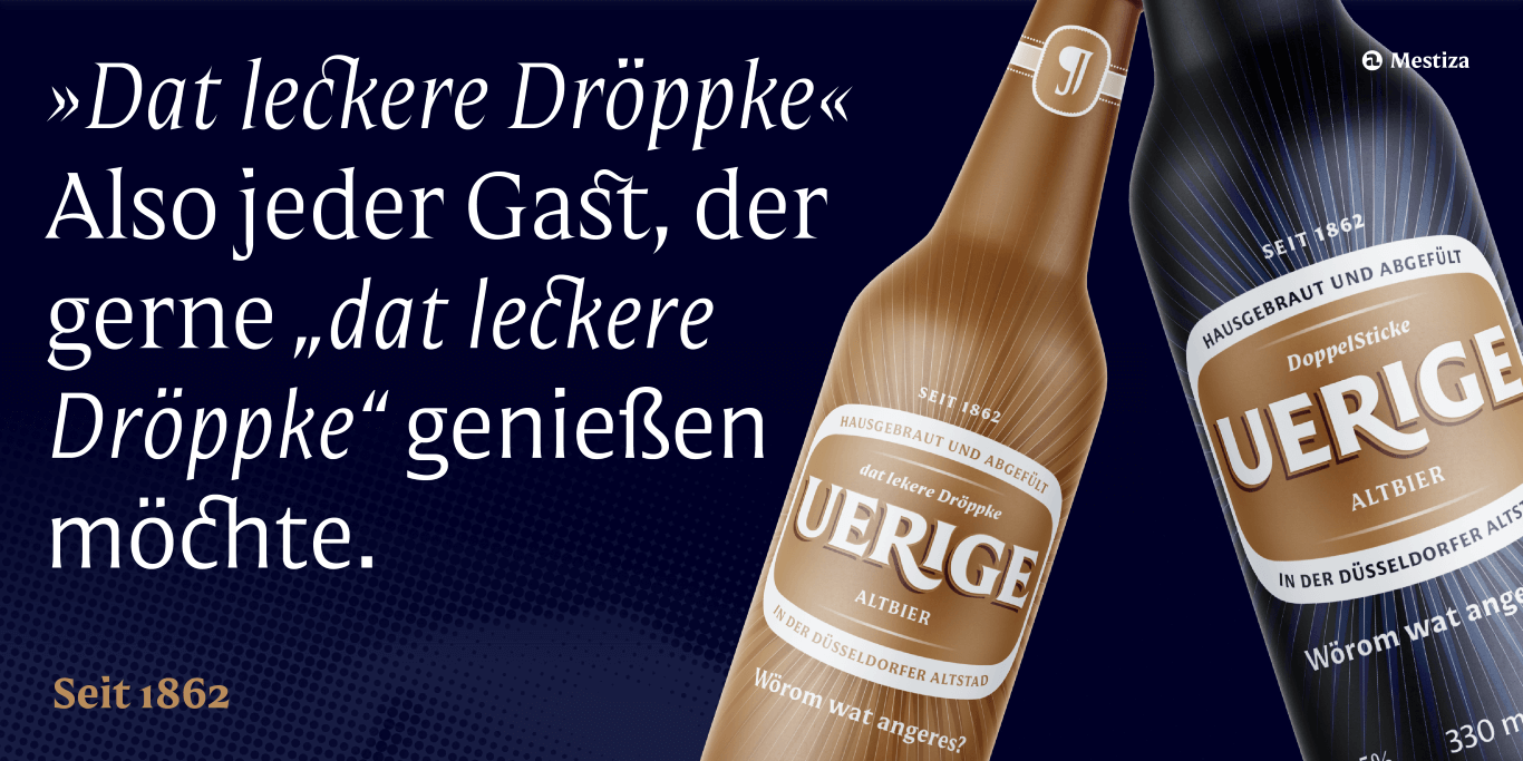
Mestiza was a project I rescued from an unused logo design. It had the potential to develop into a system with a sans version, too, which is how Mestiza Sans was born.
Mestiza Sans
Regular
Starting at $30
BuyWhat does it mean for you to be joining Type Network? Who among the foundry partners and staff are you most excited about working with?
It is a step forward in the professionalization of my work and a great challenge to be surrounded by many of my references and designers that I admire so much. Thanks to Roger Black, Glenda Bellarosa (library manager), Guido Ferreyra (font engineer), and the rest of the TN team for allowing me to venture into this new territory and continue to improve my quality as a type designer.
What is next for you?
I have a few projects in the incubator and hope to release at least one more this year, along with some custom projects I’m developing for clients. I’m running out of time!
Bruna, Mestiza, and Mestiza Sans can be licensed for print, web, mobile apps, and ePubs. Webfonts may be tested for thirty days, and desktop trials are available upon request. Have a licensing question? Check out our support page or get in touch.