Loading...
Please wait while we load the content.
Please wait while we load the content.
I’m told you work from home and that you designed and built your house. Did type and lettering help pay for it?
Actually, they did! I was fortunate enough to run a design agency from 2003 to 2013 with two business partners in London, focusing mostly on web and digital design. The agency was acquired by a friendly competitor, which gave us a substantial amount of money to start new endeavors. So, in a way, this is my third career.
I had jumped straight into the web world after university, did that for several years, then founded the agency in 2003. We worked on building and growing the agency, but after about ten years, we all felt burnt out. We survived two global financial crises and then decided to sell the agency. Meanwhile, I was running the Type Worship blog on the side and decided to delve deeper into typography. I attended an intense summer course at Reading University and went back the following year because I just couldn’t get enough. That’s really where it all started for me.
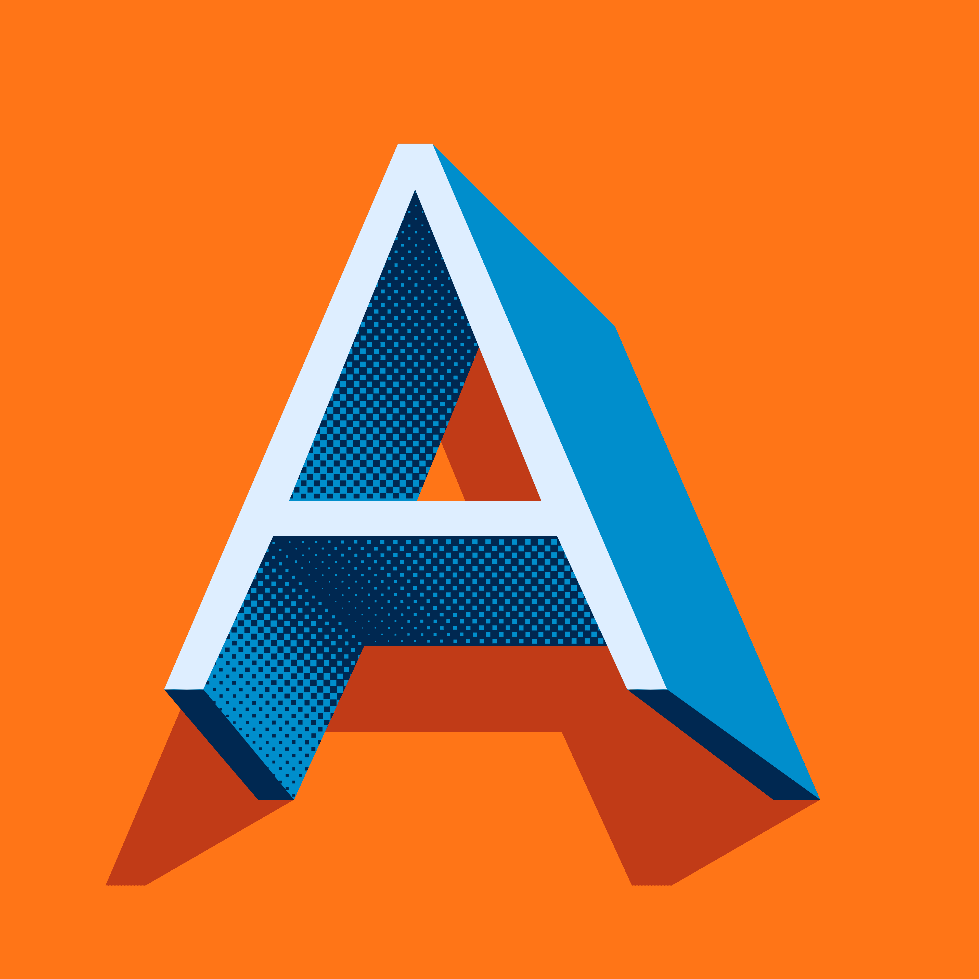
Clarke’s typeface Rig Shaded contains layers that can be individually colored and combined, creating quick, effective display type.
Do you find that your background in web and graphic design influences your work in type design?
A little, yes. To give you the full backstory, my interest in type started during the Emigre days. Influential figures like Barry Deck and Jonathan Barnbrook were a big inspiration while I was studying graphic design in college. However, when I transitioned to web design, the lack of typographic variety felt like a setback. This period was before the days of hosted fonts and services like Typekit, making it quite challenging. My experience over those 10 to 15 years taught me a lot about design and interfaces, but when I shifted my focus entirely to typography, I somewhat put that web and graphic design experience aside. It’s still in the background, influencing me, but I don’t actively draw on it as much.
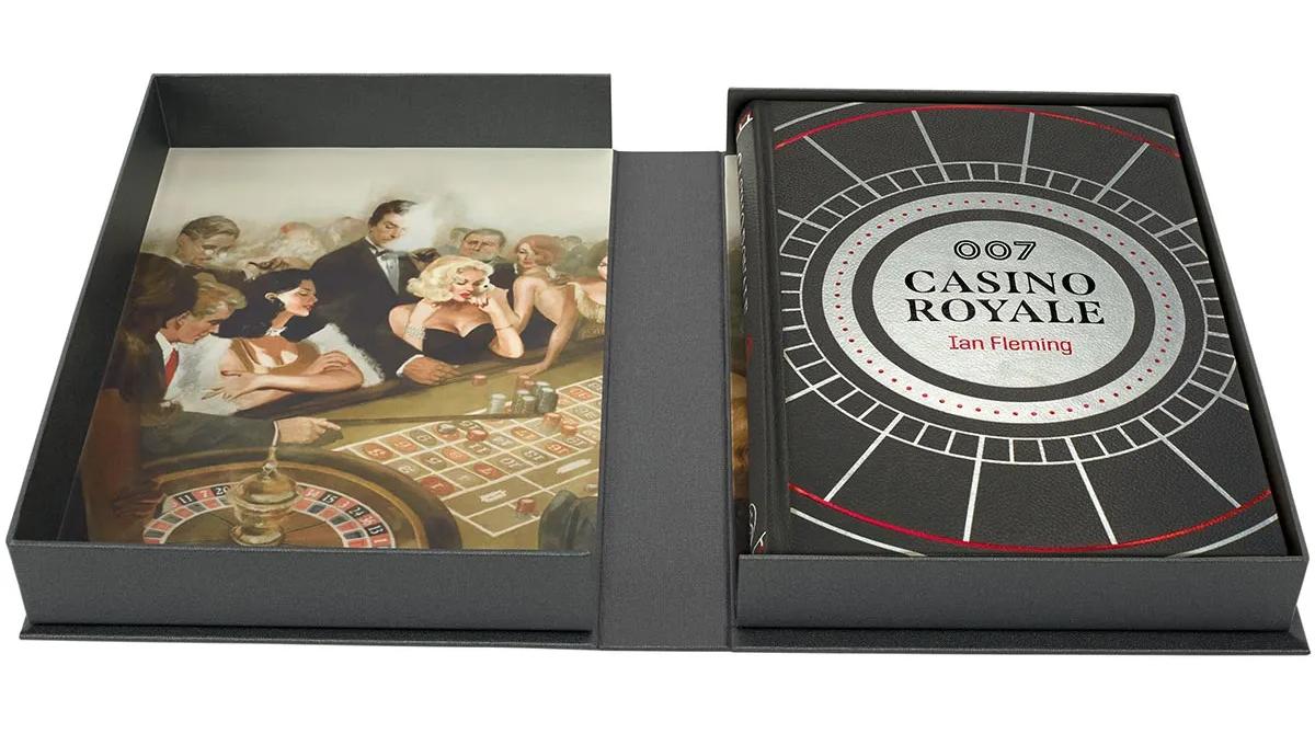
The Folio Society asked Clarke to redesign a limited-edition cover for the 70th anniversary of Casino Royale. The cover features his typeface Span.
You work in both hand lettering and type design. Could you explain the differences between the two?
Certainly. Lettering is essentially a one-off drawing of letters for a specific use, like a logo. It’s a unique creation each time. In contrast, type design involves creating a more modular system that can be used repeatedly in various applications. You can think of lettering as crafting a single, distinct piece, while type design is about building a versatile toolkit. They’re separate disciplines but share similar skills and objectives, especially in terms of drawing, readability, and legibility.

Jamie Clarke is an independent lettering artist and type designer with over 25 years experience, based near Bristol in the UK.
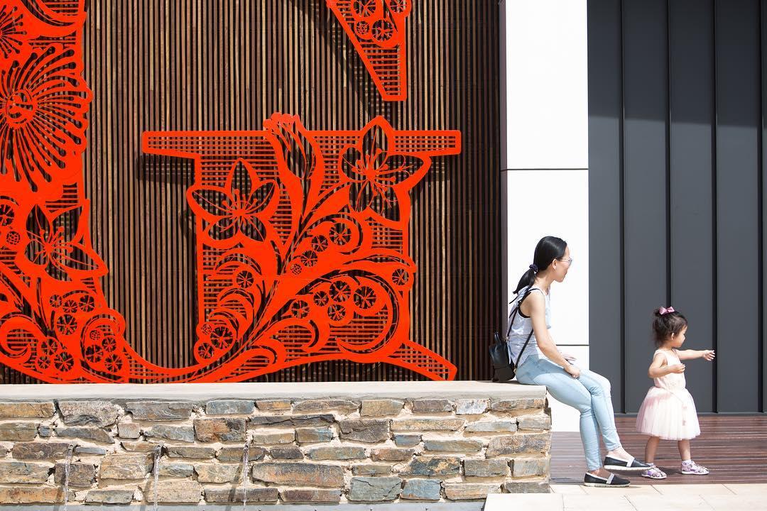
Clarke designed this ornamented G as part of a new identity for the Glenside residential redevelopment in Adelaide, South Australia. Here, a giant CNC-cut version stands outside the show suite entryway.
How would you compare the processes of creating lettering versus type design?
They start off quite similarly, with a concept and initial drawing. With lettering, the direction tends to be more decorative; I often embellish it with illustrations. Type design, on the other hand, goes in a more refined direction, focusing on how it can be utilized in various design applications. All my typefaces have origins in my lettering work; they've been significantly influenced by my illustration and lettering projects. For instance, my first typeface, Brim Narrow, emerged while I was working on an illustration. I needed specific lettering to complement a historical woodblock model inspired by Pouchée and ended up creating something unique. This led to the development of Brim Narrow. Similarly, my latest release, SideNote, was designed to annotate my illustrations for clients. I needed a typeface that was friendly and professional for client presentations.
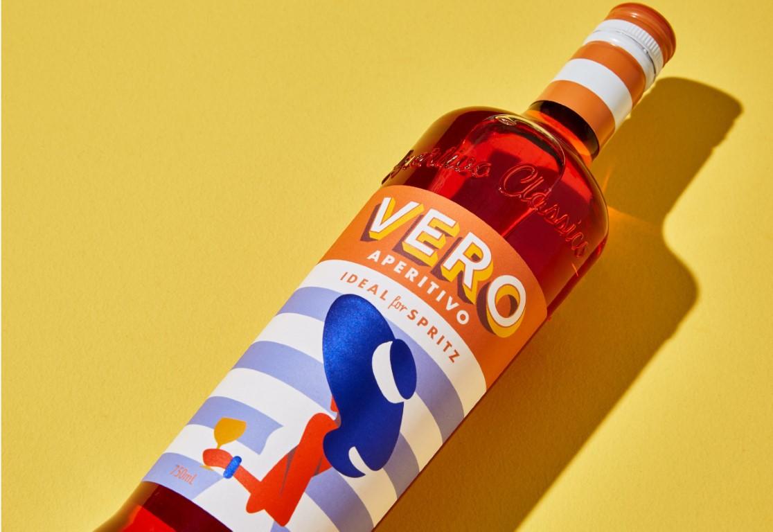
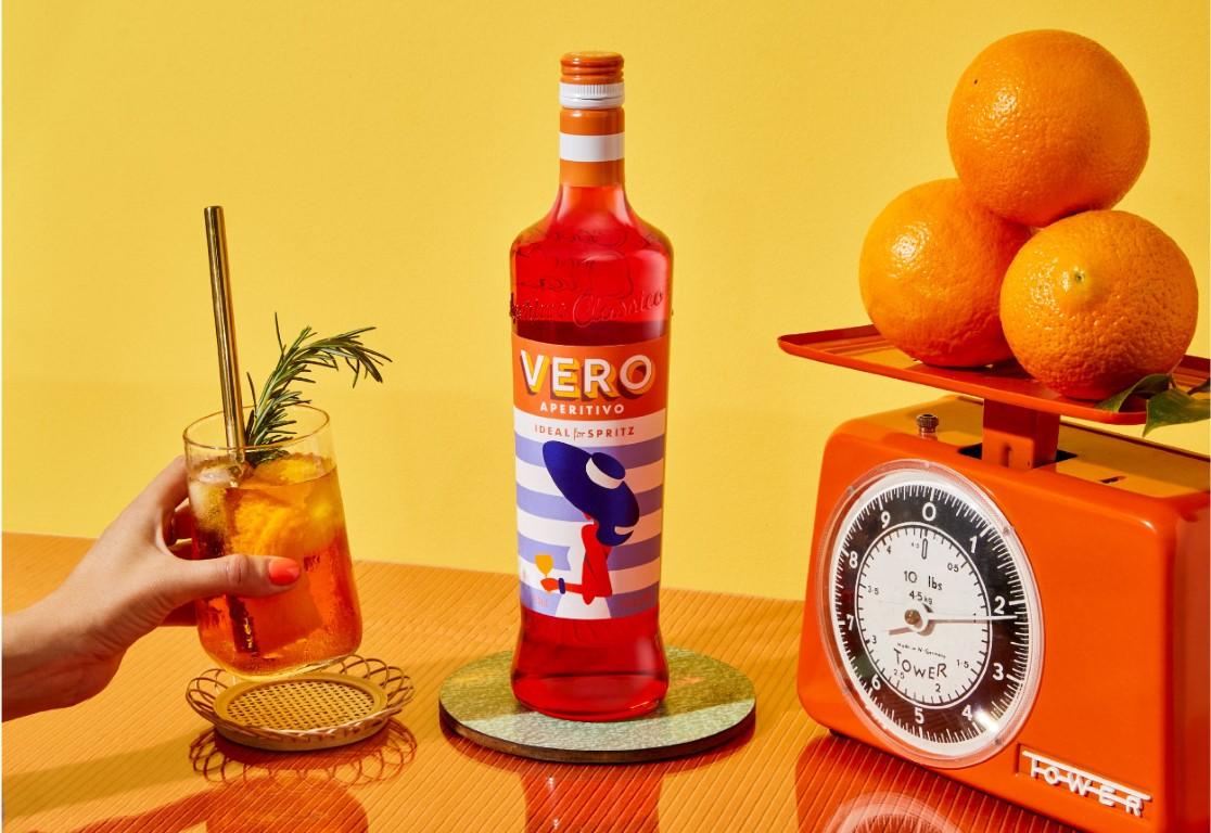
Coles in the U.K. launched their own version of Aperol, dubbed Vero Aperitivo. Designers Ben Galbraith and Alan Walsh used Clarke’s Rig Shaded for the packaging and branding.
You’ve worked with some pretty big clients. What’s it like to be approached by organizations like the Folio Society to work on projects like a James Bond book?
It’s an amazing feeling and a real privilege. Ten years ago, I couldn’t have imagined doing such work, especially in illustration and type. It’s taken me a decade to reach a point where I feel confident calling myself a lettering designer and artist. When big clients approach me, it’s still a bit surreal. I never saw myself in the same league as full-time professional illustrators. The Folio Society first noticed me when I came runner-up in a book design competition they judged. At that time, it felt like a distant dream to collaborate with them, but years later, they remembered me from the competition and reached out for the James Bond project.
Similarly, seeing your typeface Span used by major international companies must be quite an experience.
It’s absolutely astonishing, and I genuinely love it. The first time I saw Span being used, I was at a bus stop and saw a bus with an ad featuring the font. It was a surreal moment, initially doubting it was mine but then realizing it indeed was. It was the first major use of Span, to my knowledge, and it was here in the United Kingdom. The moment I saw it, I was completely taken aback. It’s an amazing feeling.
Have you had instances where you thought a design was yours but weren’t quite sure?
Yes, I remember once at an airport, I saw a font that looked like Rig Sans, which is distinctive due to its 90-degree terminal cuts. It’s a unique feature, though a few other typefaces have it. I took a photo, checked it later, and realized it wasn’t mine. Identifying fonts can be tricky, even when it’s your own, since designers do all kinds of things with letterforms and spacing these days.
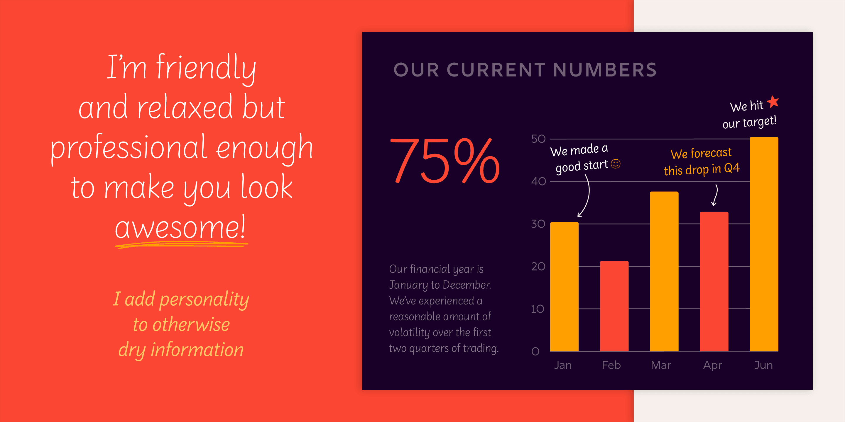
Clarke’s business casual variable font SideNote sprang from his own need to annotate presentations and illustrations. It’s great for marginalia, labels, and anywhere else you don’t need absolute professionalism.
Tell me about the typefaces you’re bringing to Type Network.
The typefaces I’m bringing to Type Network are all deeply connected to my work in illustration and lettering. They’re intended to be used with illustrations, offering various strengths for different applications. It took me a long time to differentiate my work from other foundries. I finally realized my niche is ‘type for illustrations.’ These typefaces are born out of my experiences in illustration and lettering, so when I show them in specimen graphics, they’re often shown alongside illustrations, highlighting their use as part of illustrative works.
What does joining Type Network mean to you?
Joining Type Network is exciting for me. Firstly, I appreciate how Type Network adds a distinct voice to the type industry and offers a diverse range of typefaces, which I think is vital. Secondly, having experts like Glenda Bellarosa and the Type Network team quality-check my fonts is invaluable. It’s reassuring to know that my work is evaluated and approved by such experienced professionals. Lastly, being in the company of so many amazing designers is incredibly special. It’s humbling and inspiring to be part of such a talented group.
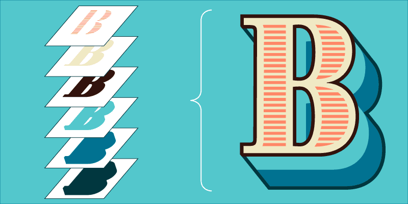
Brim is inspired by antique woodtype and chromatic type from the 1800s. Layer its styles to create unique and striking 19th century designs.
That’s great to hear. It’s always interesting to know what aspects of Type Network appeal to different designers. Speaking of design, what’s next for your foundry?
Currently, I’m working on a typeface that I started at Reading about ten years ago. It was a challenging project, well beyond my skill level at the time. It’s a tricky design with an organic, Art Nouveau feel, but I believe I’ve finally cracked it. I’m planning to create specimens for it as labels, possibly for cider, which is popular here in Somerset. This project, along with a few other commissioned pieces, keeps my work fresh and exciting.
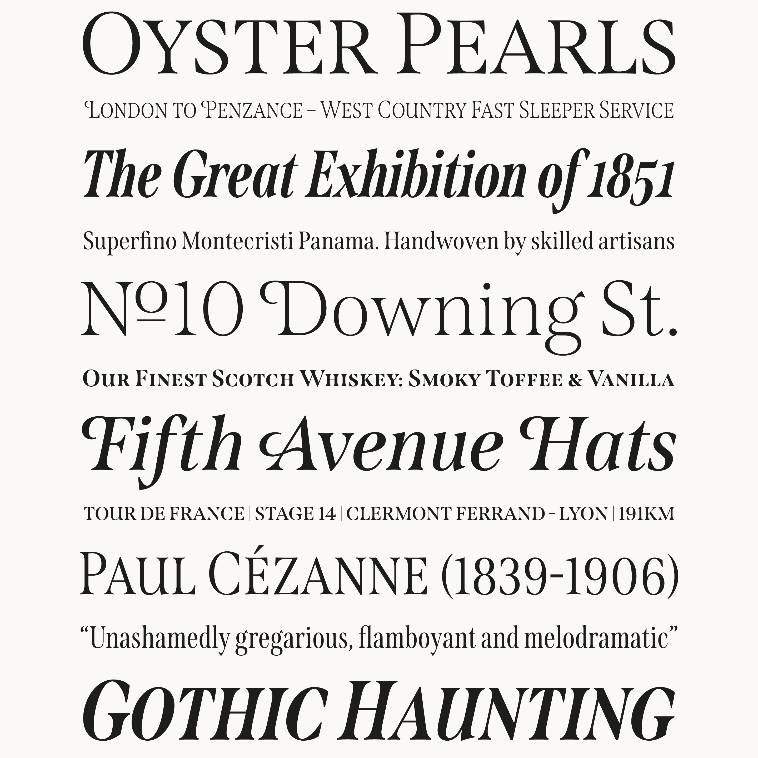
Span’s ‘Mid Caps’ sit midway between full-height capitals and lowercase letters, providing exceptional flexibility over uppercase settings.
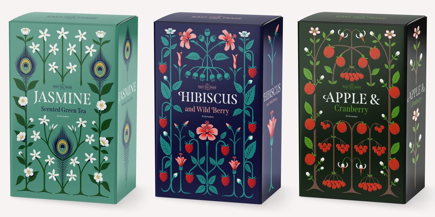
Span is a modern glyphic type family, revealing its engraved heritage with sweeping serifs and sculptural forms.
What would your ideal project or commission look like?
I’m particularly drawn to the tradition of wine and spirits branding. There’s a strong creative opportunity there. For instance, I was approached to design a label for a Napa Valley wine bottle, which was an incredible brief. Unfortunately, it didn’t materialize, but it’s exactly the kind of work I’d love to do more of. If someone approached me with a project to design arts and crafts-style illustrations for a gin brand, I would be thrilled.
Perhaps your cider label designs will open doors to such opportunities. Before we wrap up, is there anything else you’d like to share with our readers?
One key thing I’ve learned is the importance of creating work that aligns with your aspirations. Clients often approach based on what they’ve seen in your portfolio. Producing self-initiated projects can lead to the kind of work you genuinely want to do. It’s about showing potential clients what you’re capable of through your existing work.
That’s an excellent point. Jamie, it’s been great speaking with you. Thank you for sharing your time with me.
My pleasure, Lucas. Thanks for the opportunity. It’s been a brilliant conversation.

Jamie Clarke is an independent lettering artist and type designer with over 25 years experience, based near Bristol in the UK.
Rig, Brim, Span, and SideNote can be licensed for print, web, mobile apps, and ePubs. Webfonts may be tested for thirty days, and desktop trials are available upon request. Have a licensing question? Check out our support page or get in touch.