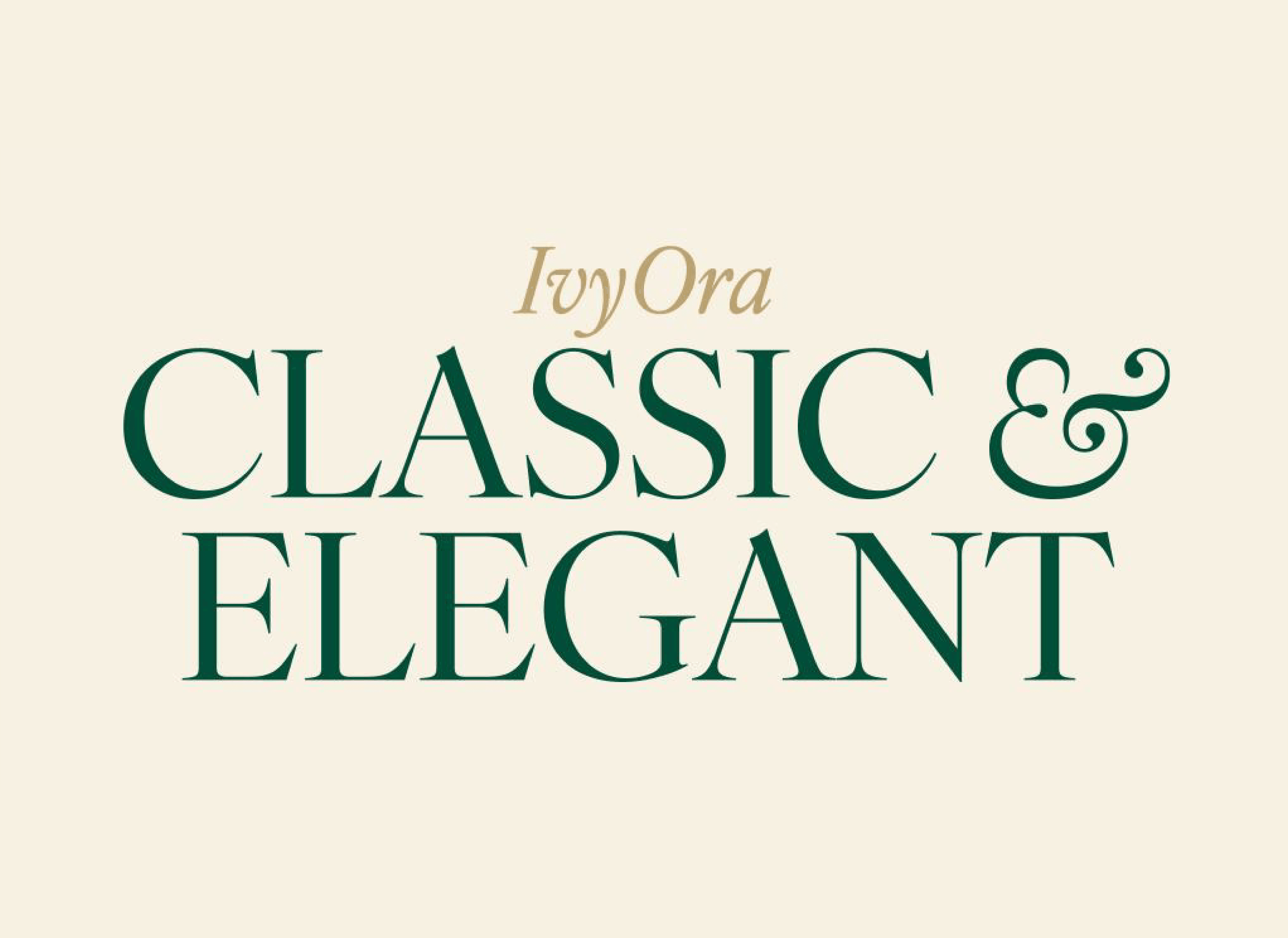
IvyOra: An alternate to Caslon that isn’t another Caslon!
For Ivy’s latest family, Jan Maack drew inspiration from the same Dutch fount as William Caslon. The result is a set of fonts that can be used not only instead of typical Caslons, but also in places Caslon can’t go: elegant headlines, stylish displays, and more. They might need to update that old printers’ saying: “When in doubt, use IvyOra.”
In 2001, Jan Maack of The Ivy Foundry took a trip, courtesy of The Danish Arts Foundation, to conduct research at the Museum Plantin-Moretus in Antwerp. Among its well-equipped shelves stood out one folio, printed in 1695 by Dirck Voskens, entitled Proef van Letteren. Poring through its pages, Maack discovered two exceptional Dutch Baroque typefaces—Cleene Canon and Ascendonica Romein, both attributed to Nicolaes Briot.
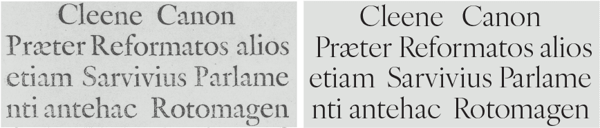
Type historian John A. Lane attributed the Cleene Canon and Ascendonica Romein to Nicolaes Briot (ca. 1585 — 1626). Both specimens served as a basis for IvyOra. (Source: John A. Lane. Early Type Specimens in the Plantin-Moretus Museum. Oak Knoll Press, 2004.)

The Ivy Foundry, founded in 2016 by Jan Maack, is a small independent type foundry based in Denmark.
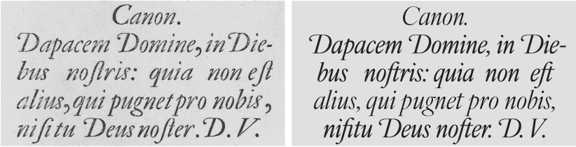
In spite of the initials D.V. at the end of the showing, this is the Kleene Canon Italic of the 1681 Widow Elsevier Specimen, which is attributed to Van Dijck. Maybe by mistake the initials of Van Dijck were set to match Dirck Voskens. (Source: Type Specimen Facsimiles. Reproductions of fifteen type specimen sheets issued between the sixteenth and eighteenth century. Bowes, Bowes and Putnam, 1963.)
Maack wasn’t alone in his admiration for these faces; the famed William Caslon looked to them for inspiration, as well. In his entry for the Oxford Dictionary of National Biography entry on William Caslon, James Mosley described Caslon’s affinity for the same two Dutch faces, drawn from the same 1695 folio:
Caslon’s pica ... was based very closely indeed on a pica roman and italic that appears on the specimen sheet of the widow of the Amsterdam printer Dirck Voskens, c.1695, and which Bowyer had used for some years. Caslon’s pica replaces it in his printing from 1725 … Caslon’s Great Primer roman, first used in 1728, a type that was much admired in the twentieth century, is clearly related to the Text Romeyn of Voskens, a type of the early seventeenth century used by several London printers and now attributed to the punch-cutter Nicolas Briot of Gouda.
Instead of the original specimens’ italic angle of 22-degrees, Maack designed IvyOra’s italic with a more contemporary 16-degree italic.
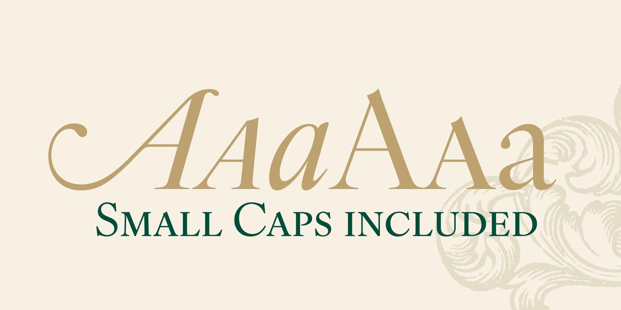
IvyOra includes small caps, case-sensitive forms, alternate glyphs, OpenType ligatures, oldstyle and tabular figures, swashed uppercase letters, and more.
Not content to produce another Caslon, Maack explains why he chose to pursue this design: “Type is culture, and just like preserving buildings and paintings from a golden period in time, it feels necessary to safeguard these old type forms and to revive them into digital fonts.”
In Maack’s words: “In my opinion the Bold weight in any Old Face loses a lot of the specific characteristics of the letterforms. This is not the case with the lighter weights, here you can push the design and they will keep the elegance.”
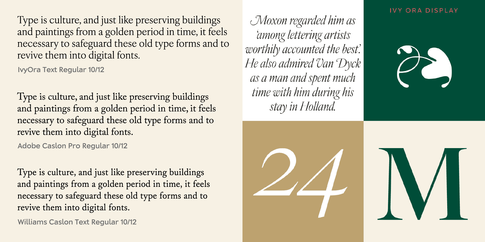
Compared to Adobe Caslon Pro and Williams Caslon Text, IvyOra Text appears roomier, with larger counters, apertures, and spacing. By using the same source material as Caslon, Maack avoided making a copy-of-a-copy, creating something that is not only more historical but also seemingly new.
IvyOra comes in two optical sizes—display and text—with five weights plus italics, for a total of 20 styles. Maack started with the regular weights, which he describes as the “historic starting point.” The regular weights adhere to the principles of Old Face designs and make suitable replacements for Caslon. The lighter weights add elegance, especially at scale; meanwhile, the heavier weights might not be the most historically accurate, but they add gravity to the family (and any design that uses them).
All styles of IvyOra are now available in the Type Network store. License one or all of them today, and while you’re at it, explore the other typefaces available from The Ivy Foundry. Have a licensing question? Get in touch.