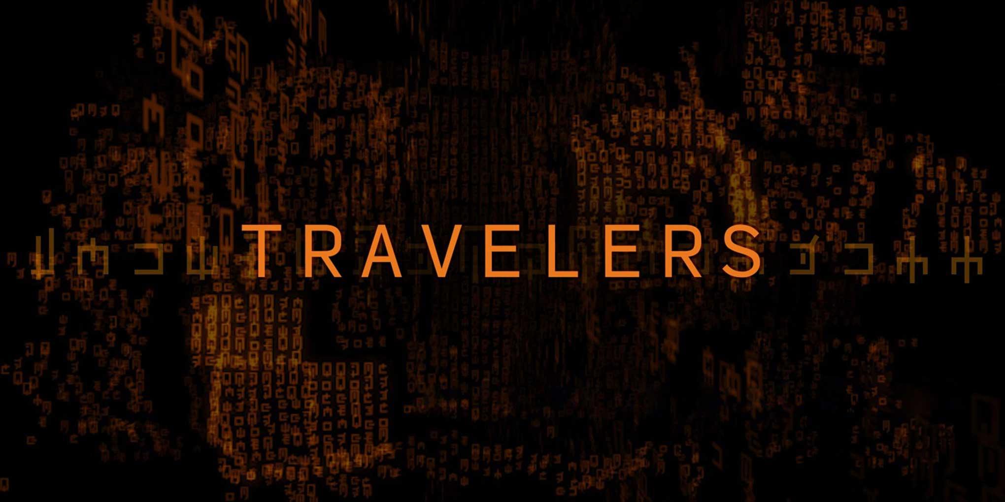
Trailer for Travelers. © 2017 Showcase/Netflix.
Travelers tells the story of the last survivors on earth, who, centuries from now, launch a final attempt to save the human race. Having discovered a way to project their consciousness back through time into the minds of people in the twenty-first century, they form teams whose mission is to alter key events to prevent a terrible future from arriving. This Netflix/Showcase coproduction consistently receives positive reviews, but there is more to it than the story, the characters, and the acting. The typography also deserves special mention.
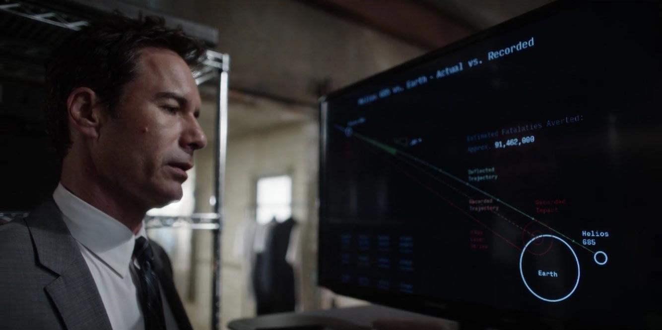 Still from Travelers showing one of the computer screens featuring Input. © 2017 Showcase/Netflix.
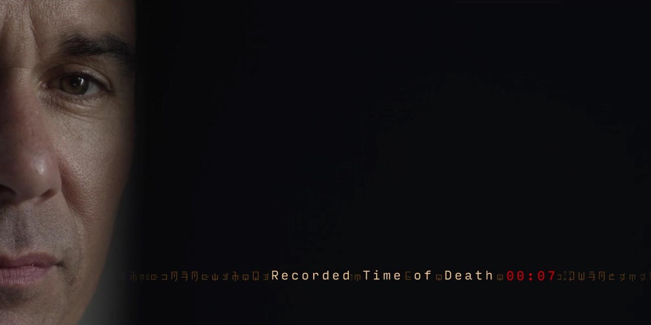
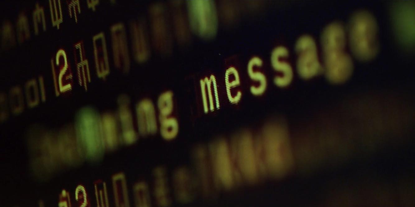 Close-up of a computer screen in Travelers. © 2017 Showcase/Netflix.
Series creator Brad Wright initially hired
West Media Film and Post Inc.’s Scott Steyns just to design the computer interfaces. Steyns selected David Jonathan Ross’
Input Sans for the job. Because Wright loved the typography so much, he decided to expand the type concept and use it for the title sequence as well.
Travelers’ opening title sequence. © 2017 Showcase/Netflix.
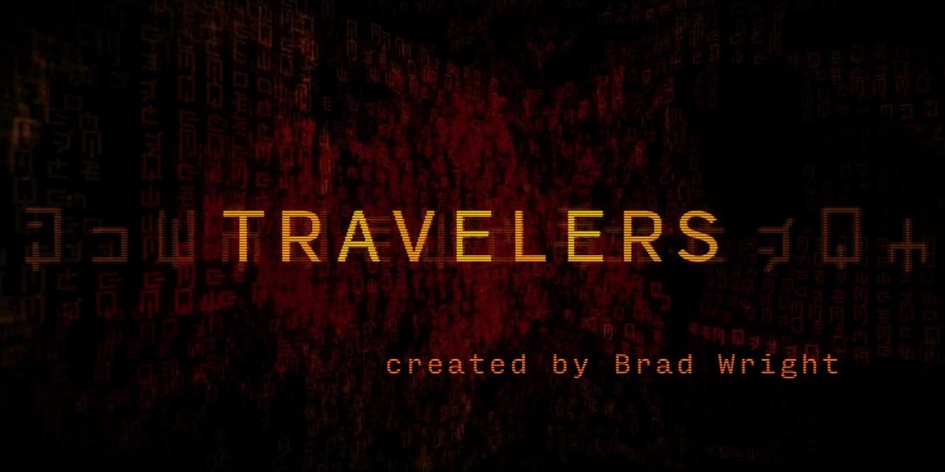 Title card for Travelers. © 2017 Showcase/Netflix.
Steyns’ choice of Input Sans for the computer screens is an interesting one. Production designers usually select typefaces that quite explicitly create associations with computer interfaces or futuristic communication in the minds of the audience—think OCR-A (so overused that it has, sadly, become a cliché) or Greg Thompson’s whimsical
Clicker. Input Sans is far subtler, yet a general audience will still recognize it as a “computer font.” No wonder: Input Sans is part of a
type system designed specifically for code, and its shapes and curves have a technical quality that perfectly fits the bill. The expansive family includes
serif and
monospaced versions, too, with all three variants available in four widths and seven weights with matching italics. The Input series weighs in at a whopping 168 styles, offering the flexibility needed for contemporary typesetting.
 Still from Travelers. © 2017 Showcase/Netflix.
 Still from Travelers. © 2017 Showcase/Netflix.
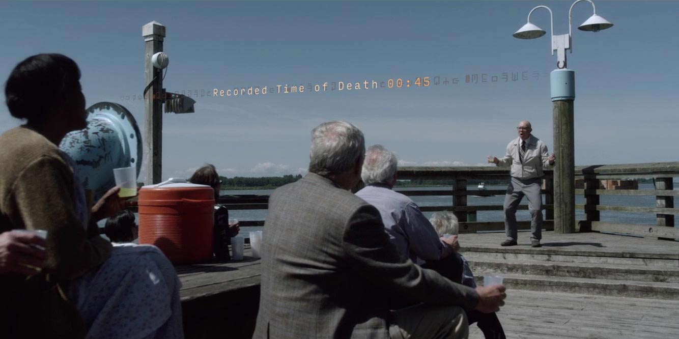
Input Sans also surfaces in certain scenes as an immaterial presence, like a virtual interface with type floating in space. It looks like a vision of the future, where computer interaction is liberated from any physical screen or device. Keeping in mind that Input Sans was
welcomed by many type-savvy Mac users as an alternative when
Yosemite ushered in Neue Helvetica as the OS X system font, this could be interpreted as a prediction that DJR’s family has an enduring and bright future ahead.
Bald Condensed, né Yves Peters, is a Belgian-based rock drummer known for his astute observations on the impact of letterforms in the contemporary culture-sphere. A prolific writer on typography, he has a singular knack for identifying the most obscure typefaces known to man.