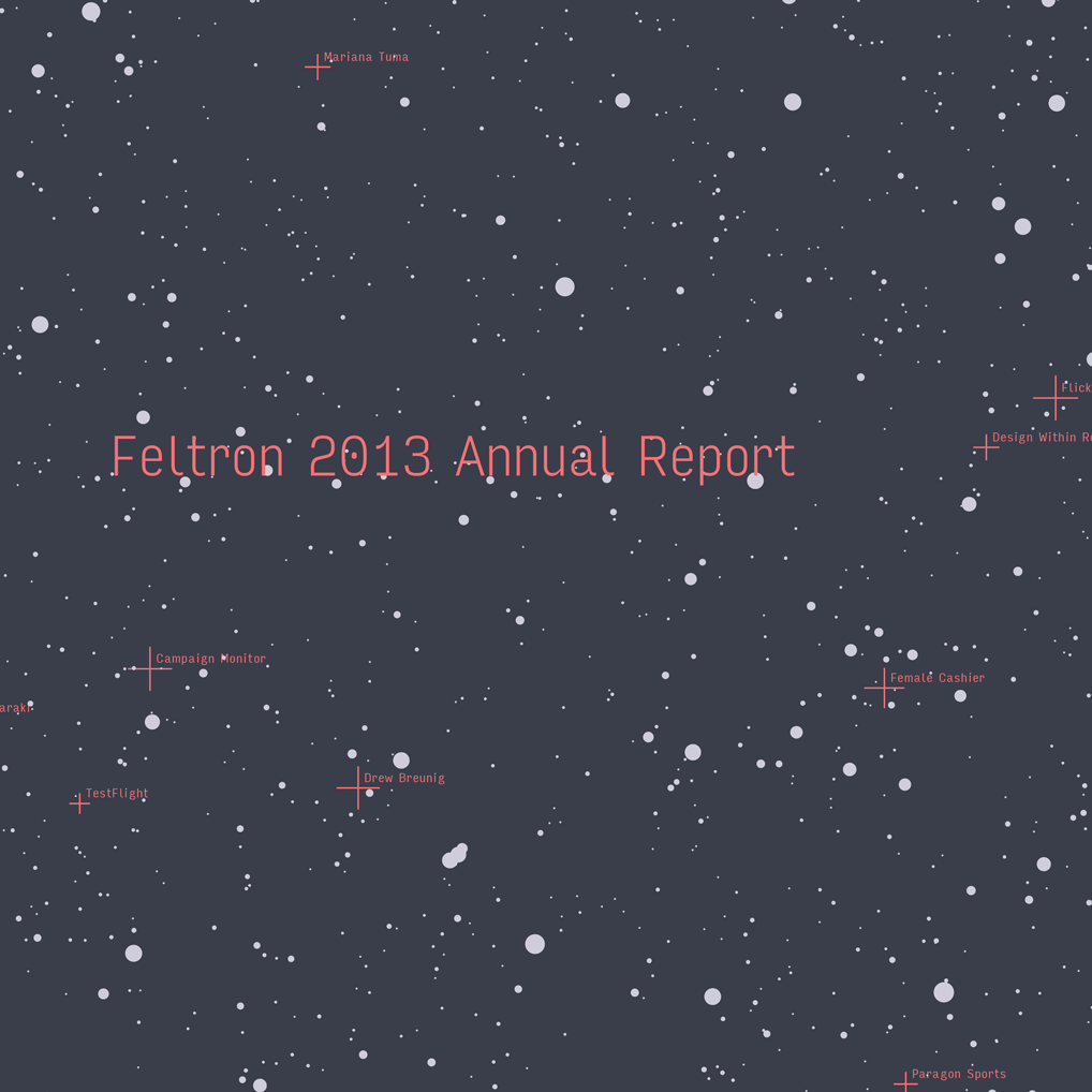
Input in use for the Feltron Annual Report
“It’s definitely the typeface I was searching for”: Nicholas Felton found Input to be the perfect choice for a hard-hitting presentation of raw data.
 Input’s design centers on coding environments, but comprises a variety of styles-like Compressed, Thin, and Black-for other settings where a raw data aesthetic is desired. In these situations, its proportionally-spaced variants have better readability than the monospaced typefaces traditionally used for code.
Felton explained his typographic choices via email:
Input’s design centers on coding environments, but comprises a variety of styles-like Compressed, Thin, and Black-for other settings where a raw data aesthetic is desired. In these situations, its proportionally-spaced variants have better readability than the monospaced typefaces traditionally used for code.
Felton explained his typographic choices via email:
The story of how I wound up using Input is convoluted but has a very happy ending. As a result of the Edward Snowden / NSA revelations last year, this whole “communications” approach to the report adopted some much darker connotations. I realized that I had collected a set of data that might actually overshadow the detail of an NSA archive, and was interested in producing a document that would resemble more of a bureaucratic document than a sexy typographic exercise.
This angle and the amount of coding I was doing led me to think about monospace typefaces, and screen fonts. I cycled through so many faces without finding something I loved. I wanted something monospace (or monospace-ish), but that I could still achieve nice textures with. Nothing I tried could work at a range of sizes … and what agency software is going to have text and display faces?He continues, describing the serendipitous timing of Input’s release:
I eventually settled on something, and was getting ready to wrap things up when I discovered Input just in time, and reset the entire report about a week before the release date. It’s definitely the typeface I was searching for at the beginning of the year, and absolutely fits the bill for the tone of the document.And on Twitter:
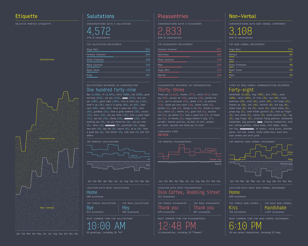
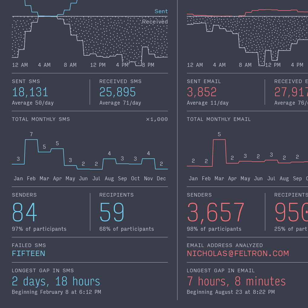
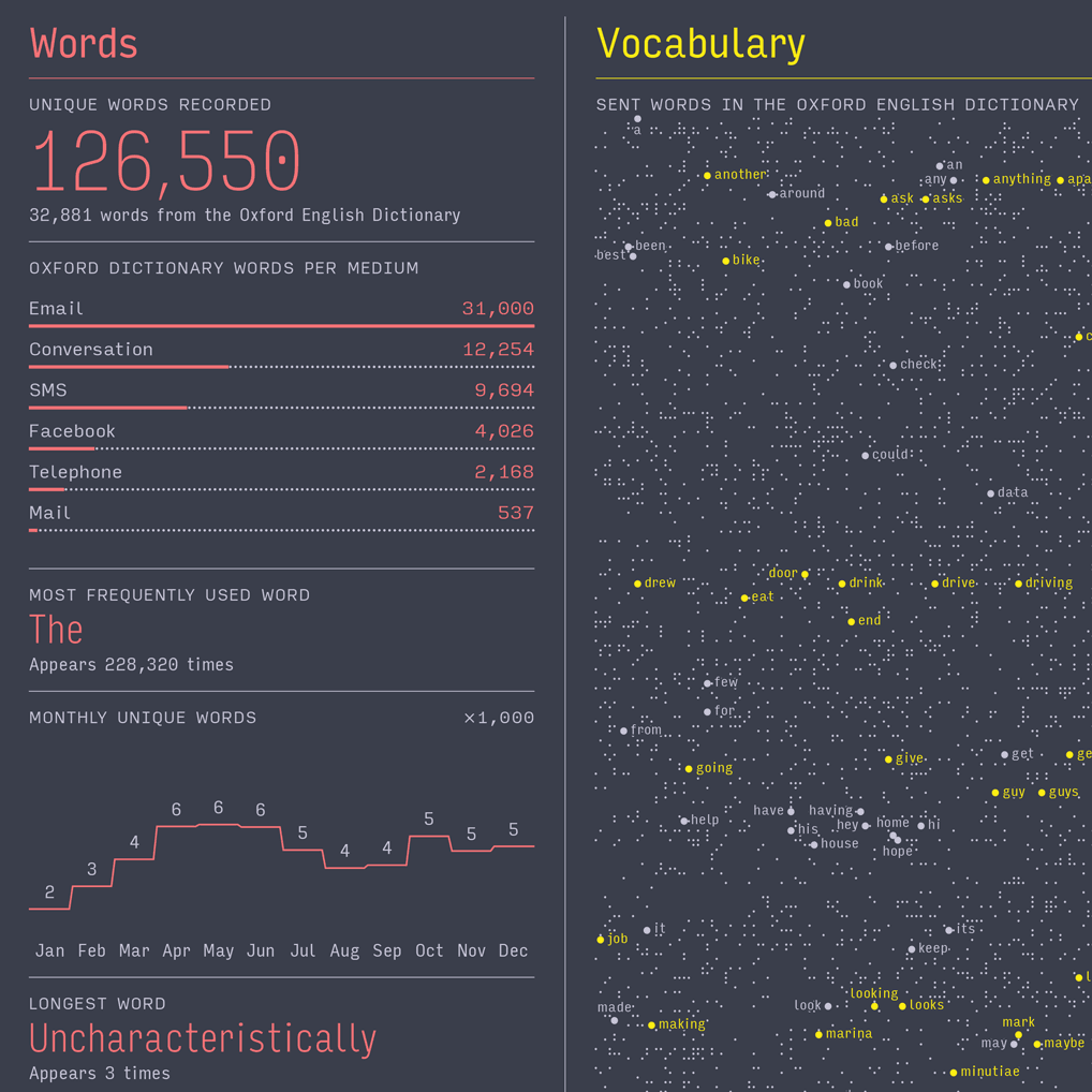
It took 8 months to find the right typeface for the 2013 Report. Thanks @djrrb for dropping http://t.co/Sh6JfYKRRD exactly when I needed it.—Nicholas Felton (@feltron) August 19, 2014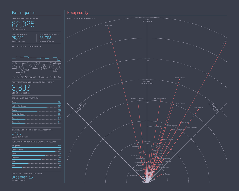 Felton does an excellent job of using Input’s wide range of styles for the report’s various kinds of text. Large numbers and call-out statistics are presented in the Thin and Compressed styles, while small supporting text is set in the normal workhorse widths and weights. For chart labels, where space is tight, the Condensed styles reduce clutter. And the finely-tuned weights made it possible to avoid problems that can arise when type is set on a dark background.
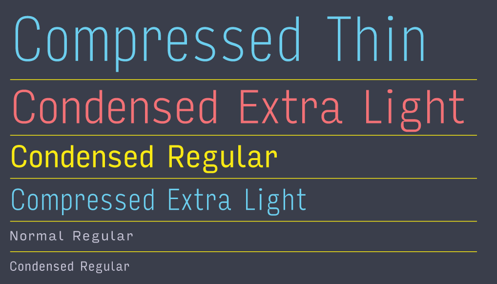 Felton’s design is built around Input Sans, and these styles in particular. Input has two other variants: serif and mono.
 The 2013 report is not the first to utilize a Font Bureau typeface. The very first 2005 report was set entirely in Tobias Frere-Jones’s Garage Gothic, and the 2008 report used David Berlow’s FB Titling Gothic. These early reports established a theme of narrow sans-serif typography that has reappeared in subsequent reports, and has arguably influenced the popular aesthetic of information graphics today.
The printed 2013 Feltron Annual Report and other previous reports are available for purchase from Felton’s web store. Also, the New York Times made a worthwhile video about the Feltron Reports. •
The 2013 report is not the first to utilize a Font Bureau typeface. The very first 2005 report was set entirely in Tobias Frere-Jones’s Garage Gothic, and the 2008 report used David Berlow’s FB Titling Gothic. These early reports established a theme of narrow sans-serif typography that has reappeared in subsequent reports, and has arguably influenced the popular aesthetic of information graphics today.
The printed 2013 Feltron Annual Report and other previous reports are available for purchase from Felton’s web store. Also, the New York Times made a worthwhile video about the Feltron Reports. •