Het Parool
Drawing inspiration for a logo from an existing type palette
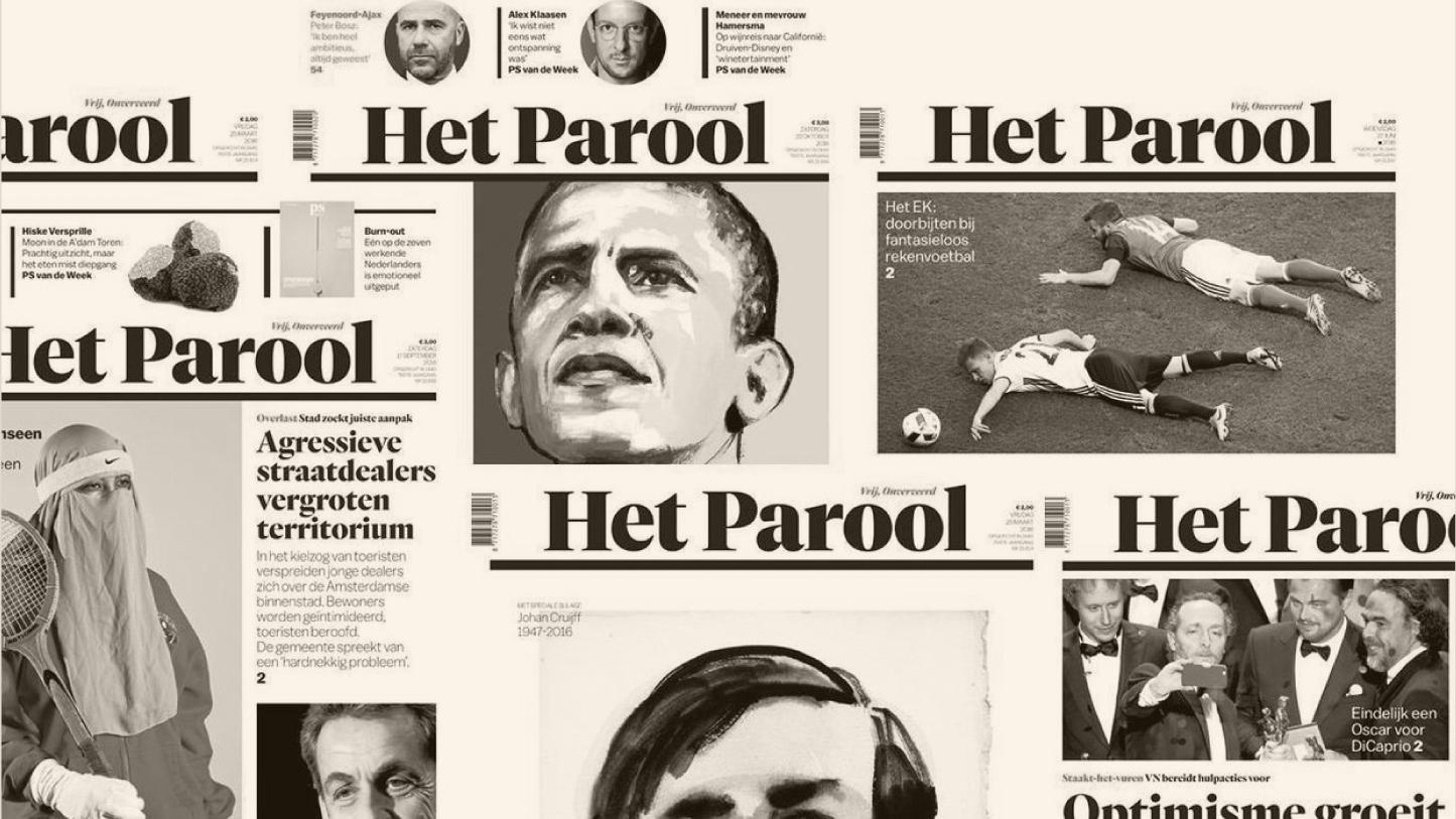
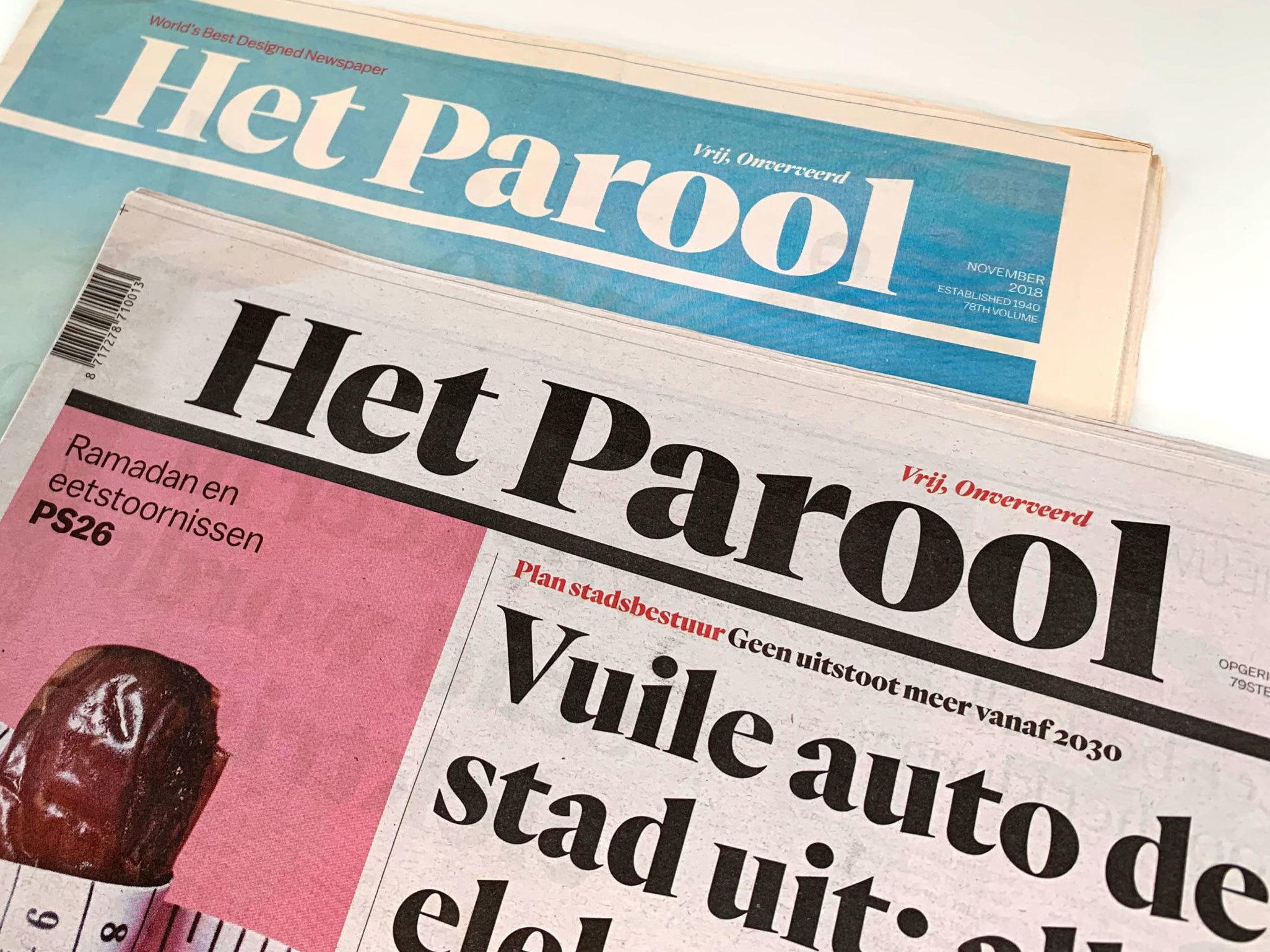
In 2016, Amsterdam-based daily newspaper Het Parool launched a new design. The printed paper and accompanying website were overhauled to mark the organization’s seventy-fifth anniversary. One of the most striking changes was the new logo and masthead, expertly lettered by Spanish type and graphic designer Laura Meseguer of Type-Ø-Tones. During the course of the redesign, John Koning and Floor Koop, Het Parool’s art directors at the time, commissioned Meseguer to draw a few proposals. Their brief called for a design that went “back to basics”, flexing a confident and powerful personality.
Meseguer went through an intensive exploratory phase in the summer of 2015, trying out several design directions: typographic or calligraphic serif letters, more or less contrast, uppercase or mixed case, different configurations for the two words. Gradually homing in on an appropriate aesthetic, Meseguer started experimenting with two typefaces that play a major role in the redesigned newspaper: Quarto, the new headline face, and Tiempos, the new body text type. She achieved a crisp, strong look by introducing Quarto’s contrast into letters inspired by Tiempos, continually refining the design until it reached its final form. The carefully weighted, decisive black rule underneath the letters became an integral part of the design.
Service: Custom lettering and logotypes
Partners: Type-Ø-Tones in collaboration with Het Parool
Date: 2016

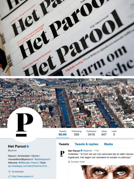
The final mark adorns not only the newspaper and website but also all expressions of Het Parool’s identity, such as the app and its social media channels, where the initial P is isolated and punctuated by the strong underline. The “back to basics” concept from the initial brief prescribes that the logotype only be used in black, which is an important part of the newspaper’s aesthetic.
The only supporting color is red. Black and red are Amsterdam’s city colors; all other colors in Het Parool come solely from the photographs. All of these features made for a double win as Het Parool was selected the ‘World’s Best Designed Newspaper’—not once—but twice by the Society for News Design.

Type-Ø-Tones is a typographic design company founded in 1990 by Joan Barjau, Enric Jardí, Laura Meseguer and José Manuel Urós.
Many people automatically associate lettering with handwritten scripts, but type designers are often called in to draw typographic lockups, which are in fact custom-made. Whether they are based on an existing typeface or drawn from scratch, custom-drawn letters offer unparalleled control over shape and spacing, so a logo, headline, or title looks just right. Contact us for more information or a personalized quote.