
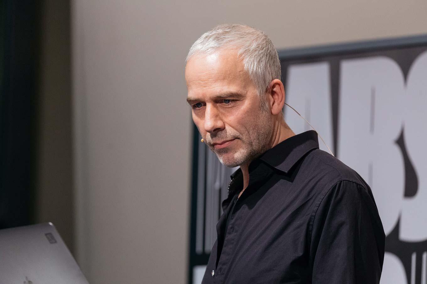
Getting to know Luc(as) de Groot
Luc(as) de Groot sits down with Type Network’s own Lucas (Czarnecki) to talk about Calibri’s ubiquity, de Groot’s interpolation theory, and what it means for LucasFonts to join TN.
Berlin-based LucasFonts is a bustling studio with a small, dedicated team, producing the narrowest, thinnest, wittiest and boldest typefaces around.
You’re both a type designer and typographer. What unique experiences do you have when you’re designing a piece of typography using a typeface you also designed?
Creating typographic designs helps me find bugs in typefaces; it’s important to use what you make. Actually, I designed my first typeface while working on my final art school project, which was to design a big pile of applied typography, editorial, illustration, photography, 3D, etc. around a self-chosen theme. I decided the project needed an original typeface; I wanted to create a new and unique voice that would make the communication an all-encompassing matter.
You’re well-known in the type world for your superfamily Thesis, but it’s Calibri that is used by millions every day as the default font in MS Word. Did you know it was going to be such a ubiquitous typeface? Had you foreseen its omnipresence, would you have done anything differently?
Calibri being the default font came as a surprise to me. I had originally delivered it with hanging figures as default, for the purpose of reading longer texts on screen. That was understandably swapped by MS for the Office environment. In hindsight, I would have made a few more of the ligatures discretionary, so they would not be on by default in design applications.

TheMix used in branding for German shipping company GargoLine. Source: http://www.cargoline.de CargoLine GmbH & Co. KG. License: All Rights Reserved.
A large portion of your work is corporate in nature—you have created typefaces for Bell South, Sun Microsystems, Heineken, Volkswagen, and Miele, among others—and even your Thesis superfamily has corporate roots. What draws you towards corporate type design?
I worked in corporate design for eight years before starting my own business. My previous role was as Typographic Director at MetaDesign, where I was responsible for proposing an appropriate typographic voice (sourced from the various MetaDesign type collections) for our clients, often to discover that such a voice might not exist. I like to solve problems, and creating fonts for brands is an interesting challenge—it means inventing a new communication tool.
Your Interpolation Theory has influenced many great type designers and their faces. How did it come about and how do you use it?
I came up with that theory when I saw that a 50% interpolation is not the optical middle between two weights. Then I saw that classic font families had rather uncontrolled distribution of weights, so I shared my insights at type conferences and in teaching. In addition, I discovered that interpolation of the horizontal strokes needs to follow different interpolation curves depending on the weight range and design. I do not blindly use the curve myself, but rather use it as a guide and adapt it.
What will the world see next from you individually? What will the world see next from LucasFonts?
If I weren’t so busy satisfying custom clients, I would want to get my book ready for print. We published three new font families recently, and extensions of popular families are always in the making, like a new slab serif companion for Spiegel Sans that is coming soon and some extreme weights for Corpid that are already looking fantastic.
Luc(as) de Groot spoke on interpolation and curve technicalities at TYPO Labs 2018. Image courtesy of Norman Posselt/Monotype.
What are your thoughts on joining Type Network? Are there other foundry partners you’re close with or are looking forward to working alongside?
I have known and respected the people behind Type Network for a long time. LucasFonts fonts are popular in Europe, and I hope joining Type Network will spread the word about our fonts in the US and other markets. I very much appreciate the fact that Type Network has such high standards for selecting foundries to partner with. I find this mutually beneficial. As for specific foundry partners, I’ve known the people behind many of these foundries for years and I consider all of them to be friends and quite nice people. The whole principle of small foundries uniting in this network is great. LucasFonts recently joined TN with four excellent typefaces:
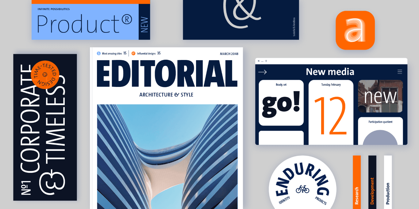
The Sans
TheSans is a modern classic. It is part of the Thesis superfamily which Luc(as) first published in 1994. Over the subsequent decades, TheSans came to epitomize the useful-yet-friendly, all-purpose contemporary sans-serif.
The Serif
TheSerif is part of the Thesis superfamily. Together with TheSans and TheMix, it is the face of thousands of organisations, publications and web sites—making it one of the most widely read typefaces world-wide.
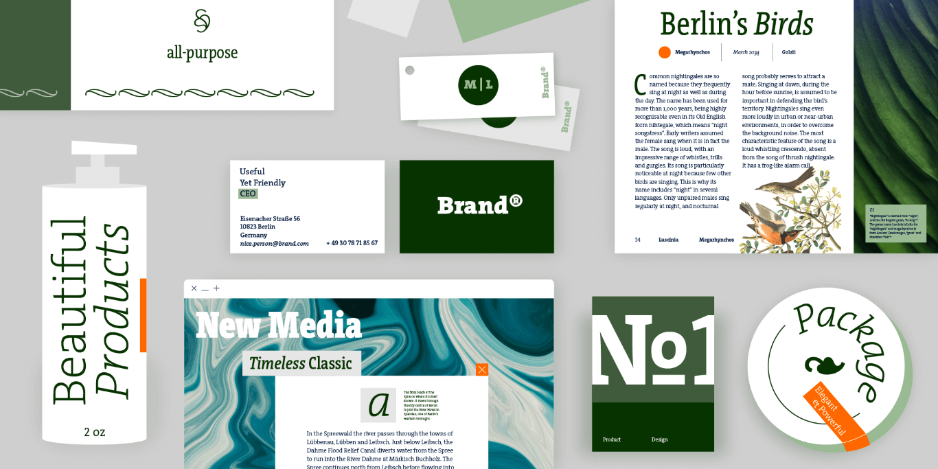
TheMix
TheMix is part of the Thesis superfamily. It originated as an alphabet for the logotypes of the Dutch Ministry of Transport, Public Works and Water Management drawn by Luc(as) while working at BRS Premsela Vonk in Amsterdam. The alphabet later became the starting point of the entire Thesis system.
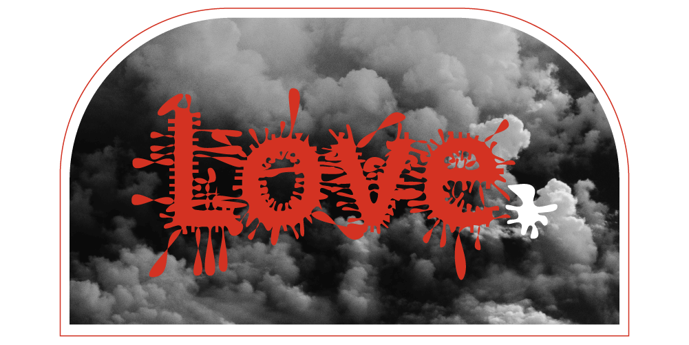
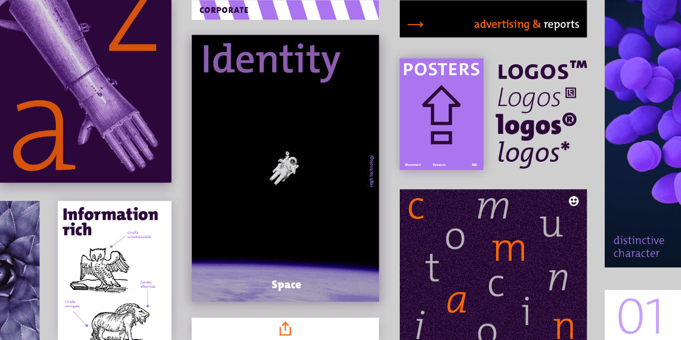
JesusLovesYouAll
JesusLovesYouAll offers a destructive revision of TheSans’s smooth proportions. The letter shapes have been distorted by thorns, drops or random damage.
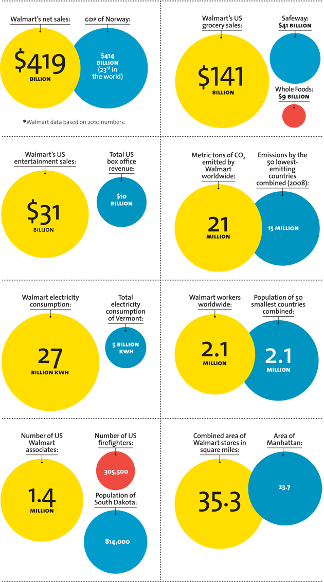
TheSans used on Mother Jones infographics about Walmart. Source: http://www.motherjones.com Mother Jones. License: All Rights Reserved.
All LucasFonts fonts are available for print, web, applications, and ePub licensing. Webfonts may be tested free for thirty days; desktop trials are available upon request. To stay current on all things LucasFonts, subscribe to Type Network News, our email newsletter featuring font analysis, designer profiles, type and design events, and more.