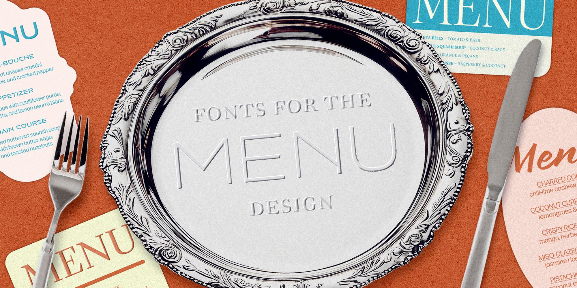
Featuring: MVB Sirenne · MVB Fonts, Quiosco · Occupant Fonts, Artusi Grande · Zetafonts, Brushland · Type-Ø-Tones, Vintage Deco · Canada Type
Fonts for menus that make you hungry
Good menu type does what a good host does: It makes a stranger feel like they already belong at the table. Here are five faces for the menu, the packaging, and everything in between, from bistro serifs to chalkboard scripts.
A menu has about four seconds to do its job, without a soundtrack, a server’s pitch, or a filter. Before anyone orders, the type on the page has already set the mood, priced the experience, and made a promise about the kitchen. It has to hold up in candlelight, survive a table passing it hand to hand, and still read in a hurry. Consider this the type audit before the next reprint.
A timeless typeface, crafted for every detail
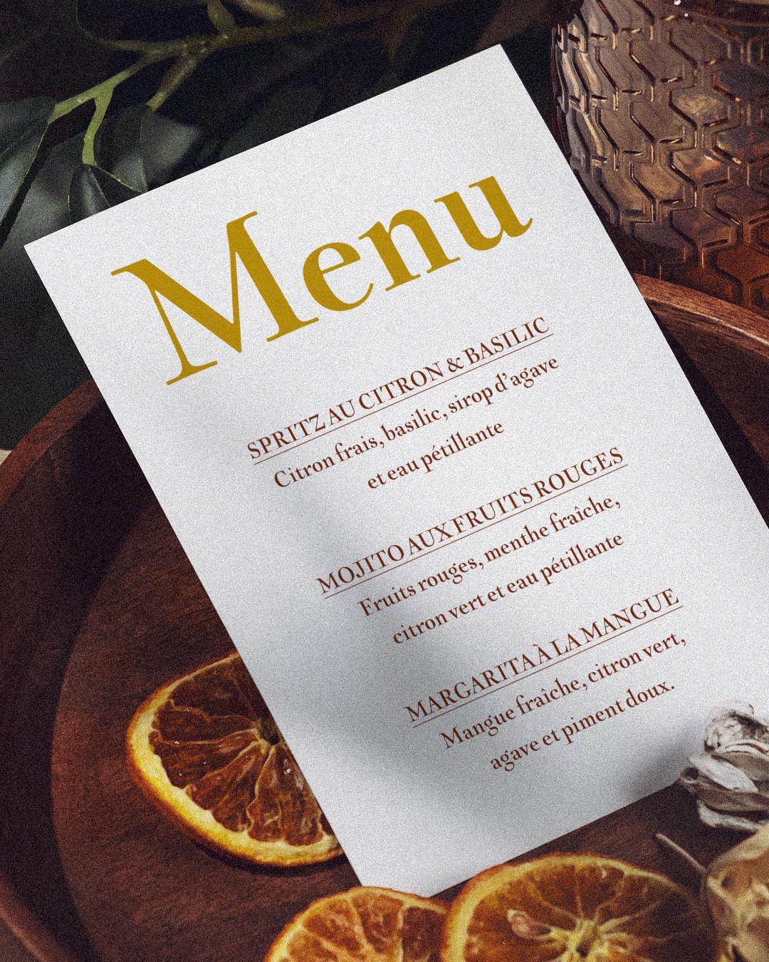
Alan Dague-Greene and Mark van Bronkhorst dug Sirenne out of a rare eighteenth-century book published by Louis Renard, and its ornamental capitals still carry more history in one initial than most menus carry on a whole page. Twenty-three cuts, four optical sizes, roman, italic, and a properly extravagant swash italic, mean the same elegance scales from a tasting-menu cover down to the smallest footnote on the wine list, no matter how humble the vintage. Set the specials in the swash italic and even the Tuesday risotto sounds like an occasion.

Alan Dague-Greene
Alan Dague-Greene is a type designer and founder of Basic Recipe Design near Boulder, Colorado.

Mark van Bronkhorst
Mark van Bronkhorst founded MVB Fonts in 1991 and has designed typefaces for clients including Disney, NBC, and Warner Bros.
Small footprint, big appetite
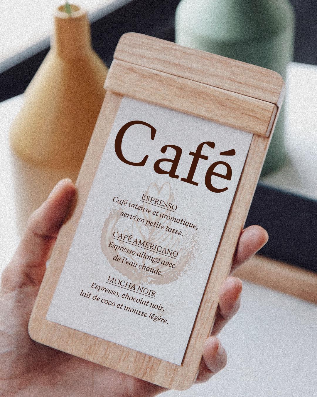
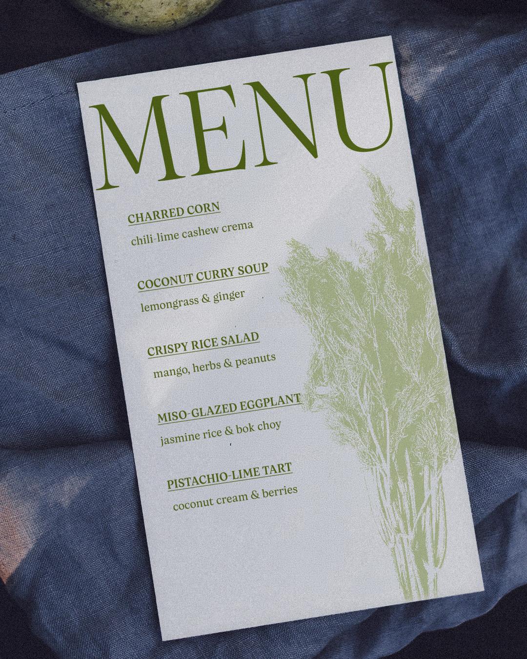
Cyrus Highsmith named Quiosco after the Spanish word for kiosk, then made sure it could work a shift just as demanding as any street vendor’s. Drawing on W. A. Dwiggins’ ideas about the tension between a letter's inside and outside, Highsmith packed in a lively texture that holds up in the narrowest column, so a two-page menu can list every appetizer, entree, and side without the type feeling cramped or the reader feeling rushed. Semibold and bold weights carry the section heads, and the companion Quiosco Display steps in when a dish has earned its own line. Small footprint, big appetite.

Cyrus Highsmith
Cyrus is a type designer, teacher, and author who teaches at RISD and wrote Inside Paragraphs.
A typographic tribute to the art of Italian cuisine
Pellegrino Artusi was a celebrated Italian food writer who is credited with the creation of one of the most influential cookbooks in the history of Italian cuisine. Taking inspiration from his legacy, Francesco Canovaro decided to work on a typographic homage to the delicacy and finesse of Italian traditional cuisine.
Artusi Grande
Regular
Starting at $40
Buy
Francesco Canovaro
Francesco is a designer and typographer, co-founder of Zetafonts, with over 40 typeface families to his name. He lives in Florence with his family.
A handcrafted typeface with a naturally painted spirit
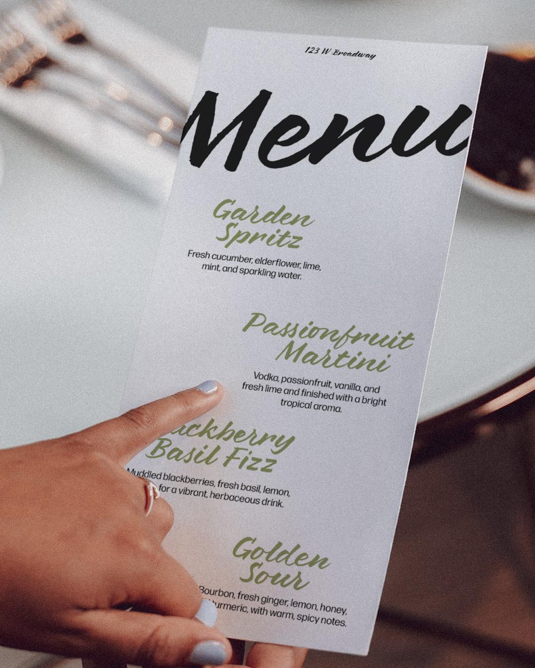
Laura Meseguer built Brushland on commission for Interbrand, tasked with giving the Spanish winery Azpilicueta a signature worth toasting to. She wrote every letter with a Pentel pocket brush pen, and the digitized version keeps the illusion alive with four alternating glyphs per character, so a name never repeats a letterform the same way twice, no matter how many bottles it ends up on. It is built for branding and packaging rather than body copy, the kind of face that makes a takeout box or a farm-stand sign look hand-painted that very morning.
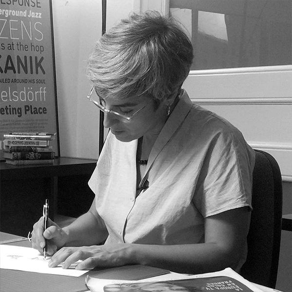
Laura Meseguer
Laura Meseguer is a Barcelona-based graphic and type designer specializing in typography and custom typefaces.
Vintage character with a bold Art Deco spirit
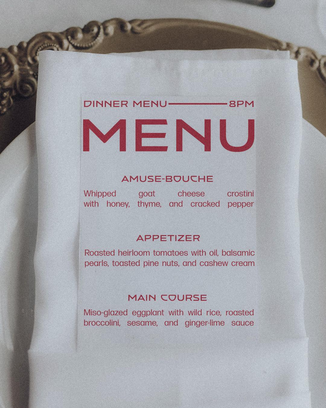
Patrick Griffin found Vintage Deco on the side of a building: a vintage hotel sign at Spring Street and Fifth Avenue in Seattle that stopped him mid-stride, and mid-lunch-run, at a type conference. He redrew its wide, breezy caps with the sharp cuts of Bank Gothic and Microgramma, landing somewhere between art deco and late-1950s futurism. Five weights make it as comfortable holding down a diner's window lettering as anchoring a fine-dining wordmark, proof that a hungry glance upward is still one of the better research methods in type design.
Vintage Deco
Regular
Starting at $30
Buy
Patrick Griffin
Patrick Griffin is a type designer, teacher, writer, and founding partner of Canada Type.
From the swash italic on a tasting menu to the chalkboard by the door, type is setting the table before the first course arrives, and it does it without ever asking for a tip. Set your own menu, and meet the foundries behind these five, at
store.typenetwork.com.