Font Bureau helps loyalkaspar take type to uncharted territories for SYFY · Type Network
Font Bureau helps loyalkaspar take type to uncharted territories for SYFY
The branding agency collaborated with Font Bureau on custom typefaces to infuse the science-fiction-and-fantasy channel with a typographic voice as striking as its programming.
By Bald Condensed
SYFY relaunched in June wearing a new logo and identity developed by loyalkaspar, with a little help from Font Bureau. To learn more about the redesign, I talked with loyalkaspar’s executive creative director, Daniel Dörnemann, and chief creative officer, Beat Baudenbacher. As Baudenbacher explained, the channel-wide rebranding was not their first commission from SYFY. loyalkaspar had previously worked with the television broadcaster on the logo and teaser for The Expanse, a futuristic dramatic series that debuted in 2015.
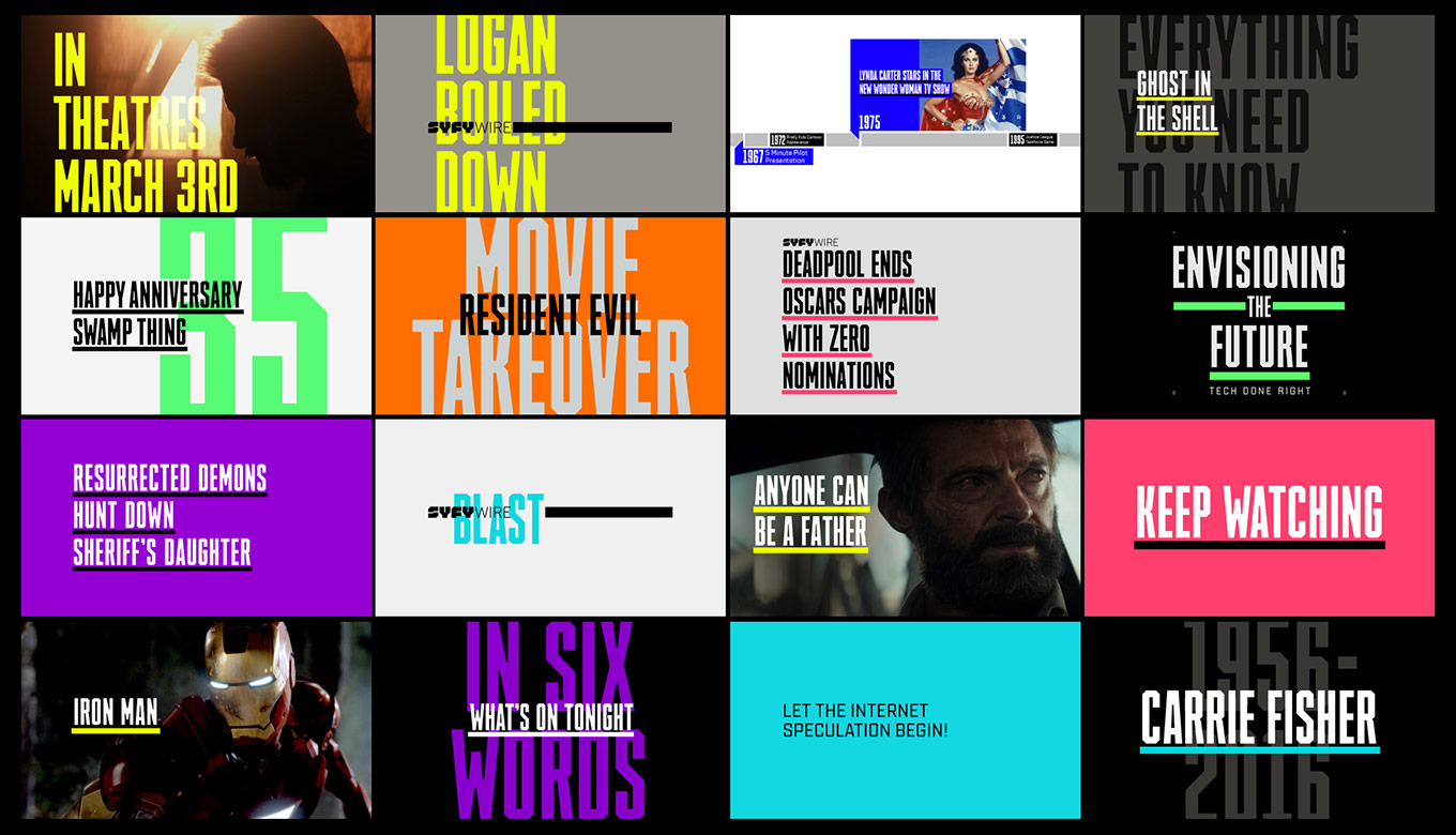
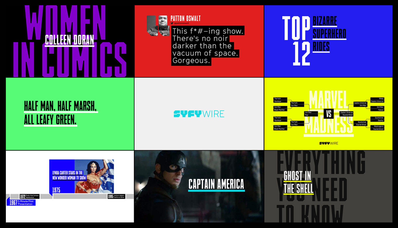
The custom typefaces SYFY Hero and SYFY Sidekick create a consistent brand image while offering plenty of flexibility. Image courtesy of loyalkaspar.
Incredibly for an overhaul of this magnitude, Doernemann said, there was no formal brief at the outset. The project took shape spontaneously during conversations that fleshed out the core concept: shifting to an around-the-clock focus on the broader science fiction genre, rather than focusing exclusively on SYFY’s original shows. The new identity needed to go beyond a traditional on-air package, connecting to the SYFY community through a shared passion and point of view. This was going to be a whole new SYFY.
Designing the logo
loyalkaspar’s first challenge was to develop a new logo. The SYFY brand isn’t just about science fiction and outer space anymore; it also includes fantasy, horror, the paranormal, and superheroes. Baudenbacher stressed the difficulty in designing the new logo: they had to make sure that it didn’t lean too far into any specific visual vernacular. The mark had to be bold without coming across as authoritative or exclusionary, yet neutral enough to coexist with SYFY Originals subbrands and a wide range of acquired content.
Its solid shapes and blocky nature allow the SYFY logo to act as a “window” for visuals. Image courtesy of loyalkaspar.
The squat, faceted geometric letterforms seemed a little risky at first, yet once the team began working through various applications, the logo felt right in almost any context. It looked cool on a T-shirt and appropriate on a book cover—the unofficial benchmarks for determining if you’re onto something, said Baudenbacher. The blocky letters also lent themselves well to different ways of stacking without creating too many odd angles and negative spaces. The revamp made for a flexible logo system, extremely useful in a multiplatform universe. Because it was drawn entirely with straight lines and 90-degree angles, pixel-optimized versions of the mark could be built for use across all digital applications, ensuring maximum sharpness when rendered on different types of screens. This will become increasingly important as brands appear on ever-smaller devices.
The SYFY logo effortlessly adapts to a variety of media.
Baudenbacher recalls the redesign process with satisfaction and surprise: “What’s interesting about the overall experience is that the internal logo reception switched from ‘Let me sleep on it’ straight to ‘I love it,’ literally overnight. That’s never really happened to us before. It was a unique experience.”
Shaping the custom alphabets
The original alphabets for SYFY Hero and SYFY Sidekick were drawn by loyalkaspar, then handed over to Font Bureau to be transformed into finished, high-performance fonts.
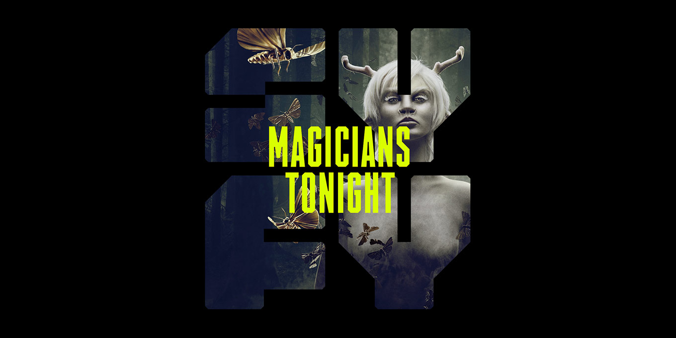
loyalkaspar drew the custom typefaces SYFY Hero and SYFY Sidekick to complement the logo and shape the voice of SYFY. While basic characteristics like the blockiness and 45-degree angles of the letters relate to the logo, they are not meant to belong to the same family. Logo and typefaces are rather part of the same universe, Doernemann said. As previously mentioned, SYFY now encompasses the full gamut of “fantastic” genres. Since each sphere comes with a distinct visual language, this diversity of programming presents particular challenges when designing for the brand. The new typeface designs had to work organically across all genres while becoming the glue holding everything together.
Each face had specific requirements. Since much of SYFY’s communication centers around event and news coverage, SYFY Hero needed to evoke the quality of a headline font. And it was important that SYFY Sidekick could extend beyond bold primary headlines to create a hierarchy, especially on the website, for secondary heads and short paragraphs.
The custom SYFY typefaces accommodate a variety of genres. Image courtesy of loyalkaspar.
Building the SYFY fonts
After loyalkaspar drew the uppercase, lowercase, and numerals for SYFY Hero and SYFY Sidekick, they turned over the base alphabets to Font Bureau. Dyana Weissman transformed the drawings into working digital fonts; she refined the glyphs and their spacing, made them more consistent, solved minor problems, and added kerning. Cyrus Highsmith consulted, lending an extra pair of eyes and advice when needed.
Its very narrow character shapes give SYFY Hero the appearance of a headline face.
Due to schedule dictates, the uprights had to be finished first. Once she completed the roman styles, Weissman designed obliques for both typefaces. Given their angularity, one might think it would be easy to simply mechanically slant the romans—yet there was significant work to do in perfecting the companion styles. If a change in an obliques encroached on a roman, Weissman would go back and adjust the upright version.
Weissman has only positive things to say about the collaboration. The direction loyalkaspar wanted to go in was clear from the start, but there was still ample room for her input. “There was a point where I got a little crazy and tried a somewhat bizarre approach, and loyalkaspar were very professional in saying, ‘That’s cool, but let’s go in this other direction,’” Weissman said. “For me, it’s just fun to have that opportunity, to be inspired, even if it doesn’t work out. I also enjoy having the kind of relationship with my clients where we can talk about possible explorations, and everyone is receptive to constructive criticism. Effective communication with the client is essential to making a quality typeface that everyone can be happy with.”
SYFY Sidekick creates hierarchy for secondary headlines and short paragraphs.
What made loyalkaspar decide to team up with Font Bureau? “We love type, so much that we can’t resist designing typefaces. With our love for type comes our respect for the craft of type design, which is why we love working with Font Bureau,” Doernemann said. “We don’t see them as a vendor that can code our drawings into a font, but rather as a partner that brings our design to life, makes it better, and helps it live up to the standards of cohesive, well-flowing typefaces.”
To see the results of this otherworldly collaboration, tune in to SYFY, explore new horizons, and dive into the unknown with SYFY Hero and SYFY Sidekick.
Bald Condensed, né Yves Peters, is a Belgian-based rock drummer known for his astute observations on the impact of letterforms in the contemporary culture-sphere. A prolific writer on typography, he has a singular knack for identifying the most obscure typefaces known to man.