Finesse and express
With 3.5 billion searches per day—and billions more using their other products—Google has perhaps the greatest need in history to adapt to its users. To explore how variable fonts can enable precision typography in dynamic environments, Google has commissioned Font Bureau's David Berlow.
Not long after variable fonts were announced in September 2016, Google Fonts and Font Bureau released two open source fonts designed by David Berlow. Amstelvar and Decovar each demonstrated what could be done with the new technology, with controls that went far beyond the typical handful of typographic options like weight and width. These projects proved to be lively field tests for how dynamic these new kinds of fonts could really be.
Berlow’s early discussions with the team at Google Fonts identified a number of possibilities for the new font technology, neatly summarized by Google’s Dave Crossland as “express” or “finesse”. That is, variable fonts could be used to both showcase creativity and refine the appearance of text. The first two faces focused on these directions, with Decovar showing how much a variable font could express, and Amstelvar showing how many typographic details could be altered to finesse a text.
Those two demo projects—Amstelvar, in particular—convinced Google to enlist Font Bureau once again. For the last few years, David Berlow has been developing Roboto Flex, a variable version of Google’s popular Roboto family. This single variable font needed not only to express all of Roboto’s widths and weights, but also to make sure they could look consistent and readable at different sizes and in different display environments.
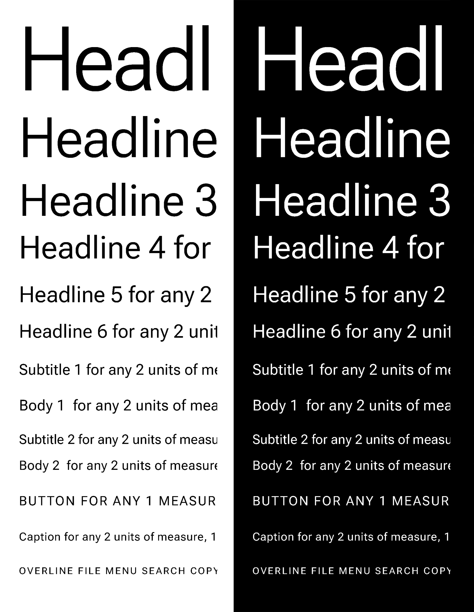
Berlow describes the dilemma of working with the existing Roboto fonts as “futzing with fonts” and “cascading style slop”. Those are colorful ways of describing the need to use different font weights over a range of font sizes to make smaller text look like it’s about the same weight as much larger text. While this can be an effective trick, it is difficult to automate when exactly one weight should be replaced by another, especially when reflowing or resizing a layout.
With so many factors at play, a variable font that can adapt to changing conditions would be the best way to ensure consistent luminance and readability. Instead of working with numerous fonts of slightly different styles and trying to anticipate when to use each style, a well-organized and well-drawn variable font could efficiently change its appearance to work well in any number of user contexts.
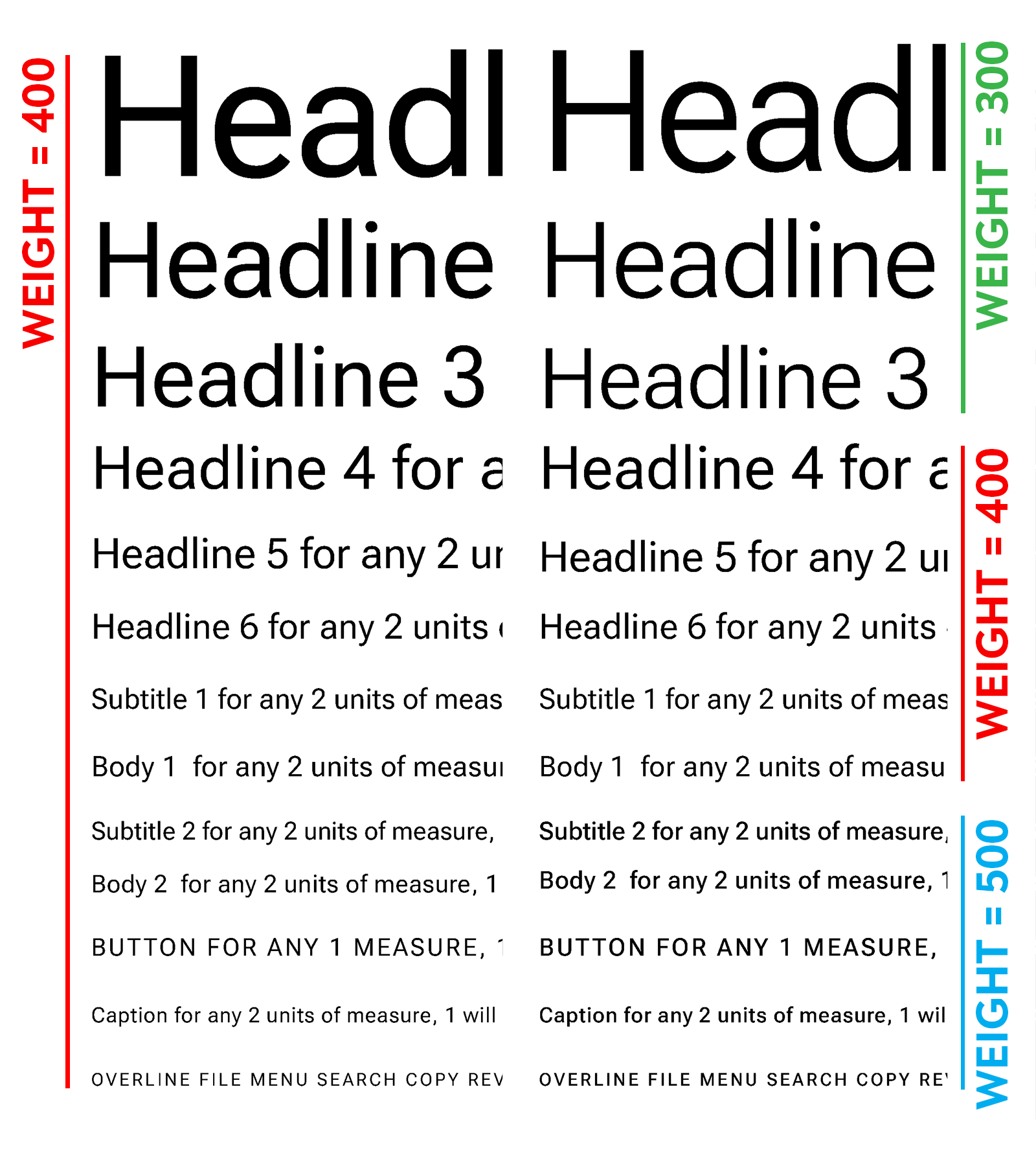
Font Bureau’s earlier work on Amstelvar provided the architecture for a solution. Like Amstelvar, Roboto Flex breaks down typographic concepts of “grade” and “optical size” into more specific parameters that can be adjusted individually. For instance, the weight of vertical strokes can be changed independently of the weight of horizontal strokes. The x-height or cap height can be altered separately. The width of the internal white spaces can be changed without changing stroke weights. These are all factors that a type designer might naturally factor into the design of different grades or optical sizes, but picking them apart into separate axes of a single variable font allows better control over how they interact. That makes it easier to measure and automatically refine the overall appearance. Create more variable fonts with the same axes, and things get interesting: An element set in Roboto Flex can change to a different typeface and preserve the overall luminance of the text on screen, making sure things stay just as readable no matter which font is used.
Drawing these parametric axes is a challenge for any type designer. It requires extreme changes to each aspect of the typeface—just the width of the vertical stems, just the internal counter space, and so on—and then determining how to apply those extreme qualities across the whole alphabet (even if it makes many of the letters look strange). Parametric axes are parts of a formula and not necessarily attractive designs on their own, so while you're drawing them, you need to think about the systems behind the characters you’re working on.
It's very easy to lose confidence, so very few people even want to embark on it, because you have to make funny looking fonts. Except that they're not so funny looking! If you go back and look at history, there is always a font somewhere where somebody just did it. They took all the weight off or added weight, or just totally just crushed it. And you can see what you have to do to make it look right.—David Berlow
Learn about variable fonts
To learn more about variable fonts, subscribe to the Type Network Newsletter, where we’ll be sharing interviews, case studies and tutorials explaining everything designers should know about variable fonts.
Berlow has designed the interplay of axes and drawn their various poles for the basic character set, while organizing teams of contractors to follow his lead as they design for other languages and writing systems. Altogether, they’re making Roboto Flex and the next generation of Google’s own variable fonts into compact, flexible elements of a design system.
Getting a single font file to look right—no matter what size it is and no matter what is happening on screen behind it—might sound impossible. But that’s the opportunity of Font Bureau’s parametric approach to variable fonts. They enable a font to interact with the properties of its context: A designer can choose a typeface for its expressive qualities, while letting the overall system finesse the results.