Christian Schwartz expands his Fleischman-inspired family with a finessed set of styles for headlines.
In 2004, Font Bureau first released Farnham, a transitional typeface by Christian Schwartz. A contemporary take on the work of 18th-century punchcutter Johann Michael Fleischman, Farnham was originally drawn in Text and Display. The 14 finely rendered styles of Farnham Headline, commissioned for use in newspapers, are now available to the public from Schwartz's foundry Orange Italic.
In developing Farnham, Schwartz studied the work of Fleischman, a German-born standout in the Dutch type scene who worked with Haarlem's Enschedé in the mid- to late-1700s. Fleischman's impressive repertoire included sumptuous Blackletter faces and a comprehensive set of fonts for musical notation. But it was his transitional Roman forms that struck a chord with modern designers like Matthew Carter, Stanley Morison, Paul Renner, and Schwartz.
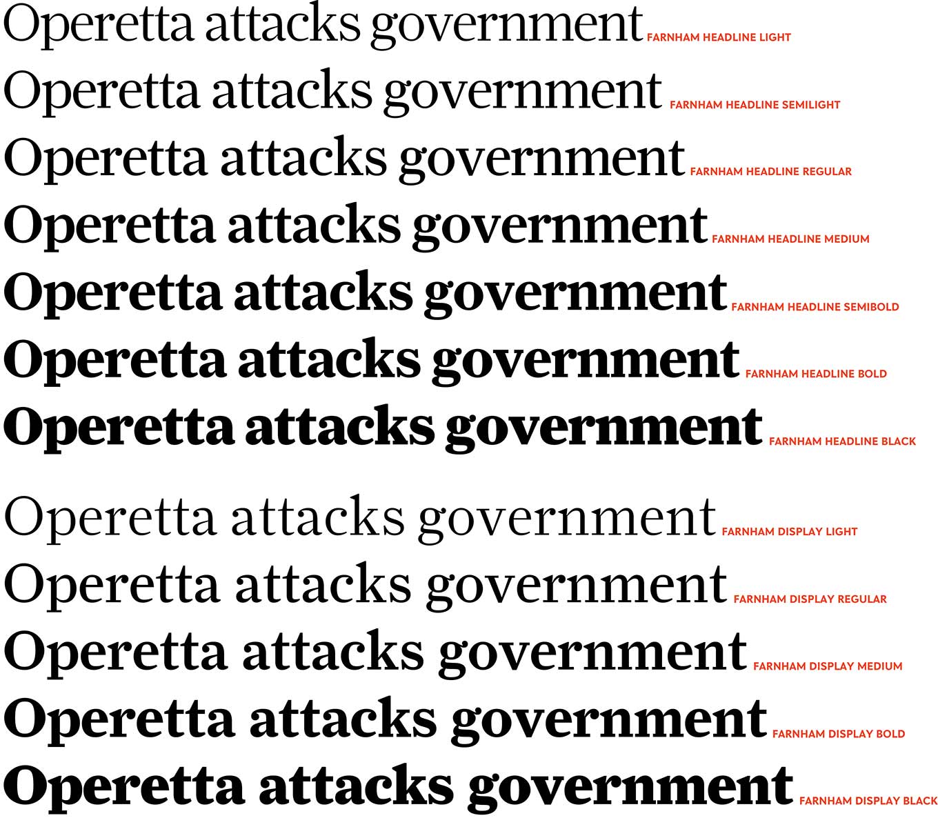
Farnham Headline’s versatility and charm are evident throughout seven weights ranging from Light to Black.
Not interested in a strict revival, Schwartz used Fleischman's work as a jumping-off point for the text design that would become Farnham. In documenting the development of Farnham, he said: "Fleischman's Romans are remarkable for their energy and 'sparkle' on the page, as he took advantage of better tools and harder steel to push the limits of how thin strokes could get."
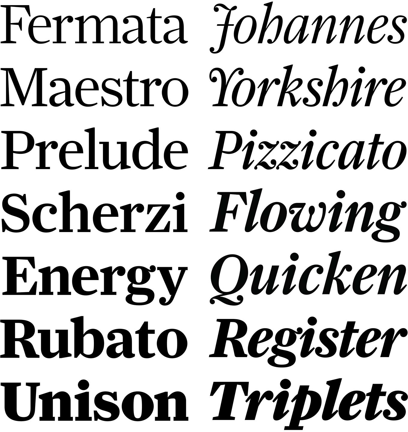
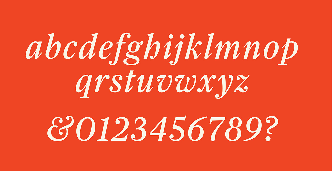
Schwartz retained that sparkle, but took the design in a direction more suited to a contemporary text family. Farnham Text and Display made a harmonious duo while still exhibiting an intriguing tension. Open, "normal" styles in the Text contrasted with the merrily dancing swashes of the Display's italics. Schwartz cleverly integrated many of Fleischman's hallmarks, such as the mixture of flat and wedge-shaped serifs, while avoiding extreme traits like exaggerated spikiness that could have impacted readability.
"The strangest forms in this typeface all come directly from Fleischman's work," Schwartz said, "It was interesting to see how well they adapted to the clean, contemporary finish I tried to apply to the typeface as a whole."
Farnham Headline exhibits quirky Fleischman traits: the energetic italic's ball terminals are gloriously interrupted by deeply etched cuts, while characters like k, v, w, z, and & are unusually spirited.
Farnham Headline's alternate characters, available through stylistic sets.
Farnham Text and Display have been used to great effect by a number of publications, including GP International and a Michael Lawton redesign of Men's Journal. The family's vibrant personality make it an ideal choice for magazine typography. The time was ripe for a Farnham that would better serve the gravitas of newspaper journalism.
"If I remember right, I drew Farnham Headline in two weeks about ten years ago," Schwartz said. He prepared sketches for editorial designer Simon Esterson (Eye, Blueprint, the Guardian, the New Statesmen): "though I don't remember which publication he was proposing it for."
James de Vries commissioned Schwartz to flesh out the headline styles with more weights and italics for a redesign of the South China Morning Post, which used Farnham until relatively recently. "There wasn't much to the brief: 'Make it less busy and more newsy' is what I remember," Schwartz said.
That abbreviated brief made sense to Schwartz. "Farnham was almost appropriate for news headlines, but was still a bit too much of a magazine face, both because of its more generous vertical proportions and the idiosyncratic (and perhaps unnecessary) ink traps," Schwartz said. "It was just a bit too exuberant in its finish, but the contrast and the overall approach to construction seemed to work".
Comparison between the romans of Farnham Display and the Headline expansion, based on a preview sketch Schwartz provided to editorial designer Simon Esterson.
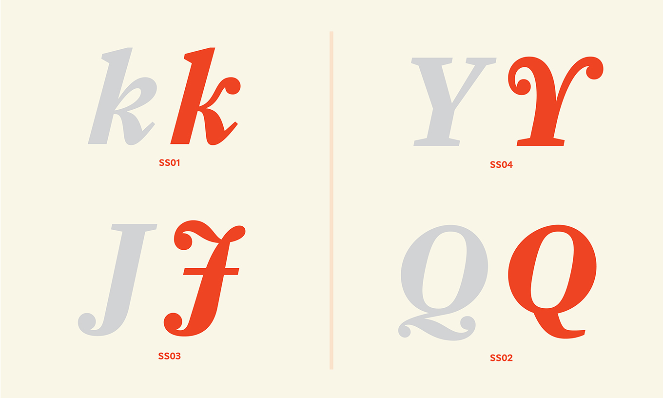
Farnham Headline has a slightly larger x-height compared to its caps, shorter serifs, less notching, small accents, and serifs with decreased angles. Rather than carrying a full complement of swashes, there are four alternate characters in the Headline italics for added interest: J, k, Q, and Y.
The Headline neatly rounds out the Farnham series, giving type users a suite of faces capable of expressing a wide range of emotion. Pair Farnham Headline and its brethren with a well-proportioned partner like Benton Sans for added versatility in typographic compositions.
Orange Italic has been an art project, a design studio, and a magazine, and is now library of legacy typefaces from early in Christian Schwartz’s career.