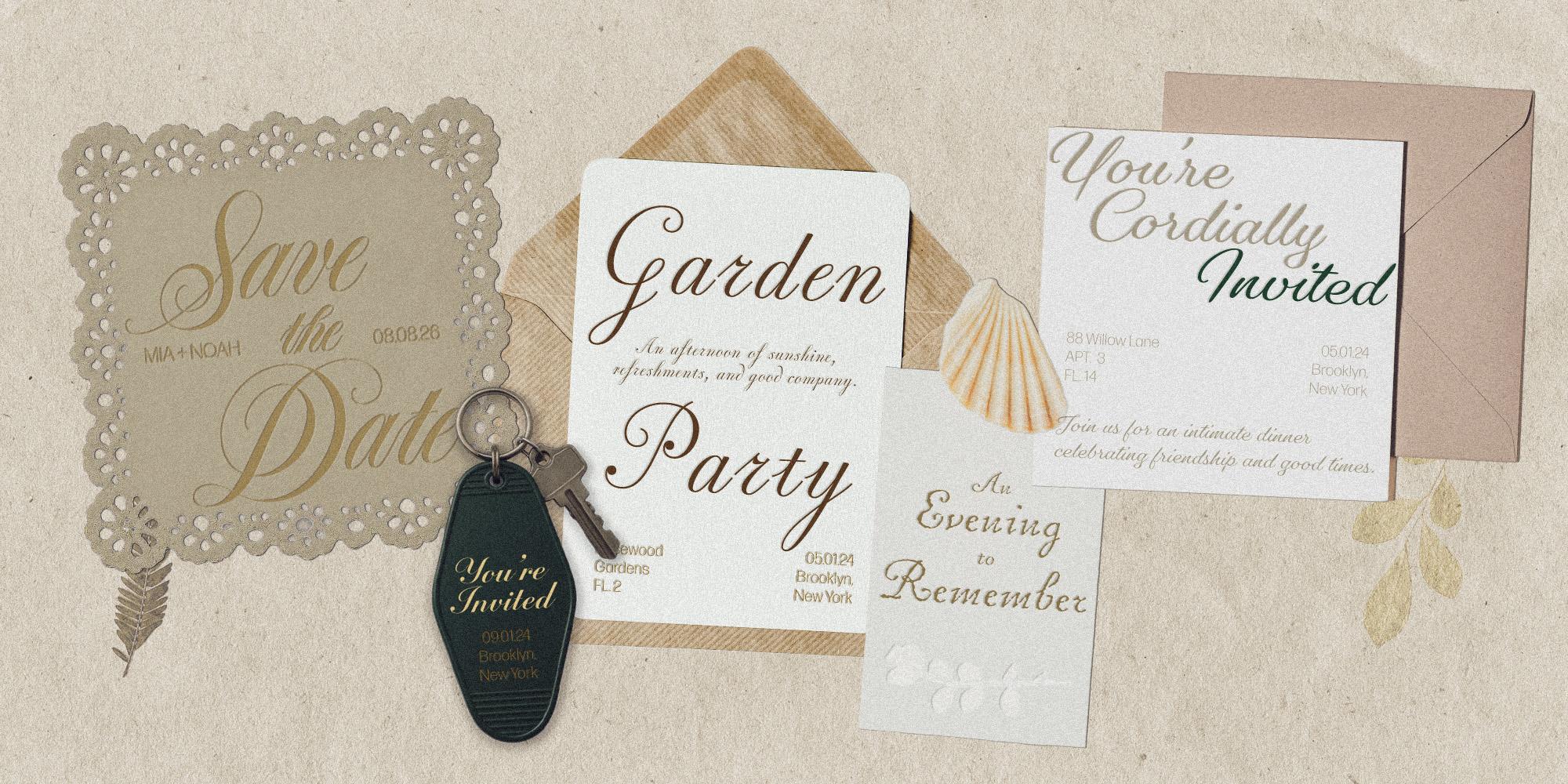
Featuring: Spignarian Script · Antonio Di Spigna, Inglesa Script · Sudtipos, Pritzious · CAST, Gautreaux · Victoria Rushton, MVB Chanson d'Amour · MVB Fonts, R41 Donatello · R41
Fall opening scripts: Faces with a flourish
The season begins, and it’s time to send out the premiere invites. Here are six scripts—from white-glove formal to rolled-up-sleeves casual—each with a flourish to spare.
Six scripts, six different ways to make an entrance. Some are polished and formal, others are playful and a little unexpected, but all have plenty of personality. Together, they make a case for letting your type do a little of the talking.
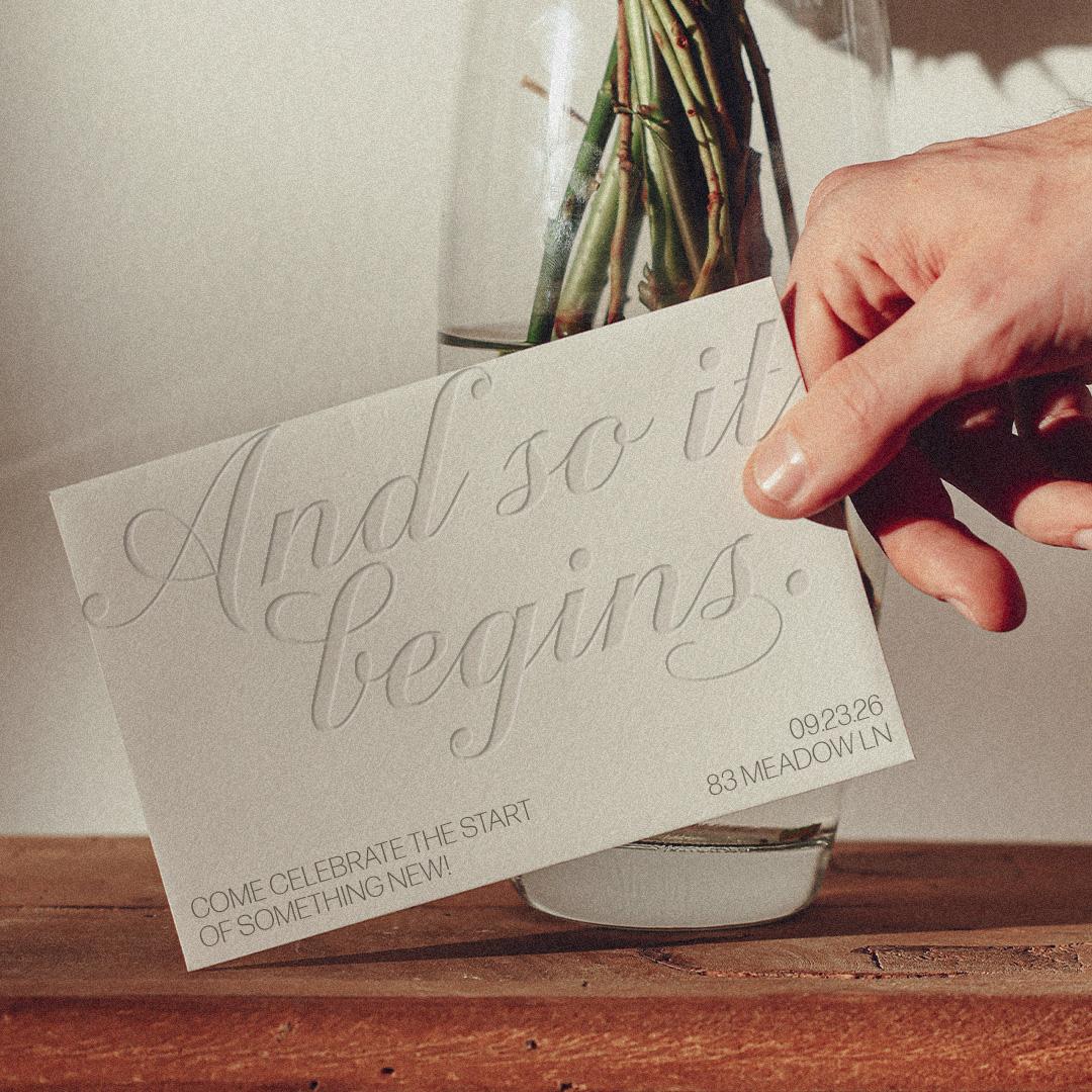
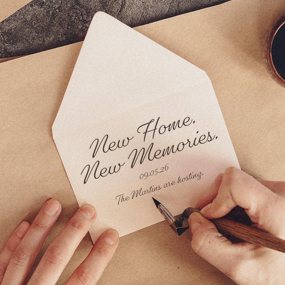
Inglesa Script by Sudtipos in use.
A master of penmanship, turned into type
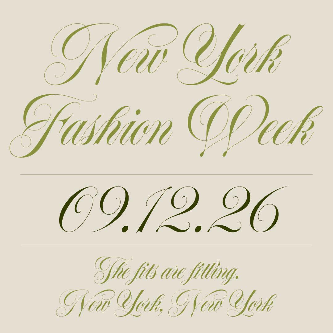
Spignarian Script
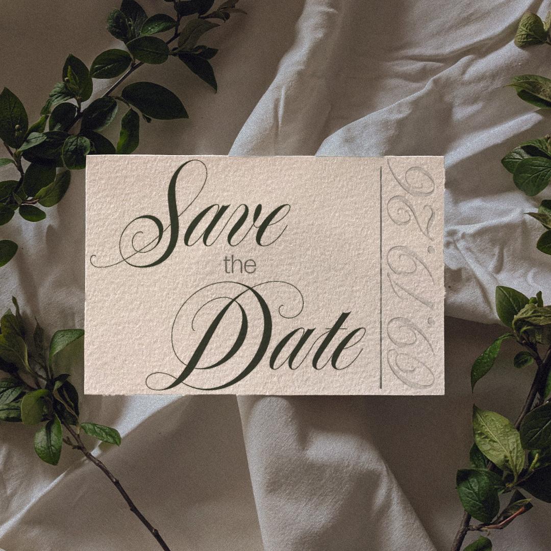
Tony Di Spigna drew ITC Serif Gothic and ITC Lubalin Graph with the great Herb Lubalin as art director. Spignarian Script is his penmanship at its purest: true hairlines and smooth swells, penned by hand and refined with countless adjustments. Its intricate swashes carry the Spencerian tradition into type with a confidence few faces can match. For the formal invitation, this is the gold standard.
Spignarian Script
Regular
Starting at $40
Buy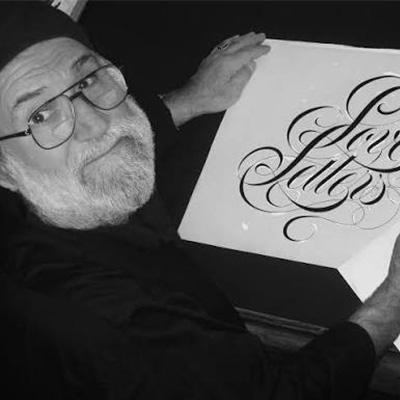
Tony Di Spigna
Tony Di Spigna is an renown graphic designer and typographer known for his influential letterform designs.
Formal enough to impress, playful enough to surprise
Inglesa Script
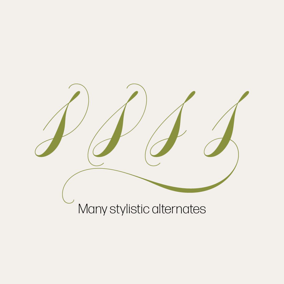
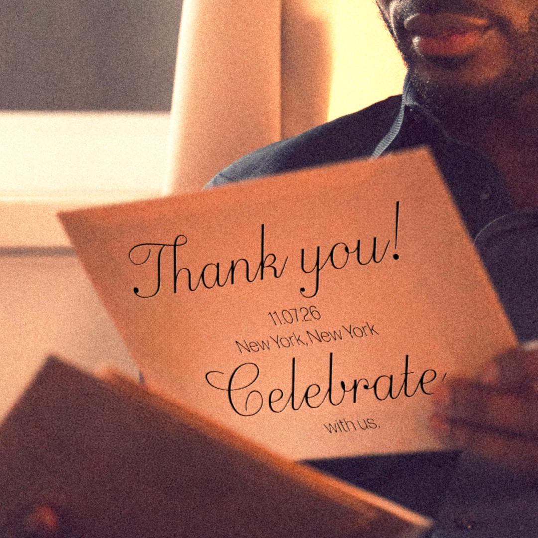
Alejandro Paul of Buenos Aires powerhouse Sudtipos began Inglesa with caligrafía inglesa, the Spanish name for copperplate calligraphy, then let it grow a personality all its own. Six weights run from a skinny monoline to an elegant black, a companion set of roman caps handles the supporting lines, and a vast bench of alternates, endings, and swashes means no two names ever set quite alike. One step less starchy than Spignarian, but every bit as polished.
Inglesa Script
Variable
Starting at $60
Buy
Alejandro Paul
Ale Paul is an award-winning Argentine type designer and co-founder of Sudtipos, known for his influential typography and global recognition.
A flamboyant script that breaks the rules
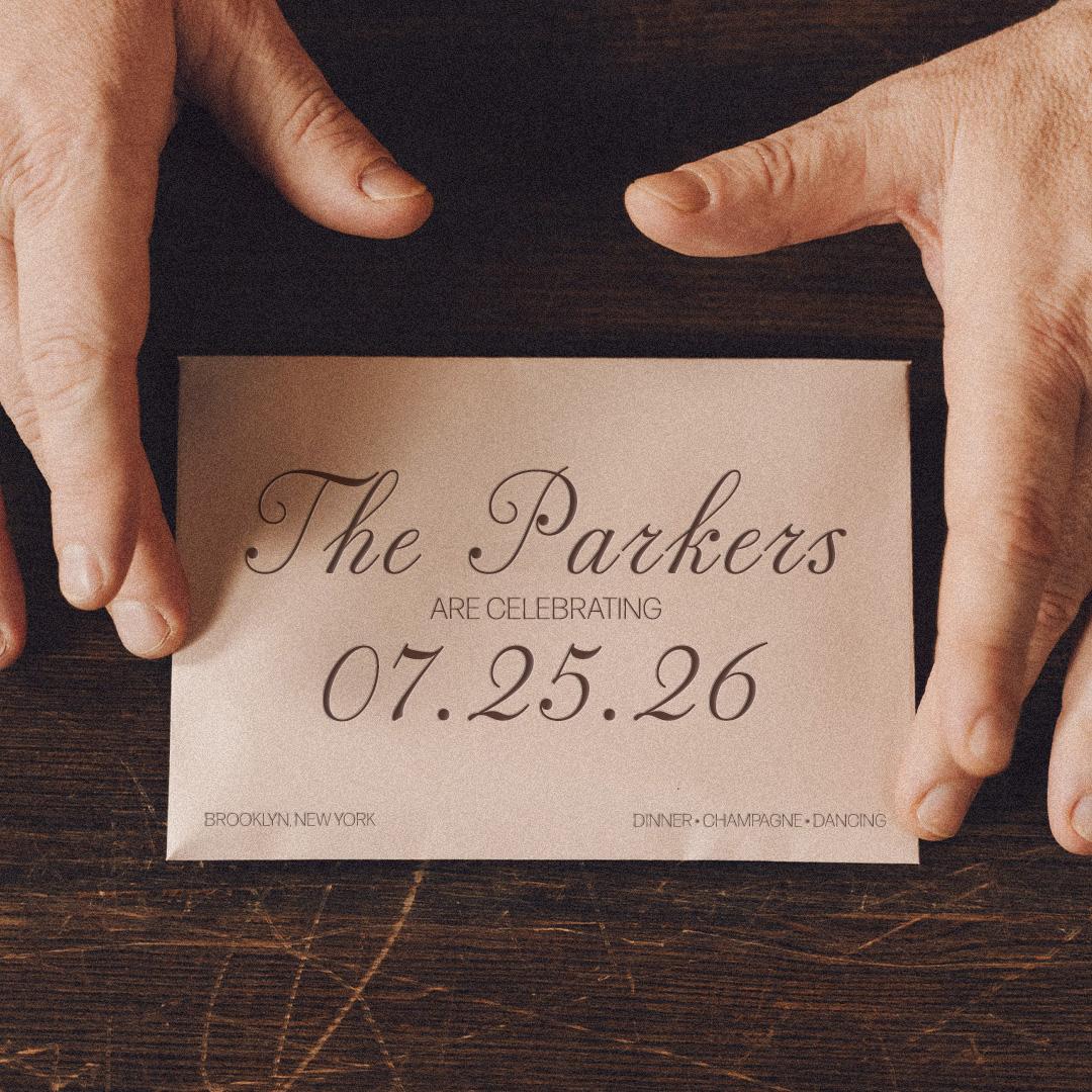
Pritzious
Valentina Casali drew Pritzious for Italy’s CAST, looking back to the 1760s, when the financier scripts of Rosart and Fleischman could not connect their letters for technical reasons. Rather than correct that quirk, she celebrated it, opening the connectors on purpose and stocking the font with alternates, initial and terminal forms, and swashes. Flamboyant, historical, and happiest at display sizes, it gives a formal setting a knowing wink.
Valentina Casali
Valentina Casali is an award-winning Italian type designer, educator, and co-founder of Sunday Büro, known for her work in type design and lettering.
Easygoing, polished, and full of character
Gautreaux
Victoria Rushton came to type through script lettering, and Gautreaux shows the discipline behind the breeze: by engineering the connection in every letter pair, she built a connecting script that needs only four alternates to flow naturally. Three weights radiate a jovial, vintage-tinged charm, and the sturdy shapes hold up on screens as happily as on cards and packaging. The middle of our spectrum, and the easiest to live with.

Victoria Rushton
Victoria is a type designer trained at Font Bureau and RISD, specializing in lettering and type design.
A love letter, brought back to life
MVB Chanson d'Amour
Kanna Aoki found her muse in an old book from a Paris bouquiniste, filled with samples of the eighteenth-century bâtarde scripts known as caractères de finance, and drew MVB Chanson d’Amour with their hand-inked texture lovingly intact. Delicate, romantic, and a little rough around the edges in exactly the right way, it makes an invitation read like a love letter that survived the centuries. A little texture, it turns out, is a lot of fun to play with.
MVB Chanson d'Amour
Regular
Starting at $39
Buy
MVB Fonts is a digital type foundry established in the San Francisco Bay Area in 1991 by type designer Mark van Bronkhorst.
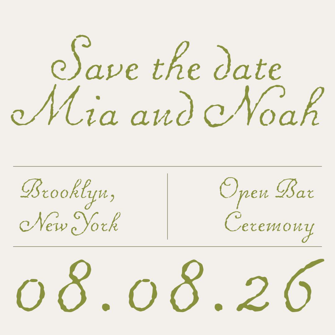
Vintage Italian charm, brought back to life
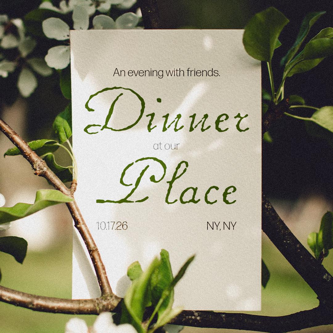
R41 Donatello
And for the closing number, the revivalists at R41, keepers of the Nebiolo archive, bring back Donatello, a script that once lived in the cases of Turin’s storied foundry. Warm, vintage, and unmistakably Italian, it carries the romance of another era’s printed ephemera into modern form, flourishes and all. When the last toast of the season calls for an encore, Donatello takes the bow.
All the most iconic fonts from the legendary Nebiolo Foundry in Turin, designed by Aldo Novarese, digitized and authentic.
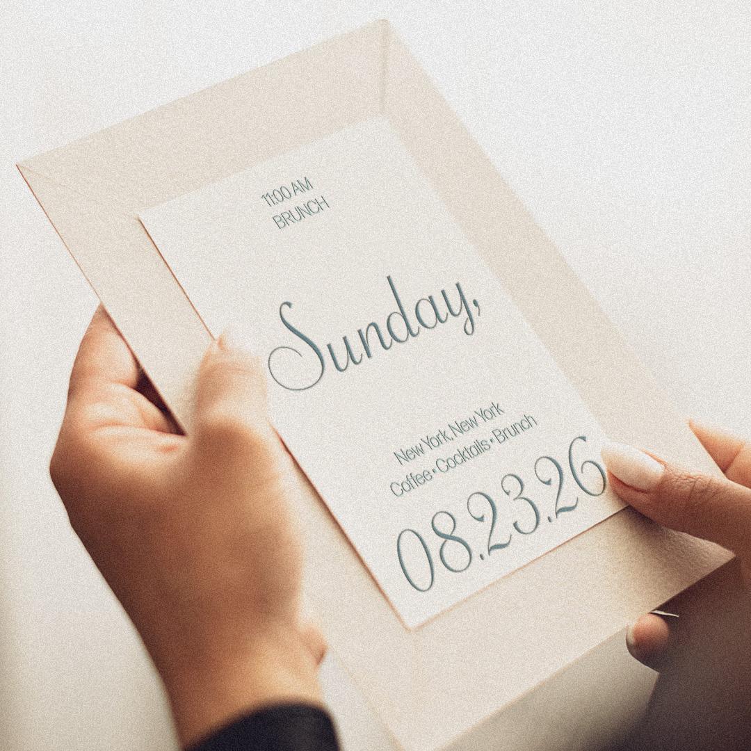
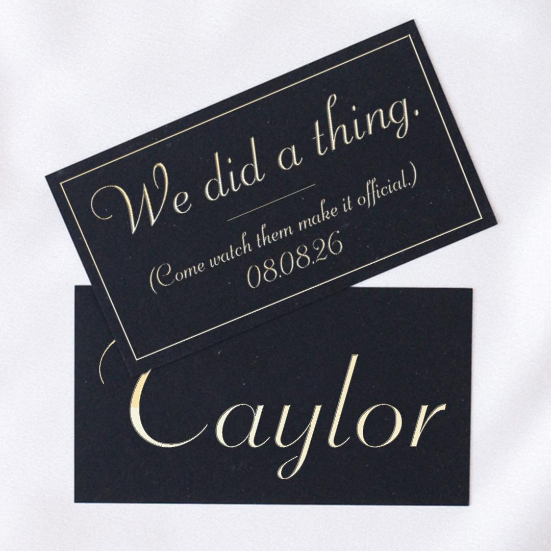
Fall leaves the way a good script does: with a flourish. Whether your last event of the season is black tie or backyard, one of these six will sign it beautifully. Meet them all, and the foundries behind them, at
store.typenetwork.com.